Here's a cool concept: Designing your BG layouts and character poses so that they compose artistically together.
Chuck Jones always thought about how his cartoons would look as graphics-even at an early stage of his career.
He worked closely with his layout artists-John McGrew and Robert Gribbroek in the 1940s to design each scene so that it would look good and read clearly in almost every pose.
Most cartoon directors staged their cartoons functionally-so that there was negative space in the background designs that would allow room for the characters to perform their actions in the clear-so you could see what they were doing, without a lot of clutter crossing through the silhouettes of the characters.
Jones took this functional concept and made it an art in itself.
THE EAGER BEAVER (1946)

THE EAGER BEAVER (1946) credits

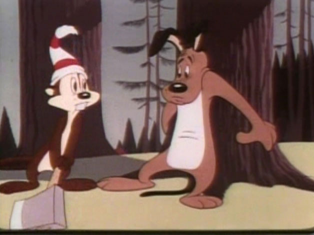
Framing: The tree on the right and the smaller tree on the left of the beaver serve functionally as a frame around the character. Behind the character there is no detail to get in the way of the beaver's action.
Now, artistically-the contrasts in the design of the BG and pose are crafted very cleverly.
There are 2 trees.
One is big and tall
The other is small and short-contrast in sizes.
Nothing is in the middle-many cartoons today stage everything symmetrically-the left side of the composition mirrors the right.
The left side of the composition is mostly empty-the right side is filled with trees and a hill-this side is not going to interfere with the action so it can be filled to balance the open space on the left.
The trees are all slightly different angles-contrasts in angles.
Negative shapes-negative shapes are the spaces between the objects-these spaces, when used correctly, help make the positive shapes "read" clearly.
The 2 framing trees create a clear shape in the negative shape-a big "U" shape.
There are large negative shapes to frame the character. There are small negative shapes in the character's pose to help the line of action of his pose read. Contrast in negative shapes.
His line of action opposes the angle of the tree on the right which makes the composition dynamic.
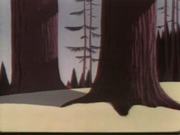
Here's just a still background. It looks simple. It doesn't have a lot of detail or arbitrary clutter to impress your Dad or Jeffrey.
The complexity is in the thought behind the picture-in the choice of shapes and the placement of them.
Nothing is in the middle.
The main tree is in the foreground on the right.
The shdow of it falls on a diagonal and points to the tree behind it.
The skinny trees in the negative space between them are composed towards the right of the negative shape.
All this careful artistic asymmetry makes the designs seem natural and organic, not stiff, cluttered and accidental like many cartoons today.

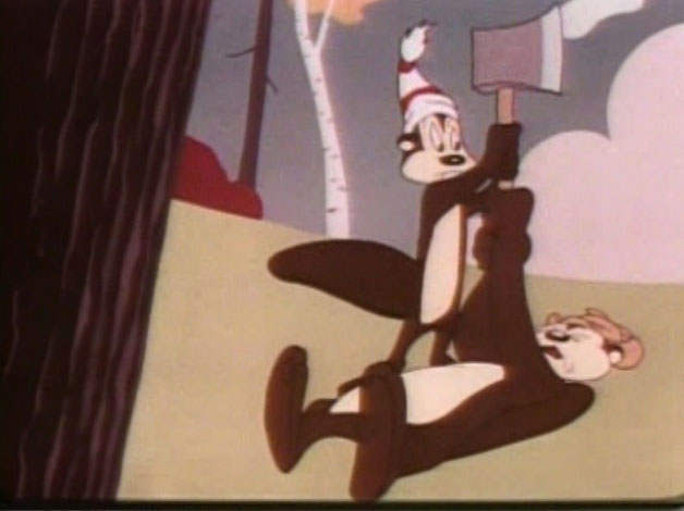
Here the tree on the left acts as the frame around the beaver's pose. The negative shape between the trees will help his axe swing read clearly.
The skinny trees are not evenly spaced and all follow organic curves moving up, rather than straight lines.

Here is an example of what today would be misinterpreted as "No perspective". We are looking up at this shed, yet the lines all converge down rather than up and away from us as they would in reality.
Today's wacky layout artists think this means there are no rules in cartoons and they draw no perspective at all and the lines don't converge anywhere. Windows don't fit on buildings. Every building twists and turns in a different angle. This is sometimes referred to as "wonky" design. It started in Ralph Bakshi's Mighty Mouse, was copied by Beetlejuice (the Nelvana cartoon), Tiny Toons and A pup Named Scooby Doo and now is everywehere used as an excuse to not have to design anything with control or purpose or visual appeal.
This shed's backwards perspective is consistent with its bending of one rule-every edge doesn't follow its own way, so the shed holds together as a solid, yet cartoony form.
I find all these layouts to be elegantly handsome. Jim Smith is an expert at this kind of controlled design and composition.When we did Ripping Friends, Jim would deisgn and draw many great compositions-we sent them to service studios up north who immediately redrew them all and undid all the design, filled them with ugly clutter, placed everything in the middle and took out all the contrasts. I later discovered that that was the Canadian layout style that it is actually taught at the schools up here.
Shocking!
Nick Cross was the first Canadian I've met to break from the clutter style and he quicky became a top designer and layout artist once I informed him that is was OK to use artistic principles in cartoons.
These great Chuck Jones cartoons inspired other animators and designers who later founded UPA and used some of these principles and got rid of the clutter of the entertainment part of cartoons.