Wednesday, May 07, 2008
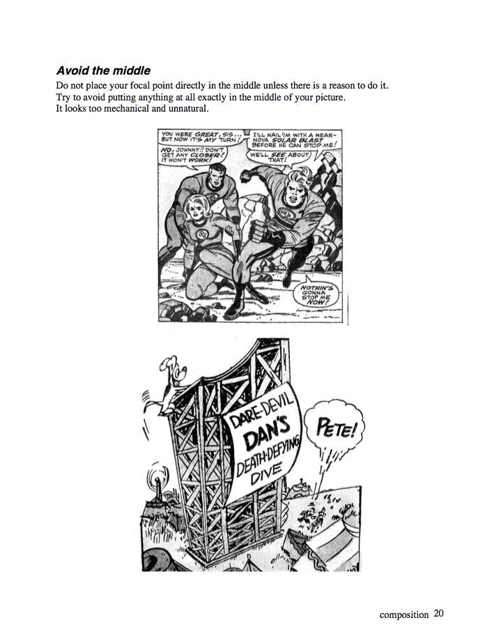
Composition 6- Avoid The Middle, Asymmetry is more natural and interesting
Newer Post
Older Post
Home