

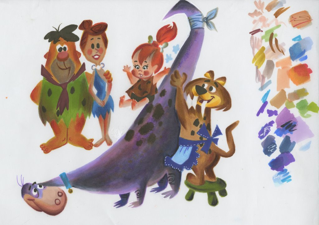
She copied a page from my favorite Golden Book of all time, "Pebbles Flintstone" illustrated by the king of Golden Books, Mel Crawford.
I remember seeing this book on a golden book shelf in a drug store when I was 11 and my eyes popped out of my head. The wrong colors on the characters, the brash painting style, the angled yet organic drawings just exploded in my brain.
I begged my nanny, Mrs. O'Neil to cough up the whole 29 cents to get me this amazing thing and she did. (She also bought me Sgt. Pepper's Lonely Hearts Club Band" for Christmas after my Dad refused to get me any of that dirty hippie music!)
Anyway, more on Mel Crawford later.
Everyone can learn faster by copying the greats. But copy with intense self criticism. Don't be a pussy! If something doesn't look exactly the same as what you copied, then it's wrong and you should analyze why it looks different and then try to correct it.
It helps to have someone who is a pro already to help critique it for you, and if you are so lucky, then be like Kali and appreciate the free help! If not, then keep copying and fixing your copies as best you can and have no ego about it.
Having an ego when you are young is a huge detriment to your progress as an artist.
Kali is brave enough to let me share my critique of her very good copy with you so that if you are young and eager, you can also benefit.

Spumko (3:45:23 PM): hey that's pretty good
Spumko (3:45:29 PM): you did it with markers?
Kali Fontecchio (3:45:33 PM): hey
Kali Fontecchio (3:45:34 PM): ya
Kali Fontecchio (3:45:42 PM): i thought it was pretty bad!
Kali Fontecchio (3:45:49 PM): i see everything i did wrong
Kali Fontecchio (3:45:53 PM): the drawing for starters
Kali Fontecchio (3:46:03 PM): i didn't have the right purples for dino
Spumko (3:46:13 PM): want a bit of a critique?
Kali Fontecchio (3:46:14 PM): so i tried to make up purple with pinks gray and blues
Kali Fontecchio (3:46:17 PM): it got too dark
Kali Fontecchio (3:46:19 PM): YES!
Spumko (3:46:40 PM): your observations of the angles and style are really good
Kali Fontecchio (3:46:52 PM): yay
Spumko (3:47:01 PM): too much shading
Spumko (3:47:08 PM): overdoing it
Kali Fontecchio (3:47:16 PM): ya totally
Spumko (3:47:23 PM): you are adding colors and shades that aren't on the original
Spumko (3:47:32 PM): and it is muddying it up
Kali Fontecchio (3:47:38 PM): ya
Spumko (3:47:47 PM): use more restraint
Spumko (3:47:56 PM): don't fill the whole area with shadows
Spumko (3:48:01 PM): it creates a blur
Spumko (3:48:11 PM): and distracts from the subjects
Spumko (3:48:28 PM): also your shadows come too far into the objects
Spumko (3:48:35 PM): Mel puts them close to the edges
Kali Fontecchio (3:48:44 PM): oh ok
Spumko (3:48:49 PM): look at Dino's tail
Kali Fontecchio (3:48:58 PM): ya i did that terrible gradient thing- because i kept adding pointless colors
Spumko (3:49:03 PM): just next to Pebbles
Spumko (3:49:14 PM): see how thin the area of shadow is?
Kali Fontecchio (3:49:17 PM): oh ya!
Kali Fontecchio (3:49:18 PM): shit
Spumko (3:49:31 PM): yours comes almost to the center of the tail
Spumko (3:49:40 PM): AVOID THE MIDDLE
Kali Fontecchio (3:49:44 PM): ok!
Spumko (3:49:49 PM): do not split your images in 2
Spumko (3:50:05 PM): Dino is the image, not the shadow
Spumko (3:50:27 PM): the shadows are just there to help define separate parts of the images
Spumko (3:50:38 PM): like the cat's arms
Kali Fontecchio (3:50:54 PM): i forgot one arm
Kali Fontecchio (3:50:58 PM): because i'm retarded
Spumko (3:51:07 PM): if they were painted flat tan color you wouldn't see them where they cross his body
Spumko (3:51:29 PM): Mel uses shadows sort of like cartoons use lines
Spumko (3:51:37 PM): just to clarify separate parts
Kali Fontecchio (3:51:43 PM): oooh
Spumko (3:51:50 PM): they are not sensible
Spumko (3:52:01 PM): not like light and shadow in real life
Kali Fontecchio (3:52:17 PM): i see that now
Spumko (3:52:40 PM): in most of the images, there is less shadow than main body colors
Kali Fontecchio (3:52:48 PM): ya the cat's butt originally had a sharp shadow line
Spumko (3:52:50 PM): except at the bottom of Dino
Kali Fontecchio (3:52:51 PM): mine is fuzzy
Spumko (3:53:04 PM): but there the shadow is MORE than half a leg
Spumko (3:53:18 PM): which makes the thin strip of main color seem like a highlight
Spumko (3:53:42 PM): avoid taking anything near the middle...usually
Kali Fontecchio (3:53:48 PM): ok
Spumko (3:53:58 PM): see Fred's feet?
Kali Fontecchio (3:54:01 PM): ya
Spumko (3:54:23 PM): in Mel's painting the red shadows are only on the toes, not the top of the feet
Spumko (3:54:33 PM): see his face?
Spumko (3:54:46 PM): in yours, he has more shadow than he has face
Kali Fontecchio (3:54:50 PM): ya
Spumko (3:55:03 PM): see the shape of the shadow on Mel's?
Kali Fontecchio (3:55:05 PM): ya
Kali Fontecchio (3:55:09 PM): it's much smaller
Kali Fontecchio (3:55:11 PM): muuuch
Spumko (3:55:18 PM): it's a softened triangle
Spumko (3:55:26 PM): hey
Spumko (3:55:31 PM): save this IM
Kali Fontecchio (3:55:34 PM): ok
Spumko (3:55:41 PM): would you mind if I blogged this?
Kali Fontecchio (3:55:45 PM): uh
Kali Fontecchio (3:55:46 PM): ok
Spumko (3:55:47 PM): it would help others
Kali Fontecchio (3:55:54 PM): can i make a better version before you do?
Kali Fontecchio (3:55:59 PM): so like the before and after
Spumko (3:56:04 PM): yeah
Kali Fontecchio (3:56:07 PM): yay
Spumko (3:56:14 PM): see the blue shadow you put on Pebble's face?
Kali Fontecchio (3:56:18 PM): ya
Kali Fontecchio (3:56:32 PM): it's wrong
Spumko (3:56:38 PM): you should avoid putting a cold color as a shadow on a warm color
Kali Fontecchio (3:56:45 PM): oh ok
Spumko (3:56:48 PM): it makes the colors look dirty
Spumko (3:57:06 PM): like you didn't wash your brush before you painted her face
Spumko (3:57:19 PM): make the shadows out of RELATED colors
Kali Fontecchio (3:57:26 PM): ok
Spumko (3:57:30 PM): not opposite colors
Spumko (3:57:48 PM): otherwise you get a muddy dingy image
Kali Fontecchio (3:57:57 PM): ya it looks like she has a five o' clock shadow on her forehead haha
Spumko (3:58:06 PM): make your shadows have shapes-draw them on instead of pushing them around into nebulous shapes
Kali Fontecchio (3:58:15 PM): not blended
Spumko (3:58:16 PM): that don't mirror the form they are on
Spumko (3:58:34 PM): no parallel shadows
Spumko (3:58:39 PM): like on Fred's legs
Kali Fontecchio (3:58:43 PM): uh huh
Spumko (3:59:09 PM): it splits the leg into two images if you make shadows that are parallel to the object they are describing
Spumko (3:59:43 PM): In Mel's the shadow fades out faster and avoids becoming a darker stripe on his leg
Spumko (4:00:34 PM): Important point: Don't put a whole bunch of textures and different colors all in the same area. Like on Dino's body near the spots
Spumko (4:00:43 PM): it becomes messy and a jumble
Spumko (4:01:24 PM): the spots are the important design information there, so try not to distract from them with extra colors and stripes and textures
Spumko (4:01:29 PM): too noisy
Kali Fontecchio (4:01:33 PM): ya
Spumko (4:02:11 PM): in Mel's, the purple texture starts around the far edge of the spots and leaves most of them in the clear where you can see them easily
Spumko (4:02:40 PM): Follow the general thoughts here?
Kali Fontecchio (4:02:52 PM): ya completely
Spumko (4:03:13 PM): OK, try copying another painting and see if you get a clearer image
Go thank Kali here for being a good sport!