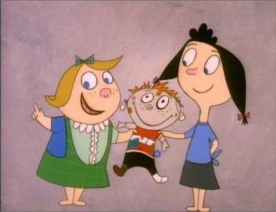
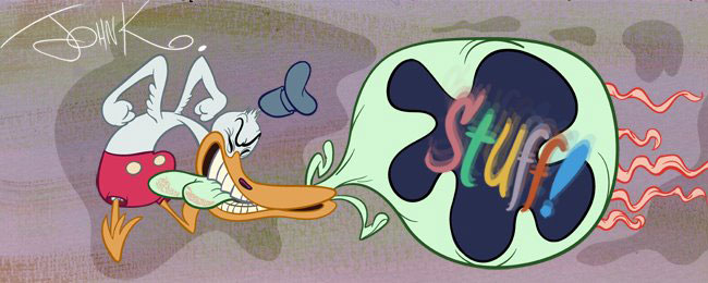
All through the 80s I had a flat stylized kinda style-inspired by Ed Benedict and the 50s commercials. I didn't find UPA cartoons themselves entertaining, but I loved the idea of striking flattish designs.
Everyone else in the studios hated it! No one would let me do it.
I met Mike Giamo once while looking for artists to work on ...I think it was Mighty Mouse and I realized that he and a few other artists also liked that sort of thing. But they liked it in adifferent way.
Mike is probably most responsible for steering the Cal Arts students in that direction-they combine the flat shapes of UPA with Disney-style (Frank Thomas) eyes and expressions and that's basically the Cal-Arts style. Cruella DeVille's face on Gerald McBoingBoing's head.
George Lucas hired a bunch of Cal Arts guys and made a paper cut out movie (I forget the name-help me out!) that Amid and many Cal Arts fans folks love. It's extreme Cal-Arts.
I thought that Mike and all these artists were very talented, but I took the flat designy stuff in a different direction.
To me, the style is just a tool-not an end in itself. It has functions.
It's great for commercials. It doesn't lend itself well to "personality cartoons". Super stylized characters are more like general symbols, rather than detailed layered living characters.
That's why I like Ed Benedict so much. He took a graphic style but made his characters look like characters, not just symbolic representations of generic people types.
I grew up watching early Hanna Barbera cartoons, that are a somewhat watered down version of graphic character design, but they are real characters-they seem alive and they interact with other characters and with us in the audience.
The only problem I have with UPA and it's descendants is that it philosophically leaves out the audience. It's intended for artists, not for regular humans. I, like other artists can find a lot of good in it, but I wanted to use the ideas to entertain a wide audience.
LOG (character stolen from Marky Maypo)
 When we did the fake commercials in Ren and Stimpy, the artists and I attempted to go with a real 50s retro look to contrast with the design of Ren and Stimpy in the story cartoons.
These commercials were not meant to be stories or personality explorations. They are bookends to the stories.
Prizes in the cereal. Window dressing.
 Here's one that Bob Camp did the storyboard for. He himself is not a stylized designy cartoonist, but he is a great all around illustrator and good at picking up styles fast. LOG was the first fake commercial we did, so we just stole the design from Marky Maypo. Basically to get used to drawing in a retro style.

 I had met a really good natural retro designer named Dave Sheldon before we did Ren and Stimpy and it dawned on me that he would be good to design some of the commercials.
 I had to "sell" the idea to Nickelodeon. They didn't understand why some parts of the cartoon would look different than the other parts, so I argued and they reluctantly gave in. Once they saw the cartoons they loved them and wanted more more more.
 I had Dave design the first Powdered Toast commercial and he did hilarious 50s style versions of Ren and Stimpy, but Nickelodeon flatly refused to let me do it. They thought it would confuse the kids, so sorry folks you didn't get to see that. It was a real treat!
 LOG FOR GIRLS - Dave Sheldon


 An unintended consequence of including "UPA-style shorts in Ren and Stimpy is that, more than any other part of the show...that's what everyone copied and still copies 15 years later. They took these throwaway candy bits and decided to make whole shows with cardboard characters.
I should have known better. That's what happened with the real UPA. Everyone copied the wrong parts-the cold, sterile blandness and the seemingly simplistic looking designs. History repeats itself I guess.
I'm making a commercial now in Rex's style.


Steve and Eddie have told me of a great controversy stirring over me analyzing UPA cartoons and discussing its historical impact.
They said some people are actually mad that I don't just say every part of everything everybody ever did was great. I just would like to point out, that I am one of the style's biggest proponents and am in awe of Hubley, Cannon and Scribner. I'll even bet a large % of the (younger) folks who are outraged at the idea of discussion and analysis would not even have heard of UPA had I not battled against the whole industry to revive an interest in it!
Soon, I will show you what I think is best about the UPA cartoons. Here to start....
1) It's not the individual character designs themselves-or any of the little details. It's the stage design-how the characters all fit and compose with the backgrounds and the colors.
The characters themselves are not usually impressive, they are basically stick figures and only work in the context of the scene staging. And this is the part that no one copies. Anyone can draw stick figures today, but I don't see very many people who can make a composition and that's a huge difference.
Here are cluttered non-compositions from a UPA cartoon and others. Superficial imitations of the good stuff.
I'll show you more of what I mean soon...Soon, I will show you what I think is best about the UPA cartoons. Here to start....
1) It's not the individual character designs themselves-or any of the little details. It's the stage design-how the characters all fit and compose with the backgrounds and the colors.
The characters themselves are not usually impressive, they are basically stick figures and only work in the context of the scene staging. And this is the part that no one copies. Anyone can draw stick figures today, but I don't see very many people who can make a composition and that's a huge difference.
Here are cluttered non-compositions from a UPA cartoon and others. Superficial imitations of the good stuff.


