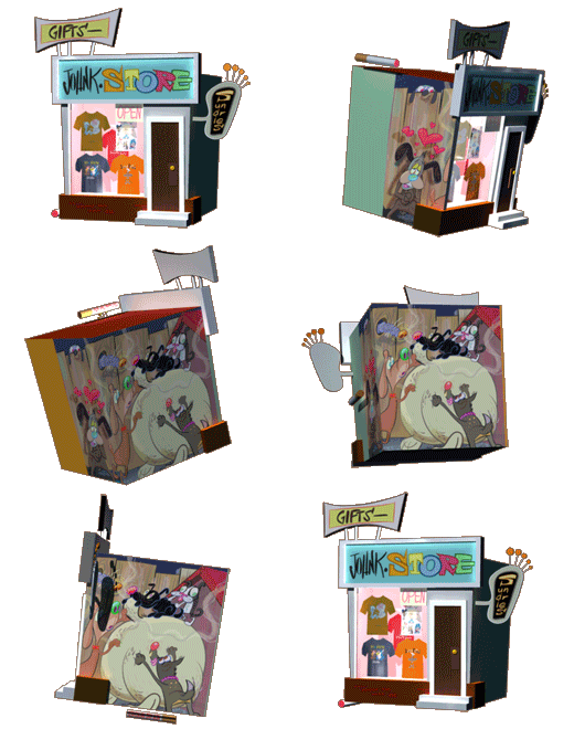
How about if I use this drawing to do a few posts, each one pointing out a separate aspect of good cartoon drawing?
ASYMMETRY IN THE LARGEST CONSTRUCTED FORMS

These characters have good construction, BUT notice that the forms that make them up are not perfect ovals or circles. They are ORGANIC shapes, asymmetrical.
Not mirror images left and right, or top and bottom.

This is a hard technique do right. First you have to understand basic construction. Then you have to be free enough that you can draw shapes that are not mathematical, but still look convincingly solid.

The asymmetry has to be subtle, not wild and wonky, without any form at all.
Real things in nature have form, yet hey are not perfectly symmetrical, and a god cartoonist applies this concept to his drawings to make them feel natural. Warm and not clinical.
25 comments:
Want proof that John K. is a genius? Even his SPELLING MISTAKES serve the point that he's making. "A god cartoonist"? Well, we're talking about things in nature, right? Makes perfect sense!
Sorry
I bought a new Mac and the keyboard doesn't type every letter if I type too fast...
Ha ha, I thought you really did mean God cartoonist, it would kinda make sense here.
Great post John, learn something new everyday.
Great breakdown. That opposition gives a lovely tilt to the head. Looks so simple when you go over it like that but so hard to do right. Lovely.
A great illustration of this would be to take that Bullwinkle and adjust him, so that everything's symmetrical. Then place the two side by side. The symmetrical one would be atrocious, by comparison.
One thing that I always, always liked about Ren & Stimpy was that there never seemed to be a definitive version of the rascals. I liked that. I admired it. It let me know that the people behind it were thinking.
Thanks for the amazing insight. It's a deceptively simple drawing and while I enjoyed it when you first posted it, your breakdown makes the drawing much more inspiring.
John- does asymmetry work because when we look- at anything, we aren't concerned about the composition, we crop the image in our focus- honing in on what aspect is important by walking towards it or bringing it closer to your eyes. So, looking- at life, naturally- is asymmetrical?
That frame is so Kricfalusian, and it portraits exactly the aspect I like about Kricfalusianism.
Something I've been wondering about
Do Disney's golden age animations follow all of the rules set for appealing cartoons?
they obviously follow all of the Animation principals, but are they held as good "Cartoons" in your eyes?
Also, On a side note, what did you think of Pixar's Wall-E?
It definitely seems less formulaic then most Pixar movies, but what did you think of the Animation?
Actually, the reason why so many cartoon studios want you to draw symetrical these days is because someone told them that there was a scientific experiment to proove the 'mathematics of beauty' and they said that the further someone's face gets from symmetry the more revulsed we are by it.
While it is true that there were tests of this sort done ( and subsequently a documentary on the subject hosted by John Cleese and Elizabeth Hurley ), it's certainly a matter of taste in the end. I think if you don't want to identify with characters, make them symetrical, otherwise they're not unique.
That damn Wall-E robot's about as unique as any other symetrical robot Lucas had in the background of his Star Wars films.
Thanks for the form drawings, John! It's much easier for me to see the original forms in drawings now thanks to these visual lessons.
Yr. student and fan,
- trevor.
you are a great teacher
I once took a workshop in puppet design with some of the designers and builders who worked on the Muppets, and they said the same thing. A little asymmetry brings the character to life.
The opposing head and muzzle make this drawing hilarious!
Cool post, thanks!
Hey man, If you're of the mind, visit
pappysgoldenage.blogspot.com
This character seems to have droves of golden age comics obscurities which he scans, evidently, from his personal collection.
Mostly pre-code horror and SF but some Funny Animal stuff which may be of innerest...
John, I know this is completely off-topic, but I wondered if you had any thoughts on Hugh Harman's late-thirties MGM cartoons? I swear I can see the influence of Clampett's B&W Merrie Melodies on "The Mad Maestro" and "Art Gallery" - still sort of poor man's Disney, mind you, but with faster, funnier movement and nudging towards observed behavior, especially in "Art Gallery" when Nero giggles like sugar-high little kid. Still kind of clicheed thirties stuff, but better.
I liked Larson's comment in a "Far Side" book that if you've drawn Rocky Squirrel correctly once, you can never do it again.
I like this old ad...I think it's for laundry soap.
http://data4.gallery.ru/albums/gallery/74091--8814164-.jpg
the shape of the heads is just awesome...as is the colour palette
FYI...I had read an older post about your "FLASH" usage some yeas ago. Just in case you neve came across the softwae called ToonBoom, it is a flash based solution, but it has an animatos interface, and does decent lip sync.
Just passing it along if you want o check it out. :)
John,
I didn't know if in the years following your initial use of flash if you ran across a program called ToonBoom studio or not.
It is very animator friendly with a non programatic interface.
I'm actually getting better at using it for my own stuff.
Just thought I'd pass that along.
Yeah, they used ToonBoom on Looney Tunes: Back In Action.
- trevor.
Johnny my man, what are your thoughts on that new show on Cartoon Network, "Chowder"? Just thought I'd ask to see if you thought it was any good or not. Please reply...I MUST know!
Much apreciated!
John, as Matieshoe pointed out, it would be great to read your analysis of contemporary 3D animation models.
About the keyboard... these new aluminium ones are crap, get one of the old white keyboards somewhere.
:)
Post a Comment