
The setup is over and now the actual story starts. First Chuck establishes the mood and location. Robert Gribbroek drew these beautiful layouts and Phil De Guard painted them. Nice clear compositions and unusual color schemes.


I love this establishing shot of the interior of the casino. It shows how huge it is in comparison with Nasty way over on the right. The BG is full of design contrasts: The curved winding stairway, the tall vertical window that frames a tiny Nasty at his desk. Organic sinuous chairs, low in the frame contrasted against tall vertical designs on the walls. It's all intelligently planned to tell the story and be striking and beautiful at the same time. Very stylish, without being garish.

Nasty is funny here; we see him marking the cards with those stubby fingers Chuck loves.

Nasty is not as exaggerated as he becomes later in the cartoon. Chuck got more comfortable with the design as he worked his way through the cartoon and he kept drawing more complex variations of him. This could not happen if he was bound to some arbitrary model sheet rules created in another department by people he didn't know.

An almost ignorant shot of the swinging doors to contrast against the previous elegant layouts.

This straight on symmetrical ignorance helps to establish that Bugs is a hick coming to the big city. I like how we don't se him all at once. We just see the hick shoes coming in first. Good suspense.

Nice touches here. Chuck is teasing us by not just showing us Bugs all at once.

The wheat straw in Bugs mouth says it all.

Robert Gribbroek is my favorite of Chuck's designers. He has a perfect balance between creativity and control. He doesn't let creative license turn into outright anarchy, like you see in many of today's cartoons.


 The setup is over and now the actual story starts. First Chuck establishes the mood and location. Robert Gribbroek drew these beautiful layouts and Phil De Guard painted them. Nice clear compositions and unusual color schemes.
 I love this establishing shot of the interior of the casino. It shows how huge it is in comparison with Nasty way over on the right. The BG is full of design contrasts: The curved winding stairway, the tall vertical window that frames a tiny Nasty at his desk. Organic sinuous chairs, low in the frame contrasted against tall vertical designs on the walls. It's all intelligently planned to tell the story and be striking and beautiful at the same time. Very stylish, without being garish.
 Nasty is funny here; we see him marking the cards with those stubby fingers Chuck loves.
 Nasty is not as exaggerated as he becomes later in the cartoon. Chuck got more comfortable with the design as he worked his way through the cartoon and he kept drawing more complex variations of him. This could not happen if he was bound to some arbitrary model sheet rules created in another department by people he didn't know.
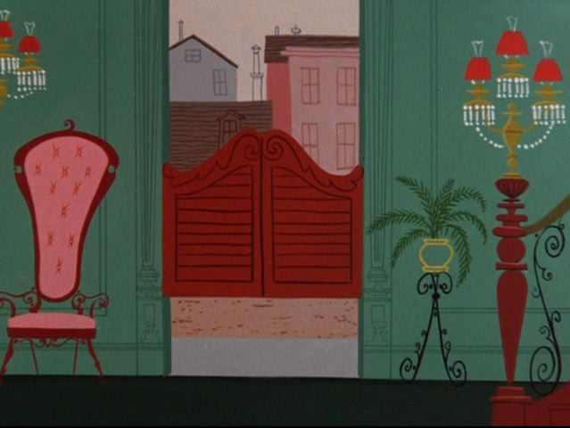 An almost ignorant shot of the swinging doors to contrast against the previous elegant layouts.
 This straight on symmetrical ignorance helps to establish that Bugs is a hick coming to the big city. I like how we don't se him all at once. We just see the hick shoes coming in first. Good suspense.
 Nice touches here. Chuck is teasing us by not just showing us Bugs all at once.
 The wheat straw in Bugs mouth says it all.
 Robert Gribbroek is my favorite of Chuck's designers. He has a perfect balance between creativity and control. He doesn't let creative license turn into outright anarchy, like you see in many of today's cartoons.