

 I did this drawing the other day in a private lesson as an example of exaggerating what you see by using the principle of contrast.
 My student had copied this Preston Blair drawing above and had drawn the proportions too conservatively. The baby's head was too small in comparison to his body. I'll ask him if I can use the drawing to show you, but basically he undertured it.
He was actually trying to measure the proportions and get the drawing to be exactly like Preston's original. In all my experience in the assembly line process of animation I have found that the vast majority of cartoonists -when they try to copy a drawing, automatically tone it down. They lose the contrasts and I always have to push them to go farther and overshoot what they think they are copying.
Drawing By Adjectives:
 Here Preston describes what makes a baby look like a baby. His adjectives could just as well describe a real baby as a cartoon baby. The words are very general and don't give a precise description of the proportions and details.
Babies have big heads, right? Well not really. What does "big" mean precisely? It means relative to what we think is small. A baby's head is big in comparison to its body- when you again compare the size relationship of an adult's head and body.
So the difference between drawing realistically and drawing cartoony is that when you draw a real person, you are trying to draw fairly acurate measurements and when you draw a cartoon you are trying to draw the emotional essense. You are drawing opinions rather than reality.
You can use the same adjecties to describe a person in real life as you can to describe a cartoon character, but in your cartoon you exaggerate the contrasts. "Big" becomes "bigger". "Sickly" becomes "sicklier". The relative contrasts are heightened.
There are all different types of contrasts, not just contrasts of size.
You can have contrasts of:
Curves vs Angles
Diagonals VS perpindiculars.
Shapes VS Fills
and more
Diagonals VS perpindiculars.
Shapes VS Fills
and more
Other Principles Depend On Contrasts
Silhouettes and lines of action depend upon contrasts.
 The greater the contrasts, the easier it is to see the point of the drawing and what the artist means. Great cartoonists instinctively use contrast and therefore make stronger visual statements. Bob Clampett and Tex Avery are the masters of contrasts in animation.
  Weaker cartoonists are timid and conservative. They don't like strong contrasts and think they are in bad taste. In my opinion that makes their statements less forceful, less entertaining and less committed to their own ideas.
I was using "Uncle Tom's Cabana" to explain a variety of animation principles and techniques to my student and started drawing the poses and compositions to show how Tex and his animators used very strong contrasts to make every point in the story. We also noted that Tex liked to experiemnt with graphic styles throughout his career. He used different designers and layout men, yet all the cartoons have the strong pointed visual statements, a confident certainty in every idea Tex wanted to present. There is nothing vague or mushy in Tex' best work from about the mid 1940s on.
Other Cartoony Principles:
There are generally known (well known at one time) principles of animation as explained by Preston Blair and Frank and Ollie, but they don't cover what makes something "cartoony" or not.
I thought maybe I'd start compiling the tools, techniques and qualities that separate cartooniness from blandness and do my own set of cartoony principles.
Some others off the top of my head are:
Simplicity: Real life is full of busy details.
 Cartoons boil them down to the essential ingredients that make a visual statement clear. Simplicity by itself is not enough to make something cartoony. There are a lot of simple cartoons on TV today that are positively moronic from a visual standpoint. Kids draw simple, but without control or understanding. It doesn't make their drawings cartoony.
Puposeful Impossibility: Cartoons can do what you can't do in real life and it's what really separates itself from other media.
 For some reason most people in animation (and still cartoons and comics too) are ashamed of this and won't take advantage of this great gift.
 Visually Funny: A good cartoon can make you laugh at the visual alone.
  Dialogue, story, appeal and other attributes are gravy, but not essential or exclusive to cartoons.
There are more principles I'm sure and when I think of them I'll add them. Giving private lessons makes me think even more analytically about things as I witness what concepts are easy to learn and which are more difficult.
____________________________________
Caricatures Are About Contrasts:Caricatures are not about making everything bigger as some people think. If everything is big, then nothing is big. Caricatues are about finding the actual contrasts in a subject and then making the contrasts more extreme. A big nose becomes a bigger nose, but a little mouth (like Simon Cowell's) becomes littler. Again these are all relative to the other features surrounding them.
Not all caricatures however, are "cartoony". The caricatures that I have been doing are not all that cartoony. I am exaggerating the contrasts for sure, but not to the extent I'd like to, and I'm not really simplifying the features. There are plenty of much better caricaturists than me. I think I am too hung up on figuring out how the anatomy works and what the features really look like, so when I exaggerate them, I am held back by the struggle of trying to learn things that I am not confident of yet.
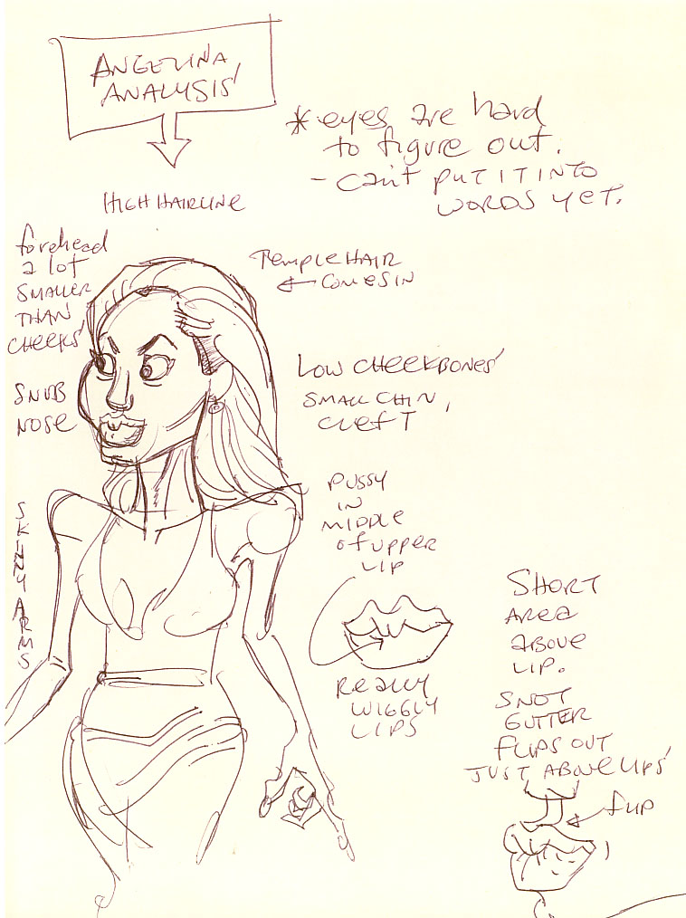
I do know that the more I draw a certain person, the more cartoony the caricatures get.
