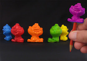
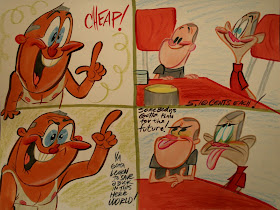
I've got a killer idea for a show about Fedor.

These are the kinds of scribbles I do while waiting for Eddie to meet me at our favorite pizza place.

Mindless doodles.

Can you believe anyone takes this guy seriously? Like HE's normal?

Man, Bugs is hard to draw!
Hey! Do you wanna see how we write our cartoons? They are totally artist friendly - as opposed to scripts - which are intended to make cartoonists commit suicide - or murder.

Here's the beginning of a story about a comic book geek going to the store on the day they deliver the new issues, something probably most of us can identify with.
I thought of posting this because the other day I tried to read a Godawful modern script based on some wacky classics. It had every single writer's sin:
CARTOON WRITER SINS
Written way too long.Crowds upon crowds: scenes taking place in sports stadiums, impossible stuff to draw.Long long episodes of boring meaningless dialogue.Everybody out of character. Too many characters. Characters that don't work together.Too much action detail described by people  who can't draw, therefore can't visualize.
Boring prose.
Pop culture references.
Explaining the "jokes".
Cartoon scripts are torture to read. You can't do it in one pass. It causes narcolepsy.
I believe in writing outlines - just enough material to get across the story and plot. Then you give that to a storyboard artist to flesh out with the director and other gag men.
Over the years I've developed this system. Computers have helped make it easy for us to combine the drawings of the key moments with the loose written descriptions of the most important events. The result is like a rough children's book.
If you'd like, I'll post the whole story in this form as a preview of the episode in progress.

The drawings in the outline are by me and Jim.
 I have a big TV pitch next week and figured having a couple group shots would impress the crap out of the execs.
 If any of you inkers who have done work for me before wanna help out, please let me know in the comments or email me. It will be greatly appreciated and I'll send you official Spumco Fan Club certificates and pencil enhancers for whoever does them. I still need someone to ink the bottom picture.


