I've always considered myself a champion of the audience. While most of the industry conspires against being nice to humans, I fight to appeal to normal human desires. I don't succeed every single time, but at least I try.
When I do kids' cartoons I aim to give kids what everyone else refuses to. Like, can you imagine a super hero cartoon where the characters actually punch anybody? Well I had to fight executives for even the very few punches that appeared in a show about a genre that is all about punching.
In the Ripping Friends-a show that had many conspiring forces against it, I purposely crafted a segment to let the kids know that Spumco cartoonists were on their side.
I came up with a concept called "Rip Along With The Ripping Friends". In each of these sequences, kids would write the Ripping Friends to tell them who was being mean to them this week: Bullies, Teachers, Networks, Cartoon writers, Parents, Homework assignments, Lumpy toymakers, etc. The Ripping Friends would read the kids' complaints, empathize and then go after the monsters who dared to be mean to them.
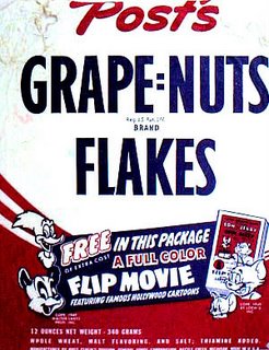
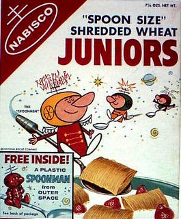
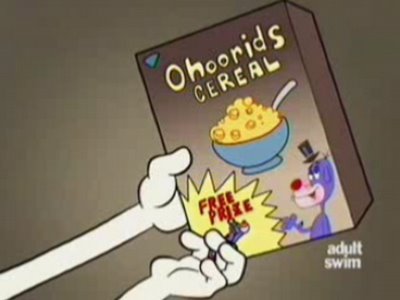 Cereal companies are mean now, but they used to love kids. They used to cover their cereal boxes with great cartoon art, games and cut-out-activities. They made great entertaining animated commercials, they sponsored cartoon shows on TV, they coated every single nugget of cereal with glorious sparkly sugar, but the thing they did best was...they put PRIZES in every cereal box!
In this particluar Rip-Along, The Ripping Friends try to find out who's responsible for not putting real prizes in cereal anymore and then they rectify the affront.
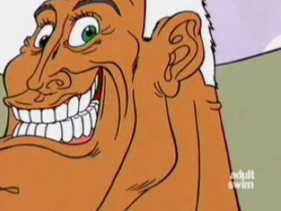
This segment pretty much illustrates my whole philosophy of entertainment-let actual entertainers do whatever they can to entertain their audience and stay out of their way, then collect the money. The irony of the animation here is that much of it is pretty blandly executed. I drew the first half of the segment and did my best to try to get everyone along the production line to trace my drawings exactly. They didn't, they felt compelled to add lumps to every drawing, but you can at least recognize my style underneath the lumps- in the first half of the cartoon.
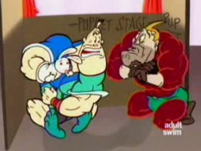
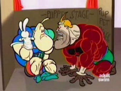
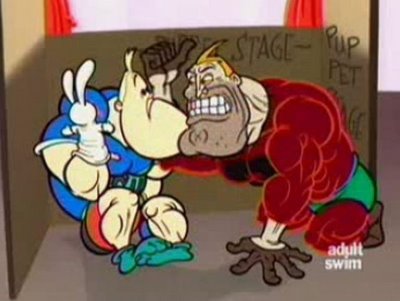
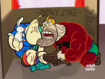
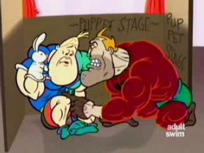
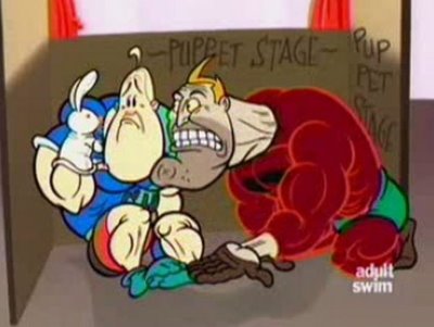
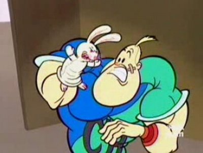
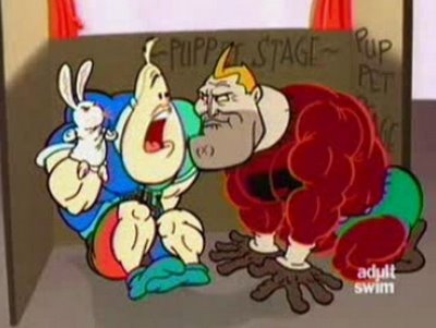
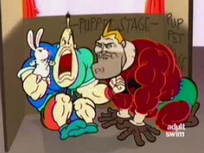
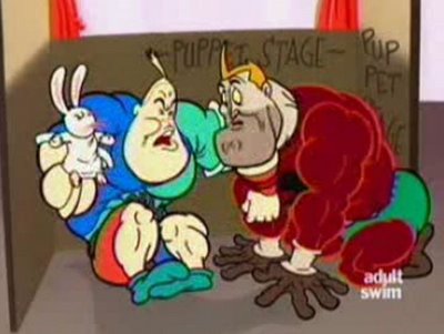
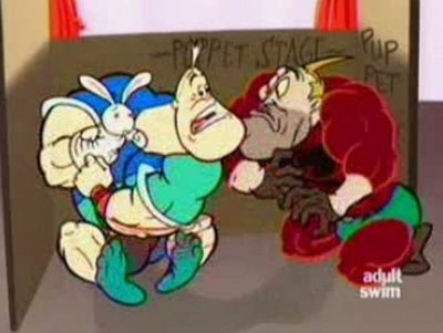

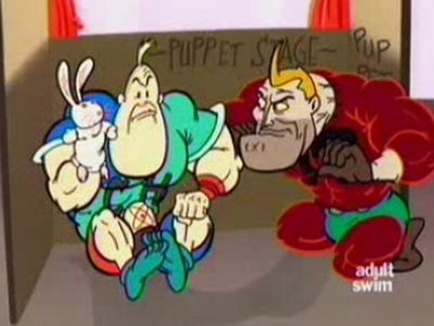
The second half of the cartoon is some combination of me and the generic Canadian style. It was storyboarded in a very funny style by Mike Kerr, but his board then went through the blandifying Canadian studio who composed eveything in the middle, designed ugly incidental characters and liberally piled the lumps all over the stuff. I did some of the drawings of Rip, trying to keep the life and wackiness that Mike did in the storyboard, but of course that had to be covered in lumps too.
It was this bland, symmetric uncomposed lumpiness that drove me to write up the manuals I have started to post on the blog.
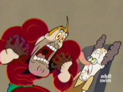 Even though the expressions in the drawing above are extreme by modern standards, notice that the features on either side of the face are totally symmetrical. The original drawings had a lot more life, but the Canadian director "fixed" them for me and evened them all out.
After I caught him, he explained he had to do it, because Jim Smith and my drawings were "off-model". Jim and I designed the characters.
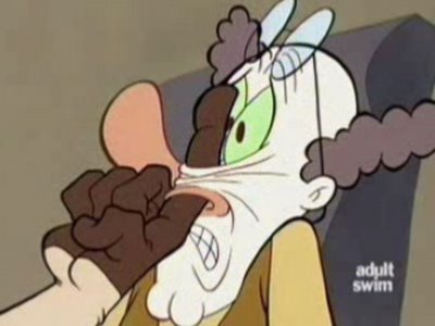
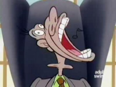 That same "director" designed this wonderfully appealing pile of lumps above.
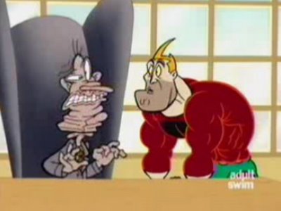
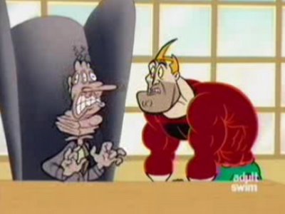 A lot of this art makes me cringe, but I'm going to show some clips now and then of stuff that I've screened at festivals that got a lot of laughs from the audience. Luckily for me, many modern cartoons have so dulled people's eyeballs that they can laugh at satire and gags despite many nasty drawings.
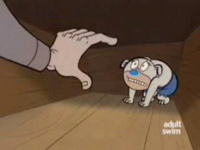
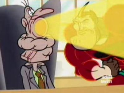
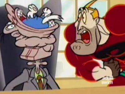
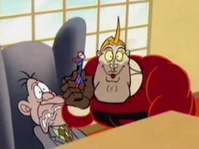 See the pin-point eyeball pupils in the characters above? Dead. Robotic. Non-organic. I had to make manuals just to show Canadian studios how to make eyes look like they are coming out of living creatures. The manuals were hidden in the file cabinet of the idiot production manager. What was his name again, Mike?
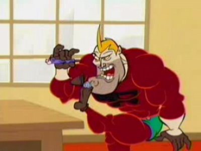 Wow! A slightly non-symmetrical drawing somehow slipped through the system! The director probably got fired for this.