 Yes John,
I saw the newest post and I sit here open-mouthed at the reaction and the responses. Above all (and I repeat) you deserve lots of praise for turning these people on and directing them, like you're satisfying a hunger. The way you describe and analyze makes it clear that you have a great sense of color yourself.
But as you point out, color sense is not a subject or an item that can be taught in a class. It's innate and it grows with exposure. Color theory? Yes. The technique of color? Yes. Psychology of color? That too. We know that color affects moods, as light does. We cannot paint with light but we can paint light itself, by using different tones, contrasts, etc. Color is a tool.
But as you point out, color sense is not a subject or an item that can be taught in a class. It's innate and it grows with exposure. Color theory? Yes. The technique of color? Yes. Psychology of color? That too. We know that color affects moods, as light does. We cannot paint with light but we can paint light itself, by using different tones, contrasts, etc. Color is a tool.
Now how does one use it? Acrylic? Water colors, oils, gouaches, pastels -you name 'em. You can slap it on, dribble it, roll it, sponge it, spray it, finger it and even glue it. But that's not what determines if the final look is good or not. If there is no inborn taste or acquired, studied, knowledge, then don't expect too much. And if you see that you don't have the feel of it, then drop it and hire someone who has it. If one exposes him-her-self to what's considered good, long enough, then it's possible that it can rub off onto him-her. Open the eyes, observe, absorb. What's good is not necessarily what's trendy. Beware of trends. Analyze: WHY do I like it? WHY is this considered good? It has to come from inside. Usually, good is lasting. And usually good will last.
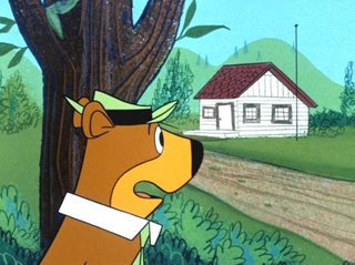
The technique I used in the bgs you ask about? I don't remember. (I keep reminding you that this was 45 years ago! What were YOU doing then?). I see that I painted the sky a soft salmon pink, knowing who and what is working against it. It's always pleasant, warm and it goes with so many other colors, like a sunset. It's not dramatic. No need for drama unless the story calls for it. Yogi looks great against it...as somebody pointed out his muzzle. You?
Paint Overall BG Color First
This color is rolled on (onto the thickish Bristol paper we used, not board and not canvas) and everything was painted on top of it so that if there were any "holes" or spaces, the sky color would tie it all together.
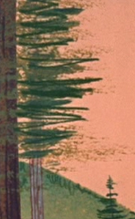
You can see the peach sky in the little holes in the hills where the sponge didn't paint. This gives the effect of mixing the main BG color with the other colors in the BG and it ties them all into one harmonious color scheme.
You can also see the hill color behind and through the tress and so forth.
Blending the colors makes all the objects in the BG part of a family of color, rather than having a bunch of separate objects each with completely different colors splitting up the image and all competing for attention-John
What Tools To Paint With?
Sponging, frisketing, brushwork, pencils, as you mention, were all used. (The paint is cel paint)
http://www.cartooncolour.com/catalog/index.php?cPath=1&osCsid=1eb3bd8aa6e248e3c18c1e24f5a74d80
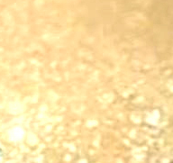 SPONGE
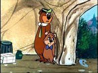
 BRUSHED LINES ON CAVE
 FRISKETS
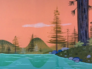
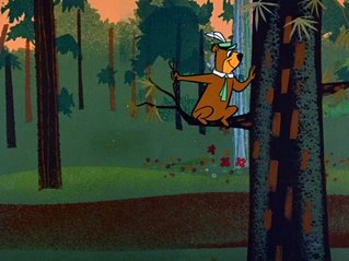
The brown path was a hole cut in a cel, then painted brown over the green The light green above the brown path was done the same way. The outlines of the foliage at the top of the BG was cut out of friskets and sponged on over the salmon sky. The tree silhouettes were cut from friskets and sponged on, that's why you see the rough edges from the rough texture of the sponge.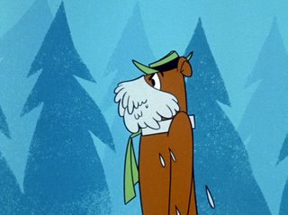 These trees are painted with sponges and friskets.
 PENCIL
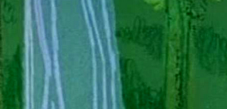
The leaves and black tree sketchy lines are done in pencil. The light blue lines on the turquoise tree might be chalk.
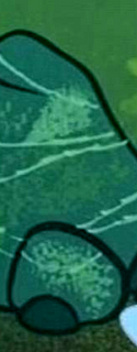 HEAVY BLACK BRUSH OUTLINES
The black heavy lines are drawn on with brush in slow smooth controlled yet flowing natural lines.
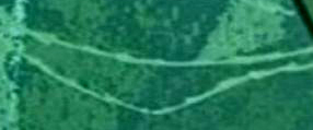 JAGGED BRUSH
I think these light lines are done in a jagged brush stroke, but they may be chalk too.
What Colors To Choose
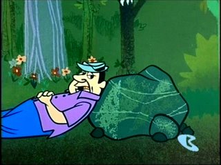
The choices of these colors were what the artist felt were right. This is what distinguishes one from another. Same goes for the shapes, other than what the layouts called for.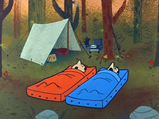
Use Nature's Colors to add Depth and Interest
 http://johnkstuff.blogspot.com/2006/10/color-theory-neutral-or-natural-colors.html
And try to use the many colors of nature itself. There is NOTHING in nature that is pure brown or green or red. Everything is a blend or a texture.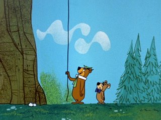 Animated characters and objects, of course, have to be painted flat, but this is why a textured bg adds depth and interest. Even on a one-color wall we add a shadow or a slight texture. On a flat sky we add a slight white cloud or two. Avoid bland.
Use Contrast and Variations on a Theme To Keep Things Organic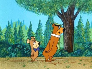
Art Lozzi on Technique
Paint Overall BG Color First

This color is rolled on (onto the thickish Bristol paper we used, not board and not canvas) and everything was painted on top of it so that if there were any "holes" or spaces, the sky color would tie it all together.

You can see the peach sky in the little holes in the hills where the sponge didn't paint. This gives the effect of mixing the main BG color with the other colors in the BG and it ties them all into one harmonious color scheme.
You can also see the hill color behind and through the tress and so forth.
Blending the colors makes all the objects in the BG part of a family of color, rather than having a bunch of separate objects each with completely different colors splitting up the image and all competing for attention-John

Sponging, frisketing, brushwork, pencils, as you mention, were all used. (The paint is cel paint)
http://www.cartooncolour.com/catalog/index.php?cPath=1&osCsid=1eb3bd8aa6e248e3c18c1e24f5a74d80
 SPONGE
 BRUSHED LINES ON CAVE
 FRISKETS
The brown path was a hole cut in a cel, then painted brown over the green The light green above the brown path was done the same way. The outlines of the foliage at the top of the BG was cut out of friskets and sponged on over the salmon sky. The tree silhouettes were cut from friskets and sponged on, that's why you see the rough edges from the rough texture of the sponge.
 These trees are painted with sponges and friskets.
 PENCIL
The leaves and black tree sketchy lines are done in pencil. The light blue lines on the turquoise tree might be chalk.
 HEAVY BLACK BRUSH OUTLINES
The black heavy lines are drawn on with brush in slow smooth controlled yet flowing natural lines.
 JAGGED BRUSH
I think these light lines are done in a jagged brush stroke, but they may be chalk too.
The choices of these colors were what the artist felt were right. This is what distinguishes one from another. Same goes for the shapes, other than what the layouts called for.

Use Nature's Colors to add Depth and Interest
 http://johnkstuff.blogspot.com/2006/10/color-theory-neutral-or-natural-colors.html
And try to use the many colors of nature itself. There is NOTHING in nature that is pure brown or green or red. Everything is a blend or a texture.
 Animated characters and objects, of course, have to be painted flat, but this is why a textured bg adds depth and interest. Even on a one-color wall we add a shadow or a slight texture. On a flat sky we add a slight white cloud or two. Avoid bland.
Use Contrast and Variations on a Theme To Keep Things Organic


Notice how every tree is different, as in nature: wide, thin, tall, short, various colors. Same also goes for branches, leaves, pine needles, ground plants, etc. 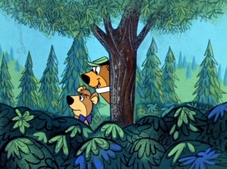 Sometimes Art would add a lot of drawing and detail that wasn't provided in the BG layout. The bark on the tree. The free flowing patterns on the bushes etc.
 Sometimes Art would add a lot of drawing and detail that wasn't provided in the BG layout. The bark on the tree. The free flowing patterns on the bushes etc.
This is NOT because the layout artist asked for it, but because the bg artist "felt" it. Look around you. It's all there. Look at your hand and notice the nails, skin, pores, veins, colors, tones, textures, size, shapes. And yet, every hand is different from all the others. Simple: If you don't look, you can't see.

John, how else can I say it? I hope it's useful to all those who ask. I certainly appreciate their interest to learn.
Continue it, whatever you're doing.
Best, Art Lozzi
Me, I'm being called back into the cruiseship world with a couple of new medium-sized ships to work the Aegean. Busy, but very glad.