
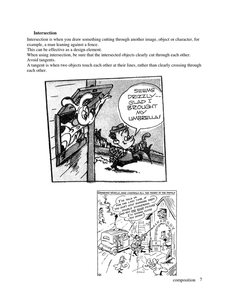
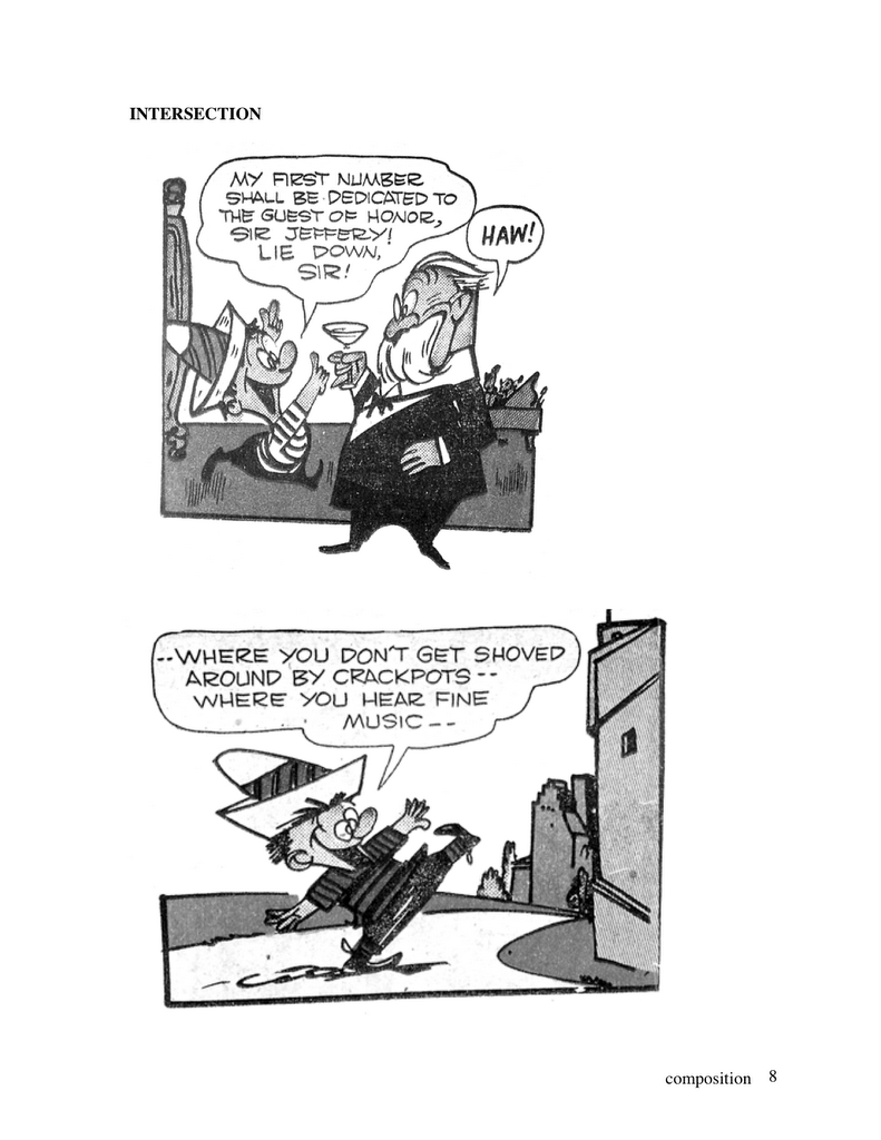
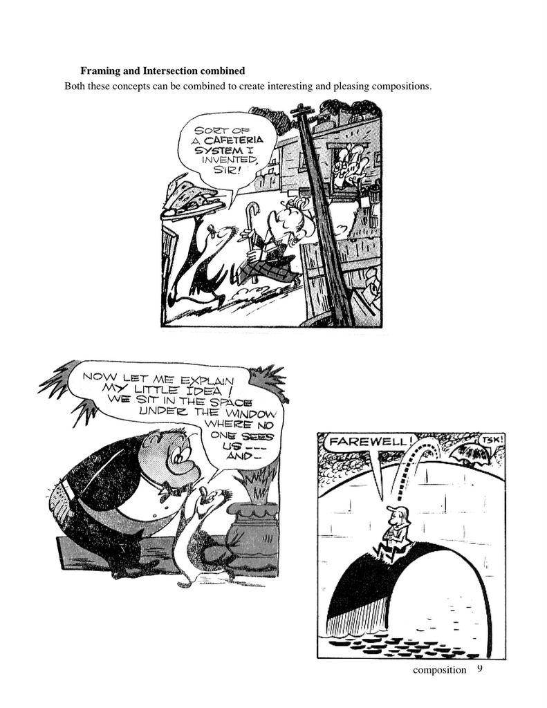
From Art Lozzi:
Hi, John,
I'm impressed, not to say flabbergasted. OK, I'm flabbergasted.
You're right - I was never consciously aware of how different my background colors were from the others, but my message here is to stress my own admiration of YOU, that you would notice and comment on them. I'd call that super aware and sensitive. I applaud you. Some time ago I was emailed a page from AWM where you mentioned me in the same sentence as Ed Benedict and Walt Clinton and used words like "absolutely amazing, more subtle, more harmonious colors". Very lofty heights! Thanks. And while I'm on the topic, let me say that I really, truly praise what you, yourself, are doing. Happy continuation!
Here's the beginning of a series of interviews with early Hanna Barbera color stylist and BG painter, Art Lozzi: Hanna Barbera Beginnings-limited animation
We were at the first studio of theirs, the Charlie Chaplin Studio on LaBrea. Bill Hanna had me installed at Disney's after my short time with them at MGM, telling me that he and Joe were planning their own studio, a first of its kind, doing limited animation for television. Cartoons made especially for TV!!! When the time was right he'd call for me to start up the background department with Monte and Bob Gentle. I was delighted.
But this is how I actually got into the field: In-betweener at MGM, lured by Bill Hanna (who told me that my portfolio was exceptional) NOT to return to UCLA, and to join him and Joe B as soon as the studio was ready, and to help form the background department.
As mentioned, this studio was at the Charlie Chaplin Studio on La Brea. Great. Fantastic history. There was space for only 14 people to work there; the rest worked at home and brought their suff in. I was in a corner room with Montealegre (Montie). Bob Gentle worked at home, bringing his work in a couple of times a week. Wonderful guy, Bob Gentle!
1958 EXPERIMENTAL COLOR / STYLIZED GRAPHICS
 COMBINATION OF NEUTRALS WITH TINTED PRIMARIES/SECONDARIES
 Was there a plan or any direction to the BG styling in the late 50s Hanna Barbera Cartoons?
You'd be very surprised how little was preplanned, studied, discussed, reviewed, exchanged with Monte, Bob Gentle or the layout department. Esp. at the start there simply was not enough time. "Here are the layouts. Get busy. A new batch is coming up."
Since each layout artist drew differently from one another, it was up to the bg painters to established a unity among all the cartoons.
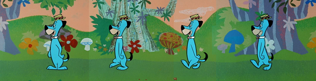
Just as Yogi had to look like Yogi in all of the shows, so did the bg's have to look recognizable for the most part....with allowable variations. Yogi's Jellystone park had to look like it.
 John: Try to name the color of that tree! It ain't brown.
Color Keying ConsiderationsI can't remember doing sketch ideas and tests with colors or textures or lines. I made sure that I knew which characters were working in these scenes, what their colors were, and what other animated objects were there.
A few times I'd discuss this with the head of Ink and Paint (Roberta) just to be on the safe side, to make sure that a movable chair, the opening-shutting front door, the telephone or a pair of shoes was going to be legible.
Forests and FlowersAs for forests, that's easier. A rose is a rose is a rose, without going wild. If I paint them differently from Monte or Bob G, it's because that's the way I paint forests, with a wide range of styles included....for the most part. As I say, there wasn't the time to do sample tests.
 AVOIDING MONOTONE!
Me, I love using textures, I enjoy the many shades of one color. I avoid monotone (monotony)...even in my speech. (John, you showed some of the most beautiful photos on the blog, the colors of Nature. Absolutely Beautiful. That was great! And I hope that your people picked it up, got the message.).
Was Someone The Boss or Head Stylist?
Was there a boss? No. There was simply the fact that Monte and I, in the beginning and still later as we grew, worked standing right next to each other, about 6 feet apart. I used some of his brushes and he used mine. Together we adopted a certain style that was approved by Bill and Joe and by the layout guys -altho they kept their noses out of backgrounds- and we stuck to it. Bob Gentle did a similar thing at home.
MONTEALEGRE Wow! Look at the beautiful and colorful cartoony BGs from Lion-Hearted Huck!
 Disney doing the same kind of thing for more money
 -just for contrast sake, this is a BG in a similar technique done at a much higher cost for Disney. In my opinion it is a lot less appealing, both color wise and compositionally. The colors are more garish and it looks less like a background than a potato painting.PRIMARIES AND SECONDARIES SEPARATED BY WHITE AND LIGHT GREYS
 John: If you are going to use large areas of primary colors, separate them by a neutral color inbetween. In this case Art used white and greys to separate the bright colors.If you had blue right beside red, then the two areas would clash and cancel each other out as they do all through Disney's Alladin.
Pure bright colors seem brighter when they are framed by neutral colors because the neutral colors don't compete with them.
 Do You Remember Anything About Ruff ‘N’ Reddy?
Ruff and Reddy? I have very little recollection of it. It was early, it was great fun - those voices! And the bgs were simple, flat and direct. A fence was white. Sidewalks were toned grays.
 John: This rooftop may look simple, but to me, I love it just because it is not typical. Each sort of primary is mixed with organic (non-mathematical) proportions of other tints and greys.The sky is slightly violet blue, the roof is not red, it's red mixed with purple and brown-I guess you could call it burgundy or even funnier-maroon.The chimney is one shade of greyish reddish brick on the light side and bluish shadow on the dark side.
This pretty combination of colors was done fast and looks a million times better than the more expensive fruity looking fuzzy tasteless mess below. BG Painters Selected The Paints-Cell Paints
The paints were selected by us. The paint supplier was somewhere in the neighborhood. We used plastic squirt-type containers with spouts... that you can see in the photo of me that I sent you.
As you know, we painted the bgs so that they didn't appear too heavy and dark. The characters were painted with exactly the same paint as the bgs. Acrylic. We worked out all the hundreds and hundreds of colors and shades for all the cel levels, labeled them, and according to the number of cels, the density of the bg colors was determined. Paint colors were named with the initials of the color. Ex: Y was yellow, YO was yellow orange and OY was orange yellow, etc. ...obviously.

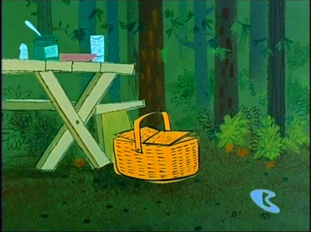
Then there was OY1, OY2, OY3, OY4, OY5, for the different cel levels. That "yellowish'' picnic basket that appears next to the table, by the way, was that color because it was also animated in other scenes...it was one of the Ink and Paint department colors, not a bg color.
 The Painting Tools and Brushes
Rollers, brushes, colored pencils, sponges, cut-outs, tape; these were the basics. I still have a couple of those old brushes here...Finepoint....expensive. I wish I could find that great bg paper here....maybe if I look around. I'm sure that all of this is deep-ingrained in you but maybe it could be useful in explaining it to others.
Thanks To The CommentersI want to thank those young bloggers for the the flattering comments. I could never really understand why they thought the bgs were SO good. I never analyzed them. They just seemed to happen. One of them -Akira- said, "Any idea how Art Lozzi learned to paint like this? besides a god-given talent, i'm guessing lots of actually observing and painting the real world." Very good commentary. Akira, thanks, but not to sound disillusioning, very little was studied. The bg's were the result of painting them. Lots of enjoyable experimentation too of course. Looking at work from other studios could also be an inspiration where you love what you saw and try to do a variation. The same would be for music too, or whatever else creative. Mozart, I'm sure, was influenced by Bach, etc. The Flintstones by The Honeymooners. Etceteraandsoforth.
-Art Lozzi
 ...more to come...Art will talk about his fellow artists and how and why Hanna Barbera became standardized and less experimental later


 Whoever it is draws great and moves everything in a very flowing way-almost like liquid wrapped in a tight elastic skin that can bend and stretch when moving fast.
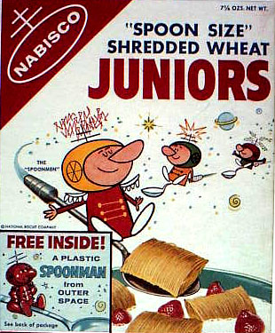

 Cereal companies are mean now, but they used to love kids. They used to cover their cereal boxes with great cartoon art, games and cut-out-activities. They made great entertaining animated commercials, they sponsored cartoon shows on TV, they coated every single nugget of cereal with glorious sparkly sugar, but the thing they did best was...they put PRIZES in every cereal box!


 Even though the expressions in the drawing above are extreme by modern standards, notice that the features on either side of the face are totally symmetrical. The original drawings had a lot more life, but the Canadian director "fixed" them for me and evened them all out.
 That same "director" designed this wonderfully appealing pile of lumps above.
 A lot of this art makes me cringe, but I'm going to show some clips now and then of stuff that I've screened at festivals that got a lot of laughs from the audience. Luckily for me, many modern cartoons have so dulled people's eyeballs that they can laugh at satire and gags despite many nasty drawings.


 See the pin-point eyeball pupils in the characters above? Dead. Robotic. Non-organic. I had to make manuals just to show Canadian studios how to make eyes look like they are coming out of living creatures. The manuals were hidden in the file cabinet of the idiot production manager. What was his name again, Mike?
 Wow! A slightly non-symmetrical drawing somehow slipped through the system! The director probably got fired for this.
 These are all caricatures of Kali, Katie and Marlo by who else-Katie!
 I'm settin' up the party now, Kali!


 Hi Jessy!
 Here's Katie's design.


 Hanna Barbera Beginnings-limited animation
 Was there a plan or any direction to the BG styling in the late 50s Hanna Barbera Cartoons?
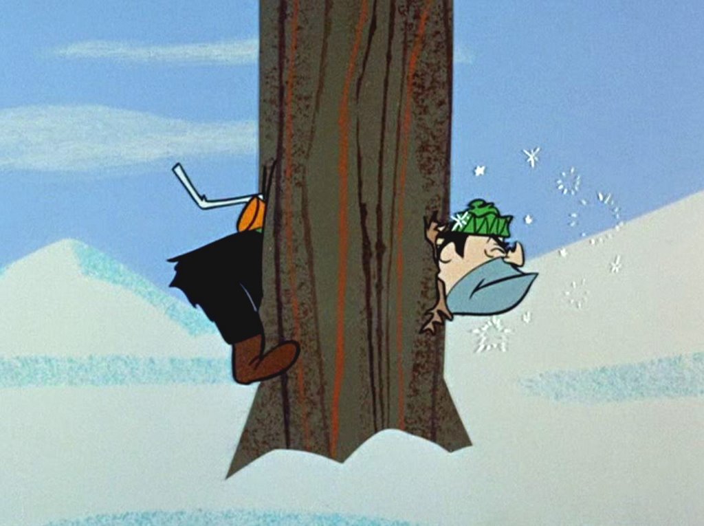 John: Try to name the color of that tree! It ain't brown.
 AVOIDING MONOTONE!
 Wow! Look at the beautiful and colorful cartoony BGs from Lion-Hearted Huck!
 -just for contrast sake, this is a BG in a similar technique done at a much higher cost for Disney. In my opinion it is a lot less appealing, both color wise and compositionally. The colors are more garish and it looks less like a background than a potato painting.
 John: If you are going to use large areas of primary colors, separate them by a neutral color inbetween. In this case Art used white and greys to separate the bright colors.
 Do You Remember Anything About Ruff ‘N’ Reddy?
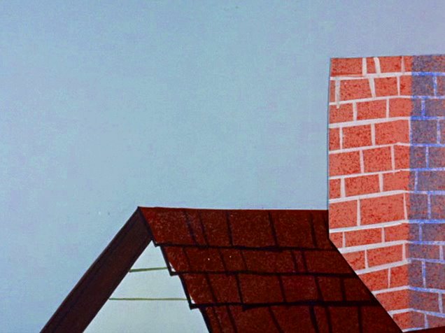


 "Fred Seibert Oct 18th
