Send As SMS

Tuesday, October 31, 2006

Color Theory - neutral or natural colors


Many cartoon artists think there are only 7 colors:
RED BLUE YELLOW primaries
GREEN ORANGE PURPLE secondaries
PINK stinkies

And if you only looked at modern cartoons and video box covers it would be understandable why.
BUT!
There is a whole huge family of colors that I encourage my painters to add to their palettes.
The neutral or natural colors. There are an infinite variety of these. They are made up of differing amounts of greys, browns and tiny amounts of the primary and secondary colors.

These kinds of colors are hard to name. Maybe that's why they are seldom used. Good artists can paint them, but there are no words to describe them, so execs can't say yes to something that doesn't have a simple word.


Now, for those of you who think only pink and purple are pretty colors, do you think these are ugly colors?
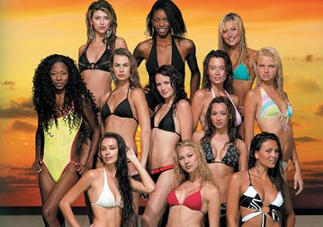
These colors are all covered by the one inadequate description: "Flesh Color". There are a zillion "flesh colors" and most people I know really like them.
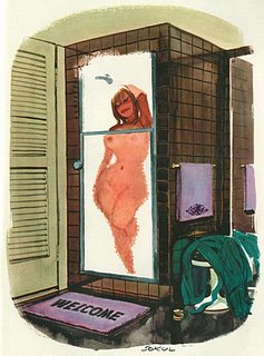
Would your naked friends be prettier if they were these colors?:
Natural colors are rich and deep. They make things feel more real-even when used in an abstract way. I think this is what the "serious" cartoons are trying to acheive when they use "pee and poo" colors, but as you can see, natural colors don't have to look dingy and dirty. They can be quite beautiful.


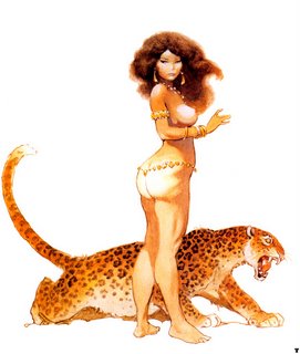
Here, Frank Frazetta's main color is a tan-but if you look close you will see it is made up of many shades and hues.
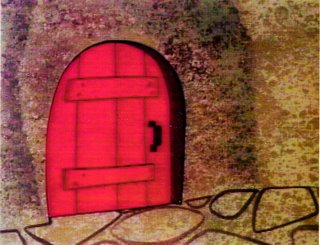
Here is a similar color scheme only simplified, from Slumber Party Smarty-a Yogi Bear cartoon, I think painted by Monteleagre in 1958. The browns on the wall are made up of different tints of brown-some yellowish brown, some reddish brown, some purplish brown.

The bright red door really pops from the BG without breaking up the image. If the red was next to another equally bright primary or secondary, it would clash and be garish and would break up the image.

This is a very unusual and striking limited palette of black/grey and light peach with a bit of yellow. Who would think of a color scheme like that? Nature would. Steal it!

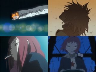
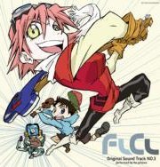
Here's a very limited palette of warm greys from FLCLY
In this Art Lozzi BG, the yellowish tan color is painted on the entire canvas and then the brown of the tree and fence, and the green grass are painted on top- in different degrees of opacity. This instantly brings all the colors into a harmonious family-and it is striking because it is an unexpected color scheme that you don't expect to see in cartoons.
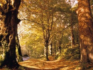

Sokol manages to use shades of subdued yellow and greyed browns to make a warm soft scene, without making it look depressing.

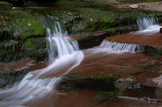
If you use natural colors as your main scheme, you can then paint small details in brighter colors as in this scene of rocks and flowers.
Look at all the interesting tints within the rocks-they aren't simply grey.
The whole little waterfall scene is framed by the green foliage.


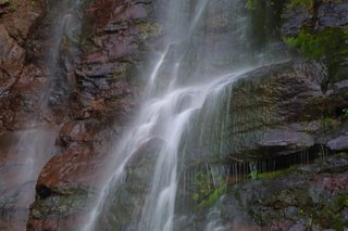
Here is a similar color scheme-dark, greyed yet rich and full of life and beauty. Look at the two main tints in the rocks-the faces are deep reddish brown, the tops are warm grey.
Notice that the water isn't blue. Even the rainbow is not your typical My Little Pony rainbow. Here's what Frazetta can do with the same basic color scheme. Again, look close-nothing is made up of a single color, yet everything looks more like the substances they represent than the actual substances themselves.
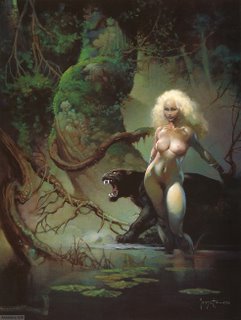

Grey and very light greyed-pink.


Dirt can be beautiful-it doesn't have to look dirty or muddy.

Neutrals with spots of bright colors.

Here is a basic natural color scheme with spots of bright color. The bright colors really stand out against the neutrals.
Here's Mary Blair using that theory.

Her layouts and paintings are so well organized.
Many artists look at her stuff and glean that the secret to her style is to draw flat shapes, and then they proceed to draw an unorganized assembly of unrelated broken up flat shapes and then paint them pink, purple and green.

She uses an extremely thought-out hierarchy of shapes within shapes and levels of color shades and contrasts.

Everything ends up looking unique and readable and pretty-and cartoony.Art Lozzi is using a simple color palette that is also well organized. The color and value contrasts of the cabin, snow and sky are less then the contrast of the inside of the cabin.
That makes the inside stand out more and grab your attention.

If this scene was painted today, it would be unreadable.

Something like this:


There are an infinite amount of greys. You put any color against grey and it will pop-like this flower.
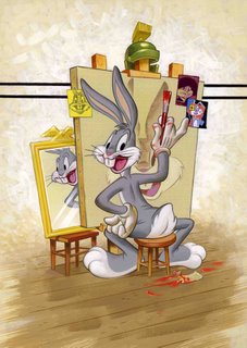
Tortoise Wins By a Hair is painted by Johnny Johnston, who tends to use rich dark, subdued color schemes. Within his deep tones are many subtle color and value blends which makes the paintings and scenes really rich. Bugs' cool grey really reads against the warm greys on the wall and floor. Johnny painted his BGs in oil-a very rare and inconvenient medium for cartoons.

He also painted The Hep Cat (which has been totally ruined on the Looney Tunes DVD set-they actually removed color for once and most of the cartoon looks black and white now. It looks way better on the Laser Disks and VHS tapes).
He later worked for Tex Avery at MGM and painted such wonderful cartoons as King Size Canary. Take a look at how rich the colors are-especially in the back yard with the alley cats.


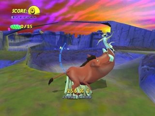
See the hierarchy of colors? The BG is mostly grey tones - blueish purple grey sky and craters, then brownish grey rocks. The centaur is darker grey and blends from warm brownish greys to cooler greys up towards the man chest and head.

Even the girl's flesh is greyed, yet it is so much lighter that she pops out and appears more delicate.
Her red cape really pops.



This kind of coloring takes a lot of skill and a keen eye and TASTE. Even if you know all the theories behind it, it doesn't mean everyone can combine subtle colors and make them beautiful. It takes a rare and special painter. Many painters try it and end up with mud.

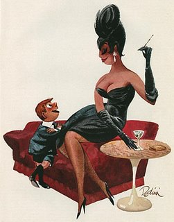
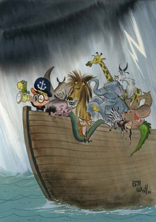
It's too bad taste can't be learned. However if you are gifted with a tasteful eye, and you learn the theories and the ways great colorists combine and mix their colors maybe you can be another Mary Blair, Frazetta, Sokol, Wray or Dedini.

Monday, October 30, 2006

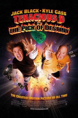
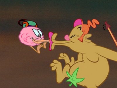
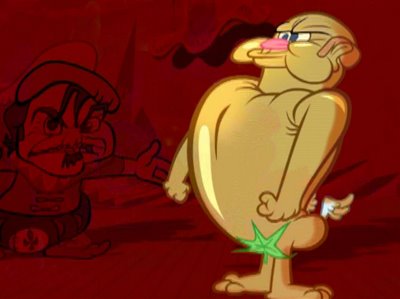
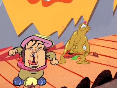
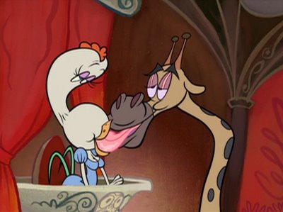
Classico is here! Tenacious D video starring Jack Black and Kyle Gass

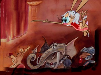
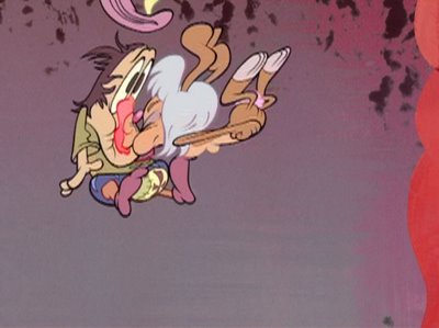
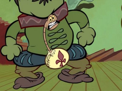
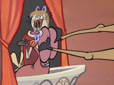
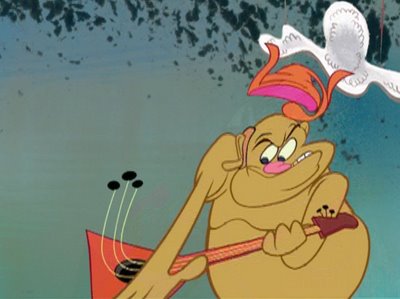
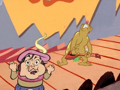
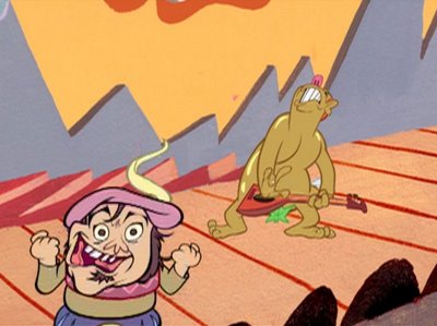
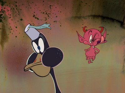
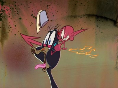
Hey Everybody! Today is the official premiere of Classico. I drew it, Nick Cross did BG design and color styling and Copernicus did the Flash animation.
Marc Deckter, Jay Li and Marlo Meekins also were invaluable as were Pringle and Kristen McCormick. And Kali Fontecchio too!


If you are OVER 18, click this below!

See it at Tenacious D's site:
http://tenaciousd.com/classico/


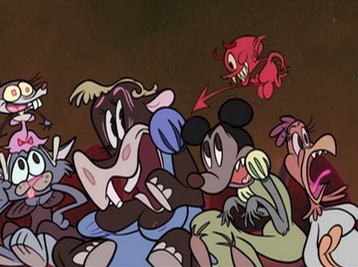
FUNNY ANIMALS, ZOMBIE CROWDS

MORE ANIMAL CROWDS

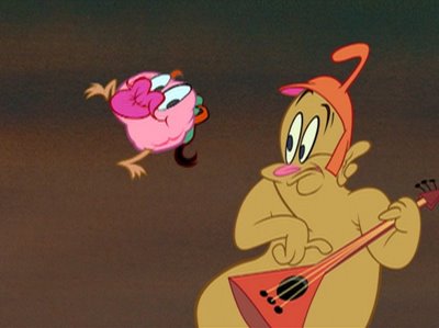
FUNNY ANIMALS ARE FUN TO DRAW

LOWER FUNNY ANIMALS

ASSORTED WEEKEND CARTOONY TYPE PICTURES

Pencil Test seq5,6,7 (Kristen McCormick):


Pencil Test seq8 (Kristen McCormick):


Pencil Test seq9 (Pringle)


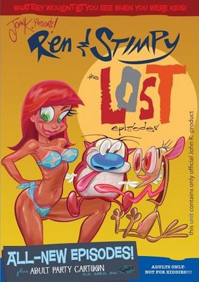
If you want more crazy cartoons, buy this action below!


http://www.myspace.com/jkricfalusi

Sunday, October 29, 2006

Specific Acting-Scribner, Clampett, Blanc, Foster


It took 4 wonderful talents to do this great scene.

Warren Foster wrote the rhythmic dialogue. (Very important to voice actors. Bad stilted cartoon writing , written in "writer-speak" is very hard for an actor to read naturally. This might be partly why so much voice acting is so dry and monotone now. You can't read the awkward dialogue any other way.)

Clampett directed the cartoon and gave it context and emotion.

Mel Blanc read the dialogue with verve and rhythm and a huge variety of contrasts and accents. (no one does this any more)

Rod Scribner animated it perfectly and in context to Mel's voice and created expressions and poses that gave even more meaning to the dialogue and delivery.


Drawing specific acting is my favorite thing to do and more than anything else is why Ren and Stimpy was so successful. They had rhythmic dialogue and tons of unique expressions which made them seem real no matter what crazy situations I would plop them into. Of all the innovations that came from that show this is the biggest one and the one that wasn't carried on by anyone else. People would copy certain specific Stimpy expressions and use them out of context in their own cartoons, but I've yet to see anyone make their characters have an inner life which can only be achieved by doing what I've been talking about here.

You have to be willing to turn over your model sheets too. And do layouts in the country.


"I can hardly wait to see..."


(crazy laugh)


"I love that man!"


"He drew a knife on him..."


"AUGH!"


"..whew..."


"They're at it again!"


"...I hate to look..."


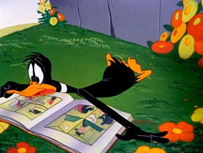
This so Clampett. He himself was a big cartoon and comics fan so the whole gag itself is based on how he feels about getting the latest edition of one of his favorite comics.

Everything Clampett did, even his dirty jokes are presented from the point of view of a kid. It's a kid's eye view of the world.

I really identify with this scene because when I was kid I couldn't wait for Tuesdays and Thursdays, the 2 days when all the new comic books would arrive at the local drugstore.

I would walk the mile and a half to Paul's Sundries and pace until they would place the new issues in the racks and then I'd spend an hour or two molesting all the comics, deciding and stressing over which 4 or 5 issues I could spread my allowance out to grab.

Ditko's Spiderman and Kirby's Fantastic 4 were always on top of the list, then I'd have to take turns on Deadman, The Hulk, The Avengers, Hot Stuff, World's Finest and a zillion others.

I always snapped up Betty and Veronica's Giant Size Summer fun issues to gawk at the sexy drawings Harry Lucey did of the girls frolicking on the beach in their skimpy suits.


Wanna freeze frame through this amazing cartoon yourself?

Well you can! Watch Clampett's "The Great Piggy Bank Robbery" and MORE on the 'LOONEY TUNES GOLDEN COLLECTION VOLUME 2'...

...BUY IT FROM AMAZON WITH THE LINK BELOW!


Friday, October 27, 2006

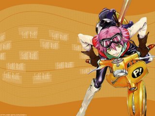
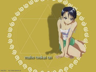
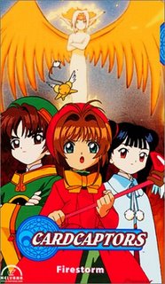
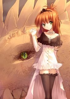
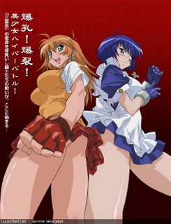
Color Theory - steal from anime if you can't think of anything yourself


Like Eddie says, this is a cultural crisis! The Japanese are beating the crap out of us at our own game!
http://uncleeddiestheorycorner.blogspot.com/2006/10/thoughts-about-anime.html

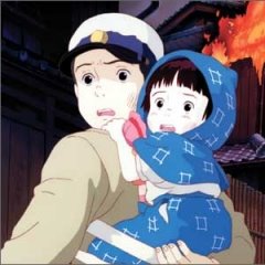
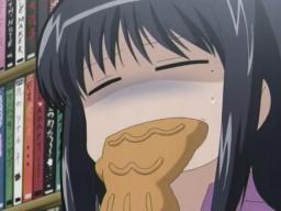
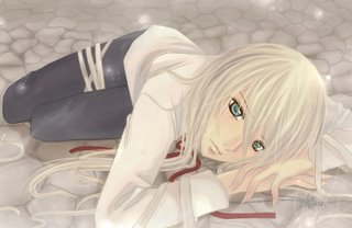
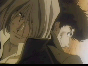
Look what a wonderful variety of color styles the Japanese cartoonists come up with just as a matter of course!

Color seems to be the thing that anime does best.

It's a tad bit on the cold side for me, but then the Japanese are a cold race.
We westerners on the other hand are naturally emotional and warm and inventive, yet our stupid-ass corporate franchise controlled society is stopping us from what we could easily do-beat the crap out of cold cultures that are still imitating what we did from the 1930s to the 1950s!

This stuff makes me crazy!

So much fun and eye candy. Every mood imaginable.
If you are a painter and are stuck for color ideas, just steal a pile of these!
After copying these color schemes, you might be able to see the general concepts behind them and start to create your own schemes.


But there is no excuse for bad color in America anymore. The internet is a vast library of ideas.

All I did was type "anime" then "FlCl" in "the Google" and a wealth of genius color ideas came up.

You can do it too! Look up anime, fashion magazines, nature photography-anything but modern American cartoons to break your habit of only using 3 approved cartoon color schemes.

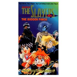
With all the easily accessible inspiration available today, why the Hell is there still shit like this?
AAAAAAARGH!!!!!
Thank God our pals the Japs are keeping visual pleasure alive. Let's pay attention!

This last one isn't too impressive color wise but it just goes to show you how Japanese artists know what the public wants and are not stingy at giving it to us whereas stupid evil conservative modern Americans refuse to give humans natural things that humans like.

http://mag.awn.com/index.php?ltype=search&sval=RD01&article_no=2738

Color Theory - eye relief

Here is a bit of stuff to wash away the dirty pictures I violated you with yesterday.This is a great establishing shot from Yogi's Big Break painted by Monteleagre and drawn by Dick Bickenbach.
The strongest contrast in the picture is the cliff and tree in the foreground.
It has more saturated color than the BG and stronger contrasts in coloring and texture of the 3 objects that make it up.

1) Dark grey-green tree
2)Green (slightly bluish) grass
3) red brown cliff with dark purple-brown sponge texture

Look at all the textures on these things. They are different tints than the color underneath-unlike all the crappy BGs in the last couple posts that just use darker and lighter shades of the same purples and pinks.

Using different tints and values to texture your surfaces adds depth and makes even stylized cartoony or artistic paintings seem more real and inviting and natural.

REMEMBER THIS IMPORTANT CONCEPT! -IT'S IN ALL THE GOOD PAINTINGS ON THIS PAGE. And in nature.

The background in the painting-the ground, hills and sky are allvery similar in value-lighter and greyer which makes it seem farther away and attracts our eye to the foreground.

The whole beautiful scene invites us into the cartoon. It pleasures our eyes and tells us fun is on its way.

That is good logical thinking. Tell your audience you like them by giving them sensory pleasure right away!


Samurai Jack was full of brilliant color schemes. Look how moody this poster is. All the colors are related, yet the picture is not monochromatic-because of the theory I mentioned above.

Also there is a hierarchy of contrasts in the picture.

Jack is lighter than the BG which makes him read against it.

But he also blends with the scene by having the reds mixed in with his colors.

At the top of the pan, the absracted shapes are silhouetted against a bright orange spot circled by a wash of brownish tan.


Glenn Barr has a book out now filled with brilliant color paintings that are full of thought. If you are seriously interested in learning about how to control color get this book and study it! Copy the color schemes and try to figure out the general concepts behind them! I wish Glenn would do a blog and explain his technique and thoughts. It would benefit mankind.

Jamie Hewlett's Gorrilaz- the best cartoons today in my opinion.
The foreground characters are cooler colors against the hot reds behind them. The characters instantly read even though their colors are muted.
How much more interesting is this than seeing the same old pink and purple color schemes in so many cartoons? (Actually there are some in Gorillaz, but the drawings are so great I forgive them!)

I also really like odd skin colors.

I hate the concept of "flesh color". There is no such thing! Flesh comes in an infinite variety of colors and tones. Throw out your "flesh colored" paints and mix up interesting colors that suggest flesh but aren't really.


Here is some greyed bluish flesh.


Greenish flesh

Look how different each of these color schemes are-all from the same cartoon!


I wish I could find more of the good stuff from Powerpuff Girls. The show is loaded with clever and effective well thought out color. When I googled for pics I mostly found purple and pink scenes! But I don't remember the show having mostly that.

WHAT THE HELL IS GOING ON?
Why can't we have more stuff like this?

Now, if I were a BG painter or color stylist and I had to go into work everyday and paint the exact same 2 or 3 color schemes that I have painted for the last 10 years I'd be suicidal.

I just don't get it.

Color can be so fun. Our eyes crave it. Artists are supposed to CREATE. Why do so few do that? What a great job it would be to invent new color schemes every day and new brush textures and techniques.

If you are some bored painter who likes inventive and succulent colors and nobody lets you do them you better post some links to your stuff in the comments because I will give you something to do that the whole world will see.

Thursday, October 26, 2006

Will It Ever End?


Color Theory - does cost equal quality?

One of these " 'toons" costs 50 dollars to make, the other hundreds of millions.

http://www.crayolastore.com/index.asp
Here's everything you need to color style a cartoon, no matter what the budget!

Wednesday, October 25, 2006

Color Theory- good color without a lot of money - Art Lozzi HB

Some of my painting heroes:
Frank Frazetta
Mary Blair
JP Miller
Mel Crawford
Bill Wray
Johnny Johnston
Monteleagre
and...

ART LOZZI!

You don't have to have a lot of money in your production budget to still have tasteful and appealing, interesting, non-generic art.
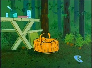
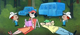
Here are some BGs from extremely low budget $3,000 HB cartoons from 1958. I find them infinitely more appealing than the purple and pink BGs that appear in movies that cost $200,000,000 and more to make. In Daffy Daddy and Robin Hood Yogi, Art Lozzi chose very atypical colors to paint the forest. Many cartoons paint trees and grass a simple middle green-straight out of the tube or they use 50-50 yellow green and paint all the trees middle brown.

LEVELS OF IMPORTANCE: The painter decides what is important in the scene and uses color and value and texture and contrast to draw your eye to a hierarchy of elements.
The picnic basket is most important, so it has a lighter color than the BG and it is a contrast in hue. The BG is mostly greenish so the basket is orange-tan.
The table is less obvious than the basket but is still contrasted against the forest by being a lighter and more yellowish shade of green.

The values of the trees against the green BG are very close in value to the BG, so that the image doesn't become too contrasty or busy to compete with the foreground elements.
This is very logical or functional.
The choice of colors is then aesthetic on top of their functionality.
They work and they are pretty.
The tree in the foreground has the strongest contrast and thus it stands out and frames Yogi. The analogous colors (colors that are similar in tint) in the green BG give the BG depth. If it was all one tint of green with just darker and lighter areas (as in all the bad examples I showed you in previous posts) the BG would seem flat and artificial.


This peachy sky is surprising and a nice color and adds cartoony happy interest to the scenes.

EVEN STYLIZED IMAGES SHOULD BE ORGANIC: Even though the trees are ALMOST straight lines, they aren't all perfectly parallel. They are just organically different enough to make the stylized BG feel natural.
The trees also are not evenly spaced. There are different sizes and shapes of negative spaces between them.
Note how the flowers are little spots of bright happy colors to liven up the image.

This man is not brilliantly color keyed but at least he is not garish. His colors are related which helps him read as one object-a man. His colors contrast well against the BG painting and make him read clearly against it.


I had Richard Ziehler-Martin reproduce this pan BG for me and I used it in my Ranger Smith cartoons. I tried out so many BG painters and asked them to learn the early HB techniques and Richard was the only one who pulled it off. He then took the ideas from these cartoons and did more elaborate BGs for Boo Boo Runs Wild.


I like how hills and planes are suggested by just putting a texture with one hard edge and then a faded edge.


The log cabin is not the typical tan wood color you always see in cartoons. It's sort of a warmly greyed tan which is cartoony and still feels natural. It's not screaming at you.

Look how happy and colorful this is!


I don't know what Art's thinking was for these 2 cartoons but maybe he figured that thick forests are actually kind of dark, not bright and typical "cartoon-colors".

Part of what makes something fun and colorful is that it differs from what you are used to seeing in a cartoon.

In later Hanna Barbera cartoons, the colors become much more standardized and generic.

For the first 3 years of Hanna Barbera's TV studio there was a lot of experimentation in design and color and texture and animation. All done cheaply, but much done creatively and full of surprises.

Fun needs surprise. Imagine getting the same birthday present every year? That's how modern cartoon studios treat their product. They give you the same thing over and over again.

Even if you genuinely like the combination of pink-purple and green, do you really ONLY want that combination?

Here's another Yogi Bear cartoon painted by Art that is in a different color style.
A still from Threadbare Bear
Art doesn't like to paint the same exact style every time and even on a super low budget cartoon show with a fast schedule still finds the time and will to make his work fun and pretty and full of surprises.

More about Art to come, including his insights and history of 50s and 60s HB cartoons.

Tuesday, October 24, 2006

What's Wrong With These Pictures?

CONGRATULATIONS!
EVERYONE WHO COMMENTED (ALMOST) GETS AN "A".

THE CORRECT ANSWER TO "WHAT'S WRONG WITH THESE PICTURES?" IS:

EVERYTHING!

It seems like you all have been paying attention. Now how many of you will start applying this hard-won knowledge to your own art? That's what I'm waiting for. Get at those Preston Blair Lessons!


If you've been reading my blogs and lessons for awhile, you should easily be able to tear these babies up. Gimme some comments. I wanna see if you've learned anything.


Here's a start:

Monday, October 23, 2006

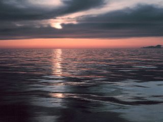
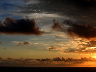
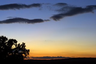
Color Theory- look at the sky before you paint a sunset

I wonder why there is only one way to paint a sunset anymore in cartoons:


My suggestion to BG painters is to look at the sky instead of looking at cartoon sunsets. Here is a pile of free ideas from God, the greatest color stylist:


Ideas are everywhere, but as I've said before, animation is such an inbred world that many artists don't take advantage of the richness of inspiration just outside their studios to draw from.

Instead we tend to rely on what has been done over and over again in our tiny little field that seems to get tinier with each generation.

Let's turn our senses back on and reflect a wider world to our audience.

Sunday, October 22, 2006

Color Theory: Pee and Poo colors versus Colorful Greys

DULL AND DINGY COLORS TO MAKE YOU THINK SOMETHING SERIOUS IS HAPPENING
There is one other color style that is sometimes used in features. When the feature directors want you to think they are doing some kind of serious statement, they use dirty colors. Colors of waste products and boogers. This is a sort of limited palette and is the opposite style of the all primary and secondary color palettes of most cartoons. It's not warm and rich or inviting.
These kinds of color schemes make you depressed. They are the colors of musty old animators who probably aren't having much fun anymore and their cartoons reflect this lack of joy.


Here are some pee and poo colored BGs from cartoons you are to take seriously as you contemplate suicide:


This looks like an overuse of art school color theory, where they tell you to mix yellow ochre and burnt sienna in everything to make it look like waste products.

So, all the above, to me seems to be the opposite of fun or mood or life. They sure don't say "cartoon". Dingy colors make me depressed. It looks like the painters never clean their brushes and all the colors are dirty and muddy.

On the other hand, limited color palettes when done by artists with taste can be very colorful and fun indeed.

Grey Can Be Colorful
Now, it's funny, but these color schemes from Blame It On The Samba are actually supposed to show that Donald and Jose are depressed and down, but when I first saw this cartoon it was like a color revelation to me. These colors look like candy, even though they are greyed.


WOW!


These Mary Blair trees have a bluegrey BG behind greyed down light green leaves. The leaves are close enough in value to the grey behind making them blend together to create a new total color as if they were mixed.

This blue-green-greyish BG lets the more colorful birds contrast against it and they really pop.

Almost every bird is its own bright color scheme. The colors that make up each bird are related-they harmonize to keep the bird a complete, non-broken up image. Notice that the shadow colors on the birds aren't the same exact tint as the color they are supposed to be darker versions of. This makes the colors richer and happier.

The birds are the important point of the picture and they stand out against the BG, unlike the dark and dingy stills at the top of the page where you can barely make out the characters from the BGS because everything is the same (sickly) color and value.

Color Theories for Cartoons- Garish versus Warm

REALLY BAD GARISH COLOR

Cartoons don't generally have good color styling. About 90% of them use only primary and secondary colors, straight out of the paint tube.
The usual color palette in cartoons is:
Pink
Purple
Green
Blue
Red
Orange

Skies are blue, grass is green, trees are brown and everything else is pink and purple. I call this "video box colors". I hate it. Most painters when they start working for me-even the ones who have great technique, paint video box colors and I go insane.

Look how hideous this Alladin stuff is. Unbelievably retarded. Basically, it is no color choice at all. It's the artist just pouring the paints out of the tubes without mixing anything, with no thought to color harmony or contrasts or warmth or mood. No thoughts at all. None. The easiest way to choose colors is to not choose. Just use the same ones that almost every cartoon has.
Yikes! Every color in this frame is competing for attention with every other color. They are all equally on fire and as a result, the image doesn't read as a whole. It is a puzzle made up of individual pieces of primary and secondary colors.
It doesn't help that there is no composition either.


GOOD WARM COMPLEX HARMONIOUS COLOR
By contrast, here are some frames from cartoons that have thought and warmth behind the color decisions.
In this Art Lozzi BG above, the palette is kept "limited". It doesn't have every color in the rainbow spread across the scene.

The BG has mood and fits behind the characters as it should. If the scene was painted like the ones above, the BG would compete for attention with the characters.

Now there is green in the BG, but it isn't middle green straight out of the tube. There are many subtle tints of geens-some bluish greens, some greyed greens, yellowish greens, brownish greens. The values (dark and lights) aren't just darker versions of the same tints as in all the examples above.

These subtle tints and value blends give a feeling of depth and warmth to the scene even though the styling of the drawing is very stylized and 50s. The rich colors make it a scene, rather than a video box cover.

Note that the sky isn't blue.


Here is more color harmony from Fantasia. The night blue is actually slightly greyed and slightly tinted to the violet, rather than being just a straight middle blue as in all the cheesy paintings at the top of the page.
Bambi is a tour de force in color styling. It's so sophisticated and beautiful, I don't know where to start to describe it-but the theories they used on Bambi can be applied in simpler form even in low budget TV cartoons today. Ren and Stimpy once in awhile had good color. Power Puff Girls had some great color styling and so did Time Squad.

Look how warm this scene from Snow White is. How much more inviting is this than the crappy ass purple and pink stuff at the top of the page?
Note the floor-what color is that? You can't even name it. Part of it is warm grey, part is cool grey and there are all kinds of subtle tint and value variations in it. Those subtle variations make it seem real, even though it is obviously a stylized painting, not photo-realistic at all.

Well all this is a prelude to more color theories. I don't want to go too far in this post, just enough to give you some terms and basic concepts that I'll explore further in more posts.

Color is an amazing tool and can add so much to the mood and feel of a cartoon. It can also suck away any chance of warmth or feeling when abused, as it usually is.

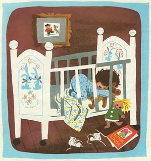
In this Mary Blair painting, the brightest colors are separated from each other by neutral colors inbetween them-white, grey, brown, flesh etc. The brightest colors are still not pure primaries or secondaries. The pajamas are greyed blue. The doll dress is olive green. Even the flesh colors are not "flesh color".

This is way more colorful to me than the typical pink, purple and green cartoon BGs that are everywhere. This is color candy.
This Frazetta painting really illustrates the concept of color harmony. All the colors are related. Even her flesh is mixed with green. There are a ton of tints of greens and blues. The color palette is limited, yet a million times lusher and richer and more "colorful" than the terrible paintings at the top of the page.

Tuesday, October 17, 2006

why rock stars should be animation executives

When I do work on music videos, whether for Bjork, Weird Al or Tenacious D, the creative process is always super simple. They give me a song and I do some sketches of ideas I have to illustrate it, they say "do it". Then we go ahead and make it as good and fun as we can and no one stops us every two seconds to throw monkey wrenches in the works and force us to make everything ugly, stupid and depressing.I sent the intial sketches I did on napkins for this video a couple months ago to Jack and he sent me his network note: "Awesome, Dude."
funny animals blogurl:johnkstuff.blogspot.com
If I sent a one page outline of a story idea to a network executive, I'd get back 10 pages of retarded notes telling me to ruin every creative thought and make all the drawings bland and ugly and make the story not make any sense.
Kyle's only note for the video was "make me sexy" which was a completely reasonable request and easy to fulfill.
Rock Stars seem to understand that creative stuff is a treat and you should leave creative people alone to make their ice cream. Executives want to mix in poo and cigarette butts with your ice cream.
So if you ever see Jack or any other rock stars who like funny cartoons, give them a big sloppy kiss (or give 'em your sister).
http://uncleeddiestheorycorner.blogspot.com/2006/10/one-of-most-beautiful-cartoons-ive.html


And who absolutely shouldn't be animation executives?


actual size


Find out in the most offensive article ever written about animation!

50s-60s forms-fun toys, off model and wrong colors

Jessica Borutski just contributed this beautiful Jinks the Cat with black fur!


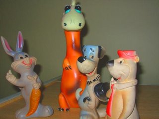
A major trend in character toys in the 60s was to make famous cartoon personalities that every kid knew exactly what they were supposed to look like in the wrong colors.This is a good thing. It helps kids' brains grow and gives them the idea that it's ok to be open to weirdness and fun.


Knickerbocker toys went further than anyone in the department of making the toy characters look different than the cartoon versions. Not only did they use the wrong colors, they sculpted the characters way off model and added lots of details that weren't in the cartoon designs.
Here Yogi has a flesh colored face and a yellow shirt with a red tie. Good.
Here's Yogi's delightful little underage green martian friend, Boo Boo.
Blabber, a grey mouse in the cartoon of course has to be purple as a toy. I love the attention to airbrushing and whisker stubble!
The highly detailed pie cut eyes and iris' really do it for me.
Whoa! 2 versions of Pixie and Dixie. The one on the left is Knickerbocker and is waaay off model and stubby. The one in the middle with the cheese I think is Mexican. It is only slightly off model but beautifully sculpted and completely the wrong colors. The mouse on the right is not from a cartoon, but she's hot and I figured the boys were lonely so I gave the 3 of them a wife which is legal in cartoons.
70s Yogis that by some weird fluke happen to be funny. And a killer alien Bugs Bunny!
Yes!!!


Fred coming out of a bag with tiny down syndrome eyes, and his friends.

Monday, October 16, 2006

The Death Of Form

1960


1980-now

What's the difference between the world before 1970 and the world after?

Simon the Chipmunk will demonstrate:
Before hippies destroyed the western world in the late 60s there was a concept called "form". Form is structure. It is a skeleton which has an central idea and existence and it holds together various details which add up to a specific instance of the form.
Here is a toy of Simon the chipmunk from the 1960s cartoon series. It is a well made toy. It has a solid recognizable form and the details are fairly cute and tasteful. It is a nice happy thing to give a kid (or a grown up nerd like me). Whoever made the toy liked kids and was kind to them by making something cute and fun. The sculptor did what was once obvious to people-make things well and make them with a purpose in mind-in this case-make a cute toy because kids like cute toys. Logic and common sense-foreign concepts today.
Here's a version of supposedly the same character from the 1980s. What's the difference? No form. No taste. Ugly, sloppy and wrinkly. Whoever makes modern toys for kids doesn't understand the concept of toys and cartoon characters. They are supposed to be made to make kids happy. That means cute and appealing and with a distinct shape and form. In order to be appealing, you have to have form and design. It doesn't seem to exist anymore.
The bastards that make shit like this must hate kids. Either that or they are just plain retarded.
I really feel sorry for kids today, kids and girls actually. There is nothing cute or visually appealing anymore. Have you seen how ugly and bland Teddy Bears are now? Unbelieveable. There is a commercial on TV today that is actually kind of clever, it's about sending Teddy Bears to girls you wanna hook up with. The girls get the bear in the mail and then want to mate with you. It's a good and logical concept, but it doesn't work because the actual teddy bears are hideous. There's nothing remotely cute about them. They look exactly like the cheapo ones you see at the check stands. Girls and kids (and cartoon nerds) need cute stuff! There's a huge market just waiting for somebody to exploit and no one is doing it. Not since Powerpuff Girls.

Compare Dreampets from the 1960s to Beanie Babies of the 90s. Two very similar types of toys, except the Dreampets are well designed and have solid forms and Beanie Babies are limp lumpy blobs.

http://inspiration-grab-bag.blogspot.com/2006/03/dream-pets-updated-wsketches.html


Look at these amazing wrinkles and lumpy seams. How in Hell does stuff like this get approved by the cartoon companies, the toy companies and the toy stores?

Alvin in 1960. Cute with form.
Alvin in 1990. A vague limp shapeless wiggly blob.
Hey, most people like babies, right? We think they are cute and cuddly. It's a good thing corporations aren't in charge of baby design. Imagine if babies didn't have skeletons or even cartilage? If the people in charge of modern culture had their way, babies would be pink bags of skin filled with eyeballs, gums and poo.

Look at these interesting and fun specific designs of similar forms from the 1960s. So when did everything fall apart?In the 1970s form began to be considered uncool. It represented the rigid establishment. So everything started to become vague and mushy. These toys are just one example of the horrible thing that has happened in all walks of modern (post 1970) life. Nothing has form anymore. Music is rambling non melodic nonsense. Jorge's pants aren't the same shape as his legs. Movies and TV are vague, dark and shot with wobbly cameras. Form has since been replaced by meanness, ugliness and "attitude".

This Fred is an early example of slipping standards in toy manufacturing. Compared to the toys of just 5 years earlier, this seems to have less form, structure and appeal, yet compared to today, it looks brilliant.


I think it's time to return to form and planning instead of this random ugliness that pervades modern western life now.

The sad part is, no one even knows what form is anymore. They sure as hell don't teach it in schools. Makes me wonder what school is for if everyone is just allowed to be random and vague.

All this of course applies to drawing cartoons. If you wanna be good at it, you need to learn construction, which is the form of characters. If you draw that flat stuff you will never have any control over what you do and everything you do will be accidental. Modern flat is nothing but avoiding the problem of learning to draw. Understanding and practicing form will open whole new worlds to you and give you much wider choices in your art.

Believe it or not, the 1950s UPA style cartoons do have form, unlike today's flat stuff. I will explain and show you the difference in a later post.

Sunday, October 08, 2006

Spumco Toys and Comics- Barbie Has Them For You!

Hi,

Barbie has made a nice page to show you how I go about making merchandise. My theory is to make the packing as fun as the content.

Go see if you agree!

SALUTE TO SPUMCO - PART 1

SALUTE TO SPUMCO - PART 2

SALUTE TO SPUMCO - PART 3

Say hi to Barbie too. She's one of the good ones!

Friday, October 06, 2006

Maxwell's Plum between 9-10 pm Saturday night

animators come and shoot the shit

we might go to Dooley's after

but we'll show up at Maxwell's between 9 and 10 and stay for awhile

http://www.myspace.com/jkricfalusi

Thursday, October 05, 2006

The Eager Beaver (1946) - functional & beautiful layouts

Chuck Jones staging-using the backgrounds and characters as a composition.

Here's a cool concept: Designing your BG layouts and character poses so that they compose artistically together.

Chuck Jones always thought about how his cartoons would look as graphics-even at an early stage of his career.

He worked closely with his layout artists-John McGrew and Robert Gribbroek in the 1940s to design each scene so that it would look good and read clearly in almost every pose.

Most cartoon directors staged their cartoons functionally-so that there was negative space in the background designs that would allow room for the characters to perform their actions in the clear-so you could see what they were doing, without a lot of clutter crossing through the silhouettes of the characters.

Jones took this functional concept and made it an art in itself.


THE EAGER BEAVER (1946)


THE EAGER BEAVER (1946) credits


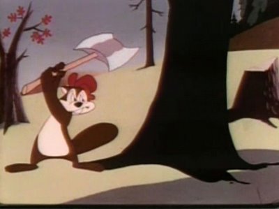
Framing: The tree on the right and the smaller tree on the left of the beaver serve functionally as a frame around the character. Behind the character there is no detail to get in the way of the beaver's action.
Now, artistically-the contrasts in the design of the BG and pose are crafted very cleverly.

There are 2 trees.

One is big and tall

The other is small and short-contrast in sizes.

Nothing is in the middle-many cartoons today stage everything symmetrically-the left side of the composition mirrors the right.

The left side of the composition is mostly empty-the right side is filled with trees and a hill-this side is not going to interfere with the action so it can be filled to balance the open space on the left.

The trees are all slightly different angles-contrasts in angles.

Negative shapes-negative shapes are the spaces between the objects-these spaces, when used correctly, help make the positive shapes "read" clearly.

The 2 framing trees create a clear shape in the negative shape-a big "U" shape.

There are large negative shapes to frame the character. There are small negative shapes in the character's pose to help the line of action of his pose read. Contrast in negative shapes.

His line of action opposes the angle of the tree on the right which makes the composition dynamic.


Here's just a still background. It looks simple. It doesn't have a lot of detail or arbitrary clutter to impress your Dad or Jeffrey.


The complexity is in the thought behind the picture-in the choice of shapes and the placement of them.

Nothing is in the middle.

The main tree is in the foreground on the right.

The shdow of it falls on a diagonal and points to the tree behind it.

The skinny trees in the negative space between them are composed towards the right of the negative shape.

All this careful artistic asymmetry makes the designs seem natural and organic, not stiff, cluttered and accidental like many cartoons today.


Here the tree on the left acts as the frame around the beaver's pose. The negative shape between the trees will help his axe swing read clearly.

The skinny trees are not evenly spaced and all follow organic curves moving up, rather than straight lines.


Here is an example of what today would be misinterpreted as "No perspective". We are looking up at this shed, yet the lines all converge down rather than up and away from us as they would in reality.


Today's wacky layout artists think this means there are no rules in cartoons and they draw no perspective at all and the lines don't converge anywhere. Windows don't fit on buildings. Every building twists and turns in a different angle. This is sometimes referred to as "wonky" design. It started in Ralph Bakshi's Mighty Mouse, was copied by Beetlejuice (the Nelvana cartoon), Tiny Toons and A pup Named Scooby Doo and now is everywehere used as an excuse to not have to design anything with control or purpose or visual appeal.

This shed's backwards perspective is consistent with its bending of one rule-every edge doesn't follow its own way, so the shed holds together as a solid, yet cartoony form.

I find all these layouts to be elegantly handsome. Jim Smith is an expert at this kind of controlled design and composition.When we did Ripping Friends, Jim would deisgn and draw many great compositions-we sent them to service studios up north who immediately redrew them all and undid all the design, filled them with ugly clutter, placed everything in the middle and took out all the contrasts. I later discovered that that was the Canadian layout style that it is actually taught at the schools up here.

Shocking!

Nick Cross was the first Canadian I've met to break from the clutter style and he quicky became a top designer and layout artist once I informed him that is was OK to use artistic principles in cartoons.

These great Chuck Jones cartoons inspired other animators and designers who later founded UPA and used some of these principles and got rid of the clutter of the entertainment part of cartoons.


Sunday, October 01, 2006

Halifax and John K. shows Classic Cartoony Cartoons


7 PM -10 Thursday Oct 5

At King's College
6350 Coburg Rd.
Halifax

See a whole pile of cartoons made by cartoonists back when cartoonists were allowed to make whatever they wanted without idiot executive interference!


I hope a lot of you local animators will come see this rare and funny stuff! We'll hang out after.

All "real cartoons" fans are welcome!

sponsored by Copernicus Studios-the folks who are animating all my latest crap-including the Weird Al video and Tenacious D! See previews!


WHAT IS A CARTOON?

WHEN CARTOONS WERE CARTOONY - LIVE EVENT IN SHERMAN OAKS

John


View My Stats
web page visitor counters
Travelocity Travel Coupons