Send As SMS

Saturday, September 30, 2006

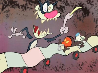
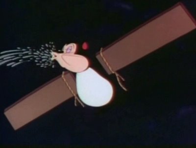
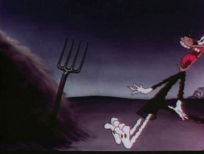
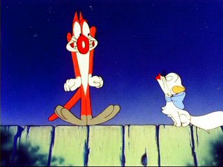
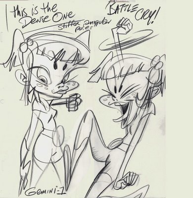
Weird Al Cartoons-STRAIGHT OUTTA LYNWOOD

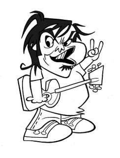
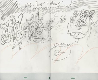
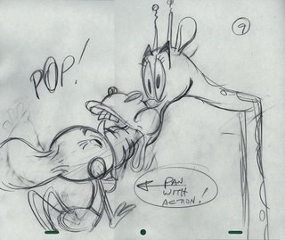
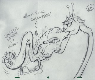
Hey, it was really fun working for Weird Al. He's a super nice guy, really funny and he loves cartoons!

Katie and I had a blast doing this video, and now you can get the album it's on and a ton more great animated videos and great songs too!

I hope we get to do more stuff with Al soon. Make him rich and buy his cd so he can afford to hire us again!


"Weird Al" Yankovic's new album, STRAIGHT OUTTA LYNWOOD, is on sale NOW!

Buy "Weird Al"s 'STRAIGHT OUTTA LYNWOOD' here!

CLICK HERE TO VISIT WEIRD AL'S SITE!!!


CloseButNoCigar
Uploaded by chuckchillout8

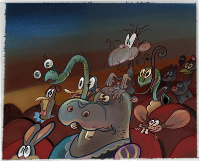
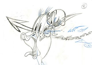
By the way that great animation is by Copernicus in Halifax. I am on my way there tomorrow to help finish the Tenacious D video.

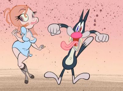
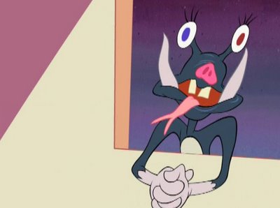
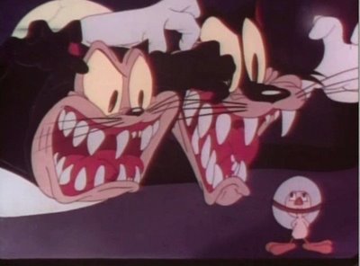
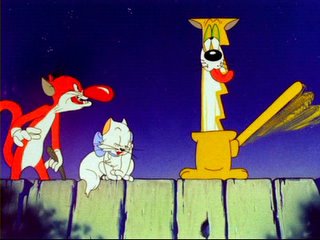
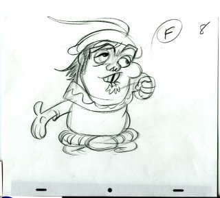
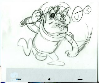
Hey you know the scene with the cats on the fence singing? That was all posed out by Katie after she told me she couldn't draw cats or do dialogue acting.

I personally think its great and soo cute and funny!


You remember these posts, don't you?

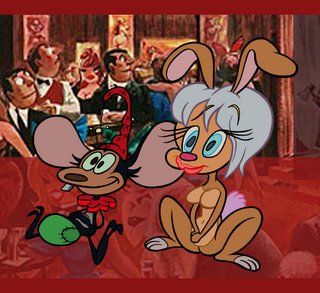
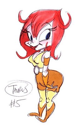
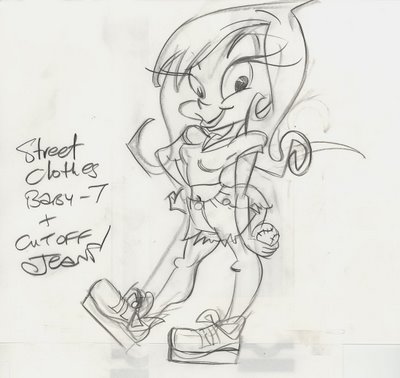
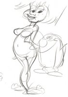
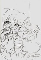
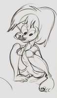
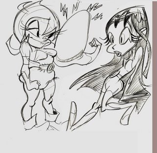
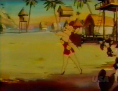
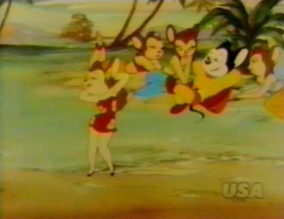
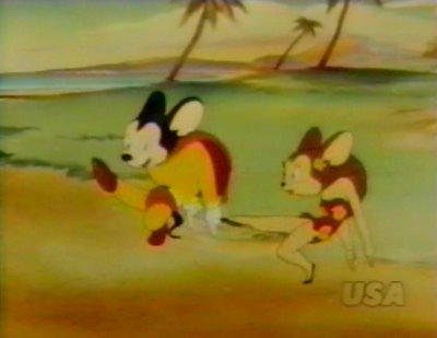
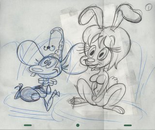
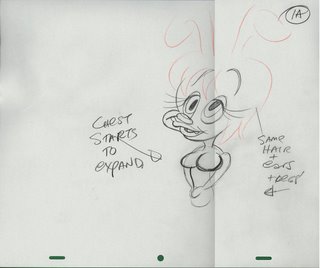
FUN AND SEXY FRAMES FROM MYSTERY CARTOON BY KATIE AND JOHN

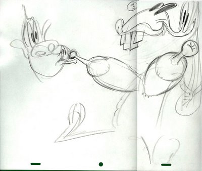
EVEN MORE MYSTERY IMAGES

MORE MYSTERY THAT'S NOT A MYSTERY ANIMATION

RANDOM ROCK IMAGES

Take It From Katie - an essay about style versus skill

Katie sent me this comment and it's brilliant. She said what I was trying to say only she said it much more succinctly. Her experience can be yours if you follow this logical advice!

Katie:
I almost think that anyone who can tell you what their style is, or openly talks about "developing their style" is in danger of never finding a real style whatsoever. I tend to think that your "style" is similar to your personality- something that grows as you get older and learn more, but that you're born and stuck with none the less. A real artist's style is like a thumbprint...unique and impossible to really recreate. You can copy an eye shape that John invented or a particular Chuck Jones mouth curl or whatever, but you can never master their "style" because you can't absorb what really matters- an artist's personal point of view, their emotions, or their personality. I guess this sounds sort of cheesy, but it's difficult to explain!What John said about learning skill before style is extremely important. People today are far too interested in "expressing themselves" and trying to prove how unique their points of view are to take the time to learn. No one wants to waste time learning how to do something right. In most other professions this is ridiculous. Would you get up onto a stage to sing some song you wrote in front of the whole world if you couldn't play your instrument? If your ideas are so important to you that you want to show them to the world, do yourself a favor and take the time to learn the skill. I can say from personal experience that studying and practicing and eventually getting better is EXTREMELY rewarding. Before working on APC my drawings were REALLY crappy. I had no skills whatsoever, although I talked a lot about construction and perspective and all that. I didn't actually learn anything until I was forced to while doing layouts for John. After the season ended I woke up one morning and realized that something new had clicked- where a year before I could only draw someone standing perfectly straight with no expression or life, suddenly I was having fun drawing poses that I had previously thought to be too hard. It seemed like almost over night drawing went from being arduous and kind of entertaining to being thrilling and super fun. It's been two years or more since then and I'm only now coming off of that high. I'm in no way saying that I made the leap from amateur to professional- I've only made one tiny step towards being good enough to tell the kinds of jokes and stories I like through art.The thoughts in this post aren't very organized…sorry! There's one more thing I want to say though- I've observed something about the modern world, and that is that it encourages creativity and uniqueness in people than ever before. This is very bad. I learned in school that it was more important to be "unique and creative" than it was to be smart or knowledgeable. Dumb people on MTV or in artsy fartsy magazines who aren't smart or creative tell you what smart and creative stuff to like. I wasn't around until a somewhat short while ago, but I believe in the past people who were meant to be artists simply became them because there wasn't anything else to be. Today there are millions of "creatives" fighting to be the most popular with our dumb modern culture. Ask yourself if you have no choice but to draw funny pictures for a living (for some reason it seems so glamorous to people). If you are reading art/theory blogs like John's and you love the art but aren't helping yourself out by following the advice, then perhaps you ought to look for work in another area. If that makes you mad and you don't want to be thought of as a faker, then take what John says to heart and better yourself. You'll be happier, and the people looking at your work will be happier too!

go check out her drawings:
http://funnycute.blogspot.com/

Hey Katie, we should repost this later with your drawings showing the before and after and then the further evolution of your drawings and poses...

And don't ever "come off that high"! Just go to the next level on my next cartoon!

Thursday, September 28, 2006

Influences Won't Help You Without Skill

Here's part 2 of my post about having a lot of influences.

I repeat: It doesn't do you any good to say you have a lot of influences if you don't put them to tangible use.

I see a lot of people eagerly jumping in and agreeing with how important it is to have a lot of influences, then I click the links to some of their blogs and see that while they may believe they have influences, the art doesn't show a bit of it.

You can't be influenced in any useful way if you have no discernible drawing skills. First you have to get to the point where you can just draw basic principles, before you can start to absorb and use, say... Chuck Jones' personal stylistic flourishes.

SKILL IS WAY MORE IMPORTANT THAN STYLE.

What almost all the people I admire have in common is that they have high levels of skills. Then on top of that, they use their skills to express their own ideas and personal quirks and styles.

Now most people today have little or no skill. Why? This is an era of amateurism. The whole idea of skill is a concept from the distant past. There are no schools teaching basic functional skills. There is no general high standard in the arts to look up to that you could at least reach up for or be embarrassed by your lack of the general level of skill in professional art.

The most skilled artists today can't touch the average skills of artists from 1940. The best modern Disney animators are shadows of the masters they look up to. I'm a shadow of Bob McKimson and Rod Scribner. The few of us who have any skills at all are completely bucking the system and having to flounder around and get through sheer talent and trial and error and searching the past. There is no one around to help us.

Well, I'm helping you and you should take advantage of me. What has taken me decades to rediscover from the past, I am offering you for free. I can save you a lot of time, but I can't make you do the work you need to do to get there. You have to actually draw and copy solid drawings that use basic principles.

David Germain admits in the last post that he is too cocksure to copy anything directly. Look at his art and see the result of his attitude.

Now just for comparison, take a look at the drawings of a 22 year old Canadian lass who went to the crummiest animation school in North America.


What's the difference between these drawings and most of the drawings on the cartoon blogs? They look REAL. Like...professional. Well Jess taught herself to draw like this by watching old cartoons when she was a kid and copying them and trying to figure out what made drawings look real.


She taught herself-with the help of classic cartoons-how to do

Construction
Line Of Action
Sillhouettes
Clear posing
Appeal
A bit of perspective

And on top of that she was doing full animation by the time she was 18! Now Jess is an exceptional case. She absorbs information and things she likes like a sponge. Obviously if everyone had her gifts we wouldn't have crummy amateurish drawings and animation everywhere today like we do.

But everyone doesn't have super human talent. But if you have some talent you can learn this stuff too by following the free lessons I put on this blog.

FREE FOR CHRIST'S SAKE!
http://johnkstuff.blogspot.com/2006/05/animation-school-lesson-1-construction.html

All you have to do is do the work. Copy the Preston Blair drawings EXACTLY. Do the drawings in the order of the steps he tells you to.
Check your mistakes and draw the same drawings again and fix them.
Then, when you start understanding drawing principles, start copying the best drawn classic cartoons.

COPY HIGHLY SKILLED NON-STYLISH CLASSIC ANIMATORS

Copy Bob McKimson in the Clampett or Jones or Avery cartoons.
Copy Tom and Jerry cartoons. This may surprise you because I have mentioned that I find Tom and Jerry boring and bland as entertainment. I do. I can barely sit through them. They are totally generic.

BUT-they are full of good drawing and animation principles and are perfect for learning these principles yourself.

ONCE YOU LEARN BASIC CLASSIC ANIMATION PRINCIPLES, YOU CAN THEN EASILY ADAPT TO ANY OTHER CARTOON STYLE.

Preston Blair is not a style. It's an approach to drawing for art that moves easily and well.

On the other hand, while I find many of Chuck Jones' 50s cartoons infinitely superior in style, thought, craftsmanship, wit and humor to Tom and Jerry, I don't recommend copying or studying those-not until you understand the basics, which will take many of you at least a couple of years of steady concentrated study and practice.

It's too easy to be distracted by all of Chuck's stylistic flourishes that he lays on top of the principles, and you will miss the foundations.

You need to be able to tell the difference between fundamentally good drawing-and style. Everyone today thinks he has a style. You don't. You have to be able to draw before you can have a style, Chet. Even among highly skilled animators and artists, very few have original and unique styles. You can't learn style. You either have it or you don't. It's like personality. I only know one person who actually made up a personality. Don't make up a style. Draw well instead.
Study 40s Chuck Jones and you will learn a lot.

This is why I also why I don't recommend studying 50s or later Disney-it also has many superficial stylistic nuances that distract from the great principles underneath.

Look at the difference between say, Sleeping Beauty and Mulan. Sleeping Beauty is phenomenally well drawn and animated and staged and colored. It's a technical masterpiece. Mulan is just a piece.
The only similarity is that both movies draw sharp corners on the characters. But in Sleeping Beauty, the corners are in consistent and sensible places. In Mulan, they just morph and switch places and warp all over the structureless melting characters.

Classic Disney features are waaaay too sophisticated and difficult to draw to be able to help you learn anything. They also use very specifically Disney type cheesy expressions and you will absorb those, as all the Cal Arts kids too. They absorb the cheese without the solid foundation.

Late 30s and early 40s Donald and Mickey's are good for principles and solid drawing, but they are dangerously sissified, so be careful!

Disney is a very dangerous influence. Those original artists had a ton of serious drawing training and they combined strong principles with vacuous kitschy Walt Disney acting and sappiness. The amazing craftsmanship lures you into thinking that everything they did was right-even the cheesy ideas and sick expressions and sissy movements.

A horrible thing about how ignorant people in the business are today-especially management at the studios, is that when you do learn solid and appealing drawing, sometimes studios will tell you that you have the "Spumco style". That's a danger of being able to draw these days. Executives and art directors think that good drawing is a "style". So learn to draw, then hide it when you apply at the flat or wiggly style studios. A friend of mine today showed me the model sheets for a new show being worked on and it was shocking how amateurish the "designs" were. They had not a single drawing principle, no style whatsoever and they were just purely depressing to look at. There are networks that run tons of stuff that look like mean 10 year olds draw and write them.

If you want to do that kind of stuff, then ignore this blog. There are plenty of suicide inducing jobs out there for you.

But if you truly love old cartoons and wonder in awe how they could be so beautiful and fun and out of this world with magic, then do the simple lessons I put up here. And forget worrying about style.

Once you learn basics, then you can start being influenced by a wider group of artists because then you can actually understand some of what different artists are doing and apply a bit of their tricks.

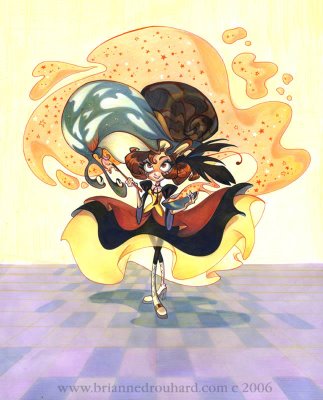
Here's another supertalented gal. Brianne has lots of skill and a very personal style. She obviously has mixed together a lot of influences and added her own personality to tie it together so well. I hope I get to work with her some day soon! I think the girls are taking over!


Take it From Shane-and join Cartoon Retro!

Cartoonretro has left a new comment on your post "The Importance Of Having A Lot Of Influences":

When i first started "Cartoon Retro" I sent John a password along with a note telling him that I wouldn't be doing the site if it wasn't for him. I wasn't at Spumco long, but it was a defining moment in my life. It was exciting to find someone else who not only loved old comics, cartoons and movies, but who had an intellectual curiosity about them. John wasn't content to just experience art- he wanted to know how it was done. What were the tools? The thought process? The influences? He analyzed, studied, and interviewed- not just as a fan, but in an attempt to discover the secrets so that they could be applied to his own work, and that of his artists.

THEORY was a big word at Spumco. Don't just copy. Analyze, study, write it down. Explain in words what you are seeing. It's not easy- It uses two conflicting sides of your brain.

When I first discovered the Spumco library I was in heaven. John noticed how much time I was spending in there, and the big stacks of books and binders and videos I was checking out. He called me into to his office- "I'm glad you are taking advantage of the library- but in return I want you to write down what you are learning." He wanted me to make "theory binders"- so that he and other artists could benefit.

John has given you an impressive list here- but it's Important that you realize that this is John's list, one that developed over decades of study and research. Use it as a starting point to find what excites YOU. One of the drawbacks to working at Spumco is that John's personality and taste is so strong that it's hard to not be overwhelmed and only like what John likes. John respects individuality, and I don't think he would want you to unquestioningly parrot his likes and dislikes any more that you should accept every word written by Frank and Ollie.

Be curious, smart and critical. Don't believe everything you read. Develop your eye and your taste. Find what excites you- not because you were told it was good, but because you have a mental (and even better, a physical) reaction to it- and then dig deeper. When I was young I worshipped Frank Frazetta. I would read interviews that discussed Frank's influences and when he mentioned people like Howard Pyle or N.C. Wyeth, I would head to the library and find out who these people were. Artist interviews are my favorite thing in the world, because you have someone you admire telling you who THEY admire. What better education could there possibly be?

Best,
S.

P.S.- Join Cartoonretro! (www.cartoonretro.com) Just today I posted complete comic stories by two of John's favorites- Milt Gross and Owen Fitzgerald.

Wednesday, September 27, 2006

The Importance Of Having A Lot Of Influences

Check out this article to see how to tell different Flintstone animators apart:

http://www.animationarchive.org/2006/09/biography-john-k-on-flintstones.html

Animation tends to be a really inbred artform. Even in the Golden Age. Most animators are influenced by a very small school of a single animation style. There are the Disney imitators, the Warners imitators, the Hanna Barbera imitators, the Anime imitators, even the Dic imitators. Now there are even Tiny Toons imitators! An imitation of an insincere imitation!

The most prevalent house styles today are the Cal Arts style (every Disney, Bluth, Pixar and most feature cartoons), or they are Spumco influenced (Cartoon Net and Nickelodeon and many of my young fans), or they are Dic influenced (Shrek and most Dreamworks stuff).

In the early days of sound cartoons most animators were influenced by comic strips and there was a huge variety of styles at the time...HUGE! There have been way more cartoon styles drawn by individual comic book and strip artists and for a few decades the rule was "anything goes". Sure each major artist had his imitators, but overall, comics was a very healthy and varied field.

All these artists had their own sets of heroes and influences, some were more cartoony, some illustrative and a ton of variations on those general themes.

Chester Gould, George Herriman, Windsor McCay, Harvey Kurtzman, Milt Gross, Sullivant, Billy DeBeck, Chic Young, Jack Kirby, Virgil Partch, and on and on. Tons of different styles and approaches.

I think that animation in its early days was heading in healthy directions with the Fleischers, Terrytoons and the New York studios all exploring unique styles and giving their animators freedom to express themselves.

Men like Grim Natwick, Carlo Vinci, Jim Tyer, Willard Bowsky, Bill Tytla all drew in completely unique styles and no one seemed to be doing anything to force them into a house style or mold. Each house style was the sum of the artists that happened to be working there. At Terrytoons, it seemed to be very random with no control at the top at all, and to me that's a good thing for some studios to be.

The Fleischers had a studio vision, Dave or someone gave its cartoons a structure and statement that most other studios at the time didn't have and that's why their cartoons are so great even now. Terrytoons are pretty much an aquired taste by really picky eclectic artists and cartoon historians.

But all the artists at that time were influenced by many other art forms, not just other animation like the situation we have today.

The concept that all cartoons have to follow one style and one form was started by Walt Disney, who in my opinion diverted the natural tendency of a young art form to develop in random and varied directions and find itself, to a stilted inbred medium that quickly went against everything the medium was naturally capable of.

Walt's greatest talent was to convince everybody else that he was right and that everyone else was wrong, even though he was the most wrong of all.

When he came to the west coast, he somehow managed to convince all the other cartoonists to make cartoons like his, bland and boring and very generic in design. All of a sudden, cartoonists who previously were making cartoony and fun pictures like the guys at Looney Tunes, started making their cartoons more and more generic. If you watch Bosko cartoons from 1930 and then watch some Looney Tunes or Merry Melodies from 1934, you can see a big decline in design, fun, cartooniness and gags.

Luckily in 1935, Tex Avery and Bob Clampett came along and brought cartoons back to their roots and followed their own unique visions, rather than being low budget inferior clones to Disney's big budget bland and sappy non-cartoons.

Well I don't want this post to be about Disney. I'm just making the point that it is extremely dangerous to limit yourself to a small body of work in one small field of art. It's Ok that some people like Disney and the original Disney artists at least had some pre Disney influences. Now the inheritors of the Disney style only have Disney as an influence but without the solid art training that held together Walt's cheesy vision. Well, lately The Disney followers today actually do have some small other influences, but usually worse ones, like Anime or Hanna Barbera 70s cartoons-like every Disney Feature that has come out since Eisner and Katzenberg took over. They preserved the worst part of Disney-the sappiness, the insincerity, the pandering to mothers and they threw out the good parts-the amazing draftsmanship and attention to intricate detail. The 2d movies that came out in the 1980s and 90s look like big-budget Ruby Spears cartoons, they are drawn as badly as Saturday morning cartoons but pretend to have Disney sensibilty by breaking into awful songs every 5 seconds and having fake pathos and wacky irritating sidekicks. About the only visual similarity the modern Cal-Arts Disney style has to real Disney are the eyes and eyebrows and a couple mouth expressions, lifted out of Frank Thomas' little strip of expressions that nobody in real life ever makes.

I get lots of portfolios from kids that copied my cartoons when they were young, and didn't copy what I copied, which is a much wider range of styles. They inevitable copy the mistakes from my TV budget cartoons-and there are tons. Cartoon Network and Nickelodeon has made whole styles out of the mistakes from my cartoons.

Unfortunately for young artists today, they are are not subjected to a wide range of great cartoon and illustrative art. They are surrounded by comic strips drawn by people with broken fingers and cartoons that are copied from recent cartoons that are copied from recent cartoons etc.

Each generation gets more sloppy and farther away from the original skills and principles that inspired the first generation of animators.


Ren and Stimpy when it came out seemed like a completely new style to most people. There isn't one single influence anyone can point to and say, well it came from that.

A real irony, is that I sometimes hear that because I have opinions that I must be "close-minded". How did Ren and Stimpy come about if that was the case?

I couldn't have made a cartoon so different if I didn't draw on a ton of influences and styles and then mix them up in my own way. The fact that I allow artists to draw in their own styles in my cartoons is the strongest evidence of how liberal I am creatively. I'll try anything-as long as it attempts to be skillful. I don't always succeed, but I also don't have a bible somewhere dictating what expressions work in animation, what kind of story structures work, what kind of color schemes do cartoons use, etc.

I explore. In fact I feel completely guilty whenever I repeat myself. I do repeat myself sometimes, it's impossible not to, but I'm ashamed when I do. I'm always on the lookout for new discoveries, new styles, new ideas and old worn-out rules to break. It is my mission.. And to discover new talent and encourage them to find their own styles and actually put them into the cartoons-I've done that countless times and launched many careers by opening people's eyes to possibilities they would not even have thought of otherwise.

I guide them by showing them tons of different art styles-Shane Glines would be the first to admit that he discovered so much about different art styles and approaches just by working with me for a few months. His great site is a testament to that and every young artist should go to Cartoon Retro and voraciously eat up all the great art there and open your minds to a few more decades than the half of one that most artists draw from today. When Shane first showed up at Spumco a decade ago, he drew in Don Bluth's style. He did it very well and because of it, at first had a hell of a time breaking out of it. Luckily he was also a fan of comic books and was at least aware of other styles that were appealing and worth being influenced by. Like most young Cal Artsy style cartoonists, they don't even know they have an inbred style and they argue fiercely about it! "Oh I'm influenced by Frank Thomas, and my friend is influenced by Freddy Moore and so and so is influenced by Ward Kimball! We're all so different!" They will actually argue this and can't see the obvious irony in it that cartoonists who are influenced by a lot more than Disney cartoons (and their copiers) do. Shane, by inking my art and Jim Smith's, Vincent Waller's and Mike Fontanelli's was quickly absorbing some new drawing styles. Shane, jump into the comments and tell your fans to open their minds like you did.

Now to the point! Whew!

Here are just a few of my influences:

Animated cartoons:
Grim Natwick
Willard Bowsky
Carlo Vinci
Manny Gould
Izzy Ellis
Ed Love
Milt Kahl
Jim Tyer
Rod Scribner
Tex Avery
Chuck Jones
Bobe Cannon
Ben Washam
Mike Lah
Dick Lundy
Verne Harding
Katie Rice
Bob Camp
Bob Jaques
Kelly Armstrong
Eddie Fitzgerald
Lynne Naylor
Jim Smith
Vincent Waller
Aaron Springer
Ed Benedict
Dave Feiss
Nick Cross
Helder Mendonca
Gene Hazelton
Rod Scribner
Bob McKimson
Irv Spence

Those aren't even them all. But every one of those animators is unique and has a strong individual style and I have used some of what I like about their work and incorporated it tangibly in my own cartoons. It's not enough to say "I'm influenced by so-and-so". For an influence to have a tangible meaning you have to put it into practice.

I'm not influenced by the bland or by the artists that copy the originators and there are plenty of those, especially today since the whole system encourages imitation rather than individuality.

I think its great that there are so many blogs now that feature all kinds of previously obscure animators and I encourage every young cartoonist to go and not only look at the stuff you like, but copy it, analyze it and put it into practice! Be merciless in your self criticism. When you first start to copy this stuff it should be obvious how inferior your copies are. If you don't see that, give up instantly. But if you see that you have a long way to go, then keep going! The more you copy and criticize, the faster you will learn and improve. And don't get stuck on any one artist! (unless its Bob McKimson-you can learn a lot of technical drawing from him without absorbing too many inbred expressions and poses) Avoid Disney at all costs! Unless you want to be another Cal Arts zombie clone and draw the same 5 expressions and poses over and over for the rest of your life!

Now, don't stop there. Each of those animators was in turn influenced by artists from other fields.

Here are some of my influences from comic strips and comic books:
Milt Gross-the greatest most inventive cartoonist ever!
Harvey Kurtzman (Hey Look period)
Hank Ketcham
Virgil Partch
Don Martin
Basil Wolverton
Harvey Eisenberg
Dan Gordon
Jim Tyer!
Walt Kelly
Milt Stein
Billy DeBeck
Elzie Segar
Johnny Hart and Brant Parker
Chester Gould
Segio Aragones
Harry Lucey (sp?)
Owen Fitzgerald
Mort Drucker

There are lots more...there is a goldmine of variation in cartoony styles in comics that could be applied to animation easily if only people would look and then try it, rather than recycle the last 5 years' worth of decadent styles.

I even like some superhero artists like:
Jack Kirby
Gene Colan
Steve Ditko
and others...

For color and paint technique I like:
Art Lozzi
Johnny Johnston
Monteleagre (his early HB stuff-not Scooby Doo)
Mary Blair
Mel Crawford
Frank Frazetta
J.P. Miller
Delwyn Cunningham
Tenngren
Rojankovsky
Bill Wray
Kristy Gordon
Tons of Golden Book painters
Renaissance paintings in general
Almost all the illustrators at Cartoon Retro
Many more...

Most cartoons today are painted in simple primaries and secondaries like the colors you see on cartoon video boxes-super ignorant and garish-or the serious ones are painted in poo and pee colors (The Rescuers, Triplets Of Belleville)

For acting I don't limit myself to cartoons, because most cartoons-even good ones have very limited acting skills:

Acting Influences:
Rod Scribner
Bob McKimson
Jackie Gleason
Kirk Douglas
The Three Stooges
Carrol O'Connor
Everyone on The Beverly Hillbillies
Jack Benny
Peter Lorre
Jerry Lewis
Robert Ryan
Cliff Robertson
Joan Crawford
Bette Davis
James Cagney
Humphrey Bogart
Sydney Greenstreet
Barbara Stanwyck
William Shatner
Clarke Gable
Vivien Leigh

Some of those are sophisticated actors, some are corny, but ALL are completely unique and original. And it's a huge range to draw from.

I also study everyone interesting I have ever known and incorporate as much as I have time to. This is cartoons' biggest shortcoming-the acting. It is so inbred and inhuman, esp. today with the Cal Arts style permeating everything. You just see the same few artificial "animation expressions" over and over again. What's the cure?

Open your eyes and your minds! Look at the world around you! Compare it to the simplicity and repetitiveness of modern cartoons. Draw real expressions from live action and from your friends. Learn to caricature so you can break away from the few permitted facial shapes and structures that animation allows today.

You have to be interested sincerely in a lot of things outside of animation and get your eye and skills up to the task of being able to interpret what you witness outside of this little inbred world.

Learn drawing skill-skill that allows you to see what things really look like, unfiltered through your animation cliches and unconscious rules. Look at lots of different kinds of SKILLED animation. Learn to see the difference between originality and imitators. You can only do this by looking at and copying tons of stuff. And you have to look far behind our current era of amateurness and decadence.

I can look at styles today and tell you exactly where they came from, what is being copied and how many generations of copy loss they have suffered.

Yes there are a tiny few exceptions today-Jamie Hewlett is a big one, but don't copy him only as I see so many fans do-find out what influenced him and open your mind!

If everyone takes advantage of all the information that exists on the web today and puts the best of it to use, maybe in a couple generations we will have human cartoons again, made by actual people with personalities and the skills and confidence to put them into their films, rather than to blindly copy my style, The Cal Arts Style, Anime or the worst of all that flat fake UPA crap that is crawling all over the animation networks and abusing children everywhere. We need to make cartoons about characters again, not poorly drawn fake stylized wallpaper. Be nice to the kids!

Sorry there is no art here. There will be. I will take this apart bit by bit and provide lots of examples of these artists and even the decadent stuff.

Marc, heeellp!

That's what this blog is all about, to open everyone's minds to new possibilities for (skilled) cartoony cartoons.

It will take awhile and I can't post everything in a week.

Why do I like Clampett so much? Because he, like me is open to a wide variety of influences and incorporates so many different ideas and skills into his cartoons. He is the least imitative of other animators and was the most imitated outside of Disney during his reign.
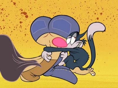
Tuesday, September 26, 2006

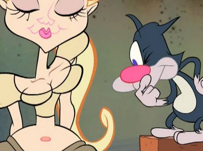
Exaggeration - Eatin' On The Cuff (1942)

Here's a nice note from Paul Etcheverry about Bob Clampett:
Hi John -
Heard you gave a fantastic show and in-depth look at the incomparable films of Bob Clampett in Ottawa. I'm glad you got to know Bob and spend time with him; he struck me as a fun guy.
Bob Clampett is very important to me personally. The same day when I met Bob I bought my first 16mm films - PORKY IN WACKYLAND, PORKY'S PREVIEW and PORKY & GABBY. He was uncommonly nice and generous with his time to me, then a goofy 17 year old long-haired rock guitarist obsessed with music and old movies (now I'm the same thing, only 50). He was also very supportive of my efforts to get recognition for animated cartoons as an art form and was the only "Golden Age Of Cartoons" icon I heard say nice things about such lesser known non-Warner Bros. directors as Hugh Harman and Sid Marcus (who produced some absolutely wonderful work in the 30's and 40's, artistic flaws notwithstanding). That said, when I started doing interviews for MINDROT a few years later, I was very surprised - shocked - by the controversy and hard feelings that seemed to surround Bob in the business. It never made sense to me at all; in my conversations with him, if anything Bob was effusive in his praise of other artists, more interested in talking about stuff that inspired him - whether it was the exciting swing music of Duke Ellington or the novels of Edgar Rice Burroughs, Willis O' Brien's innovative stop-motion animation in THE LOST WORLD or Tex Avery's cartoons - than about his own work.
The other thought I would like to convey is how strongly Bob felt about his artistic collaborators. Bob's eyes lit up whenever I said the words Rod Scribner or Manny Gould. He loved these guys! Also got the impression that Bob was tremendously fond of Tex Avery, not only as a groundbreaking director and comic mind but as a person.
So, not only are Bob's films still the best, I'll always have a soft spot for him and am proud to have worked, in collaboration with one of my heroes, the incredible Mark Kausler, on one of the first published filmographies of his work.
Also much enjoyed the blog postings on the early seasons of the Flintstones, still the textbook case on how to do limited animation right, with funny character designs, good acting, solid storylines, excellent music & voice acting and (to quote an obscure Beach Boys song title) good timin'.
Have fun in Canada. The Ottawa Festival looks like a great time.
Your pal,

Paul


Monday, September 25, 2006

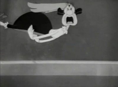
Acting - Bashful Buzzard (1945) & Baby Bottleneck (1946) McKimson and Scribner

Hey folks, how many of you made it to the shows at the Animation festival? At the Clampett panel, I talked about some of the different talents Clampett had and how he used them in his cartoons. Acting was the first topic. Clampett had the best personality animation of anyone during the Golden Age of Cartoons. Say hi in the comments and tell everyone what they missed!
Here are two examples of 2 different aproaches to animation acting.
Bob McKimson tends to use body poses, attitudes and gestures to convey his characters' emotions. He watches Clampett act out a scene and then draws all of Clampett's motions and gestures. McKimson uses a limited range of expressions-they are kind of generic (not as limited as the other studios)-but the characters' movements are full of personality and meaning.

Rod Scribner on the other hand tends to use very specific custom designed facial expressions. He listens really carefully to the voice track and makes up an original drawn expression for every little nuance he hears. Scribner was completely unique during the golden age of cartoons. I don't know anyone else who did this. He gave me the idea to do it in my cartoons.

Bob McKimson Acting:
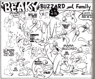
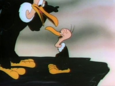
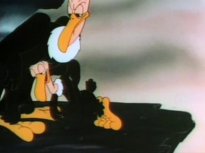
Here's a scene from Bashful Buzzard. Note how Mckimson doesn't veer much from the model sheet, but he does so much with the body language that he doesn't really need to. (Actually, I think the model sheet in this case was made from the animation drawings-which is a great idea)


(Model sheet taken from Kevin Langley's GOOBER SLEAVE - thanks Kevin!)


Acting - Bashful Buzzard
Uploaded by chuckchillout8


Rod Scribner


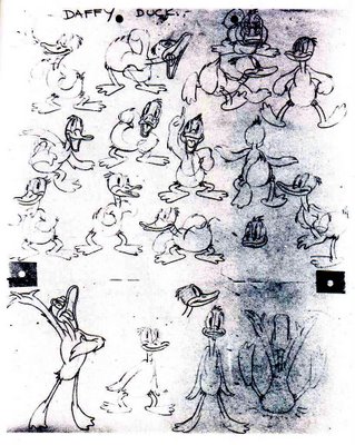
Here's an example of a model sheet of Daffy Duck from 1940:

(This model sheet is from Kevin Langley's GOOBER SLEEVE - thanks Kevin!)

As you can see, the expressions on the model sheet are typically generic 40s cartoon expressions. They are "broad stroke" emotions, and sufficient for general cartoon type production, but not good enough for Clampett. (It looks like a Friz model sheet.)


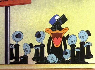
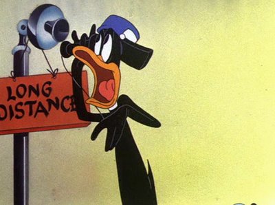
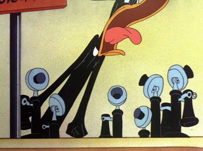
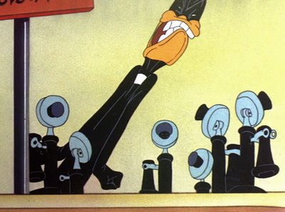
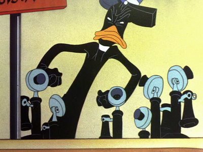
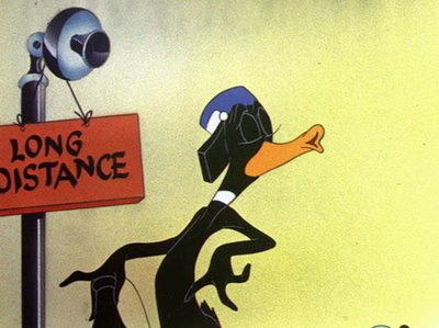
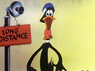
Now watch Rod Scribner's great animation of Daffy Duck. It still looks like the Daffy on the model sheet, but he is much more alive and real, because he acts as if he is constantly being confronted with new challenges, thoughts and emotions and reacts instantly with unique custom-tailored expressions. Clampett's characters act as if they are motivated from within, as opposed to Chuck's who act as if the director is pushing them around and guiding them to their marks that have been pre-planned on stage.


"What!?!"


"QUIET!!!!!"


"Mister Dionne..."

"...PUH-LEASE!"


(To see more images from this scene, head on over to DUCK WALK....)


Acting - Baby Bottleneck
Uploaded by chuckchillout8

Sunday, September 24, 2006

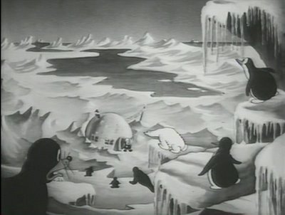
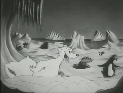
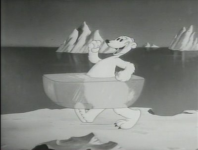
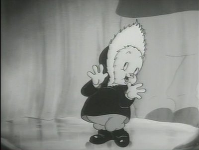
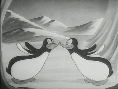
Clampett Music - Polar Pals (1939)

Early cartoons were very musical, especially Looney Tunes which by contract had to animate to music owned by Warner Bros. Later, this obligation was removed, but Clampett liked music so much he preserved the tradition more than the other directors.

Many 40s cartoons used background music as sound effects, rather than actually animating to hummable tunes. (Scott Bradley's MGM music is the ultimate example of music not being used as music; instead it just reduntantly echoes the actions in the animation. Try to hum it!) Clampett usually only used sound effects music to link 2 different tunes together.

One of the things Clampett used tunes for was just to put the audience in a good mood and prepare them for the cartoon. Here is a great example of Clampett using really happy, bouncy music for no other reason than to give you pure cartoon fun. What a swell guy! He really loved his audience and always tried to please.
The animation is really happy and totally uses the music to show off what cartoons can do that live action can't. No one at Warner Bros. was more comfortable than Clampett at animating to music. When I watch Friz' few musicals, it looks to me like he is struggling to find actions to fit into the songs. It's very uncomfortable. There will be tons of scenes that aren't very entertaining that are just there to fill in the music. Very awkward-to me, anyway.

Clampett preserved the Fleischer tradition and added his own brand of wackiness to it. The Fleischers did the best musical cartoons ever.

Notice how all this cuteness and young hearted playfullness ends with a sick joke! Good old Bob!

Friday, September 22, 2006

Timing/Pacing - A Tale Of Two Kitties (1942)


Here's a sample of one of the many clips Marc Deckter has prepared for me to show how incredible Bob Clampett is tomorrow at the Ottawa festival.


When the historians talk about Clampett, they really don't understand the vocabulary of animation, let alone animation direction well enough to really describe his achievements.

They usually grudgingly give him credit for 2 things: surrealism and being "wild". Well, he is both those things but he is also a master at every other animation principle and incorporates ideas from other mediums as well.

I think he is by far the best animation director when it comes to timing and pacing. He can cram more ideas and information into a second of film than any other director in history. He not only fills every scene with info, he makes it all read clearly!

This crazy sequence from Tale Of Two Kitties shows just how well he can take an idea and build it and make it get more and more exciting through quick cutting, tighter and tighter shots, great music, contrasts in the angles and scene lengths and stunning animation. He weaves together all these separate disciplines to give you a sensory experience no other medium can provide-and no one else in his own medium.

Bob is in a total class of his own. There are cartoons-the most creative art form in history, and then there is another medium even more inventive and fun than cartoons-The Bob Clampett Cartoon.

Come down to the National Arts Center in Ottawa tomorrow at 4:00 and I'll show you lots more of what makes his cartoons so great.

Then at 7:00, come back and watch film prints of his best cartoons. See what is possible in an animated cartoon when you let truly creative people do what they were put on this earth to do!


Friday, September 15, 2006

Bob Clampett Retrospective in Ottawa Sept 23 -next weekend!


http://www.ticketmaster.ca/event/10003D1EBF9FCFAF?artistid=1060780&majorcatid=10002&minorcatid=53

Hey folks get out to Ottawa next weekend to see a great show of Bob Clampett's best cartoons-on film!
http://ottawa.awn.com/index.php?option=com_oiaf&task=showevent&i=26&Itemid=397

I'll be there, and I'm gonna do a pre-show "workshop" panel and show clips all about what Bob Clampett does better than anybody.

Acting
Music
Timing-pacing
Exaggeration
Cartooniness

Cuteness and Sickness at the same time

Boners

"The workshop is a complement to the Bob Clampett retrospective we are doing at the Festival this year. It's scheduled for Saturday, September 23, 4:00 pm - 5:30 pm at the National Arts Centre, Fourth Stage. The space holds 150 people and it will likely be busy because it's at a good time slot. Here is the description: John Kricfalusi presents: The Genius of Bob Clampett Legendary Looney Toons animator, Bob Clampett, has been a tremendous influence on Ren and Stimpy creator, John K, and many other animators and artists. Find out why in this presentation from some of Clampett’s biggest fans, including John K himself."

After the Clampett Show, I have a retrospective too and I'll show some old and new stuff and tell behind the scenes stories.
http://ottawa.awn.com/index.php?option=com_oiaf&task=showevent&i=83&Itemid=410


Meet the wonderfully talented Jessica Borutski! And her partner Chris Dainty-make him pitch a dirty cartoon to you!
http://www.jessicaborutski.blogspot.com/

http://www.youtube.com/watch?v=GHt2JbrYTW8


Nick Cross!

http://www.pyatyletka.blogspot.com/


Kristy Gordon and many other top Ottawa talents!
http://www.kristygordon.com/

Jessy's "I Like Pandas" and Nick's new film are playing back to back in a tribute to Ottawa Animators over the past 65 YEARS. Be there!

Thursday, September 14, 2006

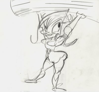
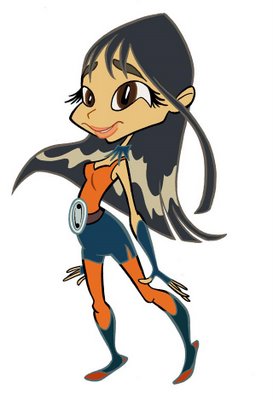
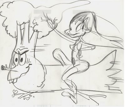
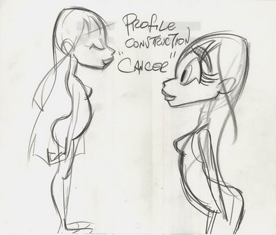
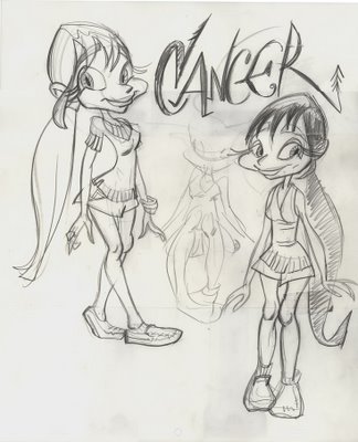
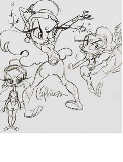
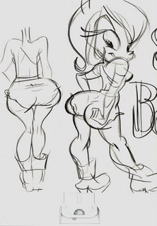
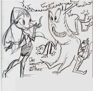
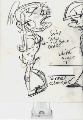
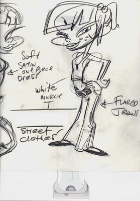
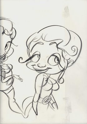
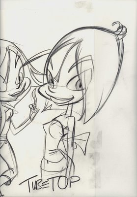
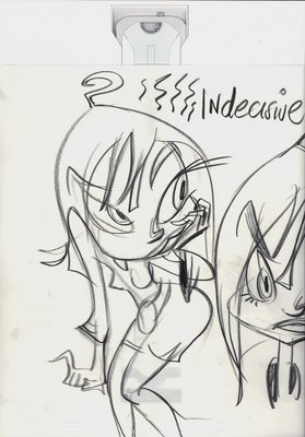
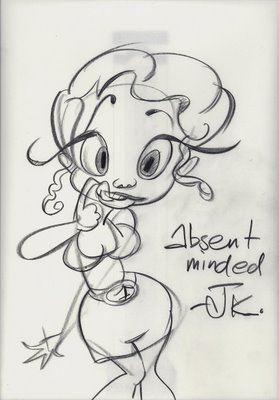
more working from Katie's designs


Katie's original design:My interpretations:

Katie's design:


My mangles:


Wednesday, September 13, 2006

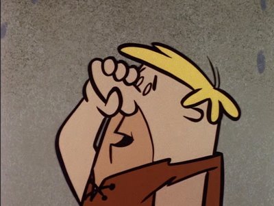
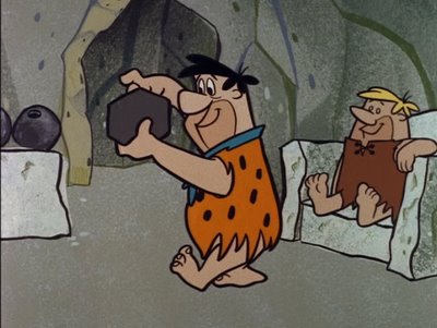
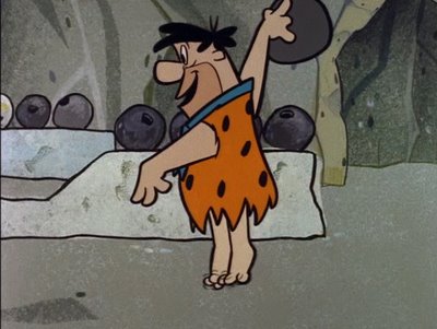
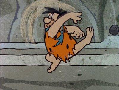
I want you to love Carlo Vinci

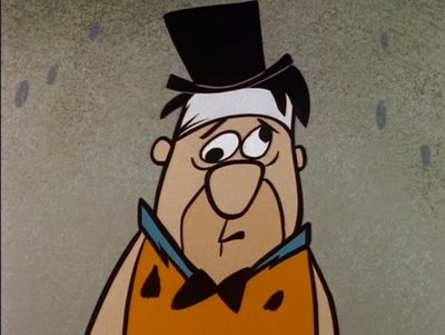
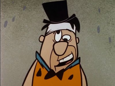
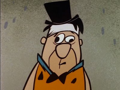
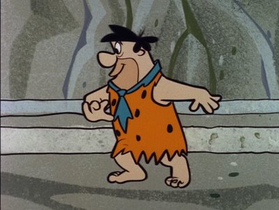
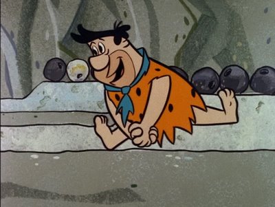
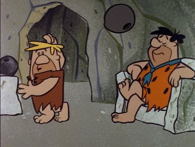
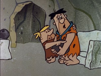
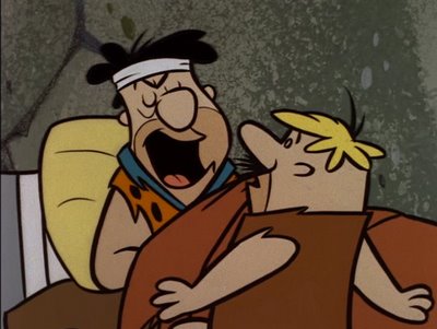
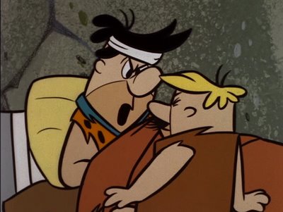
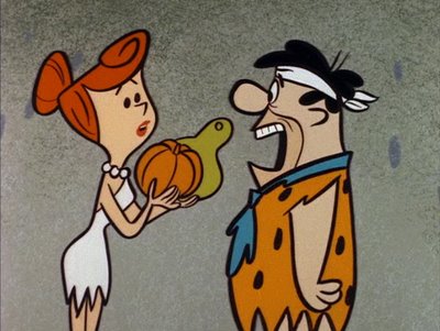
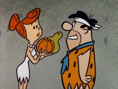
FRED'S EYEBALL TAKE- CARTOON GAG


BARNEY'S FIRM GRASP- JUST PLAIN FUNNY


FRED BOWLING AND "YABBA DABBA DOO"- FUNNY ACTION


BARNEY DROPS BALL -GOOD ACTING AND ACTION


"YOOOOUUUUUU DOPE!" - ACTING CUSTOMIZED TO DIALOGUE TRACK (instead of model sheet)


Tuesday, September 12, 2006

Happy Birthday Katie!


Hi Katie. I hope you have a great birthday and lots of fun this year! Here is some to begin with.


This item is waiting for you to pick up...at Marlo's.


Here are my practice studies for your birthday card:


Oh, while I'm at it here are more of my drawings of your characters...
do I get a good grade? How about some tips?


Hey everyone, please wish this special lass a very Happy Birthday! Draw her a card and I'll post it or link to you!

http://rmguimond.blogspot.com/2006/09/its-katie-rices-birthday.html


http://mattworldnews.blogspot.com/2006/09/birthday-card.html

http://hammerson.blogspot.com/

http://chelonianrevolution.blogspot.com/

http://photos1.blogger.com/blogger/3583/3678/1600/happi%20birthday%20katie.jpg

Monday, September 11, 2006

Part time work right now

Hey, Marc and I need some help on these videos we are making. It's just for a couple weeks but may continue on other projects.

Position 1: Marc's assistant - art student internship
Photoshop
scanning
Flash compositing

Position 2: Flash animator
to do some timing, breakdowns and compositing from my animation drawings

Contact:
Marcdeckter@yahoo.com
apply now!

Krakatoa - Carlo Vinci dancing

Just to put it in context, here is some of Carlo's "full-animation" from a 40s Terrytoon. He was using his broken-wrist/collapsing joints theories way back when. The Terrytoons directors always gave him the dance scenes and you can spot his style a mile away.
Carlo moves things as if he invented animation himself and had never seen anyone else's animation. He made up all his own rules. He doesn't use simple lines of action like the Disney animators did. Instead he uses zigzagged poses that to most animators would seem awkward.
I used to notice that about his Flintstone poses when I was a kid and I loved it. I learned early that the kind of stuff I liked most didn't fit a mold. It had to be skilled, but also needed to stand out and be a little "off" - like Carlo Vinci.


Carlo Vinci is one of the most original animators in history. I will show you some of his early 30s stuff soon. It's still recognizably him but a different and cuter drawing style.


Friday, September 08, 2006

Assorted Weekend Cartoony Type Pictures

This darling lass is from you-know-who.

Kyle likes you.
Jack is all about hardcore.
Love is everything.

Jack means it when he sings.

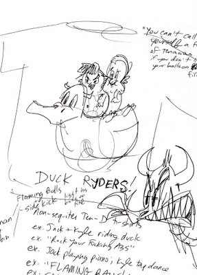
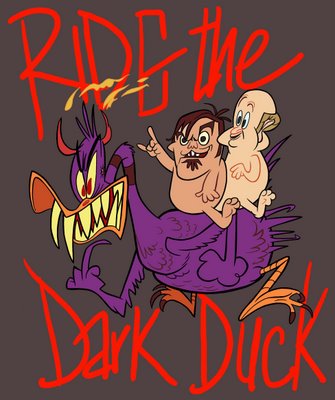
Below: My brilliant concept man Marc Deckter came up with this daring idea for every day apparel.
Then I rushed to execute:

Thursday, September 07, 2006

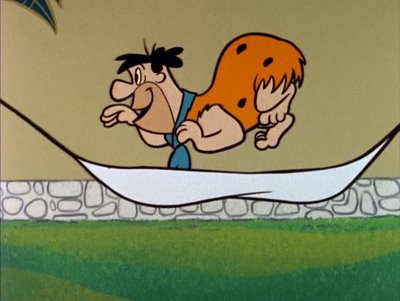
The Flintstone Flyer - Carlo Vinci, part 1

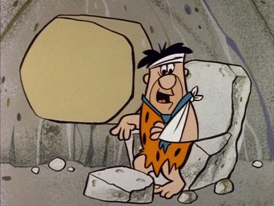
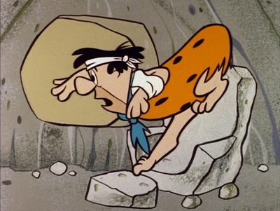
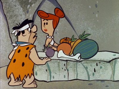
Here's proof that the Early Flintstones have funny and unique stuff in it. I love these drawings and how Carlo combines cartooniness with realistic man-type character personalities.

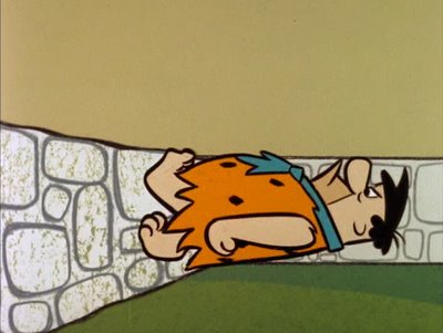
FRED SNORES


FRED WALKS OVER WALL

This couldn't happen in The Honeymooners and wouldn't in The Simpsons. A cartoon sitcom can never compete on an acting level with a live sitcom, so to make up for that, you should put in some cartoon humor to balance things out. Obviously.

Wait! It's not obvious, is it? No one does it!


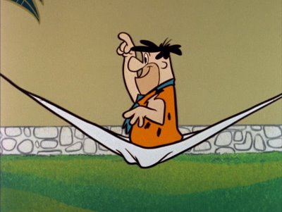
FRED LEAPS OUT OF HAMMOCK


Look how funny these drawings are! And completely off model!...which would make poor old Ed Benedict furious and me grunt with delight!


FRED'S BENT WRIST, ASS, BACK AND TEETH


This expression is perfect for Fred's emotion in the scene. It doesn't exist on any model sheet and wouldn't be allowed today. Carlo listened to the track and drew how he felt Fred was reacting.

In 1985 I was supervising The New and Crummier Jetsons in Taipei and I called Bob Hathcock, the producer at Hanna Barbera and asked him for casette tapes of the voice actors' recordings for the cartoons I was supposed to draw. Bob sounded confused. He cupped his hand over the receiver and I heard him talking to his junior producer, Jeff something-or-other who hated my guts. "Is that Kricfalusi on the phone again? What the Hell does he want now?"
"He wants the recordings!"
"What the f***k for?"
"How should I know? Just send them to him. No one else will take this job!"

Well it seemed obvious to me what I needed them for but to no one else at the time. I wanted to draw specific expressions for the characters that matched the inflections that the actors gave the characters in their line readings.
By the 1980s cartoons had decayed so bad that no one knew what an expression was anymore, let alone a specific custom-tailored one. They expected you to literally trace the 3 poses they provided on the model sheet. Trace them over and over and over again until you become a mass murderer.

Like they do on the prime time TV cartoons today. It makes me wonder why you would ever need more than one episode of a cartoon that always has the same drawings in it. That's why I can't watch crap today. Within 2 minutes you've seen every drawing you are ever gonna see of a modern cartoon character. ?????????????? Explain this to me!

I can't even figure out why Nickelodeon or Film Roman or these places have live artists on staff. Why not just do what South Park does? Put the models in the computer and just copy and paste them over and over again. Why torture creative artists? I think the studios like to pretend that something creative is going on, so they hire artists then tell them not to ever make art. But dress retro so we can feel like we're wacky.


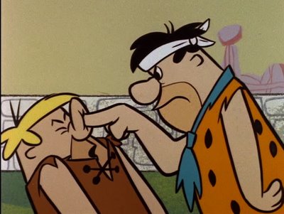
NOSE POKING

I'd swear Ed designed Barney's nose just so the animators could have fun molesting it.


FF04nosehandling1
Uploaded by chuckchillout8

Wanna know something crazy and evil? There is so much money being spent on cartoons today that they could easily animate the cartoons here, and then we could get some individuality in them like Hanna Barbera did in their first couple years of existence.

Know where the money goes? To useless people who don't draw, to scads of executives, to "development", to voice directors, to story editors, so-called writers...tons of cash goes into market research - which is like Scientology for executives. Money is just burned away today-money that could go directly into the product, to the artists so they could bring back animation to the country, learn their craft right again and then contribute some personality and fun and make each cartoon unique.

We need to bring back common sense to this business. Will we? Nah.....

Wednesday, September 06, 2006

drawing from good designs


It's nice to be able to do poses from someone else's good designs.

I'm sure you can tell these are Katie's designs. I have been assigned to draw them from different angles and do some poses.


It's challenging when a designer does new specific shapes that you haven't drawn before, but it's also fun and forces you to rewire your brain and kick it out of formula mode.


Monday, September 04, 2006

Lower Funny Animals


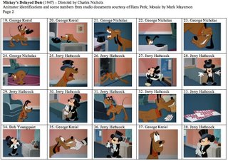
Pluto animator animates the Flintstones, George Nicholas, lucky accidents


It's designed and layed out by Ed Benedict.
I'm not 100% sure, but I think this is animated by George Nicholas. I can always tell his stuff in the show itself but this is early and a little different so...?

His drawings are very angular - as opposed to Carlo Vinci's or Ed Love's more rounded characters - his drawings are handsome and well balanced - all the elements fit together well. Carlo's are much less balanced and kinda sloppy - but really funny!

George is the one who drew Betty and Wilma really cute.
His animation for Hanna Barbera is less funny than say Carlo's or Mike Lah's, but it is very human, which is the opposite of what he did for Disney.

Again, I'm not saying the animation itself is better, just the acting in his TV stuff is more natural. Natural doesn't mean better either, it just means more like real people.

http://mayersononanimation.blogspot.com/2006/08/mickeys-delayed-date-part-1.html


Some of Fred's gestures in this commercial are subtle and simple, yet really well thought out. They aren't all stock animation actions and timings (some are) like you see in the Simpsons or modern cartoons. There is some formula here and some customized actions. "Hold it Hold it! You know I never smoke nothin' else!" Well, it ain't brilliant, just interesting and natural feeling + handsome design. It gives me ideas.
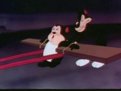
The sad thing to me is that most people judge Hanna Barbera by the cartoons they made just a few short years after they started. These later cartoons pretty much destroyed animation for good.

I saw an episode of Magilla Gorrilla in a store the other day and was repulsed at how formulaic the animation, timing, voice delivery, background paintings and music were. I can see why people would hate Hanna Barbera for letting this happen to cartoons.

If only HB had taken the good parts of what they accidentally started in 1958 and continued till 1960 and then developed the ideas further. I'm going to do a post later about the good that can come from studios that are basically unsupervised or policed creatively-like Terrytoons, Walter Lantz and the early Hanna Barbera TV studio. A random mixing of very talented artists working together in assorted combinations, just naturally comes up with unique styles and ideas that a more controlled standardized studio would never let happen.
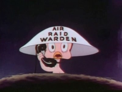
If I had a ton of money I would open 2 studios, my random unpoliced place that would have a swinging door and tons of talented people who work in different styles coming and going through and no director or model sheets.
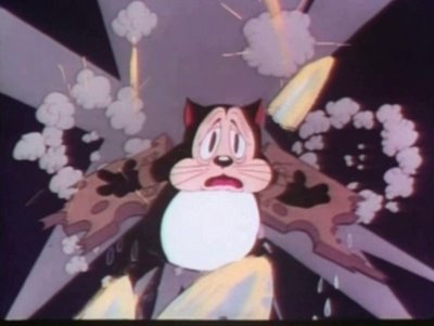
Then when the lucky accidents happened, I would take my A studio and purposely develop the accidental inventions to much further heights.

That's what Hanna Barbera should have done with their first couple years of lucky accidents and tons of one-time inventions. Instead, as soon as they had some money, they clamped down and killed all individual styles and standardized everything. That is the Hanna Barbera that made Magilla Gorilla on purpose which was completely boring and vulgar, compared to the first season of Yogi Bear which to me was beautiful, funny and always different.

Of course they later got even worse. Magilla led the way for Scooby Doo and the complete fall of cartoons. We're still paying for it and have never recovered.

Hey, anyone know who animated this?:


It doesn't look like any of the regular Hanna Barbera animators. The layout and design looks like Walt Clinton (a regular) and I'm guessing the animation might be by Art Babbit, 'cause it's so careful and solid and subtle - cartoony design by Walt but non cartoony animation and great in its own way.

Look how different these two commercials look! See the beauty of non-standardization?!

Mix 2 different layout artists with 2 different animators, and they each do the same characters and yet we get two different cartoon styles. That's candy to me!

Here's Ken Muse predicting the future of Hanna Barbera animation:

Funny Animals Are Fun To Draw

Kali Fontecchio, one of everyone's favorite bloggers and commenters helpd out this weekend. She scanned this stuff down here and did some fancy-ass after effects camera moves for us.

Go thank her ass!


Sunday, September 03, 2006

Acting and Animation are not the same thing

Here is some clarification on my last post about Carlo Vinci and believable human acting:


I like some Disney cartoons: Bambi, Blame It On The Samba The Nutcracker Suite, the dramatic scenes in Sleeping Beauty and many more.

Cartoons have many ways of entertaining us.

I analyze everything I watch and try to figure figure out what is making me like it. Then I share my discoveries for free with you. In Disney, it's color, music, staging, mood and other things.

Hardly any cartoons in history had specific customized acting in them. It's not what cartoons do best. Tex Avery didn't use much acting in his cartoons (more than Disney) but just enough to make the gags funnier. I love Tex Avery cartoons. I don't enjoy Tom and Jerry as much because it's just the violent gags without the acting.

The few cartoons that DO have some non-generic acting in them stand out and I write about them and show them to you. Clampett had the most specific acting in classic cartoons. Jones next. Popeye has some.

What I find interesting about the acting in The Flintstones as opposed to older style cartoon acting is that it's very human, not stylized funny animal "sufficient" acting that the same animators did for decades on fully animated cartoons. It's what people today say the new prime time cartoons are trying to do, but don't.

I guess the classic animators had just never thought of doing believable human acting because they never animated humans in human situations and now all of a sudden they had to.

It looks to me like they had fun doing it and that makes the cartoons fun for me. They are sincere. It's like a bunch of highly skilled regular Joes were making cartoons about guys like themselves. They weren't filtering their expressions and poses by asking themselves "Gee, would Walt understand this? Or will he think it's too weird?"


I'm not comparing the "animation" to the fluidity of Disney animation.
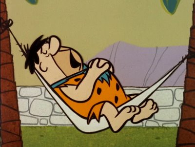
And I also wouldn't compare the "human" acting in The Flintstones to the real acting in The Honeymooners which the Flintstones is imitating. An animator can never act realistically as funny as a skilled and funny comedic live actor can. It's impossible. But it is fun to add some of that element to your cartoons if you can. I do it all the time-but I wouldn't rely on that alone, because I couldn't do it as well as The Three Stooges or Robert Ryan, Peter Lorre, James Cagney and many of my actor heroes.
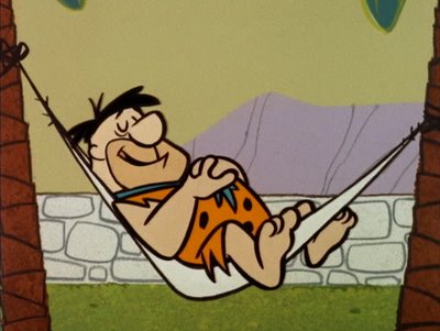

Acting and animation are 2 different crafts. Sometimes they can be done together but they usually aren't and that's ok too. I love Betty Boop cartoons and there isn't much acting in them. They are wildly imaginative and funny and pretty. What's wrong with that?

I am just separating the elements that make up my favorite cartoons and then letting you know what inspired me and my own style.

Analysis is a useful tool. It can help you build your own craft. I don't blindly accept opinions I read in books. I check the source and compare it to what I practice myself and I pay attention to my sensory organs. When I sense something I didn't sense before, I've learned something new and improved my faculties, which is always a thrilling experience for me.

I don't expect people here to blindly accept all my opinions. But unlike the books we've all read, I explain in detail the reasoning behind my opinions and then use lots of illustrations and clips to back them up.

I used to think all 30s cartoons were primitive because I was so used to the 40s style and how slick it looked. I believed what the books told me. Then I saw Swing You Sinners and was blown away. I realized I had been looking for the wrong things and then started watching other 30s cartoons and discovered tons of great practices that got lost or were abandoned by the 1940s animators. Lately I've discovered early 30s Terrytoons and I love them. They have some animation styles I've never seen before and I would love to use them myself if I can figure them out.


View My Stats
web page visitor counters
Travelocity Travel Coupons