Send As SMS

Wednesday, May 31, 2006

Bill, Joe and Friz sound off pt 2
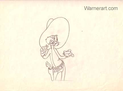
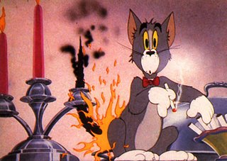
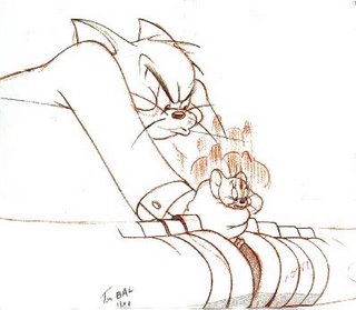

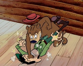
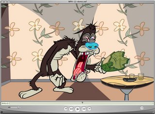
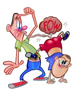
Hear the radical thoughts of 3 of the most conservative directors from the golden age of animation!

http://www.animationarchive.org/2006/05/biography-john-k-interviews-bill-joe.html

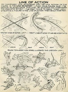
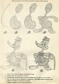
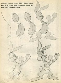
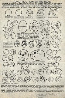
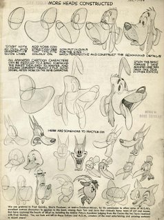
Animation School Lesson 5 - Line Of Action, Silhouettes

http://www.animationarchive.org/2006/05/meta-100000-animation-drawing-course_31.html
Click the link to get a nice big hi rez version of the page above.

Hi students. You've been doing great on the construction lessons, so now it's time to learn another important principle: Line of Action.

This principle is different than construction in that it is not based on tangible reality.
Everything in real life has construction.
Line of action is an artistic concept that sometimes by accident happens in real life but not always.

BUT! It is an important tool for artists.

Line of action helps your poses "read". It makes them clear and understandable and gives them a distinct non-ambiguous direction.


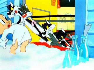
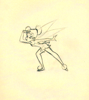
Here are some examples of strong line-of-action in the poses from classic cartoons.
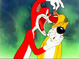
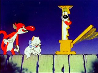
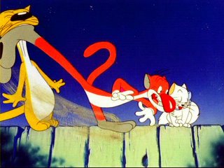
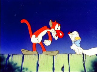
Lines of action can be obvious and exaggerated as in this pose above from Kitty Kornered and the one below of Tinkerbell.

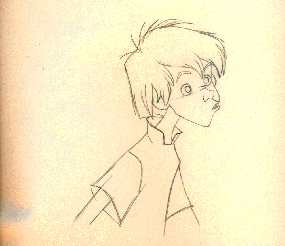
Note how the details follow the line of action and don't go in opposite directions.Here above is a more subtle line of action in the body pose of Wart, the character from Sword In The Stone. Look how the artist combines solid construction with a flowing line of action to create a solid and clear easy to read attitude.
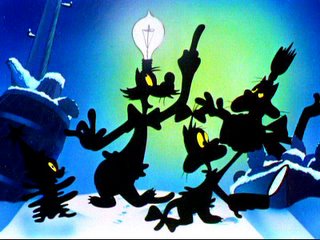
When drawing your line of action-use another principle to help the line of action read even more clearly.
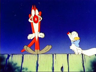
SILHOUETTE: See how the frame above combines construction, line of action and clear silhouettes to make an easy to read composition-even without having any details in the drawings.

How do you get a clear silhouette?
By using NEGATIVE SHAPES.
See the empty spaces between the arms and legs and major forms in the drawings above? Those are negative shapes. They are as important to your drawing as the positive shapes. They help make the silhouette read.


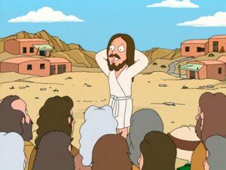
All the drawings above-the Preston Blair page, the Clampett frames and the Disney drawings are using the same basic principles. They superficially look different in style but to the trained eye, only slightly different.

The Clampett drawings are looser and more flowing and rounder, while the Disney drawings are more angular-but they all use the eaxct same fundamental principles.

Today, sadly these fundamentals have mostly disappeared.

Most cartoon characters now are rigid, they stand straight up and down, have no clear silhouettes, no construction, no line of action and no design at all. Characters now look like pieces of broken glass that don't fit together and certainly don't flow around the forms and line of action of the characters.


But you can do better.

Copy all the Preston Blair poses-using the same methods you did the construction drawings and then check them in photoshop against the originals to see where you are off.

Then when you are getting close to getting those accurate, try copying the Clampett and Disney drawings.

Tuesday, May 30, 2006

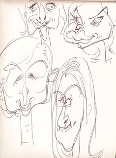
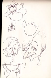
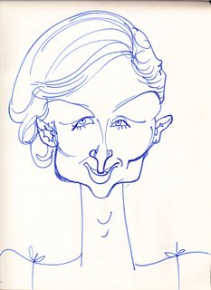
Beautiful People 19 - from memory

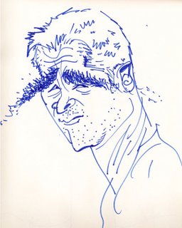
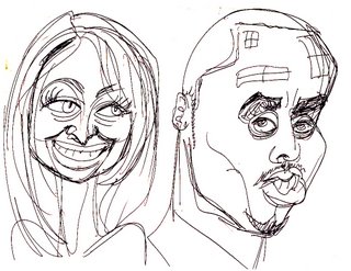
Usually I draw my caricatures out of the tabloids, like these 2 below.
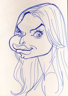
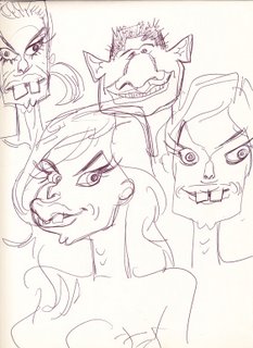
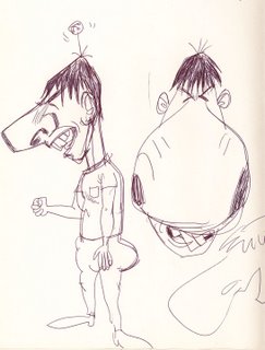
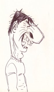
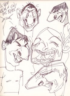
While waiting for Eddie to arrive at my favorite pizza place-Lido's in Van Nuys, I doodled up these folk from memory.


You get a different kind of caricature when you draw from memory, maybe more cartoony and more of the essence of the person, because you are not distracted by a lot of details in the photographs.

If you saw the show on Sunday, then post a comment down below this post!

Sunday, May 28, 2006

THE BIG SHOW IS TODAY!

Sunday!
YOU GOT YOUR ASSES DOWN THERE!

TO MEET ME, KATIE, VINCENT, LUKE AND MANY SPUMCO BIGSHOTS!


CARTOONS, ART SHOW, NETWORKING, AUTOGRAPHS AND ALL KINDS OF FUN CRAP!


MORE INFO:
http://johnkstuff.blogspot.com/2006/05/john-k-retrospective-may-28-santa.html
http://johnkstuff.blogspot.com/2006/05/gallery-and-original-john-and-katie.html
Now write up a report on this blog to tell everyone how much fun you had!
Rub it in for the folks who couldn't make it.

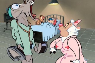
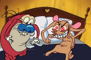
What did you think of the clips from the Lost Episodes of Ren and Stimpy coming out in July?

And what happened to you, Sabrina?

Saturday, May 27, 2006

George Liquor Stories - John and Katie presentations

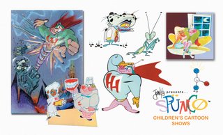
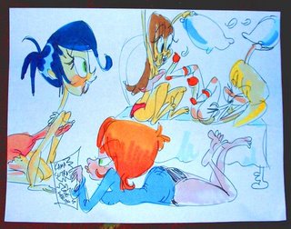
The other day we had to go pitch our ideas for web cartoons so Katie and I spent a day drawing these full color presentation boards from some of the cartoon ideas I told you about earlier.
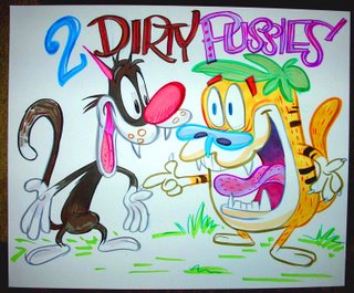
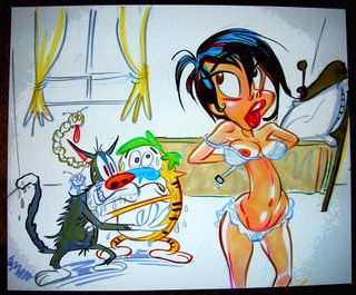
As you all know, in my cartoons you can tell the different styles that each cartoonist has, because I encourage creativity. Katie and I have similar styles of course, but she has the feminine version and I have the manly one.
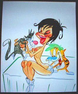
I wonder if you can tell which drawings she did and which I did.
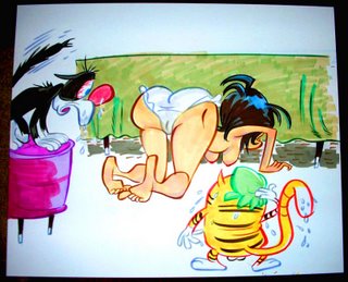
Hopefuly your eyes haven't been blunted by watching too many of those godawful "on-model" stick-figure shows.
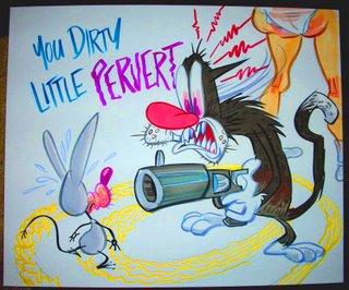
BTW, here's a link to the stories so you can see that it might be possible to have eye pleasing art and funny stories at the same time-a radical concept, right?
http://johnkstuff.blogspot.com/2006/04/george-liquor-stories-3-fast-food-lust.html
http://johnkstuff.blogspot.com/2006/04/george-liquor-stories-4-heaven-and.html
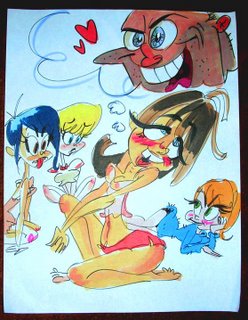
How are your eyes doing? Are they waking up somewhat?
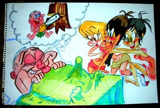
How would you like to see this kind of stuff on your media boxes of every kind?
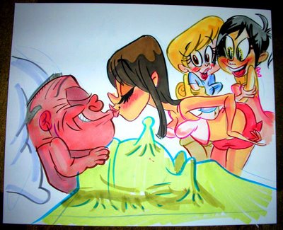
I have a concept for those folks who think that ugly drawings must automatically be accompanied by good writing-or how did it get on TV?: I think then for your tastes, you should only have sex with ugly girls who can only make 3 expresssions, because pretty ones will distract from the pleasure happening in your rude parts.
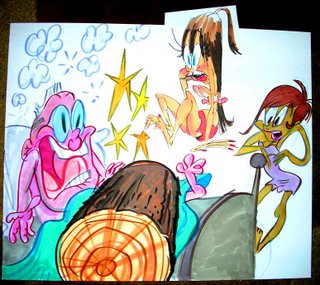
Then you can boast to your friends with the pants falling off that she's ugly on purpose and just the right kind of ugly to put across the mess.
So have you figured out which drawings were done by Katie and which by me?

Come down to meet us Sunday and find out!
http://johnkstuff.blogspot.com/2006/05/gallery-and-original-john-and-katie.html

Friday, May 26, 2006

Fan caricatures 1

Here's some folks with taste that ordered caricatures from me:
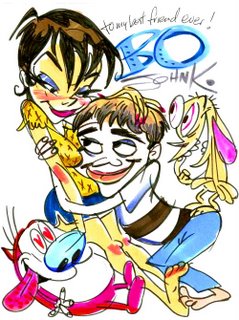
Brianna-daughter of the Famous Aimee!
Bo

http://profile.myspace.com/index.cfm?fuseaction=user.viewprofile&friendid=53167066&MyToken=17bfac10-3415-43e4-b437-929d13516ceb


If you have received yours yet, post it and I'll link to you.

Tell me in the comments!

Thursday, May 25, 2006

When Cartoons Evolved 3 - First Bugs Bunnies


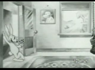
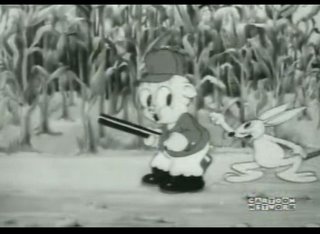
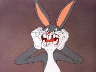
Here's the first Bugs Bunny cartoon - made by "Bugs" Hardaway and Cal Dalton in 1938.Here he is in a typical calm Bugs Bunny pose.
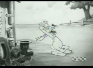
Here he is laughing the Woody Woodpecker laugh 2 years before Woody was created.
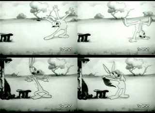
..still doing magic.

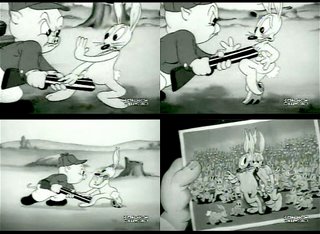
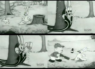
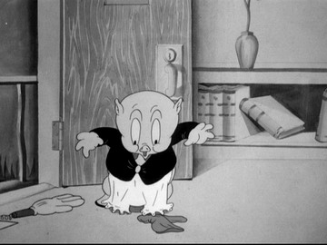
This cartoon is basically a remake of Porky's Duck Hunt with some proto Bugs traits just starting to emerge. He's kinda like Daffy Duck-really wacky but with some underplayed scenes that predict Bugs' future.

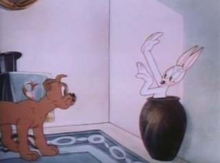
Here's Chuck Jones using the early proto Bugs in a cartoon from 1938 Presto Changeo
He's not the star of the cartoon and is basically a magician's rabbit.


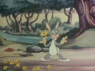
Here's another Hardaway and Dalton Bugs Bunny cartoon: Hare-um Scare-um - 1939.
His design is starting to look like the Bugs we all know. His voice is sort of like the retarded early Barney Rubble.
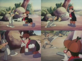
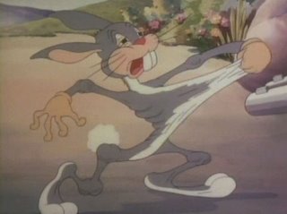
A typical Bugs Bunny routine.
Here he is invoking mock sympathy - making fun of pathos. A very Warner Bros. type of irreverence-very anti-Disney.
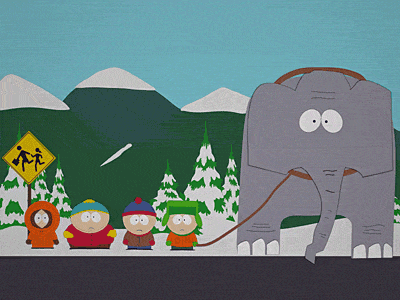


To remind you of an important point I made last post: In the old days, artists evolved their ideas constantly. The character designs would change from cartoon to cartoon, director to director and in some cartoons, from scene to scene!

These 3 cartoons here represent 18 minutes of Bugs Bunny's development-that's less than a half hour cartoon. Today's cartoons are frozen in time. They barely change at all over 100s of half hours. The world is opposed to creativity today.

70 years ago, creativity and rapid progress were just taken for granted.

You have to be raised in an uncreative environment in order to blindly accept how bland and crappy everything is today.

The difference between a generation that grew up in the 1930s and a generation that has grown up in the 70s or later is stark.

When my parents first saw The Simpsons and South Park and other primitive stuff, they said instantly: "This is crap. I can draw better than that." That should be the obvious conclusion.

No one should accept professional work that looks like they could do it themselves.
Unfortunately, that obvious type of conclusion is beyond the comprehension of most people who were raised in poo.

In a common sense era, you could never convince anyone through logic that they should wear pants that fall off while the police are chasing you, unless those are the only kind of pants you've ever seen your friends wear.

BTW, some folks have argued that The Simpsons and South Park evolved too. Please post some examples and the dates so we can compare the rate of evolution and see how far they have come and how long it took.

Here, Evan has provided proof that modern cartoons evolve:


Year 1


10 years later.

That's over 200 half hours of hundreds of quality animators and designers experimenting madly and taking their imaginations beyond whatever the most accomplished dentists and mailmen could do in an afternoon.

Monday, May 22, 2006

Gallery and original John and Katie art-May 28

Special News Bulletin
EDDIE HAS A BLOG!
http://uncleeddiestheorycorner.blogspot.com/

FUN FUN FUN!

THIS SUNDAY MAY 28 4 PM - LIVE! JOHN, KATIE AND SPUMCO BIGSHOTS

Every Picture Tells A Story located at
1311-C Montana Ave.,Santa Monica, CA 90403
.
Phone is (310) 451-2700. The Aero Theatre is located at 1328 Montana Avenue, Santa Monica. For more information and to see John K's art, go to : http://www.everypicture.com/artists/285/1/john-kricfalusi.html

Not only do we have original art for sale, but we will have some limited editions posters for less money and we will sign them for you on the spot.
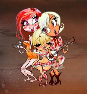
BLUEGRASS BITCHES FROM SPACE-by Katie Rice-buy one and have her sign it to you!


THE RETARD AND THE CORRUPTER OF YOUTH


REN AND STIMPY IN "LIFE SUCKS"


GEORGE LIQUOR'S ALL AMERICAN FAMILY

LIVE SINGING!! by actual cartoonists

Then at 6:15 go across the street to the Aero theatre to watch uncensored and banned Spumco cartoons!
http://johnkstuff.blogspot.com/2006/05/john-k-retrospective-may-28-santa.html

Wednesday, May 17, 2006

John K. Retrospective May 28 -Santa Monica

http://www.fandango.com/MoviePage.aspx?date=5/28/2006&mid=97056
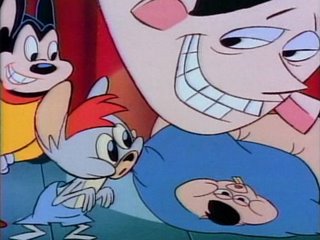
Hey folks! Come meet me, Katie and other Spumco artists and see all our banned cartoons-too hot for TV!

Look at this shit we have for you...

Naked Beach Frenzy


Bakshi's Mighty Mouse

in a take-off of Alvin and The Chipmunks!


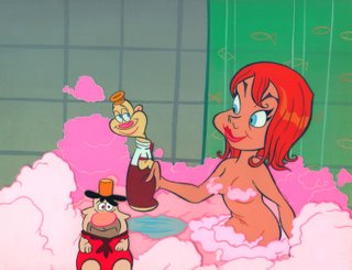
Look at this cool girl scene by Lynne Naylor!
And below is a bit from some scenes that were originally cut and I put them back for you!


He Hog MTV Pilot - adult version

Bjork-Uncut!


Boo Boo Runs Wild-Uncut!


Life Sucks Animatic-Ren and Stimpy and the Children's Crusade

Weekend Pussy Hunt 12


What Pee Boners Are For-starring Slab 'N' Ernie-Michael Jackson's favorite cartoon!

The Aero Theatre is located at 1328 Montana Avenue, Santa Monica.

May. 28: 6:30 p.m.

Box office: 323-466-3456
the Box Office is open 2 hours prior to show time, tickets are $6 for American Cinematheque Members, $ 7 for Sudent/Senior and $9 General
See you there!

Tuesday, May 16, 2006

Animation Lesson 4 - 2 legged characters-full body

TECHNICAL DIFFICULTIES
Blogger won't let me upload images and hasn't for a couple days.
I have new posts ready except for the pictures.
Computer torture!


OK, now you know the procedure for copying and learning. Apply the same procedure to drawing these simple two-legged typical 40s cartoon characters.

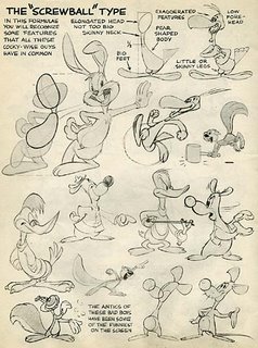
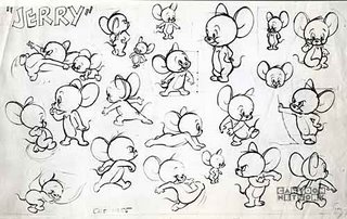
Note that they both have "pear-shaped" bodies. This was pretty common in old cartoons. Bugs, Daffy, Tom and Jerry, Mickey, Donald all have slight variations on the pear shaped body. Once you understand how to make the basic shape, you can then apply it to variations in proportions for other characters.
Also Note! - DETAILS WRAP AROUND BODY SHAPE. They FLOW.
Clothes
Fur
Eyes
Fingers


Step a- MEASURE PROPORTIONS -how many heads tall is the character you are copying?

Step b - Mark proportions on your drawing paper. Match the proportions you are copying.

Step 1 - Draw line of action (we haven't covered this yet, but just do what Preston does in his step 1)

Step 2- Rough in the basic forms of the character.

Step 3 Draw center lines through the forms that wrap around the shape of the forms.

Step 4 - Draw basic forms of next level of details-eyes, arms, hands, feet, legs

Step 5- Draw smallest details- make them follow the forms that they sit on:
Pupils sit on eyes AND FOLLOW THE SHAPE AND POSITION OF THE EYES- they don't exist as little unvarying dots as in The Simpsons and many other cartoons today. Look in the mirror and watch the shape of your pupils change as you move your eyes.
hairs sit on head
Shirt wraps around body
etc.

Pear shaped bodies aren't the only kind of body, but they are the simplest and will help you understand the basic concepts of:
Construction
Proportion
Flowing details that wrap around construction

Once you start to get a handle on that, we can try other types of shapes and forms.

Sunday, May 14, 2006

Animation School Lesson 3 - how to check your copies-PROPORTION


All these characters below have the same head construction. Then why do they look like different characters? The proportions of the shapes that make up their heads are different. Slight differences in proportions make a huge difference in the look of something. (They also have different details-ears, hair, etc.)


I've been looking at everybody's copies of the Preston Blair book and I see improvement already in all your work!

Preston is a magician.

Here's a big tip:
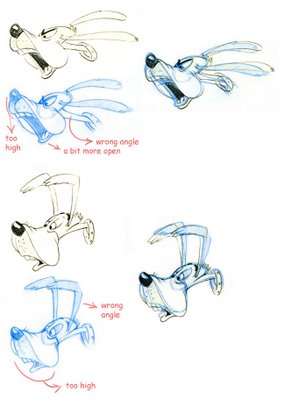
When you copy something you want to get is as accurate as you can. You need to train your eye to see mistakes. There's no room for interpretation when you are copying.

Here's a method to easily check your copies. Remember this word: PROPORTION

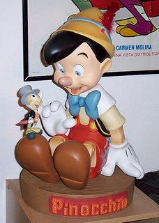
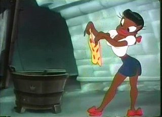
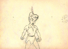
Part of what makes a character look like who it is, is its proportions. MANY characters can have the same construction, but they have different proportions-like Elmer Fudd and Coal Black and Peter Pan and Pinnochio-all those folks are the exact same construction! -THEY ARE MADE UP OF THE SAME TYPES OF FORMS-A BIG ROUND CRANIUM AND A SMALL BABY JAW.

1) Bring your drawings into Photoshop.
2) Bring Preston's drawings that you copied into the same Photoshop file.
3) Re-size the Preston drawings to match the size of yours.
4) Put the drawings next to each other.
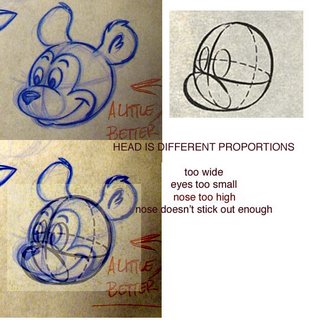
5) Make notes of how your drawing differs from Preston's
6) Make a copy of the Preston drawing and lay it on top of yours on a layer
7) Make the layer transparent so you can see through it to yours.
8) Make more notes on where yours differs from Preston's.
9) Redraw your copy, this time trying to fix the mistakes you found.

This fella's copy is pretty good, so there isn't a lot to correct. Some other artists are less accurate.

WHEN YOU COPY-GET IT AS CLOSE TO ORIGINAL AS YOU CAN!

Keep at it and then come help me change the cartoon world in a few years!

Friday, May 12, 2006

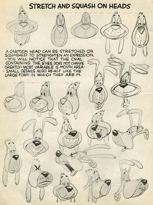
Animation School Lesson 2 -Squash and Stretch on heads

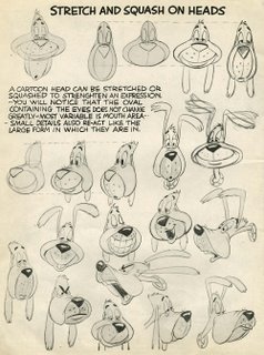
OK, here we go kids. If you haven't already drawn all the drawings from lesson 1, then don't proceed to this lesson. You need to already have a firm grasp of solid construction before you can start stretching the crap out of your drawings. Otherwise they will look like mush.
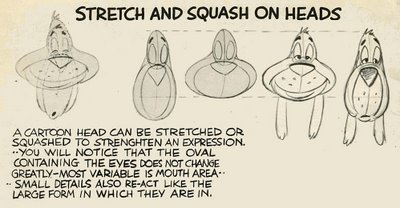
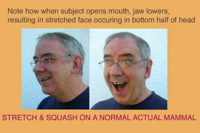
Preston makes an important point in his notes: The top of the head (the cranium) is not as pliable as the bottom half (the jaw, cheeks and mouth).
This is based on reality.
Real living heads are constructed of 2 parts:
1 The cranium.
In real life it stays solid because it is made of bone.
2 The jaw.
It is also solid and made of bone-but it can MOVE. And when it moves, it stretches the skin with it.
Got it?

Take a look at this average typical man.

That's the basic concept you need to understand when you start drawing different expressions on your constructed characters.
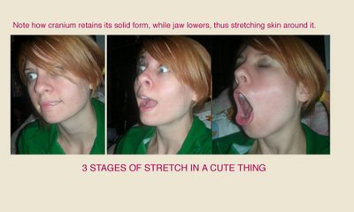
When something opens its mouth, 2 things happen:
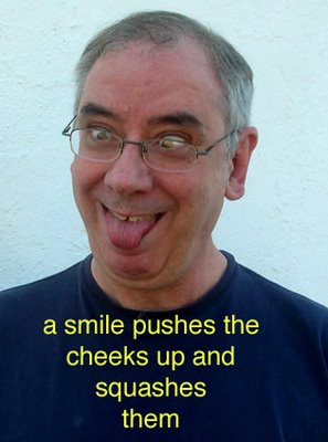
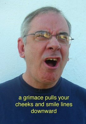
1) The jawbone lowers, thus stretching the skin.
2) The lip muscles stretch into different shapes according to the expression.

In an old cartoon, a lot of characters don't actually have jaws-like this Preston Blair dog. Instead he has a cartoony stylized version of a jaw. It's just a balloon that stretches when the mouth is open and squashes when the mouth is closed.

It suggests what happens in reality but is not physically the same as having actual bones in your head.

So my point is-even though it's not real-it still has to feel natural in order to have a convincing effect on the audience.


SMILES AND FROWNS
Note how in the drawings at the top of the page, the dog isn't even opening his mouth yet his jaw squashes and stretches anyway.
This is a cartoon invention, based on another thing that happens in reality.

When you smile, your smile pushes your cheeks up towards your eyes and compresses them.

When you frown, your smile lines pull your cheeks down, making your cheeks look longer.

OK, now that you understand the concepts of squash and stretch and why things stretch when they do-remember it's not arbirtary distortion-go ahead and start copying all the drawings on this page.

MAINTAIN VOLUME WHEN STRETCHING AND SQUASHING
IMPORTANT EXTRA TIP! When stretching and squashing something, try to maintain the basic VOLUME of what you are distorting. This will help keep your animation drawings looking natural.Remember to use construction when drawing! Don't draw straight ahead!

If you don't know what construction is yet go back and do lesson 1:
http://johnkstuff.blogspot.com/2006/05/animation-school-lesson-1-construction.html
Thursday, May 11, 2006

Animation School lessons-do you want them??

http://johnkstuff.blogspot.com/2006/05/animation-school-lesson-1-construction.html
I'm wondering whether I should continue taking anyone through these lessons.
I'll tell you why.

I've given a lot of free and good advice to young artists in my life, yet not many of them choose to take advantage of me.

The few that did, got really good -FAST.

I know a lot of people buy the Preston Blair book, flip through the pages and then lay it to rest and never bother to learn the valuable lessons inside.

There is only one reason I would bother to offer all this advice-in the hopes that some very talented young artists will actually do what I tell them, learn their fundamentals and then someday work for me and save me the trouble of having to train them from scratch.

I've hired many artists who have graduated from animation schools who don't know a damn thing about how to make a good strong solid or appealing drawing - after they have paid a fortune to the schools. I consider these schools to be criminal institutions. They are stealing from you, and they are stealing from me and they are stealing from culture.

I have spent so much money retraining cartoonists-just to teach them the very basics of good drawing. Nick and Katie and Fred and other Spumco alumni-back me up on this!

All these basics are laid out for you in The Preston Blair Book for 8 measly dollars. 8 fuckin' bucks for Christ's sake!

I'd even be willing to help guide you through the lessons, if I thought some serious young cartoonists would actually do the work.

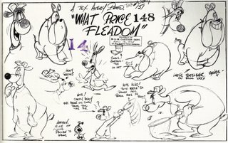
So you're gonna have to convince me that enough of you want to be able to draw this well:

These lessons are aimed mostly at folks between 10 and 24 years of age. Why? After 24 if you haven't already become really good, you will stagnate and your powers of learning and your rebellious youthful attitude will have died. I know this from 20 years of experience working with young artists. If you don't develop your brain, skills and analytic eye while you are young you will be creatively crippled for life. Or at least it will be much harder the older and more set in your ways you become.

If you want me to continue these lessons, convince my ass.

Then you will have to do the work involved and draw all the lessons I give you. And read what the lessons say. Do the drawings in the steps that Preston and I tell you. If a lot of young cartoonists do this, in a few years there could be a rebirth of great cartoons. I would sure as Hell love that. So would the audience.

Your best friend,

John

Tuesday, May 09, 2006

When Cartoons Evolved 2- Bugs Bunny prototypes

Thanks to Marc Deckter for the images!

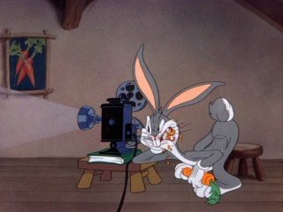
A beautifully acted subtle scene by Warner Bros. top animator, Bob McKimson From Falling Hare

What's Bugs Bunny's personality?

I'll list the traits I can think of.
His most general trait is that he's a heckler.
He also is a magician-he can drag his hole around, drop in it and then appear behind the antagonist.
Then - he is a specific kind of heckler-mostly calm and cool when in control of the situation-but when he sometimes is not in control, he becomes really irritable and his pride is sorely wounded which just makes him lose even more control.
He is aware that he's the star of the show and confides with the audience about the situation. A ham performer. (Even when he loses!)
He's sarcastic.

Bugs Bunny hams it up in Corny Concerto-animated by Rod Scribner

This is a pretty well rounded character for the times-when you consider that most Disney characters had one trait only-a really general one, with no specific quirks: Donald is an Asshole, Goofy's a retard, Happy is - guess...! Sneezy is...and then Hell, their biggest star, Mickey, doesn't even have one trait!

Bugs and his Warner Bros. cohorts were a revolution in cartoon personalities and are still leagues ahead of any other cartoon characters in terms of mere richness of personality alone.

Bugs is a few revolutions in one:
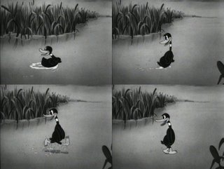
The first heckler cartoon I can think of-(if anyone else knows of one before this let me know!) is Porky's Duck Hunt made by Tex Avery in 1937.

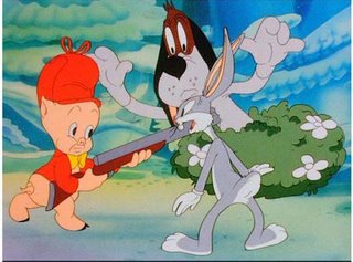
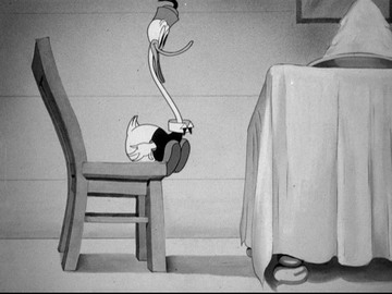
Trait 1-Daffy Duck is unfazed by a hunter's gun and dog

This cartoon introduced a prototype Daffy Duck who was also a prototype Bugs Bunny, Woody Woodpecker and the myriad of other heckler characters to follow.

Tex Avery loved hunting cartoons-he made a zillion of them. In most of them the befuddled hunter is pitted against many ducks or rabbits of creatures of the wild. In this cartoon Tex' idea was to have Porky outwitted by a flock of ducks. One of his animators, Bob Clampett, suggested they boil it down to 1 duck and make the duck have fun outwitting Porky and be completely unfazed by the threat of the hunter's gun. This gave the animators a chance to spend time seeing what they could do with the new duck character.

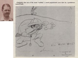
(This calm character was inspired by a hunting trip that Rudy Ising once described to the crew at the Looney Tunes factory in the early 30s. He kept acting out scenes of him trying to shoot this rabbit, and the rabbit kept disappearing behind bushes and then sneaking up behind Rudy and completely outwitting him. Clampett and the other cartoonists drew gag cartoons depicting Rudy versus the wacky wabbit.)


Avery's unit tried a couple different takes with the new duck character. Daffy is calm in some of the scenes and he becomes loony at the end of the cartoon in a crazy scene animated by Clampett of the duck spinning and flipping and yelling Woo Woo, Woo Woo!


Clampett's animation of the crazy darnfool duck

The cartoon was a huge hit in theatres and Leon Schlesinger came into Termite Terrace and told the gang that they were really on to something and to make more of those screwball duck cartoons.

Shortly after Daffy's Duck Hunt, Bob Clampett was promoted to director of his own unit and took some of the Termite Terrace animators with him-including a young Chuck Jones. This unit carried on the crazy stuff from Tex' unit and took it even further. It also took the personality stuff a lot further while it was at it.

Avery's style was always sarcasm, parody, wacky gags and high concept story premises. Clampett's cartoons were more varied in theme and concentrated more on the performances of the characters. There were really wacky gags too, but they seem even wackier because the characters were richer and the characters, rather than the the director motivated the gags.

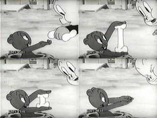
In his first cartoon, Get Rich Quick Porky, Clampett experiments with the calmer type heckler character-this time a gopher who looks and acts a lot like the early 40s Bugs Bunny.

He does magic tricks from halfway out of his own hole.
Clampett himself was a magician and a practical joker, and this gopher seems almost to be an animated caricature of the guy I knew well.


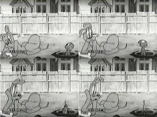
A wiseacre gopher plays practical jokes on a mutt


The gopher does wacky show off spins into his hole
The triumphant spin into the hole became a staple of Bugs' routine later.


He remains calm and sarcastic


More to come...! The first Bugs Bunny cartoon!

A lot of this historical information I got directly from classic animators but another great resource was Mike Barrier's Funnyworld magazine in the 1970s. It was the first magazine and animation history source to really seriously look at cartoons other than Disney's. Mike and his partner Milt Grey interviewed dozens of old time animators and shared much of their new-found knowledge with rabid cartoon fans like me.


Here's a great interview with Bob Clampett:
http://www.michaelbarrier.com/Funnyworld/Clampett/interview_bob_clampett.htm
Barrier has more interviews on his site:
http://www.michaelbarrier.com/interviews.htm

When Cartoons Evolved- Bugs Bunny


The western world-especially the United States- used to believe in a concept called "progress". Everyone thought that man naturally wanted to make things better. They believed in constant experiment with the purpose of finding better ways to do things. Man believed that through the power of invention, we could improve things and speed up evolution. This is a forgotten concept.

Take cartoons as just one example. It used to be a matter of course that every year, cartoons would be a different style than the previous year and not only that, each cartoon character itself would constantly change and get better as all the artists working on them would have a hand in shaping and evolving the look and the personality of the characters. No one ever thought to question this.

That's why cartoons improved so fast from 1928 to 1945. The animation world (like everything else at the time) let the practitioners use their creativity to do something considered radical today-to be creative. To constantly change things-to invent formulas and then discard them as they got bored.

Mickey Mouse, Bugs Bunny, Woody Woodpecker all looked totally different and kind of primitive when they were created than they did just a couple years later and they all continued to change and evolve (and eventually devolve) throughout their lives. Today's cartoon characters are born primitive and stay the same primitive for their whole lives. South Park, The Simpsons, Family Guy, etc. The whole system is geared against artistic progress. Artistic invention is now called "off-model".

Bugs Bunny is probably the greatest and most popular cartoon character of all time and he wasn't even created. He just evolved out of concepts and other characters.

more to come...

Monday, May 08, 2006

Happy Birthday Bob Clampett!


David Germain has notified me that it's Bob Clampett's birthday so every cartoonist out there gets to take the day off! Just tell the boss (or your teacher) I said it was OK.
http://dmgermain.blogspot.com/

Here's just a few reasons to love Bob Clampett:
More length!
More women's undergarments!
http://classiccartoons.blogspot.com/2006/05/time-for-clampett-part-2.html

More scrotal tissue
More hiding in scrotal tissue
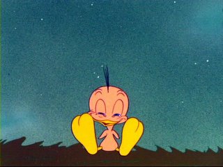
More evil naked demons!
More elasticity!
More cartoony!
More abuse!
More lust!
More Boners!
http://classiccartoons.blogspot.com/2006/04/gruesome-twosome.html

Yessir, Clampett gives you more of everything! So everyone say hi to the Clampett family and let 'em know how much you appreciate his wonderful wacky cartoons!
Give your love to:
His wife Sody.
His daughters Ruth and Cherie.
His son Robert!


Also if you have more Clampett stuff on your blogs, send me links and I'll include them!
Thanks to Andrea for all the pics on this page so far.

http://duck-walk.blogspot.com/2006/05/booze-giant-eyeballs-and-animated.html
Saturday, May 06, 2006

Meet John K., Katie and more stars! Cartoons, songs and art live in Santa Monica May 28


Hey everyone! Wanna meet my ass in person? And some other Spumco folks-like Katie Rice and the gang?
On May 28 we are screening our rarest cartoons at the Aero Theatre in Santa Monica and debuting our art across the street at Every Picture Tells A Story.

Here's the details!

GALLERY OF JOHN K./KATIE RICE ART
May 27-June 24
The Art of
John Kricfalusi
An exclusive exhibit of original art and prints from the hilarious and controversial animated programs of John Kricfalusi. In addition, we’ll be featuring the wonderful original cartoons of illustrator KATIE RICE.
BUY US AND TAKE US HOME!!
http://www.animationarchive.org/2006/05/media-katie-rices-sketchbooks.html


Every Picture Tells A Story... is located at
1311-C Montana Ave.,Santa Monica, CA 90403
.
Phone is (310) 451-2700. The Aero Theatre is located at 1328 Montana Avenue, Santa Monica. For more information and to see John K's art, go to : http://www.everypicture.com/artists/285/1/john-kricfalusi.html


MEET JOHN AND SPUMCO BIGSHOTS AT THE GALLERY ON MAY 28!

Sunday, May 28 at 4 PM
JOHN KRICFALUSI
in person!
John K introduces his new exhibit at Every Picture Tells A Story. Meet John K and hear his musical band play live! Following the reception at Every Pictre Tells A Story, John K will introduce an evening of his best cartoons at the Aero Theatre (right across the street from the gallery) at 6:30 PM.
Following the Aero program, Every Picture Tells A Story will be open for a special “nite-owl” showing of John K’s work.

RETROSPECTIVE OF JOHN K. CARTOONS AT THE AERO THEATRE

http://www.americancinematheque.com/archive1999/2005/Aero/aeroseriescalendar.htm

Better order your tickets in advance! The last few of these things sold out!

Sunday, May 28 - 6:30 PM
John K in Person!
JOHN KRICFALUSI TRIBUTE. With his landmark 1991 TV series "Ren & Stimpy," featuring the demented, wildly anti-social and hilariously inappropriate antics of the two title characters, Canadian-born animator John Kricfalusi (b. 1955) kicked modern cartooning in its underpants, starting a myriad of trends: the gross-out subversive cartoon ("Beavis and Butthead," "South Park"), the thick-lined flat retro cartoon ("Dexter’s Lab," "Fairly Odd Parents," etc.), the caricatured revival of classic characters cartoon ("Boo Boo Runs Wild," "The Flintstones On The Rocks"). After revolutionizing TV cartoons, Kricfalusi followed up by inventing internet cartoons in 1996 with "The Goddamn George Liquor Program" and developed the techniques for Flash animation that are used at practically every studio today. A selection of "Ren & Stimpy" by the animated cartoon’s modern pioneer. [Approx. 2 hrs. total.]

The Aero Theatre is located at 1328 Montana Avenue, Santa Monica.

John Kricfalusi will introduce the screening.


The "After - Show, play with us

Following the Aero film program, Every Picture Tells A Story will be open for a special "nite-owl" look at the exhibit!
Friday, May 05, 2006

Animation School lesson 1/ CONSTRUCTION/ The Head


WHY DO DRAWINGS FROM CLASSIC CARTOONS LOOK SO MUCH BETTER THAN ALL OTHER CARTOON DRAWINGS?
If you disagree, then don't bother reading the rest of this post. You are blind and have no hope of learning anything. If you are a young cartoonist who wants to learn all the secrets of great cartooning, this is your lucky day.


I used to watch cartoons all the time growing up and buy all the comic books of the same characters to try to learn to draw in "animation style".
Even as a kid, though, I could see that the drawings of cartoon characters in comics and on puzzles, TV trays, Golden Books and other merchandise seemed to be not as perfect as the animated cartoon versions. Something was missing.


I met a guy named Pat Lahey when I was 11 who also drew cartoons and he was more advanced than me and it pissed me off. Then one day I was at his house while he was drawing something and he showed me the greatest thing ever-The Preston Blair Book.
It was the greatest day of my life!

Use PRINCIPLES to draw better:
I was used to drawing straight ahead-I'd start at the top of the drawing and work my way down, doing all the details as I went. The book explained a completely different way of drawing-drawing by using principles, and building your drawings up by drawing the forms first, and adding the details last-only after all the major forms made sense.

I can't stress this enough: If you are a young cartoonists and are serious about learning how to make cartoons look like REAL cartoons, then obey me now!

Because I'm going to not only tell you about the Preston Blair Book-but I'm gonna guide you through it, fundamental concept by fundamental concept.

Save money and learn it right!
You can go to animation school, spend a $100,000 and not learn a damn thing about the basics of good animation drawing-OR you can buy a Preston Blair book for $8 and learn it all in a couple months. You pick.

Just about every cartoon being made today is based on the principles and style of cartoons made in Hollywood in the 1940s - Anime, Cartoon Network flat stuff -even the Simpsons. The only difference is, that some of the principles that make the classic stuff look so good have been lost. The new cartoons are all a degeneration of what cartoons once were-a superficial copy of them - even though many off the artists drawing today don't even know they are copying -but copying wrong- styles and trends and principles of what developed from the animated cartoons of the Golden Age.

So if you learn the principles correctly-you will be able to draw in any style today. You'll be miserable having to dumb down your abilities but you will be in demand.

Lesson 1 -CONSTRUCTION - THE HEAD

CONSTRUCTION is the most important concept you need to understand.
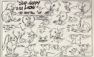
It's like sculpting your drawings.

Step 1-draw the form of your character first - a sphere, or a cranium or whatever the form looks like.

Step 2- Draw center lines through the form both vertically and horizontally-
wrap those lines around the form in the right place. Don't draw straight lines!
right through the center! Not to the side - be logical! DRAW SLOW AND CAREFULLY TO GET IT TO LOOK RIGHT.

WHAT ARE THE CENTER LINES FOR??
They are guide lines. We call them construction lines.
They help you place the features on the forms in the right place.
Place the eyes on either side of the line in the middle of the face.
This sounds so simple that you probably think-what's so hard about that??
CENTER LINES-DON'T CHEAT!- A lot of cartoonists see constructed drawings on cartoon "model-sheets" and think "Oh, I see a cartoon drawing has all these extra lines crawling all over them.
Then they draw their cartoon picture and after it's finished add the center lines on top of the drawing.
Thus, everything is in the wrong place.
Use your principles as tools to help you draw more sensibly.

Look at how great old model sheets were:
http://klangley.blogspot.com/2006/04/more-tex-avery-model-sheets.html
I know you want to be this good.
Start practicing drawing the right way and maybe some day you can work for me!

Go Here for more of the rare original Preston Blair book:
http://www.animationarchive.org/2006/05/media-preston-blairs-animation-first.html
the original copy of the Preston Blair book was
provided to the ASIFA Archive by famous cartoon historian Jerry Beck of
Cartoon Brew.
http://cartoonbrew.com/

Thursday, May 04, 2006

Beautiful People 18 -

Can anyone tell me what they do for a living?If only humans were as cute as Mickey. These come close.
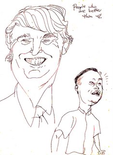
Here's someone below who has so many things wrong with him that it's hard to make it look like him. Imagine being this f-cked-up and still having girls toss their underpants at you.
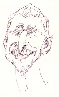
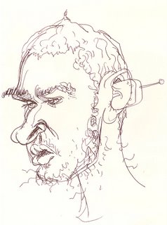
Here he is again. I did this one for a science textbook about evolution. They needed a depiction of the missing link.
Don't forget-if you want me to draw your perfect head, or something else...

write me at Cartoonmister@aol.com
Orders are pouring in!
(it costs money-but it's a good deal)

Tuesday, May 02, 2006

Design Appeal- Mickey Mouse Club - Cute and Wonderful Mickey

YOUNG CARTOONISTS PAY ATTENTION!
I'M GONNA HELP YOU BECOME GOOD...
Thanks to Marc Deckter for the frame grabs! There are more below:
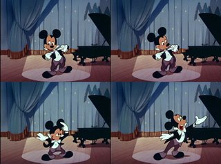
http://duck-walk.blogspot.com/2006/05/em-eye-seekay-ee-why-em-oh-you-ess-ee.html
When I was a kid, I was mesmerized by Disney cartoons-by how cute and appealing they looked and by how smooth and magical the movements were. My only complaint about Disney was there wasn't enough of it on TV.
I used to watch the Wonderful World of Disney every Sunday night and The Mickey Mouse Club every weekday. The shows were really frustrating because they were mostly vile live action. It was like they would just put enough cartoons in the shows to lure the kids in so that they could trick you into watching the amateur live action stuff.
My favorite part about the Mickey Mouse Club was the new animation-it looked different than the classic shorts-it was stylish and modern. The characters weren't just pears and sausages, they were pears and sausages with corners on them. This is different from what we have today. Now we have just the corners, but the nutritional parts have been thrown out.
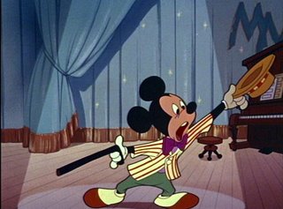
Anyway look how Goddamn cute Mickey is in these great openings. When they talk about the importance of "appeal" in the Disney books, this is it in its highest form.
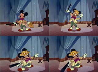
Mickey not only looks great in his design-he has all the fundamental principles of good animation drawing to back up the slick and stylish finish.
Solid construction.
Line of action.
Clean silhouettes
Perspective.
Squash and Stretch.
Asymmetry.
Organic forms.
http://johnkstuff.blogspot.com/2006/03/you-better-learn-to-love-classic.html
Disney animators were great at all the fundamental principles of animation and that's where it should all start! Without fundamentals, you really limit what you can do from an entertainment point of view.
You should see this stuff animate-look at the nice perspective on Mickey's cane-it really is effective in motion.
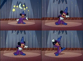
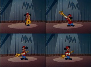
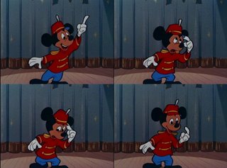
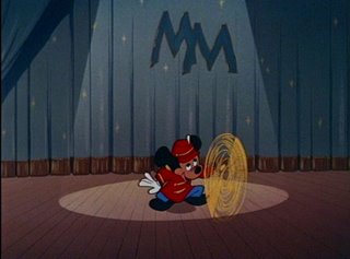

It's also cool that each animator-even though he followed the basic 1955 model of Mickey, still ddrew him slightly different.
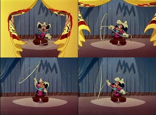
This is my favorite of all the openings-the cowboy sequence. The way Mickey twirls his lasso while jumping through the hoops is amazing. What skill these animators had!
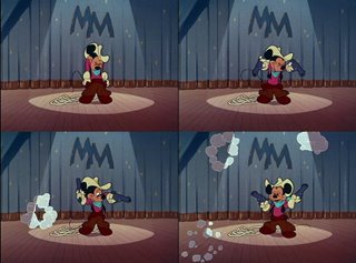
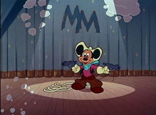

****TIP to Young Cartoonists!****
If you wanna learn how to draw for animation, copy these poses as exactly as you can-then go and copy the other great cartoon poses from classic cartoons all over my blog. If you do this a lot-and I mean a lot...you will absorb the principles I talked about above.
Get the Preston Blair book too and he explains how the principles work!
But start copying now and maybe someday you will be able to work for me (or any other real cartoonist).

In fact go buy the DVD collection of the color Mickeys and copy from all the cartoons on there!
http://www.amazon.com/gp/product/B0000BWVAF/qid=1146608716/sr=8-3/ref=pd_bbs_3/002-0978918-1199251?%5Fencoding=UTF8&v=glance&n=130

WANNA LEARN TO INK? Ask Katie: http://funnycute.blogspot.com/2006/05/inking_01.html


View My Stats
web page visitor counters
Travelocity Travel Coupons