Send As SMS

Sunday, April 30, 2006

What Do Cartoon Directors Do Anyway? Ask Bob and Tex
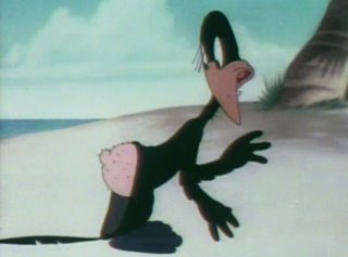
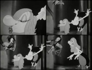
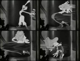

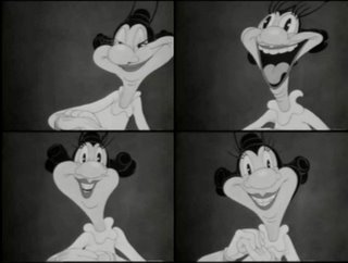
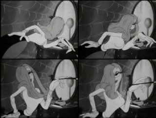
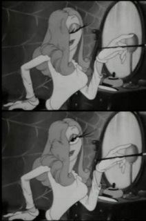
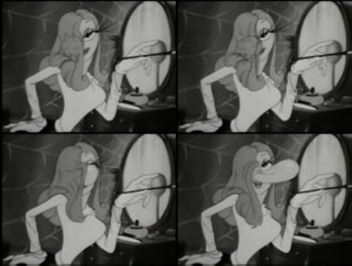
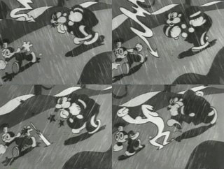
People have asked me many times what a cartoon director does. They understand what an animator does or a storyboard artist does, but it's sort of vague in most minds what a director does, so I'm gonna help you out with a controlled experiment that happened at the Leon Schlesinger studio in 1942.
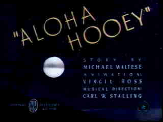
This was the last year that Tex Avery worked at Looney Tunes. He left for MGM and went on to make his best cartoons. He had just spent the last 7 years or so at Warners directing some of the greatest talents in animation history.
He directed Chuck Jones, Bob Clampett, Bobe Cannon and Virgil Ross in 1935 to 1937 and later directed Bob McKimson and Rod Scribner-the most skilled and talented animators ever at Warner Bros.
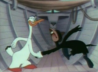
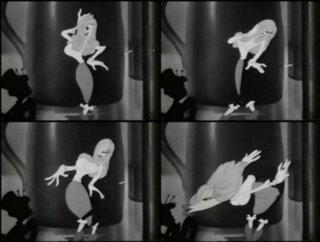
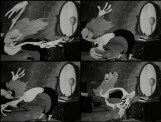
This cartoon above, Aloha Hooey is the last Tex Avery cartoon to be released by Warner Bros. Scribner, McKimson, Virgil Ross and other top animators worked on the cartoon.
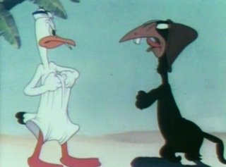
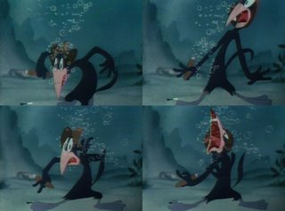
Below is a great Rod Scribner scene from Aloha Hooey (watch the acting in it too!):
After Tex left, Bob Clampett - who had been directing the youngest animation unit at Warners for the last 5 years got promoted to directing Tex' unit-the top unit at Warners.

Bob told me how exciting this was. He said he always had all these great ideas he wanted to try to animate in his cartoons, but his younger animators were not quite ready to do some of them-even though they were all really good and had already made many classics with Bob - including Daffy Doc, Porky In Egypt, Porky and Daffy, Porky's Party, Henpecked Duck and Polar Pals. These guys were all in their early 20s when they made this stuff!

So now that Bob was working with the top animators in the whole studio, he got to try some new things.
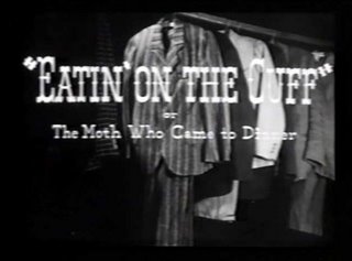
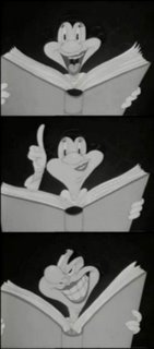
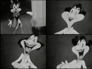
Eatin' On The Cuff was made by Clampett shortly after Tex made Aloha Hooey. These cartoons were animated by the same people and both cartoons were one-shots so that's why this comparison makes a nice controlled experiment. It allows you to see what exactly the two different directors would do under the same circumstances.

Watch the cartoons and see if you can tell what's different about the cartoons and that will help you understand what a director does.

The one other factor that's different about the cartoons: Tex had been working with this crew for years and knew their abilities well. Bob was directing them for the first time.
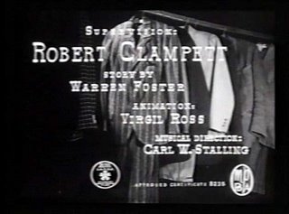
Here's some hints of things to look for:
timing
wild action
facial expressions
gags
staging
Looney quotient

Aloha Hooey by Tex Avery 1942


Eatin' On The Cuff by Bob Clampett 1942


Both directors went on to evolve and create more and more inventive and funny cartoons for years, but these two pictures are particularly interesting historically.

By the way,

Dave Mackay has a great site-that's where I get the dates and credits for all these cartoons-go check it out and see what everyone at Warmner's was doing and when and you too can trace where styles and ideas came from!
http://www.davemackey.com/animation/wb/1942.html
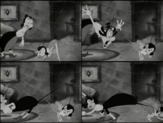
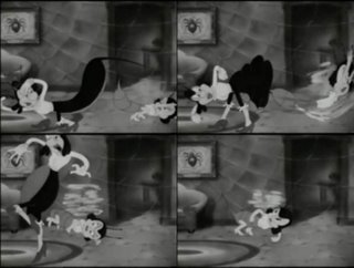
Mark Deckter provided all these great images. Go here for more! And thank him! Be polite now...He did a lot of work for you.
http://duck-walk.blogspot.com/2006/04/funny-birds.html
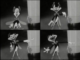
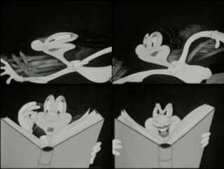
Saturday, April 29, 2006

Unbelievably Great Shit!

Hey pals, check out this crazy cartoony action!

Be here Sunday night for me to tell you all about it and give you a short quiz to see how sharp your eye is.

Thanks to Marc Deckter for the images!


Thursday, April 27, 2006

Rubber Hose c - Fleischer VS Disney


These cartoons were made within a year of each other.
One of them is more fun, crazy and imaginative.


http://www.animationarchive.org/2005/11/filmography-swing-you-sinners.html
you decide!


Hey! If you wanna hear all about the early days of cartoons from Friz Freleng, and Hanna and Barbera, go to this interview I did with them in 1992. You won't believe what these guys have to say about everything past and present! If you think I'm crabby...


http://www.animationarchive.org/2006/04/biography-john-k-interviews-bill-joe.html#comments

Steve Worth
has done an amazing job of illustrating and editing the interviews. If you love classic cartoons, you don't wanna miss this!
PLEASE! Everybody post a comment and let Steve know what a great job he's doing with the animation archive. There's already more info there than in all the animation books ever written-and he's only got started!


Wednesday, April 26, 2006

2 Types of cartoonists-Origin of styles 2 -Rubber Hose animation part B


SPECIFIC VERSUS GENERIC RUBBER HOSE CARTOONS

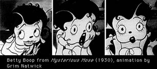
A very specific rubber hose character created by Grim Natwick-the best of the era.

I used to not like rubber hose cartoons because I thought they were primitive, and in some technical senses they are, compared to what the same animators did in the 1940s.

They didn't have color, lines of action, construction, everyone tended to move the same, not much characterization...etc.

This was true for most of the studios in the early 30s, but one studio more than made up for all these early limitations-The Fleischers'.

One of the best scenes ever in cartoons-from Barnacle Bill
The cartoons they made from 1929 to 1933 were so creative and so resisitant to formula and rules that they stand to this day as some of the most creative and fun cartoons ever made.

Fleischer character-ugly but funny (from Snow White)


By contrast the Disney cartoons of the same period are extremely generic, bland and boring.
Disney himself was such a conservative guy in his tastes that while he kept advancing technical skill, he resisted imagination and creativity.


I honestly don't know how he survived to the mid 30s with the cartoons he was making in the early 30s.

His characters are all pretty much circles and hoses and made up of mathematical proportions.

The Fleischers had a much wider range of character designs and they were hip and they used the biggest jazz stars of the day to do much of their music. Plus they were bawdy and honest. They liked dirty jokes -even rape jokes! They liked funny stuff and surrealism and wanted to please their audience.
Look. somehow the Fleischers can make circles look funny!


Fleischer Crowd Scenes

Disney was always a square.

The Fleischers, interestingly were in New York in the early days, along with Van Beuren and Terrytoons. All these studios early on followed their own whims and weren't swept along by the Disney influence that dominated the Hollywood cartoon studios. Not till later and that was their downfall.


Disney had a very different idea of what quality meant than most cartoonists had or have in thier natural state.

To Disney, "more" meant "better". He was going to make his cartoons have more characters, more details in the backgrounds, more colors, more more more.
4 symmetrical Cannibals drawn exactly the same is 8x funnier than 1/2 of one

Anybody have a frame grab of a hugely elaborate scene from an early Disney cartoon I can use as an illustration?

Disney was kind of an average guy except for his ambition. Most regular folk will look at a highly detailed drawing full of cross-hatching or lots of tiny smooth brush strokes and be impressed. "Wow, that painting looks like a photo! Now that's talent!" That's how Disney thought. Disney himself was a cartoonist but not a very good one.

He was also a guy who loved rules and formulas. He wanted everything to be controlled and symmetrical. He needed reasons for everything. Where rules didn't exist, he and his artists invented them. There's a whole book documenting this called "The Illusion Of Life" written by 2 of his animators, Frank Thomas and Ollie Johnston. It actually brags about how the studio took the cartooniness out of cartoons.


Rare instance of a funny drawing in a Disney Cartoon
Walt must have been on vacation when this scene was animated!


A regular cartoonist wants to have skills but also wants to break rules. In New York, Disney's influence took longer to grab hold and for the decade Fleischer continued to make fun and imaginative and stylish cartoons from 1929 to 1933 with Betty Boop and Talkartoons and from 1933 to about 1940 with Popeye cartoons.

Popeye funny and kinda gross and full of personality

In Hollywood most of the cartoon studios of the early 30s copied Disney's blandness. In fact many of the studios were founded by Disney animators.
Ub Iwerks-who was Disney's top animator in the early days started his own studio and managed to make some fun stuff.

Harman and Ising founded Looney Tunes and Merrie Melodies and introduced Bosko and the first talking cartoon. Interestingly, the first few Boskos were very creative, bawdy, funny and had a variety of drawing styles in them, but soon they became standardized and one was drawn about the same as the last.

Disney started the idea that each animator should draw the characters the same way and it became harder to tell one animator from the next. I think this was a huge setback for cartoons, because many animators have strong individual styles and if encouraged to showcase them can add a lot of fun and entertainment to the cartoons. Many later Disney animators were cast according to the way they move things but were still made to keep the characters as "on-model" or generic as they could.

Luckily Tex Avery and Bob Clampett soon took over the creative direction of the Looney Tunes studio. They saved it from being just another bland Disney clone. Most of the other studios tried to become fake Disneys- while dying in the process.

SOME BASIC CARTOON LOGIC OF THE 30S
Whether bland or boring or thrilling and creative all 30s cartoons shared some fundamental good things.
Number 1: all the animators timed their work to music. At first they did it very mechanically-right to the beat, but as they got better their timing became more sophisticated and by the 40s, even non-musical cartoons have an invisible meter going all the time and this automatically makes the cartoons feel good.

http://www.animationarchive.org/2006/04/filmography-al-falfas-prize-package.html

The rubber hose style and the moving to the beats was the greatest way for animators to learn. Drawing simple shapes allowed the animators to learn the fundamental principles of movement without being bogged down with all the time it takes to draw useless details. Doing this to music gave them a great sense of timing. Doing it without a lot of control from non-cartoonists allowed the process of inventing animated cartoons to happen naturally through trial and error. It caused the techniques and the art of animation to grow at the fastest rate of any artform in history.

From 1928 to 1940 the medium went from stick figures to the greatest cartoons ever made. Through the 40s the momentum slowed down a bit but continued in a forward direction. The 50s started a decline.
In the 60s cartoons crashed, non-cartoonists stole the medium from us and we have never again been able to get back on a forward moving path for any prolonged period of time.

The advances in technical aspects of animation through the late 30s brought with it an unfortunate by-product. Many of the animators-especially Disney- wanted to leave behind the best attributes of the early cartoons.

There was one cartoon director of the 40s that really preserved the good points of the rubber hose cartoons while taking advantage of all the advances in cartoon techniques. Bob Clampett.

He continued making his cartoons to music and did it better than anyone from the late 30s till today. He kept the silly, surreal impossible cartooniness of the earliest cartoons and added the squash and stretch, line of action and pear shapes that developed at Disney and on top of all that, he added strong and specific personality to the characters.

Warner Bros. pioneered the idea of cartoons having the director's individual personality stamped onto them. Clampett took it a step further by giving each of the characters a living breathing presence. He added the personality and supreme performances.

More on the 40s later.
Thanks to Max and Clarke and especially Marc for helping me out!

2 Types of cartoonists-Origin of styles 2 -Rubber Hose animation


If you didn't read the first article on this subject, you might want to start here:

http://johnkstuff.blogspot.com/2006/04/2-types-of-cartoonists-origin-of.html

BALLS AND TUBES BECOME RUBBER HOSE
The beginnings of production line cartoons were really spinoffs of the comic strip-in particular, the cartoony style of comics-the balls and tubes style of unrealistic comic strips.

http://www.animationarchive.org/2006/04/media-cliff-sterretts-polly-and-her.html

In fact the earliest animated cartoons were drawn by comic strip artists.
In the 1920s Paul Terry was the main developer of this style. Many other young animators looked up to him and his techniques-especially Walt Disney.
I'm not an expert in all the details of the very early period of animated cartoons. Look to Mark Kausler, Steve Worth and Jerry Beck if you are interested in learning more!
Here's how to find Jerry (look on the left side and scroll down to "classic shorts" and click whatever studio you want to learn about:
http://www.cartoonresearch.com/

These early cartoons are even simpler in design than the comic strips that spawned them. There is a good reason for this. A comic strip artist only has to draw 4 panels a day. An animator in those days had to do between 12 and 24 drawings for every second of film!
Animation from the 20s to the early 50s was both very logical -and at the same time the most creative time in animation history. Why? For a very simple reason: Animators and Cartoonists invented it and developed it, and at a time when Western civilization believed that the practicioners of a profession were the ones best suited to create, develop and grow the business. And that they did. This is the complete opposite of how things are done in the modern corporate and mystical west today. Nothing is logical. Common sense is a thing of the past.

20S CARTOONS
During the 20s the style of animated cartoons started to slowly diverge from the style of still cartoons and comics. The mere act of having to move drawings makes you learn things you might never have to even think about when you draw still drawings. As good and creative as many of the comics were, they were generally very stiff. The poses were unnatural and a kind of picture shorthand. Walk poses didn't flow or have weight. Characters were only drawn from 3 angles-front, side and 3/4 and in most comics, the characters didn't even open their mouths to talk! It seems that comic strip artists never even thought to have a character do what seems so obvious to an animator-to open your mouth to speak. The few that did, just barely opened the mouths and the shape of the mouth didn't describe any particular phonetic sound.

In my opinion, the animated cartoon really exploded with creativity in the late 20s and all through the 30s-once sound was added to the moving pictures.

SOUND CARTOONS-MOVING TO THE BEAT
With Steamboat Willie the sound cartoon era officially started. It wasn't the first sound cartoon, but the first to cause a sensation. What was special about it? Not much. Except one really important thing: The whole damn cartoon was synchronized to music!

This simple innovation was so magic and appealing that it caught on and soon everyone was doing it. And doing it better and better.


ANIMATED CARTOON THE HIGHEST FORM OF ART
For some reason it seemed so natural and logical to all the animators at every studio, that moving your cartoon actions to musical beats became not a creative choice but a fundamental axiom in how to make a correct cartoon. And it is one of the things that made cartoons just about the highest artform in history. It combines the two most pleasurable senses-sight and sound and makes it's goal to make your eyes and ears happy.

This is so logical to me that I can't believe that this simple concept is lost today. Most cartoons today punish your eyes and your ears.

ONE MORE MAGIC INGREDIENT: FUN!
What makes cartoons different than other forms of art? They take art which was meant to pleasure your eyes and distill the pleasure-they take out any cumbersome details that don't lead to immediate satisfaction. Cartoons are candy for the eyes. That was the whole philosophy of early cartoons and I guess was also the reason that they never got serious consideration as an art form-not until they started taking the fun out! UPA is about the first cartoon studio to be taken seriously by a lot of critics-and it's mainly because the cartoons removed the element of fun from them.

In the 20s and 30s the animators experimented with their art and would make the cartoons do impossible things that could never happen in real life.
Why? Because they could. And the audiences loved it. We all love magic. Well, all of us except executives.
Strangely, one particular animation studio of the rubber hose period had conservative forces at work.
More tomorrow...

Hey guys, send me the links to your sites that have rubber hose stuff up and I'll send folks there!

Mark Deckter has some great rubber hose posts here!

Help me do some Rubber Hose crap

SEE DISNEY RUBBER HOSE


OOGLE FLEISCHER RUBBER HOSE


Hey pals,


I have a whole bunch of articles about classic animation history and styles, but I'm stuck for the moment.

I want to do an article about rubber hose animation from 1928-1993 and am having trouble finding artwork or frame grabs to illustrate it.

I'm looking in particular for Disney and Fleischer stuff to compare especially scenes that have a few background characters in them.

If any of you can make frame grabs or have scans of art can you send me links to them? I want to put up the article tonight.

Swing You Sinners-some of the weirdest stuff
The thunder and lightning scene in Barnacle Bill.
Anything fun and weird from Fleischer
Surreal Disney??

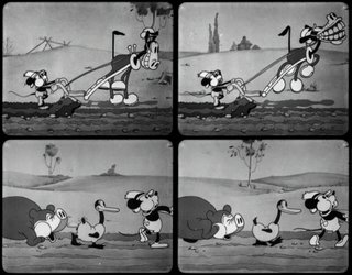
Crowd scenes from Mickey barnyard cartoons and Fleischer cartoons...


Thanks everyone!!

Your pal,

John

Monday, April 24, 2006

Beautiful People 17-


Don't forget-if you want me to draw your perfect head, or something else...


write me at Cartoonmister@aol.com
Orders are pouring in!

My animation 2

The beginning of this scene-Stimpy getting ready to hwarf a hairball was animated by the amazing Lynne Naylor. I did Ren and then in the middle of the scene when Stimpy hwarfs too..and the smacking.


The first scene below-when Ren and Stimpy take was done by Lynne, then the walks and big takes were done by me.


Here's that tail trouble I told you about:


My pal Nico made these clips for us and he has some whacked-out shorts of his own at:

www.happyhourshorts.com
Co check them out!


Big House Blues was animated about half in Los Angeles by Lynne Naylor, me, Jim Smith and Dave Feiss. The other half was animated by Bob Jaques and Kelly Armstrong (maybe others?) at Carbunkle Studios in Vancouver. The Carbunkle folks went on to animate the best of the first and second season's episodes. The style of movement and the techniques they pioneered were carried on by a Korean Studio-Rough Draft- and then by almost all the following Nickelodeon and Cartoon Network series all through the 90s and up to today. You can see their lip synch techniques in the first Dexter's Lab short and then in tons of cartoons afterwards.

They also had to develop a way to get one off model pose to snap into another unrelated pose-this because many of my layout artists were not animators (including me) and didn't flip their drawings correctly. This layout mistake and Carbunkle's animated solution of it is now an established technique that everyone in TV uses-even in Flash cartoons.

Sunday, April 23, 2006

My Animation 1


I'm not much of an animator because I haven't done it enough, but every once in a while I'm forced to do it-either because I can't afford a real animator, or there's a scene that's just so intense and specific that I can't explain it in words to an animator, so I go ahead and do it myself. The problem is, every time I animate a secene, I have to learn all over again by trial and error. I never did come up with any formulas and techniques that I could lean on. I just always custom make the damn scenes.

Like the butt slapping scene above. I just had the whole scene dancing around in my noggin and went ahead and did it.


This scene of Yogi and The Ranger struggling over the gun was a nightmare to animate. It has a million levels and a bunch of combinations of cycles and re-use in it. The sheets are mind-boggling, about 2 pages wide.

I actually had a great animator working on Boo Boo Runs Wild. He's a filipino guy named Anthony Agrusa-maybe I'll put some of his scenes up in a later post. He animated really funny and super smooth dynamic stuff, and last I heard he's been sentenced to working on those prime time animation shows. You know the ones-the ones the huge budgets that have no animation in them.


This scene above is inspired by Ed Love's animation in the early Hanna Barbera cartoons. I'll come back and explain it later, but I'm gonna go to Roscoe's Chicken and Waffles now with the best voice talent in the world-Eric Bauza! Say hi to him in the comments. He reads this stuff every day.


BTW, you can thank Nico for making these clips for me, and there are more to come!

Keep checking back.


Here's the fight scene uncut. This fight is inspired by Ultimate Fighting, my favorite TV show. My friend Todd White has a black belt in Brazilian Jiu Jitsu and he consulted with me for all the actions in the scene. Ranger Smith has Yogi in his "guard position" a standard Jiu Jitsu defense made popular by Royce Gracie and used by all fighters now.

Friday, April 21, 2006

Lost Episodes of Ren and Stimpy - sneak previews 2

The response to the last Lost Episodes clips was so great, that I've decided to tease you some more...


And pre-order the DVDs from Amazon! You can rate it too based on these lovely clips. We picked clips of stuff that we figured you can't get in any other cartoons-hot chicks, cartoon violence and all the things that make for decent human entertainment.
http://www.amazon.com/gp/product/B000F9T700/002-6127252-8652841?v=glance&n=130


You also get this thank you card from me.


Oh, sorry if I can't answer all my myspace comments and requests right away. There are so many, I don't know where to start!
..maybe with cartoonist girls, or rich investors, how's that?
http://www.myspace.com/jkricfalusi


Today, as an added bonus, my friend David has put up the clip of a banned scene from Sven Hoek and his restored version of it. Go thank his ass!
http://www.lyris-lite.net/fu_archives/000360.html

If you missed the last clips I posted click this thing here:
http://johnkstuff.blogspot.com/2006/04/lost-episodes-of-ren-and-stimpy-sneak.html


ANIMATION STUDENTS IN LOS ANGELES AREA!-
LEARN FUN STUFF AS YOU INTERN!

http://www.animationarchive.org/2005/10/volunteer-call-helping-at-archive.html


That's what these guys did. And look at them now!

Wednesday, April 19, 2006

John K. Toys - George and Jimmy


I'm a big toy collector. I have a ton of toys of cartoon characters I loved as a kid-especially the Hanna Barbera characters like The Flintstones.

YAY! IT'S THE WRONG COLORS AND EVERYTHING!

I always dreamed of having toys of my own characters. When Ren and Stimpy hit it big, merchandisers swarmed on Nickelodeon begging for licences of my cute cartoon characters. They then proceeded to make the ugliest Goddamn toys I ever saw. I was shocked!

AAAAAAAAAAAAAAAAAAAARRRRRRRRRGGGGGGGGHHHHH!


In fact most cartoon toys now are hideous, so anyway a few years ago Kevin Kolde and I decided to make our own toys so that they wouldn't look repulsive.

Here's a bunch of them for you to "oogle" as Eddie says.
I'm curious, are any of you toy collectors out there? How much do toys like this go for these days? They are about 16" tall and very huggable.Ask Shera how much George satisfies her every important need!
http://www.sherapix.com/
Jack Black and I were walking around Hollywood one day and he was carrying a Jimmy doll and girls kept running up to him, and after getting over the shock of seeing their favorite star in person then jumped all over the doll wanting to know all about him.

If you saw these buggers in comic stores, would you snap 'em up?

Beautiful People 16

Love every one of us and bring us home to worship.


If you want to buy some original John K. art here's a few nuggets. I can't afford anything under 100 bucks though!

If you want to special commision something-like have me draw your own perfect head or whatever, then email me at cartoonmister@aol
That's an email just for capitalistic transactions, though, not gossip!
and if you don't have a paltry hundred bucks, here's some cheapo fun cartoon merchandise!
http://www.cafepress.com/happytime

Thanks for coming back to my crap over and over again!
You folks are such pals.

Johnny

Monday, April 17, 2006

Lost Episodes of Ren and Stimpy - sneak previews

HEY FOLKS! Make sure you email a link to this post to every person in the world so that they can all see clips from new Ren and Stimpy cartoons!


Here's a scene from Altruists that's just plain silly.

We originally planned to do this scene as a takeoff on Game shows, with the announcer yelling all the prizes to the widow. I was eating breakfast with Eric Bauza and Mike Kerr as we were coming up with gags, and all of a sudden after each time Eric yelled what the prize was, I whispered how much it cost. We died laughing. I don't know why. It makes no sense but we decided to put it in the cartoon, and the more I whispered the more perverted it started to sound.

Buy the DVD and enjoy all the weirdness in the privacy of your own home. Don't forget to close the curtains!

http://www.amazon.com/gp/product/B000F9T700/002-6127252-8652841?v=glance&n=130

I'm gonna post a few clips throughout the day, so keep coming back to check!


That clip is just a sample of the many character based scenes from the new Ren and Stimpys. I like to have scenes in my stories that just kind of invite you in to spy on Ren and Stimpy's private moments-to let you know what they are really like. A bit of voyeurism, you know?

Then when the gross, surreal or outrageous stuff happens, it has more effect because it seems like it's happening to real people - or beasts anyway.

Here's a tender scene just before Stimpy gives birth. BTW,Stimpy's Pregnant is another cartoon first-the first ever live birth in cartoons and the moment will be on screen too, but you'll have to wait till the DVD comes out to see that.


More to come...if you beg me.


INTERESTING MUSICAL FACT ABOUT SPUMCO: If you pay attention to these clips you might notice that the actions go to the music. I got that from Bob Clampett. He told me that since the beginning of sound cartoons, every animator timed everything to musical beats. That way the musician had an easy time scoring the cartoons afterwards.

Clampett though, always wanted to decide on the music BEFORE he started animating, so he would show his storyboards to Carl Stalling who would play the piano as Bob acted out the scenes and they would work out whatever music they both thought would put the gags and story over best.
Stalling wrote the music out on bar sheets, and under the notation Bob would write what actions were happening in the cartoon.

He would then take the timing notes and transfer them to animation exposure sheets, so the animators would animate the scenes to the music.

This makes Clampett's cartoons feel very diferent from the other directors' cartoons. Even his non-musicals are musical.Clampett's cartoons have a swinging upbeat feeling so even during what could merely be exposition scenes, you feel good and just enjoy the ride. Take a look at "Wabbit Twouble" as a great example.

All the other directors wrote their timing to beats, but unless they were actually doing a musical-like Rhapsody in Rivets (Freleng) or Rabbit Of Seville (Jones) they didn't usually know beforehand what the music would be.

Clampett (and this is what I love about him) used every creative tool at his disposal to make our cartoon viewing experience a richer pleasure.

All the new Ren and Stimpys and many of the originals are timed to music before they are ever animated. We pick the music that we think sets the mood and pace for the scenes and then cut our storyboards in an animatic to that music.

PRE-ORDER IT NOW and get this nifty card signed to you!
(well, signed to you after you sign it! It comes with the set)

http://www.amazon.com/gp/product/B000F9T700/002-6127252-8652841?v=glance&n=130

http://www.myspace.com/jkricfalusi

Friday, April 14, 2006

Design 3a - Ed B article from Animation Blast

Amid Amidi was kind enough to let me put up an interview with me about Ed from his world renowned cartoon magazine Animation Blast. (the only animation magazine that's actually about animators!)

Clarke scanned these for you.
The Boo Boo drawings above are not actually by Ed. It's someone at Spumco trying to inbetween Boo Boo's front and side view. Did you ever notice that the views of him look totally different? Does anybody have a copy of the original Ed Boo Boo model that I can put up here?


Go order back issues of Animation Blast. They are loaded with great artwork and articles.
http://www.animationblast.com/inprint/backissues/

Thursday, April 13, 2006

Design 3 - Ed Benedict and Fred Flintstone

Ed Benedict is the greatest!
My favorite cartoon designer of all time is Ed Benedict. He's the guy who created the original Hanna Barbera style of the late 50s and early 60s. You're probably saying to yourself, "I thought John hated flat stuff!" I don't. I hate bad stuff. I hate bland stuff. I hate cheating.

Look how funny these drawings are! These are the first finished models Ed did for the Flinstones. Then HB made him water them down a step before they accepted them for television. Then year by year Hanna Barbera continued to water them down more and more until they finally became ugly, wobbly and bland and unwatchable. They took out all of Ed's charm. God knows why.

Ed taught me how to draw when I was a kid! He didn't know it but he did. I used to sit in front of the TV watching Yogi Bear, Huckleberry Hound, Quick Draw McGraw and The Flintstones with my drawing pads every day and draw as fast as I could.


I memorized the design of every early HB character by the time I was 9 years old.

I also copied the Warner Bros. characters from comic books, and Tom and Jerry (even though I had never seen a Tom and Jerry cartoon!)
and Disney cartoons and anything else on TV or in comics.

But my favorite characters to draw were always Ed's. I just loved the design of the Hanna Barbera cartoons and was aware that they actually HAD design. Most other cartoons were sort of generic-Disney, Warner Bros and MGM-I mean generic in design-they were all made of balls and pears. Hanna Barbera had a real look about it and it fascinated me.

I could also tell all the animators apart just by the way they interpreted Ed's drawings.

I didn't know any of them by name, but I had traits that I knew them by- That's the guy who draws crooked wrists (Carlo Vinci)-there's the guy with the upside down curly mouths (EdLove) etc.

If you want to learn who they are, get on ebay and find the Flintstones Laser Disc Flintstones collection I produced-it's all explained in there and there are music videos Henry Porch cut together for each animator to help you recognize his style

What I like about Ed's style of design is that he does all the things I like about cartoons at once.
I love style. I love interesting design. I love funny. I love cute. And I love character.

There are a lot of talented character designers from the 40s and 50s who have interesting looks-like Tom Oreb, but they create pure designs rather than characters and I want to believe that these magical cartoon creatures are real and have souls.

You can tell just by looking at Ed's designs what the character is like. They aren't just wallpaper.

I'm gonna post Barney next. The first models of him are hilarious. He's real retarded looking, like a cartoon writer! (except nice)

Hey there's a couple great Golden Books painted by Mel Crawford that are actually drawn in Ed's style with poses right from these early models!

Clarke Snyde has all the pages from "Pebbles Flintstone" - my all time favorite Golden Book. I went INSANE when I discovered this book at 10 years old. Mel Crawford is another fantastic cartoonist/illustrator/painter.
Go check it out. It's so fun!

http://inspiration-grab-bag.blogspot.com/2006/03/mel-crawford-pebbles-flintstone-1963.html


Ed's style may look simple but don't be fooled. The guy is a real artist and can draw like an old time illustrator and in many styles.
His cartoons look so great because he has strong fundamentals behind them.
I'll talk more about him when I post the Barney models.


Here's a real treat below, some practice designs as Ed was trying to figure out the look he wanted for The Flintstones.

Ed is one of my all time heroes-a true cartoon genius!

I have lots more of his stuff but it's all xeroxes and in the custody of Asifa's archive right now. Beg Steve over there to start putting some stuff up!
http://www.animationarchive.org/
Oh and he also has tapes of me interviewing Ed. Ed is hilarious! He's nothing like what you would expect from his drawing style.

In case you didn't know, Ed is also the guy who designed and layed out the stylish Tex Avery cartoons from the 50s-like this great one!


http://inspiration-grab-bag.blogspot.com/2006/03/deputy-droopy-1955-mgm.html

Wednesday, April 12, 2006

2 Types of Cartoonists - Origin of styles


There are 2 basic types of cartoonists, each exemplified by the illustrations above.
The one on the left is by T.S. Sullivant, the one on the right by Milt Gross.


Almost every cartoonist since the early days has a style based on a variation of one of these, or some combination of the 2.

CARICATURE or CONSERVATIVE CARTOONS
T.S. Sullivant represents the kind of cartooning that is based on interpreting real life. His style is caricature. He keenly observes what things really look like and then changes their proportions to create a funny version of life. His animals have anatomy. His scenes follow the rules of perspective.
This I would call the conservative cartoon approach, because he is not creating anything from scratch and has strict rules and disciplines based on actual observations in nature that he adheres to.
I love and envy highly skilled conservative art.
http://duck-walk.blogspot.com/2006/04/ts-sullivant.html
http://images.google.com/images?q=t.s.%20sullivant&hl=en&hs=9fW&lr=&client=opera&rls=en&sa=N&tab=wi

Animation cartoonists that lean towards the conservative representational style are Chuck Jones, Milt Kahl and Ken Anderson.


CARTOONY or RADICAL CARTOONS
Milt Gross is the opposite of conservative. He is radically creative. His drawings are made by design and invention and don't represent what things actually look like. He defies anatomy and perspective and just arranges all his elements purely upon what is pleasing to the eye. He is a master creator and designer.
http://www.bugpowder.com/andy/e.gross.html
http://inspiration-grab-bag.blogspot.com/2006/02/milt-gross-newspaper-comics-1928-32.html
Bob Clampett, Tex Avery, Jim Tyre and the Fleischers are animators that lean towards the more cartoony and wacky style.


EARLY COMIC STRIPS
Most early cartoon art followed the conservative approach, but somewhere near the end of the 19th century pure cartoons were invented, or maybe they evolved from caricature. I need a comic strip historian to help me here.

Some early comic strips, like the Katzenjammer Kids and Mutt and Jeff are pure cartoons, in that the characters are made of balls and tubes and simple, non-anatomical shapes.
http://www.bugpowder.com/andy/e.sterrett-all.html

Here's a nice page from Cliff Sterret who falls mostly in the cartoony/designy school of cartoonists.

Look how cool the cat is!

Note how it looks nothing like an actual cat. This is an important point!

I'll talk a lot about that in more articles.
http://www.coconino-world.com/modules/sterret/polly_tm/cvpolly.htm


Other comic strips like The Yellow Kid or Little Nemo are more representational like Sullivant's work.


Some strips, like The Kin-Der-Kids by Lionel Feininger are a combination of the two, in his case leaning towards the representational style, but with elements of cartoon-abstract design.To see more classic comic stips go to Andy's Early Comics Page:
http://www.bugpowder.com/andy/earlycomics.html


This post is the first in a continuing series about the history, forms and traditions of cartoon styles.

Animated cartoons grew directly out of the rules and styles of comic strips and then developed some new ideas of their own and became what I think of as the most creative art form in history.

Keep abreast of these articles if you want to be able to better grasp why you draw like you do.

Links:
Shane Glines at Cartoon Retro has the most amazing collection of Milt Gross' comic books.

http://www.cartoonretro.com/

Milt Gross' style really evolved over the years.
He's mostly known as a comic strip artist, but in my opinion his best work is in comic books which he did in his later years.

It's really rare for an artist to get better as he ages, but Milt kept improving right up to the end of his life.

Go sign up at Cartoon Retro now to see some of the greatest cartoon art ever!


Here's some interesting Milt Gross, stuff that's earlier and not as designy or wacky as the comic books but still pretty fun.
http://www.animationarchive.org/2006/04/media-milt-gross-cartoon-tour-of-new.html

Thanks to Clarke Snyde for some great links!
Especially this one:
http://inspiration-grab-bag.blogspot.com/

Beautiful People 15 - more perfect folks

WHO ARE WE?


* Sometime today I'm going to post the first in a series of articles all about where cartoon styles come from and how they evolved. I want to turn it into a book, but you will be able to read it here first, chapter by chapter.

If you are a cartoonist and want to understand your heritage and then control your own creative destiny, this is for you.

Monday, April 10, 2006

George Liquor Stories 4 - Heaven and more dirty tales

Well I was a little nervous to post the last stories, seeing as how they dealt with our basest needs- sex and religion, but from all the positive comments, I can see that you're nothing but a bunch of heathens, so here's a couple more tales to sate your pagan lusts.


Action VS God
George Liquor is a God-fearing widower who is saving himself for Heaven. He is totally devoted to his deceased wife Mabel, whose rear end is stuffed and mounted on the wall in his trophy room.

Merle (Sody’s big sister), A vixenish and buxom divorcee from down the street, has the hots for George and tries to seduce him in his own house of purity.
She is gorgeous and extremely tempting, so for the whole cartoon she tries to get him to cheat on his dead wife.
He has to frantically resist his natural urges and it gets harder and harder to do so.
He eventually tears pages out of the bible and sticks them on top of his erogenous zones as Merle corners him against a romantic bear skin wall rug.
George is sweating like mad and it looks like it’s over.

Cut to Heaven:
God is in His office, planning the next universe he will create. He’s deciding on how many billions of galaxies to create from nothing, and which planets will have life, and every exact countless combination of amino acids it will take to create zillions of new life forms to populate his universe, when something more important than all that comes up.

SOMEONE HAS A BONER.

Nothing makes God more furious than when the equipment he designed for man functions.
God’s helper tells him George Liquor is on the phone. God looks down at his phone and sure enough, George’s button is flashing. He picks up and George begs him to save his soul and destroy the accursed symbol of his lust.

God strikes George dead and in his dying gasp he sticks his tongue out at a frustrated Merle.
“I wiiiin!!” gasps George as he succumbs to infinity.


Slumber Party


George Liquor is concerned about the trouble his teenage niece could get into out on the streets at night so he decides to host slumber parties for Janie and her friends. This could be done as a series. Each episode could feature a different activity:

Truth Or Dare:
The girls decide to play truth or dare. They talk about the boys they like. One says she loves Justin Timberloaf. Another loves Coleman from down the street. Judy says, “You know who I think is hot? Your Uncle Georgie!”

“Ewww!” says Janie, whose Uncle is hosting the party for the girls to keep them off the streets and out of trouble.
So they dare Judy to kiss Uncle Georgie and she is scared but also eager to steal some cheap love.
Cut to George asleep in his room, with a solid woodie sticking up under the blanket. It looks like he is having an erotic dream, but we zoom in on his dream cloud to see him out in the woods naked chainsawing trees down and cackling hideously.

The door starts to creep open, casting a sliver of light into the room.
The girls peer their frightened little eyes into the scene. Judy is most frightened. She tries to turn back, but the other girls push her into the room with a pool cue.
She slides in fast and almost falls over onto George. She catches herself and whips around whispering angrily “Cut it out you bitches!”
She looks at George sleeping and gets all doe-eyed. “He’s so manly! Look at his dream!” she mutters.

She summons up her nerve and leans down to plant a sweet kiss on his heaving stubbly lips.
This happens just as in the dream George cuts through a huge tree and the tree crashes down, out of the dream balloon and onto his manhood, crushing it into its unaroused state.
Awake now, he sees his lips kissing Judy’s and jumps up screaming: “Bespoiled by a virgin!!!”
George thinks they are all going to go to Hell unless they do something fast, so he turns the party into a penance party and saves everyone’s souls.

Pajama Swap
The girls decide to try on each other’s pajamas.
What else do I need to say?

Sunday, April 09, 2006

George Liquor Stories 3-fast food, lust and atheists

Here are a few more premises for George Liquor stories!


Fast Food
Slab ‘n’ Ernie convince George to take them to McDonald’s for a treat.
George has never been to a fast food restaurant before and is stunned when he discovers what they call meat there. He pulls out the flimsy dried little burnt grey disk out of the soggy bun and looks through it –“This thing died of old age!!”
He goes crazy with outrage and shows everyone what real meat is and tastes like. There is a cow eating in the restaurant and he takes some slices off the cow and fries them up. Everyone, even the cow, agrees that organic, fresh meat is much better than the crap they pass off as meat in fast food restaurants.

JIMMY IS IN LOVE

1. SET-UP:
Jimmy comes home acting weird. He’s light on his feet, floating around dreamily. He’s in love.
George thinks he’s sick. He feels his forehead for fever.
George puts a thermometer in his mouth.
Sody swings on the gate out in front of George and Jimmy’s house.
Jimmy stares out the window making strange noises.
George understands the problem—Jimmy’s in love.

George leads Jimmy away from the window and tries to talk him out of having contact with women, “What you wanna go hangin’ `round with girls for? They got all that soft crap hangin’ off of `em. You notice that?”

Jimmy imagines Sody’s curves and nods yes.
George: “Women are fags! Afterall, they like to see men naked don’t they?”
Jimmy looks out the window and sees Sody.

2. BODY:
George calls Sody inside.

George has talk with Sody
Finally George realizes it’s no use. Jimmy is at that age.

GEORGE’S ADVICE

George teaches Jimmy the ropes, “When I was a teenager they called me ‘Lover Liquor’”
George turns Mabel’s picture face down.
Toilet seat
GL: “Leave the toilet seat up at her house. It reminds her who’s boss.”
Drive Drunk
“Drive 80-miles-an-hour on the freeway blind drunk. She’ll know you’re a real man.”

Antlers
George puts antlers on Jimmy’s head.
Jimmy Attacks
GL: “Go ahead, mark your territory on that telephone pole over there!”
George’s tip “Beat the crap out of somebody in front of your gal, girls love that.”
Jimmy (wearing antlers) attacks a suave looking boy who is talking to Sody.
3. END: (a secret! You'll have to wait till someone buys this damn show finally.)


The Dirty Atheist
George’s pal Victor Lugnuts has a problem. His son is an atheist. George offers to cure the kid and get him into heaven.
When Eddie the atheist starts asking George unanswerable questions, George sputters and concludes that Eddie is possessed by the “Science Demon” - a monster who goes around planting fossil evidence in the ground and genetic evidence in our bodies. This kind of demon can’t be reasoned with because he cheats by using logic. George performs an exorcism on Eddie and removes the accursed demon.

all kinds of stuff: The George Liquor Program
all kinds of stuff: George Liquor Stories 1
all kinds of stuff: George Liquor Stories 2
The George Liquor Program Spinoffs: 2 Dirty Pussies

Friday, April 07, 2006

THE GODDAMN GEORGE LIQUOR PROGRAM

Thursday, April 06, 2006

Beautiful People 14 -

I wonder what everyone will find to argue about if I don't say anything...?


Barber Shop - the concept of "Organic Drawing"

Here's the rest of the comic.
Some of the drawings are generic. Some are specific expressions and some are very studiously designed.

All the drawings are Organic. The lines that flow around the characters (and the props) flow in a non-mathematical way. The curves aren't bent evenly in the middle. There are lots of "s" curves and even the "s"s are not even. In real life, nothing is even, not flesh, not rocks, not bricks, not grass, nothing. I like to try to capture that in my cartoons by using organic forms and lines.

Organic seems to be really out of fashion. For a couple of reasons.
1) Barely anybody has even heard of the concept these days.
2) Organic forms are much harder to draw than graphic mathematical simple shapes.

The use of Organic shapes and lines are not used in an arbitrary assortment here, either. They have a purpose: to describe what everything is made of and to show what state of tension they are in.

These drawings, while having fairly solid forms underneath are then wrapped in skin and cloth and hair-all three substances which are pliable and in different ways.

In most old cartoons, everything is made of the same substance- "cartoon skin"-clothes, wrinkles, flesh and even hair all act and lay on forms the same way. Look at the Porky Pig clothes wrinkles in the last post. Do they look anything like how wrinkles really work on clothes? Not that I mind. I like old time cartoon skin.

Look at these sexy examples of a door with cartoon skin (and other vital organs) from Bob Clampett's "Kitty Kornered".

http://classiccartoons.blogspot.com/2006/01/100-greatest-cartoons-of-all-times.html

In modern cartoons, most characters not only don't have structures, they don't have wrapping either. It's just a bunch of squares and triangles and circles glued together.

Ugly and uninteresting and too easy.
The end.


BTW, a modern master of organic drawing lives here:
http://funnycute.blogspot.com/

Tuesday, April 04, 2006

Design 2- Style - Chuck Jones' Scaredy Cat


Chuck Jones is one of my favorite cartoonists and a huge influence on me.
I sometimes think of him as two people:
1) The entertainer that made really funny regular folk type cartoons from roughly 1945-1950
2) The stylist/designer who made beautiful effeminate cartoons from 1938-1945, and then again from 1950 to the rest of his life.

As an artist, I like his experimental and artsy cartoons.
As a regular type guy with normal man needs, I like the 1945-1950 period when he made hilarious cartoons like Pest In The House, Long Haired-Hare, Rabbit Punch, My Bunny Lies Over The Sea and one of my all time favorite cartoons, Scaredy Cat.

Jones is in his finest form in this cartoon. You can tell he really thought about it and worked hard. The drawings and poses are all really strong and solid, the acting is great and he uses a lot of imagination in one particular area of the cartoon-Sylvester's takes.

Jones did his best cartoons-at least in my opinion- when he had a good structure figured out for him and he could spend his time concentrating on one main creative aspect of the cartoon.

Mike Maltese wrote Scaredy Cat. It's a very funny idea and a funny story, so that part is well taken care of. Now Jones can concentrate on what I believe he thought was the most important part of the cartoon-Sylvester's reactions-his "takes".


Here's a take (above) that's only on screen for a very few frames. Jones' direction in this cartoon is so masterful and confident that he can draw and time his takes with such clarity and power that he barely leaves them onscreen for you to register them-but you do and it's perfect! Some of the takes-like the one above are arrows that lead your eye to the following scene of the mice doing some ghostly gag. He uses the device throughout the cartoon. Very clever indeed.

Jones was a master at drawing poses that really tell you how the character is feeling, in ways that are hard to describe in words. Look at the funny attitude Sylvester has above and below. These poses aren't arbitrary, they tell you more than one thing at once. Watch the cartoon and come comment and tell me what the poses are telling the audience!


If you remember from my post "Design 1" I said Jones was mainly a stylist but sometimes used his design ability. He didn't often use it to create new types of characters (he did sometimes and I'll post about that later) but he would use it for funny reactions. For most of this cartoon, Porky and Sylvester are pretty much "on-model". Jones always felt he needed a strong reason or excuse to break from model-or create something new.

Sylvester's extreme fear is a really good reason to create some funny new faces. These use Chuck's design abilty.


Go see all the great poses from Scaredy Cat that Duck Dodgers made for us at:
http://classiccartoons.blogspot.com/2006/04/sylvesters-takes-from-scaredy-cat.html


Chuck had an odd habit. Whenever he made an outstanding and original cartoon, he would make it again. Sometimes a million times, like The Road Runner Series. Usually the other versions of the same story don't turn out as good as his first breakthroughs. I'm not sure why. Maybe, once he made something that really worked, he figured he would turn it into a "stock" idea and every time he made it again, it would be easier and faster and cheaper. That way he could spend more time on his next firsts. I have no way of knowing, but his firsts tend to have more life and more elaborate animation and lots more custom poses drawn by Chuck himself.

Here are some frames from Claws For Alarm-a remake of Scaredy Cat. Note how blandly drawn the characters are by comparison with Scaredy Cat. It seems like the main creative part of the cartoon is now in the backgrounds instead of the characters. It is still well drawn and kinda funny, but Chuck (rightly) doesn't seem as inspired to make a cartoon that he's already done.


http://classiccartoons.blogspot.com/2006/04/sylvesters-takes-from-claws-for-alarm.html

Incidentally, have you ever noticed that every other director's Sylvester is funnier and drawn better than Friz'? That's very odd, considering that Sylvester is associated mostly with Freleng.


Friz


Clampett- This is the first Sylvester model drawn by Tom McKimson for Bob Clampett. Below is the best Sylvester cartoon ever: Kitty Kornered


http://classiccartoons.blogspot.com/2006/01/100-greatest-cartoons-of-all-times.html


Robert Mckimson.

Hey, BTW, I just discovered a great site where a fella named Thad tells you how to tell who animated what in classic cartoons. Now you can compare and contrast the styles of all the greats.

Go there for some killer clips and education!
http://classicanimation.blogspot.com/

Monday, April 03, 2006

Beautiful People 13 - Breakthrough? THESE BEAUTIES FOR SALE NOW


If you were here for my first caricature post you might remember I said it takes a while for me to loosen up and get a more extreme caricature of someone?

I think it happened the day I drew these. At least I got a bit more confident with exaggerating.

Think you can figure out who these babies are?


Hey by the way, I'm hooked up with a gallery now to sell my original art and my partner there wants to set some prices, so tell ya what. I'll sell these images here if anyone wants to buy 'em.
Let me know which you want and what you would pay for 'em.
Screw Ebay. We'll do it right here!


Hey go look at my pal Marlo's caricatures. She's much more exaggerated than me. I want her secrets!
http://marlomeekins.blogspot.com/

Sunday, April 02, 2006

Barber Shop 8 -upside down mouth + links to great cartoon art

Here are 3 more pages. We're almost done! What theories do you have?

If you wanna know the secrets of this inking style go to Shane Glines' site and ask him since he did it.
BTW, he has the best cartoon resource site in existence, so if you want to see some art from the last century's greatest cartoonists and illustrators pay him the 5 bucks a month and learn something!

Seriously, the artwork on the site is stunning! Shane is the best friend of cartoonists who want to better themselves.
http://cartoonretro.com/
Here's a couple free samples: There's tons more at Shane's Web Museum!
This is a page from a Milt Gross comic. Milt is the ultimate cartoonist and I will write a post about him later. He was a big inspiration to Bob Clampett and hundreds of other cartoonists and animators too.
Here's an illustration from Earl Oliver Hurst - a great stylist! Go learn about him!

Here's another great site that has lots of animation/cartoon and illustration art!
http://www.animationarchive.org/2006/03/media-winter-2006-illustration-roundup.html


Saturday, April 01, 2006

DESIGN 1 - KATIE and Anime

Check out these exciting new anime influenced Katie designs!
Katie is the only person I know that can take what I would consider a mistake in someone else's style and turn it into an asset.
Although I can coldy admire some aspects of Anime I've never really been into it. I am very impressed by the drawings and animation in Fuly Culy or however that's spelled but it still bores the crap out of me.

An odd stylistic cliche of anime is that the artists tend to spend a lot of time learning the anatomy of bodies. They draw them with sensible physical construction, but then the heads make no sense at all-especially the mouths-the mouth in Japanese cartoons is a magical hole that is not attached to the face or jaw-when it opens and closes it has no effect on the head that it's supposed to be part of.
This strange cliche from an alien culture has influenced even (modern) Disney animation - which for decades prided itself on its solid construction.
Note the model sheet below. Aladdin's mouth is just floating around somewhere near his nose and too close to his jaw.-and its much worse in the movie! (On top of that, the "design" is totally bland and eye numbing.)
Katie somehow takes what would normally be considered a mistake and turns it into a design. She makes it work by interpreting it in her own unique and imaginative way-the way she interprets so many of her millions of observations of the world.
Look how damn cute this design above is. She was actually a bit afraid to show me these drawings because she knew I made fun of Anime mouths, but she has sold me with these new sketches.


Katie is a true designer. There aren't many in the world. It's a gift. Design, in my opinion can't be taught-you either have it or you don't.

I'll tell you what Katie does and why that makes her a designer.

First let me say that design and style are two different concepts that get jumbled together today.
You can have a style and not be a designer. Most designers on the other hand, have styles and more than one.

Style is a slow moving evolving (or devolving) process of artistic flourish.
Design is flashes of inspiration balanced by an eye for aesthetics.

Style is flourish. It's taking an existing design approach and adding slick and fancy details on top of it. Not many artists have their own style even though many think they do.

For example, Chuck Jones is a stylist more than a designer. He did, however have design ability and used it very cleverly now and then. I'll try to post about that soon too, if I can drum up some images to illustrate.

40s Chuck Jones Above
50s Chuck Jones Below
evolution of a style

He is a great stylist. His characters are very basically the design of most 1940s animated cartoons-the same construction style as Tom and Jerry or Preston Blair or Bob McKimson. Everything is made up of pears, spheres and sausages. What makes Chuck's version of this construction approach so appealing are his finishing touches and his infinite small variations of a few simple shapes and lines. He has a unique way of combining angles and curves which basically evolved slowly over many years-but pretty much in a straight path from his style in the late 1930s to his more and more angular and curly-cue style of the 1950s. I'm going to post more about this greatcartoonist next week.

A designer creates new ideas. A stylist does a fancy version of an existing idea.
Ed Benedict is a designer.


Katie is constantly trying out new kinds of shapes and forms and line styles-and colors. Most cartoonists can only draw one eye shape-depending on which type of cartoon he's influenced by.
There's the 60s Disney eye shapes that are used by Don Bluth, Tim Burton and 90% of the kids coming out of Cal Arts. There's the oval eye shape of 30s cartoons. There's the round on the bottom, triangular on top eye shape that Chuck Jones and Bob Clampett did in the 1940s.
There's the perfect circle eyes that Cartoon Network does.

It's very hard to break habits and modern cartoons are tragic victims of especially bad habits and cliches whose origins and reasons for existing have been lost to the ages.

You have to be a really stubborn and radical individual artist to make up new things that don't follow the current trends. To do it and make it very appealing-even though it breaks all the rules, is practically superhuman.

Katie does these things all the time. Naturally. Not on purpose, but but because she can't help it. A designer has a killer eye. She can see things in the world that no one else notices until she interprets them and translates them through her art to make what is obvious to her accessible to you.

How does she do it? I'll tell you what I can figure out.


Katie has her own favorite artists and she picks and chooses which elements of their art she likes and mixes them up in a myriad of ways.

She also looks at the real world-not the world interpreted through Don Bluth or John K. or Cats Don't Dance-but the actual world itself.
Most artists (even really good ones) see the world only through the eyes of the artists they like.

Katie keenly observes real people and then finds things of interest in them and puts them down on paper. She caricatures the way real girls look. In real life everyone looks different. In most cartoons everyone looks almost the same or are just mild variations on a single design theme.

Katie has scrap books she makes of clippings from lots of girl magazines-especially Japanese teen magazines and she copies the poses, expressions, clothing, knee shapes, mouth shapes, hair styles and on and on and on. Everything of interest captures her notice.

There are many cartoonists, even really skilled and stylish ones that draw girls based on the way they've seen other people draw girls in the last decade or so. That's not a bad thing to do, but if you want a chance to be as good or original as Katie, then look at real life and interpret that and add what your own eyeballs see to your own drawing style.

When I cruise around the web, I see lots of young artists that copy Bruce Timm, me, Lynne Naylor, Katie, Don Bluth, Dexter's Lab. My suggestion to all: copy God's designs. He's the most creative designer ever.


Katie also studies other artists' work and learns what they've learned through trial and error-but she doesn't enslave herself to their interpretations-she adds what she sees in real life to her artist influences and mixes all these things up and every week creates new styles, new shapes, new character designs and new joy that everyone else can stare at in awe.

She's probably going to have to hide now because of the big build up I've given her but go and look at her blog to se some more of her latest anime inspired cartoon girls and ask her how she approaches what she does!

http://funnycute.blogspot.com/


This colored character above is a combination of Katie and I working together (and then toned down somewhat for TV consumption). She will do a drawing, then I will do my version of it, hand it back, then she'll do something to it and back and forth. It's a fun way to work. I used to be a designer but have fallen out of practice for lack of new inspiration. Most of my influences are from the 1930s to the 1950s and on my own I have practically exhausted them. Katie is my main modern inspiration. I love all the visual surprises she makes up every week.

We all also trade observations and art theories and influences constantly to stay excited about cartoons, even while the business does everything it can to kill any enthusiasm.


To Sum Up

To be a good designer you have to have these qualities:
God-given design eyeballs that see what mere mortals don't.
Good draftsmanship-you have to be able to draw well-not by cheating.
Lots of influences from assorted great artists who have different styles.
Observations from real life.
The ability to mix them all up in an infinite assortment of variations.
Lucky accidents and the brainpower to seize them and use them on purpose next time.
I'm gonna add one more thing: A sense of cartoony appeal: Look at this cartoon candy below!


What makes cartoon design different than other forms of design? Cartoons should be fun!

For another girl with impressive design and style click this!
http://potatofarmgirl.blogspot.com/


View My Stats
web page visitor counters
Travelocity Travel Coupons