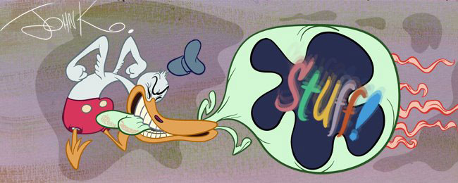
Some of the drawings are generic. Some are specific expressions and some are very studiously designed.
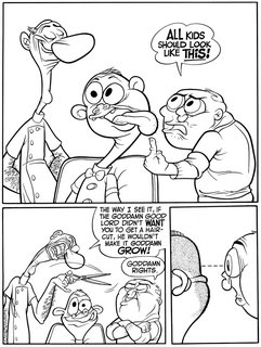
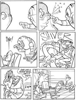
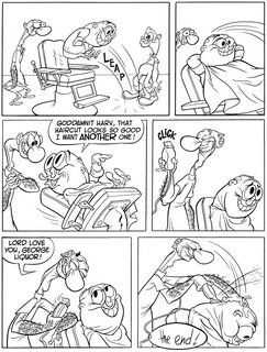 All the drawings are Organic. The lines that flow around the characters (and the props) flow in a non-mathematical way. The curves aren't bent evenly in the middle. There are lots of "s" curves and even the "s"s are not even. In real life, nothing is even, not flesh, not rocks, not bricks, not grass, nothing. I like to try to capture that in my cartoons by using organic forms and lines.
Organic seems to be really out of fashion. For a couple of reasons.
1) Barely anybody has even heard of the concept these days.
2) Organic forms are much harder to draw than graphic mathematical simple shapes.
The use of Organic shapes and lines are not used in an arbitrary assortment here, either. They have a purpose: to describe what everything is made of and to show what state of tension they are in.
These drawings, while having fairly solid forms underneath are then wrapped in skin and cloth and hair-all three substances which are pliable and in different ways.
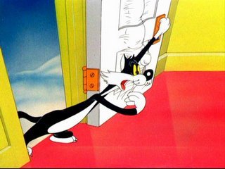
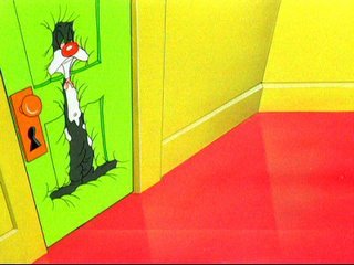
In most old cartoons, everything is made of the same substance- "cartoon skin"-clothes, wrinkles, flesh and even hair all act and lay on forms the same way. Look at the Porky Pig clothes wrinkles in the last post. Do they look anything like how wrinkles really work on clothes? Not that I mind. I like old time cartoon skin.
Look at these sexy examples of a door with cartoon skin (and other vital organs) from Bob Clampett's "Kitty Kornered".
 http://classiccartoons.blogspot.com/2006/01/100-greatest-cartoons-of-all-times.html
In modern cartoons, most characters not only don't have structures, they don't have wrapping either. It's just a bunch of squares and triangles and circles glued together.
Ugly and uninteresting and too easy.
The end.
BTW, a modern master of organic drawing lives here:
http://funnycute.blogspot.com/
