Thursday, March 30, 2006

Beautiful People 12 and Lovable Ducks


Hey look at more Rod Scribner crazy Daffy Duck faces from the Great Piggy Bank Robbery!
Andrea put a new scene up on his killer site-go there and see the rest! Then search for Gruesome Twosome on his site too.

Make sure you comment and thank the rascal for doing this for everybody! He's your pal.


http://classiccartoons.blogspot.com/


I can't think of any controversy to stir up today so you'll have to satisfy yourself with envying the natural beauty of these great stars.


I gotta run down to a TV Land shoot-it's about the most popular catch phrases on TV in the last few years I think...

I'll find some crap later to stir up the pot again.

Buy some shirts and underpants!
http://www.cafepress.com/happytime

Sunday, March 26, 2006

Barber Shop 7 -readability

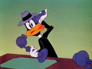
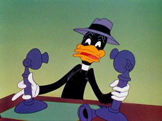
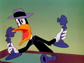
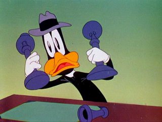
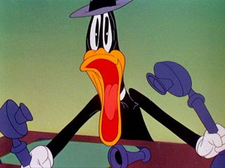
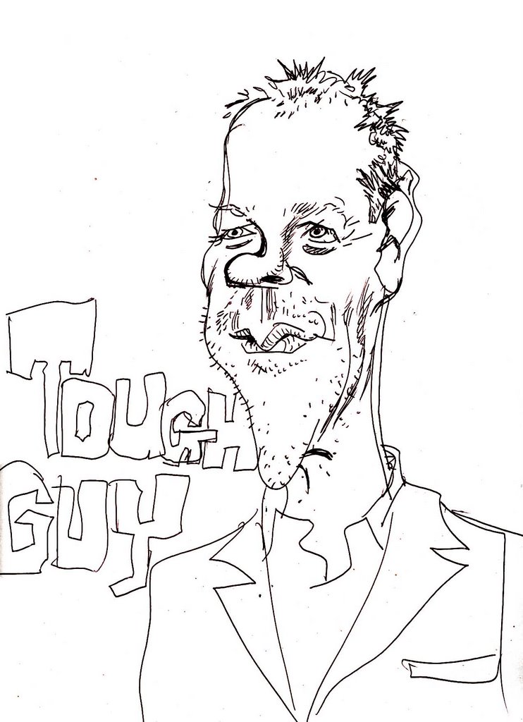
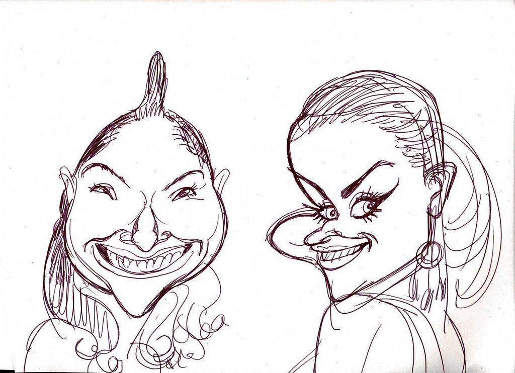
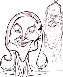
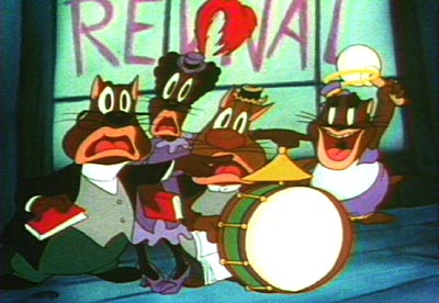
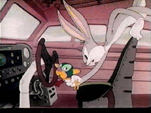
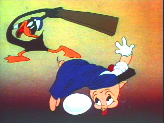
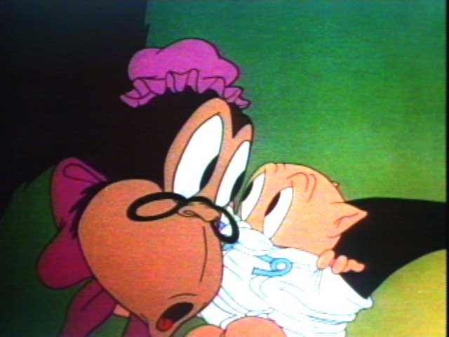
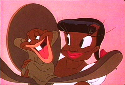
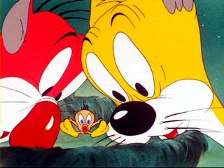
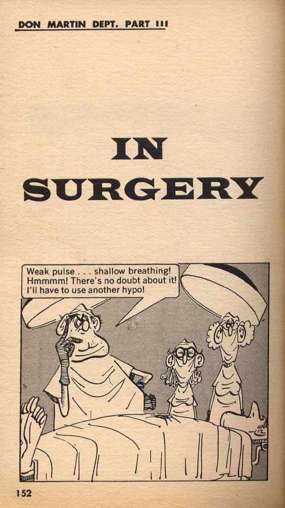
Hey go ahead and read the funnies and then I'll give you some bull afterwards.


OK, well I don't know how amused (if at all) you were but I'm going to tell you some other principles of good drawing and storytelling that have to do with readabilty.

By readability I mean how easy (or hard) it is to see the pictures and how well they draw you to the important points of the scene.
If you are already a pro, you probably know all these concepts, so I'm really just offering this stuff to young artists who could use some tools to help drive their ideas home.

Readabilty is made up of these tools:
Staging
Where you place your characters, BG and props within the panel (or screen if it's a movie).
I like to use simple staging and I usually focus on the characters.
I see some modern comics and shows that have complicated or cluttered images that make it hard for you to see in an instant what is going on.
I don't believe in filling the panel or screen with wall to wall detail. It makes your images and story hard to read.
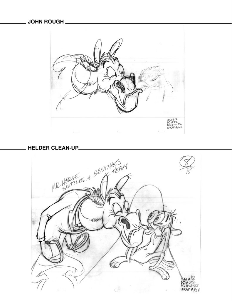
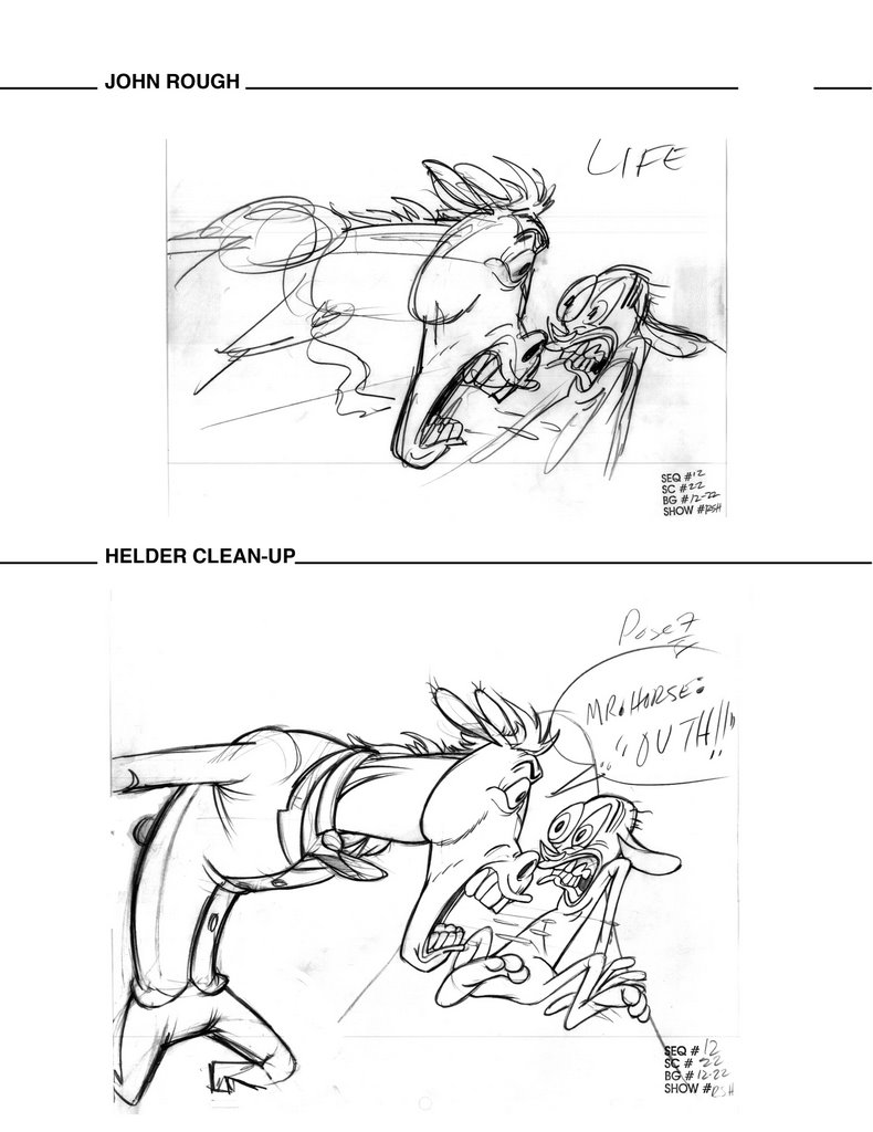
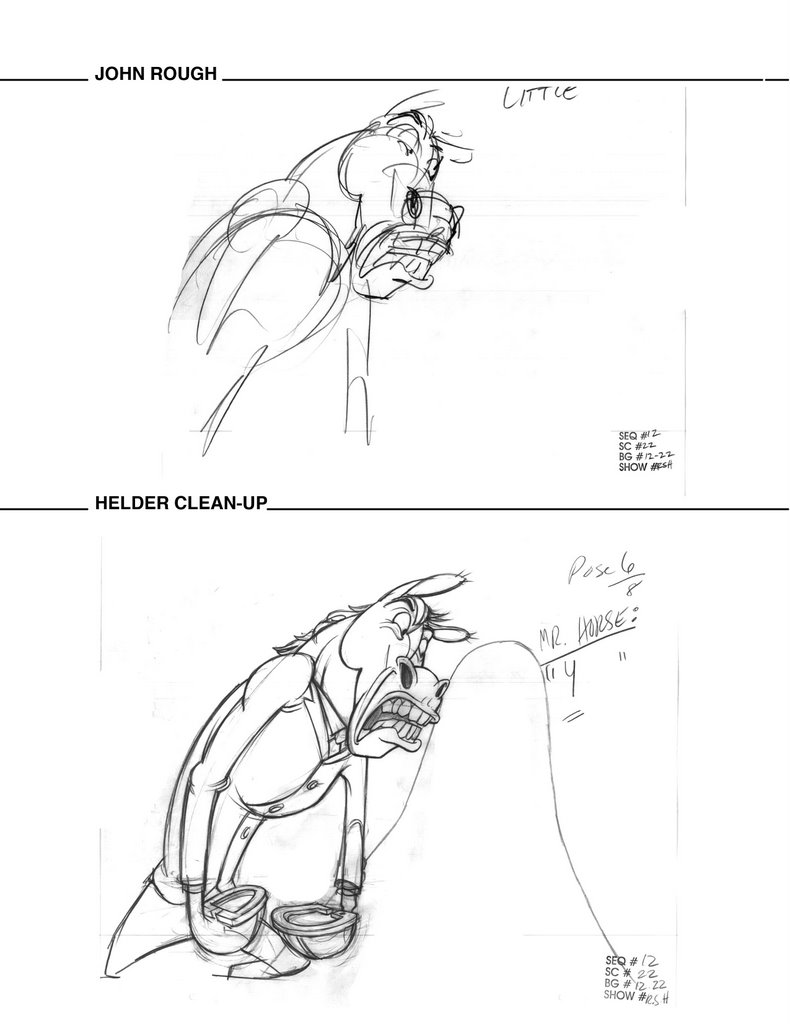
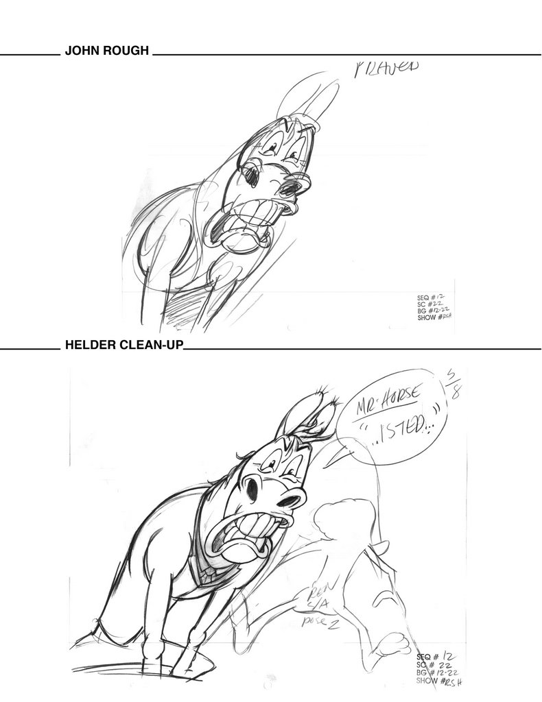
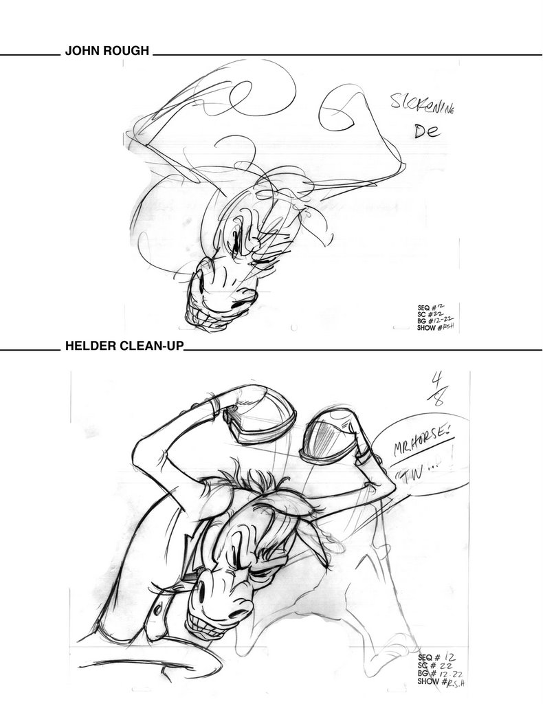
Sillhouettes and negative shapes
The characters in this comic have more details than in my cartoons because we don't have to draw as many drawings for a comic as we do for animation. We can spend more time on each drawing in a comic.
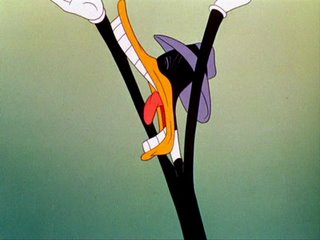
Details can be dangerous if not carefully placed or if your characters don't have clear sillhouettes.
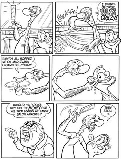
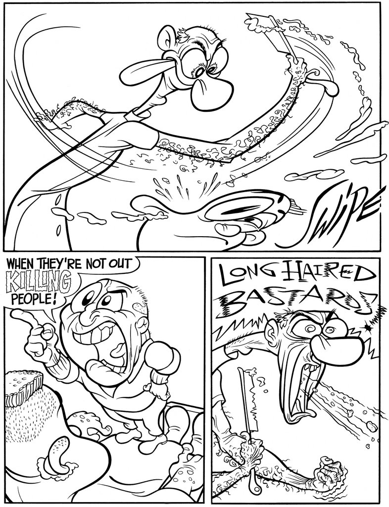
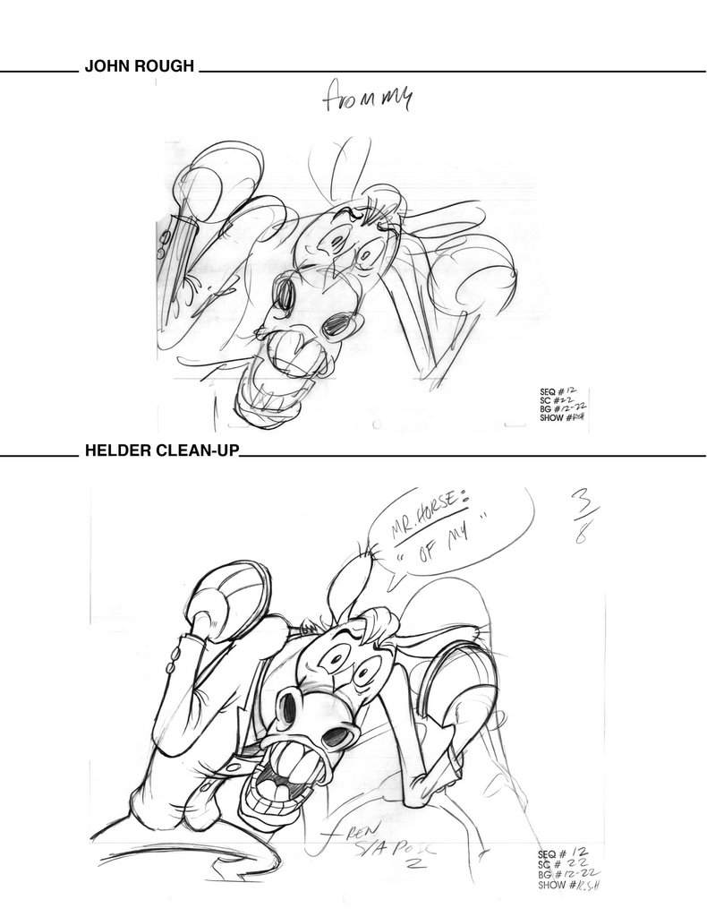
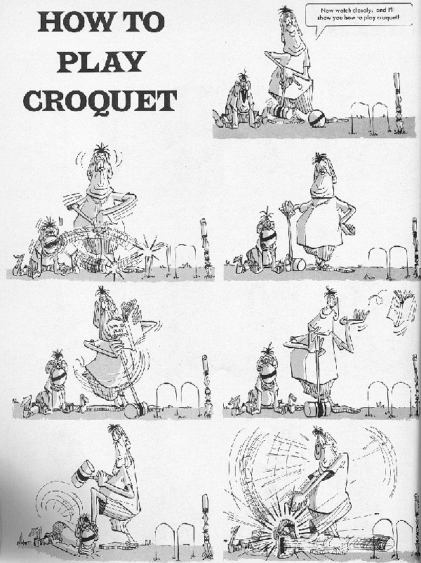
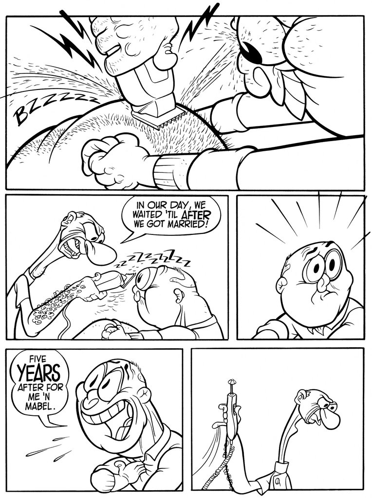
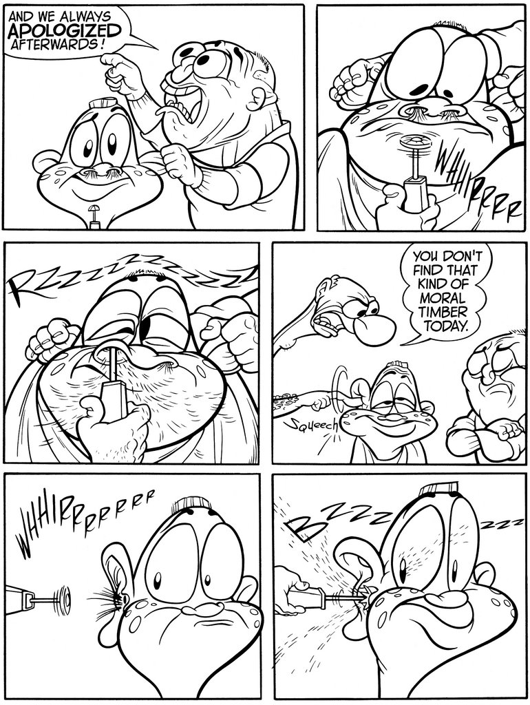
Look at the panel 1 on page 1. The barber is holding up his razor. It reads because there is a big space all around the blade. His whole body reads becausem it is a simple sillhouette. There is almost a tangent where his little finger hovers above the mirror's border. Had I noticed, I might have moved his hand up a bit more to clear the border better.
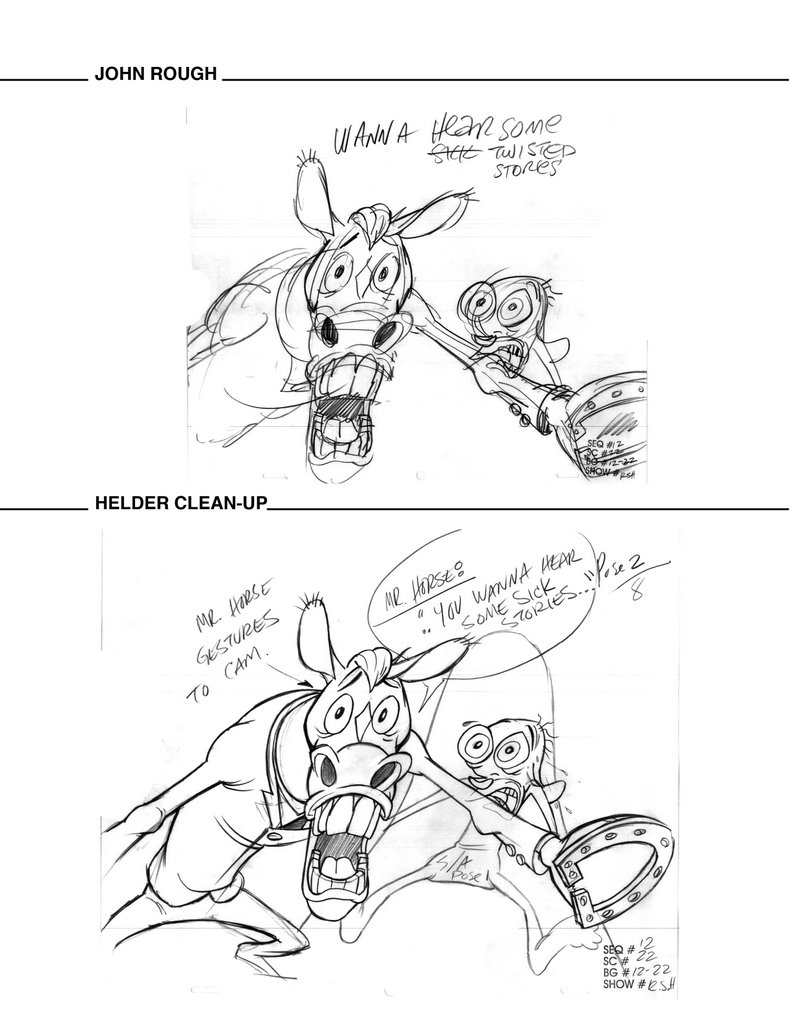
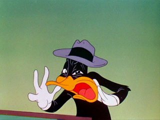
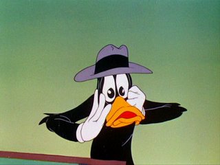
If you look at almost every panel you can see big negative shapes that draw attention to whatever the import action of the scene is.
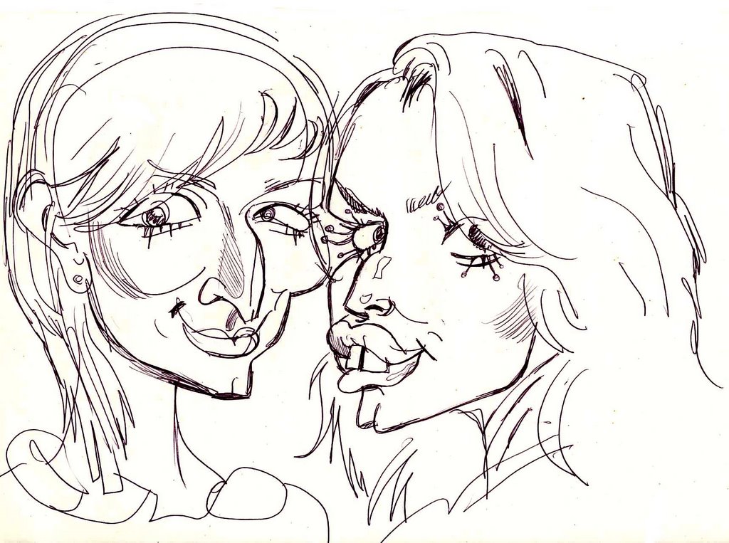
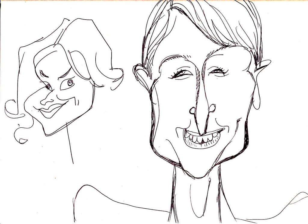
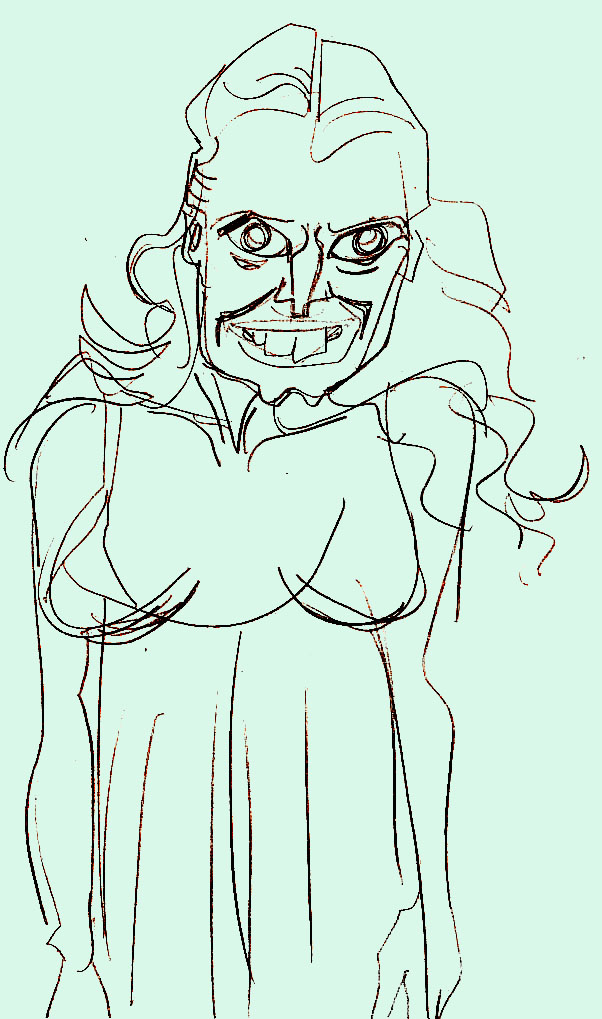
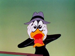
Negative shapes are just as important as filled shapes-not only in your overall sillhouettes and composition, but even in detailed areas-such as a face. Note that between the characters' eyes and the sillo of the head there are empty spaces that help draw attention to the expressions.
I see a lot of young artists who will fill a whole face with the eyes, nose and mouth, so that there is no empty space in the head. That makes the face a jumble and hard to read.

Line of action
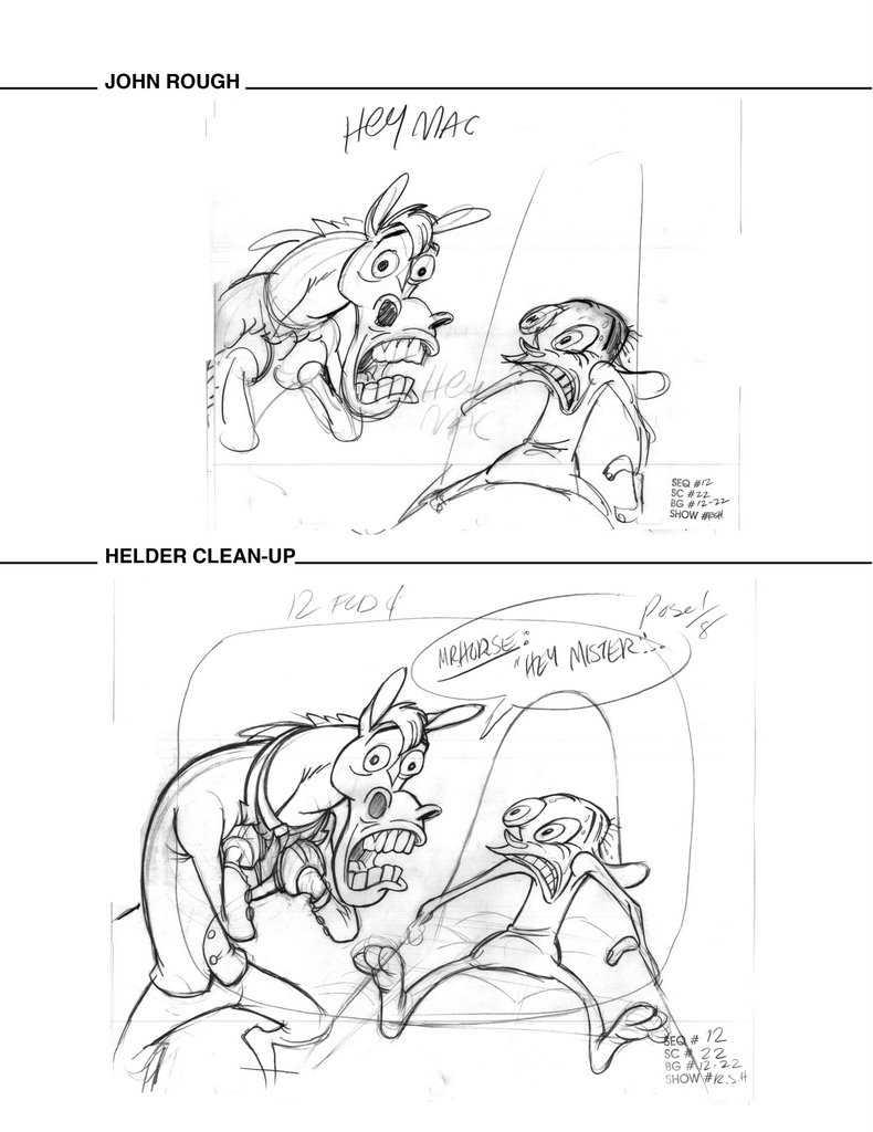
Look at the last panel on page 1. You can draw a line right through the barber's body, then through his neck and his head. This line of action makes him lean forward.
This is a concept that has really been lost in many cartoons today. I'm amazed when I see whole TV shows or movies where the characters are just standing or sitting straight up and down or equally bad-every bit of the body is zig zagging in every direction.
Almost every panel in the comic uses lines of action. I just picked the last panel of page 1 because it is so obvious-but the first panel also uses one for the barber, although more subtle.
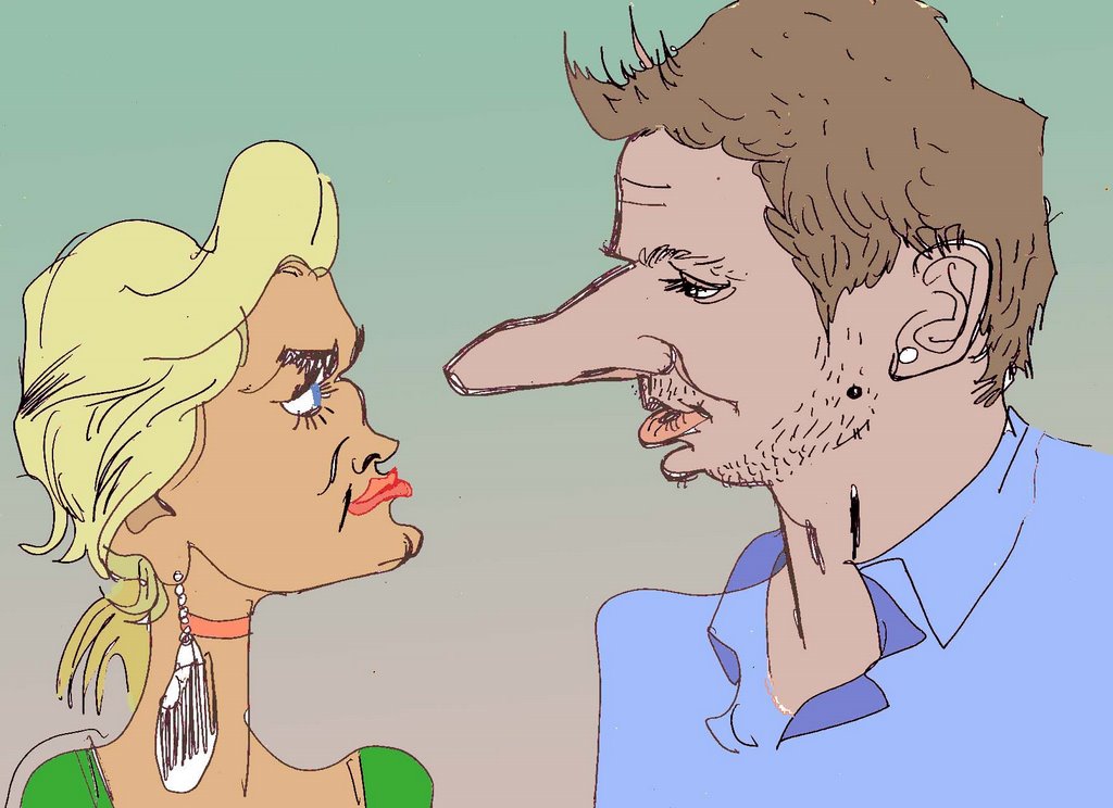
Asymmetry
Nature is asymmetrical or organic. Math is geometric.
I like art that is organic-that uses the rules of nature rather than the stricter and simpler rules of math.
When you see a scene that has 2 or 3 characters in it and they are all lined up with equal distance between them and they all are on the same angle, that to me is very artificial and boring. Poo on that.

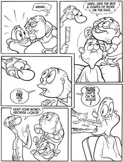
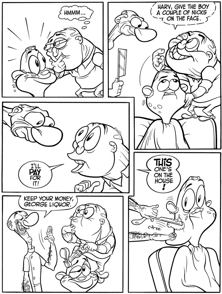
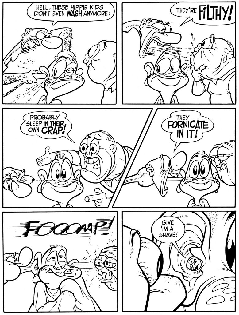
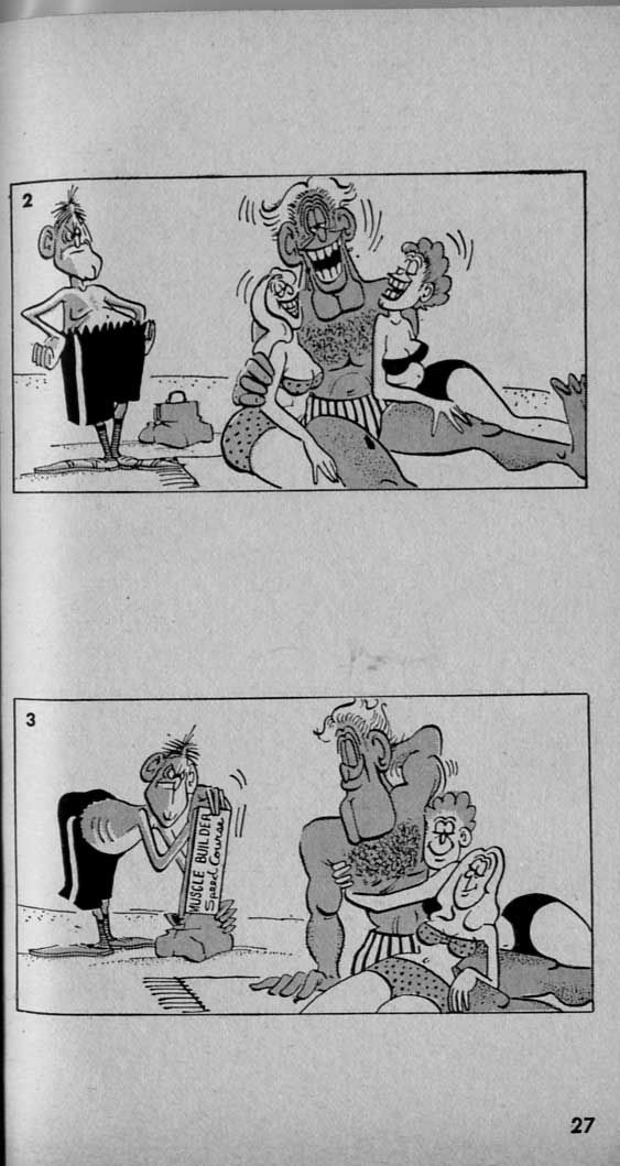
On page 3, look at panels 2 and 5. Note that George and Jimmy are closer to each other than either is to the barber. George and Jimmy are almost one entity. No one is exactly in the middle of the panel either.
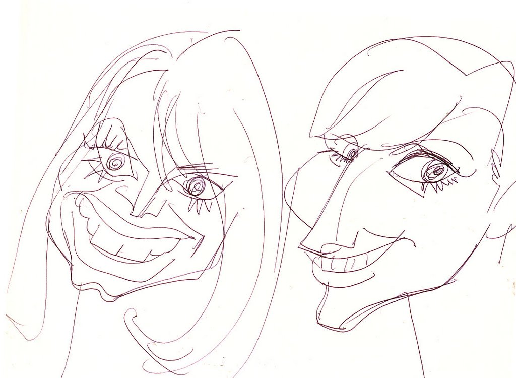
This concept of asymmetry is carried all the way to the details of all the forms. No 2 eyes are exactly the same, nothing on a character is exactly the same on one side as the other.
Even the eyes are different shapes on top than they are on the bottom. No perfect ovals.

Now even though this is a cartoon, I feel that making everything seem so natural makes all the crazy stuff that happens in the story more believable.
It's part of why people get so intensely involved in the stories of my cartoons. They just seem more real than what else is current.
It makes the cartoons warm. Many cartoons today are like staring at wallpaper that swears. You may laugh at the dirty jokes but it's very hard to be pulled into the stories because everything is so mechanical or artificial.
I invite cartoon designers and artists to comment on how many times their boss at some modern studio told them to make their drawings more even and mechanical.


Hmmm...a thought about characterization. I mentioned that I like things that seem natural. Well not just in the drawings but in the personalities of the characters too. Some cartoonists and all execs think you can define a character simply with a few rules and catch phrases-Chuck Jones for example. He says Bugs Bunny can never lose and can't ever pick a fight. I say, "Why not?" and so did the other WB directors. Some of Bugs' funniest films are the ones where he loses or is a big heckler-"Tortoise Wins By a Hare" is my all time favorite Bugs cartoon even though he loses.


Human nature is neither simple nor completely predictable. In modern cartoons the execs want you to figure out all 3 traits of a character before you ever animate a cartoon and then never to vary from this mathematical formula again.

Someone a while back told me I didn't understand George Liquor's character. Something to the effect of "George is a republican. Republicans are bad. Cigarette smoking is bad. Therefore George should smoke."

While I welcome the suggestion, I have to say that I grew up with someone very much like George Liquor who hates smoking and is very conservative.

I believe that all humans are full of contradictions and opposing motives. Which is why we are all crazy. And entertaining.

This story is about 2 conservative guys who have a lot of hate for certain things but they also have the capabilty to be soft and gentle. The pages in this post show that contradiction and I think that's what is funny about it.

My favorite panel is the bottom right of page 2 where Harvey just loses it and says what he really thinks about hippies.

Then in an instant both he and George lighten up at the generous suggestion that Harvey give the one decent young lad a couple nicks on the face and all is once again right with the world.


Now buy a Goddamn t-shirt and support natural insanity!
http://www.cafepress.com/happytime

Beautiful People 11


Thursday, March 23, 2006

Mr. Horse rough to solid

Here are some models created from Ren Seeks Help.
One of the biggest problems creatively I've faced over the years is getting an original idea to survive the assembly line system of making cartoons-especially the Saturday Morning cartoon system I began my career in.

When you do an original drawing (if you are any good) you tend to put a lot of life and action into it when you first think of it. Then it has to be traced, cleaned up, animated and assisted and colored. Each of these steps along the way tends to tone the drawing down.

This happens naturally even if you clean up your own drawing-it loses some of the guts and spontaneity.

Now imagine if your whole production system is geared on top of that to purposely tone everything down!
That was the system in the 70s and 80s and is still the system at most studios today.

In my own studio and the service studios I work with, I have to constantly beg people not to tone down artwork.
The layout artist tones down the storyboard drawing. The animator tones down the layout, then the assistant tones down the animation key and then in Korea the "on model" department erases everything and traces a pose off the model sheet.

This whole process tortures me so I always have to teach people first-to not have an inclination to tone down a drawing I hand them-and then give them some techniques to help them preserve the life of the drawings.
These are some key poses I roughed out for Ren Seeks Help. I then gave them to my most solid artist in Canada to do sample cleanups. Helder Mendonca is a really great cartoonist whose strongest attribute is his ability to construct characters out of solid shapes. He is a natural talent who learned a lot from Jim Smith-another artist whose drawings are really solid.

If you look at the roughs you can see how I try to build up my poses out of simple shapes and then lay the details on top of them. And I attempt to wrap the details around the bigger forms. This is not natural to me. I naturally draw flat and had to teach myself construction, I'm not the best at it at all but I like it when I see it so I try for it.
Helder then tries to preserve the flow of the poses and make the drawings even more solid-these 2 concepts are very hard to balance-they are naturally opposed.
We did these samples and handed them out to the rest of the artists as guides.
Mr. Horse is a particularly hard character to draw-well all horses are! Do you remember when Dreamworks did a press release for "Spirit" and told everyone that no one had ever animated a horse with personality before? They explained that it was because a horse's mouth is too far from its eyes, so you couldn't draw expressions on one. Their solution was to shorten the snout to bring the eyes and mouth closer together. Uhhhh....ok.
Boy, try to draw gestures with hooves!! Yikes. Most artists are terrified to draw Mr. Horse. Helder loved it. He did a lot of his own scenes that are just killer. He drew the great pistol-whipping scene at the end of this cartoon.
He draws a good maimed frog too.
One of my favorite "solid" style animators is Bob McKimson. He animated a lot of stuff for Bob Clampett (as well as other directors) and he could draw really realistic subtle acting. He did the scenes in Falling Hare where Bugs is sitting on the wing of the airplane reading about gremlins and scoffing at the stories "Gremlins, little men..what a fairy tale!"
This - to me - is the best looking Bugs Bunny ever animated.

Clampett told me that McKimson had a photographic memory and when Clampett handed out scenes to McKimson, he would act out the whole scene live and Mckimson would just memorize every human gesture and expression Clampett did and then turn around and animate it just like Bob acted it out.

Amazing!

Hey, Brian Romero posted some Mckimson drawings of the greatest cartoon character in history-Adolph Hitler! Go check 'em out. He has 3 sets of drawings. The first and 3rd are McKimson's animation, and the middle set is Rod Scribner.

Also look at the rest of his blog. He has lots of great stuff there. Make sure you comment and thank his ass.

http://brian-romero.blogspot.com/2006/03/lost-cartoons-russian-rhapsody.html

Wednesday, March 22, 2006

Specific Acting in Looney Tunes-Duck Twacy


While we're on the subject of specific acting you might wonder where I got the idea to do it in cartoons.

Specific acting is something we all take for granted in live action because each real actor is a live person who brings his or her own personality and observations of other humans to the screen or stage.
This is something all humans have naturally. Everyone you know has specific faces he makes and gestures she does etc...so we expect to see this kind of acting in our favorite TV shows and movies.

Most of us don't expect to see it in cartoons. Why? Because hardly anyone does it. Why? Because not very many artists ever thought of it and because it is hard to draw.

I accepted generic acting in cartoons when I was a kid, because I was so mesmerized by the sheer magic of drawings that were moving at all.

I started to become a bit more discerning when I was a teenager and I realized how much more sophisticated the Warner Bros. cartoons were than the other classics-particularly in how much more believable the characters were.

I found myself particularly attracted to Chuck Jones' cartoons and I noticed not only his slick drawing style, but also the unique expressions he drew.

I especially liked when he would invent an abstract expression that no human could actually do-like the famous "D-uh" take he draws where the two whites of the eyes are joined and one is bigger than the other. Thanks to Pat Lewis for finding me this frame below!

I used to copy all the funny expressions Jones did and talk to my friends about it. They thought I was a real weirdo let me tell you! Anyway, Jones' cartoons tend to be pose to pose, so whenever he invented some funny pose or expression, he would hold it long enough for you to notice it. That's cool!

When I was 20 I discovered Bob Clampett's cartoons and was instantly blown away by how much richer and more inventive they were than even my favorite cartoons of my childhood.
As a contrast to Jones' work, Clampett's cartoons are not pose to pose, they tend to be moving constantly. The amazing thing is that so much information is happening and yet it all reads - even without holding every idea!

He would have characters act and in a single sentence there would be a bunch of custom tailor made new and specific expressions to describe each inflection of the dialogue!

When I began freeze framing his cartoons a whole new world opened up to me. I realized why his cartoons were so exciting-something was happening on every frame! Not just bookended in the held poses. Clampett and his animators could control all this information and make you absorb it and understand it all. This is fantastic control-I can tell you from experience, it's really hard to do and back then no one else was doing it.

My pal Andrea, (Duck Dodgers) has done a great service to cartoon fans by posting still frames of classic cartoons all over his site.

Below are just a few frames from one scene of Bob Clampett's The Great Piggy Bank Robbery.

Note that the first frame is pretty normal looking.

This is animated by the great Rod Scribner. He uses every part of the drawing to get across subtle distinctions in the characters' mood at each instant of his acting.
He even changes the shape of the pupils during the animation to add color to the emotion.
This scene was one of the great revelations of my life!
Many of these expressions can't be described in words. I know what Daffy is feeling on the frame below but can't tell it to you. The picture speaks better than any words can.
Sometimes a duck has teeth, other times he doesn't. I remember an executive telling me to change a storyboard panel once because "ducks don't have teeth." It was a talking duck, by the way.
Look at the picture below sideways but don't let your Mom catch you.

That goes double for the one below! (I've seen this in real life many a time!)
Seeing Jones' cartoons and Clampett's cartoons gave me the idea to look not only at cartoons for acting ideas, but to look at real life, study actors and on top of all that even invent physically impossible expressions that can only be drawn.

I'm hooked on specific acting and can never go back.

Click the link below to see more of this scene, and if you scroll down the page fast it will animate! If you are a young cartoonist and want to learn fast, I suggest you copy these drawings and then go freeze frame more old cartoons from the 1940s and copy them over and over until you start to absorb all the great principles of the best cartoons ever made.

http://classiccartoons.blogspot.com/2006/03/to-my-hero-john-k.html

Hey Andrea, isn't there another close up scene of Daffy near this one that's even crazier?
"Hey, what's the matter with me? I'm Duck Twacy!"


Tuesday, March 21, 2006

Sunday, March 19, 2006

Beautiful People 10 - mate with them

Are we ready to name these Hollywood hotties?


Friday, March 17, 2006

Don Martin gifts from Corbett

Cobett (Vanoni) has been very kind in sending us links for more Don Martin comics, so here they are for your enjoyment. All you girls out there owe him a kiss!
The Sculptor in His Studio 1
The Sculptor in His Studio 2
The Sculptor in His Studio 3
The Sculptor in His Studio 4
The Sculptor in His Studio 5
The Sculptor in His Studio 6


The Fishermen 1
The Fishermen 2
The Fishermen 3
The Fishermen 4

Moving Men 1
Moving Men 2
Moving Men 3

After the Rains 1
After the Rains 2
After the Rains 3

Early One Morning 1
Early One Morning 2
Early One Morning 3
Early One Morning 4

Carpenter's Assistant 1
Carpenter's Assistant 2
Carpenter's Assistant 3
Carpenter's Assistant 4
Carpenter's Assistant 5
Carpenter's Assistant 6
Carpenter's Assistant 7
Carpenter's Assistant 8


The Chase 1
The Chase 2

Barber Shop 6 - tension builds and Don Martin!

I'm a little worn out from some of my own tension today. If only I had someone to shave me and calm me down.

I'm using some ideas I got from Don Martin to give a sense of timing to the Barber pages way below.
That's a hard thing to do in comics since there is no animation.
See how Don Martin does his thing.

If you don't know who Don Martin is, he's Mad Magazine's "Maddest Artist" and a brilliant innovator to boot. Grab the old 60s paperback books he did and study his pacing and staging!


On The Beach 1
On The Beach 2
On The Beach 3
On The Beach 4
On The Beach 5


The Great Hotel Fire 1
The Great Hotel Fire 2
The Great Hotel Fire 3
The Great Hotel Fire 4


In Surgery 1
In Surgery 2
In Surgery 3
In Surgery 4
In Surgery 5
Note the use of punctuation in the panel continuity. Instead of just using each panel for each gag, I use some pantomime panels to create pauses before the punch lines-like stand up comics use. I got this from Don Martin and animated cartoons too.

In this last page, the punctuation panels are gone which speeds up the actions as they get madder and madder.


OK, here’s a theory:
Most comics before Don Martin broke up their story into panels and used each panel to tell the important plot points in succession.

When I was a kid, I noticed that Don Martin’s comics told their story with a sense of timing. He broke up his actions into the important bits-in smaller increments than most comics and it made you feel like they were happening in real time.
Don Martin’s comics are like animation. They have rhythm-and I think I absorbed that into my storyboarding technique and then in my own comics.

Speaking of storyboarding technique, check out Bob Camp’s and my storyboard for Stimpy’s Invention!


Stimpy's Invention Board Pt 1
http://www.animationarchive.org/2006/03/media-stimpys-invention-storyboard.html

Thursday, March 16, 2006

You better learn to love classic cartoons!


...IF YOU EVER WANT TO WORK FOR ME!

OK, listen all you young would-be animators, if you wanna become great you have to learn from the old cartoon masters from the 1940s.
Learn everything you can about how they drew and animated, how they thought and what cartoons they made.
Don't study my cartoons; study all my influences.

Here's a poster I did with Lynne Naylor of my biggest hero Bob Clampett:

I won't tell you too much about him except that I think he was the most influential and greatest of the classic cartoon directors. He was the looniest of all the Looney Tunes animators and was largely responsible for their success and style.
My other big heroes are Chuck Jones, Tex Avery and Bob McKimson.
If you want to draw great, copy their beautiful and hilarious cartoons from the 1940s.

Look at some of these fun pictures from Clampett's cartoons:


Kitty Kornered


Falling Hare


Baby Bottleneck

So listen up, kids, many young cartoonists come to me with portfolios full of fake spumco style drawings or worse-graffiti art or the Cal Arts style. Don't do it!

What I look for is good old fashioned 40s style cartoon fundamentals. If you seriously want to work for me one day then do exactly what I tell you.
Buy this book now!
It's by Preston Blair, one of Tex Avery's animators in the 1940s. He animated Red Hot Riding Hood! This is the best book ever written about how to draw cartoons. It costs about 11 dollars and will teach you more than 4 years and $80,000 worth of cheesy animation school.

But after you buy it, be sure to open it!

Draw the characters in it and DRAW THEM THE WAY HE SHOWS YOU HOW TO DRAW THEM!

Learn these important fundamental principles:
Construction
Line Of Action
Clear Sillhouettes
Perspective
http://www.leconcombre.com/board/flashtutorial/prestonblair/prestonblairlinksus.html
These are all words they use in animation school, but they don't show you how to do any of it. Preston explains it all clearly and shows you with great solid and beautiful drawings.

I can't stress how important this advice is. You can't get into Spumco if you don't learn these principles correctly. Don't concern yourself about your own personal style. You don't have one yet. Only 1 in a hundred cartoonists ever develop an actual style. Fundamentals are much more important.

The kind of cartoonists I like are the ones that can see the obvious: that cartoons should look good and that old cartoons are the most appealing. If you can see that, then you might have a chance of learning how to do it. I'll help anyone who can prove it to me.

Now, it's very hard these days to find the great cartoons because they hardly ever show them on TV anymore for some mysterious reason.

You can learn about the history of them at Steve Worth's Asifa animation archive. Go there. Steve is very helpful and generous with his time and knowledge. Buy him a hot dog.
http://www.animationarchive.org/2006/03/filmography-winter-cartoon-roundup.html
Go and see Coal Black and De Sebben Dwarfs, the greatest cartoon ever made!

Here's another great site to see frames from cartoons that pleasured your eyeballs.

http://classiccartoons.blogspot.com/2006_01_01_classiccartoons_archive.html


Go buy some 1940s WB cartoon videos here. Buy the tapes instead of the DVDs! They are easier to use and look a lot better!

http://www.echildrensvideos.com/Bugs_Bunny_and_Looney_Tunes_VHS_Childrens_Kids_Family_Videos2.html

I'll talk more about classic cartoons in later posts, but this is a good start for those of you who are interested. Bone up!
I used to freeze frame great old cartoons and taught myself the classic fundamental principles above. You can do it too! And you will laugh a lot whiile you discover these masterpieces.

Good luck!

P.S. Don't copy drawings from Friz cartoons because they are not drawn very well. They are stiff, sloppy and bland.
Chuck is great. So are Bob, Tex and McKimson and so are the late 1940s Tom and Jerrys.
Do it.

Oh, and if you are in college I would be happy to come and lecture and show the best of these cartoons.

If you show me crummy flat cartoon drawings I'll fly apart!