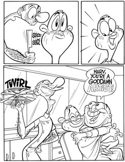
OK, well I don't know how amused (if at all) you were but I'm going to tell you some other principles of good drawing and storytelling that have to do with readabilty.
By readability I mean how easy (or hard) it is to see the pictures and how well they draw you to the important points of the scene.
If you are already a pro, you probably know all these concepts, so I'm really just offering this stuff to young artists who could use some tools to help drive their ideas home.
Readabilty is made up of these tools:
Staging
Where you place your characters, BG and props within the panel (or screen if it's a movie).
I like to use simple staging and I usually focus on the characters.
I see some modern comics and shows that have complicated or cluttered images that make it hard for you to see in an instant what is going on.
I don't believe in filling the panel or screen with wall to wall detail. It makes your images and story hard to read.
Sillhouettes and negative shapes
The characters in this comic have more details than in my cartoons because we don't have to draw as many drawings for a comic as we do for animation. We can spend more time on each drawing in a comic.
Details can be dangerous if not carefully placed or if your characters don't have clear sillhouettes.
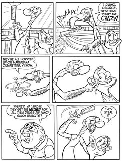
Look at the panel 1 on page 1. The barber is holding up his razor. It reads because there is a big space all around the blade. His whole body reads becausem it is a simple sillhouette. There is almost a tangent where his little finger hovers above the mirror's border. Had I noticed, I might have moved his hand up a bit more to clear the border better.
If you look at almost every panel you can see big negative shapes that draw attention to whatever the import action of the scene is.
Negative shapes are just as important as filled shapes-not only in your overall sillhouettes and composition, but even in detailed areas-such as a face. Note that between the characters' eyes and the sillo of the head there are empty spaces that help draw attention to the expressions.
I see a lot of young artists who will fill a whole face with the eyes, nose and mouth, so that there is no empty space in the head. That makes the face a jumble and hard to read.
Line of action
Look at the last panel on page 1. You can draw a line right through the barber's body, then through his neck and his head. This line of action makes him lean forward.
This is a concept that has really been lost in many cartoons today. I'm amazed when I see whole TV shows or movies where the characters are just standing or sitting straight up and down or equally bad-every bit of the body is zig zagging in every direction.
Almost every panel in the comic uses lines of action. I just picked the last panel of page 1 because it is so obvious-but the first panel also uses one for the barber, although more subtle.
Asymmetry
Nature is asymmetrical or organic. Math is geometric.
I like art that is organic-that uses the rules of nature rather than the stricter and simpler rules of math.
When you see a scene that has 2 or 3 characters in it and they are all lined up with equal distance between them and they all are on the same angle, that to me is very artificial and boring. Poo on that.
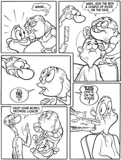
On page 3, look at panels 2 and 5. Note that George and Jimmy are closer to each other than either is to the barber. George and Jimmy are almost one entity. No one is exactly in the middle of the panel either.
This concept of asymmetry is carried all the way to the details of all the forms. No 2 eyes are exactly the same, nothing on a character is exactly the same on one side as the other.
Even the eyes are different shapes on top than they are on the bottom. No perfect ovals.
Now even though this is a cartoon, I feel that making everything seem so natural makes all the crazy stuff that happens in the story more believable.
It's part of why people get so intensely involved in the stories of my cartoons. They just seem more real than what else is current.
It makes the cartoons warm. Many cartoons today are like staring at wallpaper that swears. You may laugh at the dirty jokes but it's very hard to be pulled into the stories because everything is so mechanical or artificial.
I invite cartoon designers and artists to comment on how many times their boss at some modern studio told them to make their drawings more even and mechanical.
Hmmm...a thought about characterization. I mentioned that I like things that seem natural. Well not just in the drawings but in the personalities of the characters too. Some cartoonists and all execs think you can define a character simply with a few rules and catch phrases-Chuck Jones for example. He says Bugs Bunny can never lose and can't ever pick a fight. I say, "Why not?" and so did the other WB directors. Some of Bugs' funniest films are the ones where he loses or is a big heckler-"Tortoise Wins By a Hare" is my all time favorite Bugs cartoon even though he loses.
Human nature is neither simple nor completely predictable. In modern cartoons the execs want you to figure out all 3 traits of a character before you ever animate a cartoon and then never to vary from this mathematical formula again.
Someone a while back told me I didn't understand George Liquor's character. Something to the effect of "George is a republican. Republicans are bad. Cigarette smoking is bad. Therefore George should smoke."
While I welcome the suggestion, I have to say that I grew up with someone very much like George Liquor who hates smoking and is very conservative.
I believe that all humans are full of contradictions and opposing motives. Which is why we are all crazy. And entertaining.
This story is about 2 conservative guys who have a lot of hate for certain things but they also have the capabilty to be soft and gentle. The pages in this post show that contradiction and I think that's what is funny about it.
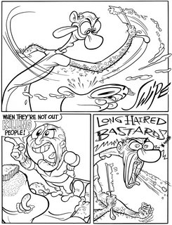
My favorite panel is the bottom right of page 2 where Harvey just loses it and says what he really thinks about hippies.
Then in an instant both he and George lighten up at the generous suggestion that Harvey give the one decent young lad a couple nicks on the face and all is once again right with the world.
Now buy a Goddamn t-shirt and support natural insanity!
http://www.cafepress.com/happytime
