I love when Scribner draws cute characters. They are reaaaallly cute - but kind of crazed too. It's like he's making fun of cuteness but at the same time likes it. he's torn - as am I.


 This frame is genius!
___________________

I have a theory about how Scribner evolved this jittery cluttered style.

The action in much of his work after Clampett happens within very confined spaces.

When Clampett left, McKimson tried to control Scribner's animation - to "bring the characters back down to earth" as Friz once said to me.


Scribner's work in McKimson cartoons seems very claustrophobic - as if McKimson drew an invisible box around the characters and told Rod :"Don't let your characters stretch beyond the walls of this box." The box can pan across the screen, but the character can never take up more than 40% of the n/s, e/w axis.
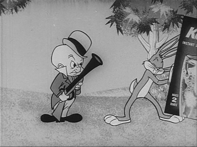
FROM MCKIMSON'S "OILY HARE"
 Scribner's poses never quite make it to the extreme frame in McKimson's cartoons. -like they are not allowed to fully extend their arms.
FROM CLAMPETT'S "CORNY CONCERTO"

" No more of this Clampett stuff!"

Scribner's immense creative energy had to express itself somewhere, so now his characters began twitching and pulsating within the invisible conservative closet that McKimson confined them in. The characters' arms could no longer completely straighten out. Characters couldn't make broad distinct silhouettes anymore. Lines of action became crumpled and jagged because the characters could no longer stretch all the way to a final pose.


You can see in this commercial and in the animation Scribner did in McKimson's cartoons the results of the spacial confinement. The characters' eyes keep bugging out in accents, characters begin to move in one direction - but never complete their action, instead they bounce off the edge of a force field and recoil in the other direction. They can't move too far left, right, up or down, so instead they boil and throb with extreme energy and lifeforce within a small area. It's very frustrating!

It's also very funny but in a way that seems to be Scribner's way of rebelling against the post Clampett conservative landslide that eventually smothered the whole animation business.

With each passing year and decade, animation got more and more creatively confining. Other animators went along with it, some crumbling, others making due. Scribner held on to his full animation and cartoony roots the only way he could within the ever tightening straightjacket. His characters wriggled and fought to break through their arbitrary bonds.
This commercial may have been almost his last gasp. I have other Koolaid Bugs commercials like this that look like he worked on them, but that someone else went over and toned down.
WATCH BUGS AND ELMER TWITCH AND THROBNote: the second half of the commercial is animated by a Chuck Jones animator- I'm guessing Benny Washam. It's very handsome, expertly timed and posed. If I had not seen the Scribner stuff next to it I would probably say it was great. I have only one problem with it. Unlike the Scribner animation, it's missing an essential ingredient of cartooning - it's not entertaining.


Very professional and crisp animation, but not very interesting.


 Cartoons and dinosaurs: 2 eternally cool things.
 Here's some more amazing Milt Stein cartoon art.
 He's obviously an animator but also influenced by the graphic looks of such comic strip artists as Herriman and Sterret.
 So cute and so stylish at the same time. A rare combination.
 And great backgrounds too!


 Milt understood the graphic power of stars.
 Not only did he draw nice star shapes (not easy to do!) but he always composed them into interesting patterns that framed the action.


 Such a killer command of graphic hierarchy...


 This cover is by someone else. I like how it looks like a completely different character.
 Masterly comic graphic sense.


![[PDVD_198.jpg]](https://blogger.googleusercontent.com/img/b/R29vZ2xl/AVvXsEhRT2A-6K2bDoSG8Y6rgfRBaPLKfWLJnlCOeHRZHv0becU19uiBIkZe_EeS2FD2r1FjfaDEtbFJ1DhpQihE5d0wnZDrMBr3TzWAu2FkHoC4Ksgtp1rkOxdKjnaWHOesWd9m-Et-/s1600-h/34.jpg)