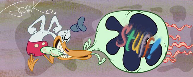
Ed Benedict is the greatest!
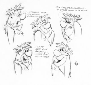 My favorite cartoon designer of all time is Ed Benedict. He's the guy who created the original Hanna Barbera style of the late 50s and early 60s. You're probably saying to yourself, "I thought John hated flat stuff!" I don't. I hate bad stuff. I hate bland stuff. I hate cheating.
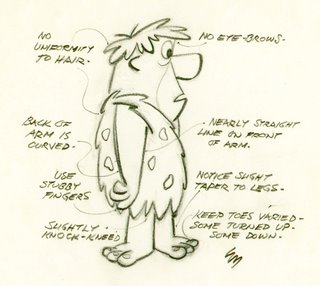
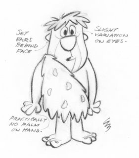 Look how funny these drawings are! These are the first finished models Ed did for the Flinstones. Then HB made him water them down a step before they accepted them for television. Then year by year Hanna Barbera continued to water them down more and more until they finally became ugly, wobbly and bland and unwatchable. They took out all of Ed's charm. God knows why.
Ed taught me how to draw when I was a kid! He didn't know it but he did. I used to sit in front of the TV watching Yogi Bear, Huckleberry Hound, Quick Draw McGraw and The Flintstones with my drawing pads every day and draw as fast as I could.
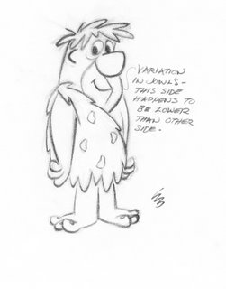
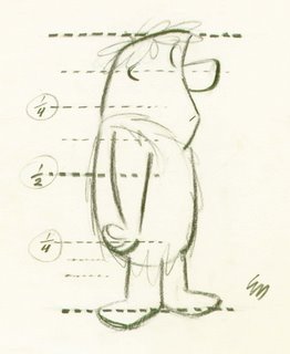
I memorized the design of every early HB character by the time I was 9 years old.
I also copied the Warner Bros. characters from comic books, and Tom and Jerry (even though I had never seen a Tom and Jerry cartoon!)
and Disney cartoons and anything else on TV or in comics.
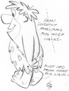
But my favorite characters to draw were always Ed's. I just loved the design of the Hanna Barbera cartoons and was aware that they actually HAD design. Most other cartoons were sort of generic-Disney, Warner Bros and MGM-I mean generic in design-they were all made of balls and pears. Hanna Barbera had a real look about it and it fascinated me.
I could also tell all the animators apart just by the way they interpreted Ed's drawings.
I didn't know any of them by name, but I had traits that I knew them by- That's the guy who draws crooked wrists (Carlo Vinci)-there's the guy with the upside down curly mouths (EdLove) etc.
If you want to learn who they are, get on ebay and find the Flintstones Laser Disc Flintstones collection I produced-it's all explained in there and there are music videos Henry Porch cut together for each animator to help you recognize his style
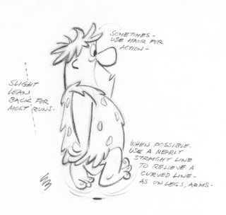 What I like about Ed's style of design is that he does all the things I like about cartoons at once.
I love style. I love interesting design. I love funny. I love cute. And I love character.
There are a lot of talented character designers from the 40s and 50s who have interesting looks-like Tom Oreb, but they create pure designs rather than characters and I want to believe that these magical cartoon creatures are real and have souls.
You can tell just by looking at Ed's designs what the character is like. They aren't just wallpaper.
I'm gonna post Barney next. The first models of him are hilarious. He's real retarded looking, like a cartoon writer! (except nice)
Hey there's a couple great Golden Books painted by Mel Crawford that are actually drawn in Ed's style with poses right from these early models!
Clarke Snyde has all the pages from "Pebbles Flintstone" - my all time favorite Golden Book. I went INSANE when I discovered this book at 10 years old. Mel Crawford is another fantastic cartoonist/illustrator/painter.
Go check it out. It's so fun!
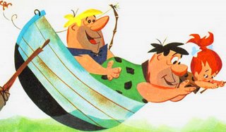
http://inspiration-grab-bag.blogspot.com/2006/03/mel-crawford-pebbles-flintstone-1963.html
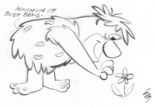

Ed's style may look simple but don't be fooled. The guy is a real artist and can draw like an old time illustrator and in many styles.
His cartoons look so great because he has strong fundamentals behind them.
I'll talk more about him when I post the Barney models.
Here's a real treat below, some practice designs as Ed was trying to figure out the look he wanted for The Flintstones.
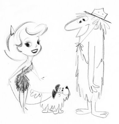
Ed is one of my all time heroes-a true cartoon genius!
I have lots more of his stuff but it's all xeroxes and in the custody of Asifa's archive right now. Beg Steve over there to start putting some stuff up!
http://www.animationarchive.org/
Oh and he also has tapes of me interviewing Ed. Ed is hilarious! He's nothing like what you would expect from his drawing style.
In case you didn't know, Ed is also the guy who designed and layed out the stylish Tex Avery cartoons from the 50s-like this great one!
http://inspiration-grab-bag.blogspot.com/2006/03/deputy-droopy-1955-mgm.html
