

REALLY BAD GARISH COLOR
 Cartoons don't generally have good color styling. About 90% of them use only primary and secondary colors, straight out of the paint tube.
The usual color palette in cartoons is:
Pink
Purple
Green
Blue
Red
Orange
Purple
Green
Blue
Red
Orange
 Skies are blue, grass is green, trees are brown and everything else is pink and purple. I call this "video box colors". I hate it. Most painters when they start working for me-even the ones who have great technique, paint video box colors and I go insane.
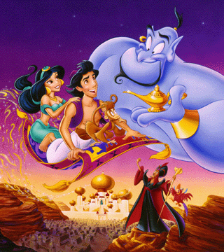
Look how garish Alladin stuff is. Basically, it is no color choice at all. It's the artist pouring the paints out of the tubes without mixing anything, with no thought to color harmony or contrasts or warmth or mood.
The easiest way to choose colors is to not choose. Just use the same ones that almost every cartoon has.
 Yikes! Every color in this frame is competing for attention with every other color. They are all equally on fire and as a result, the image doesn't read as a whole. It is a puzzle made up of individual pieces of primary and secondary colors.
It doesn't help that there is no composition either.
GOOD WARM COMPLEX HARMONIOUS COLOR
 By contrast, here are some frames from cartoons that have thought and warmth behind the color decisions.
In this Art Lozzi BG above, the palette is kept "limited". It doesn't have every color in the rainbow spread across the scene.
The BG has mood and fits behind the characters as it should. If the scene was painted like the ones above, the BG would compete for attention with the characters.
 Now there is green in the BG, but it isn't middle green straight out of the tube. There are many subtle tints of geens-some bluish greens, some greyed greens, yellowish greens, brownish greens. The values (dark and lights) aren't just darker versions of the same tints as in all the examples above.
These subtle tints and value blends give a feeling of depth and warmth to the scene even though the styling of the drawing is very stylized and 50s. The rich colors make it a scene, rather than a video box cover.
Note that the sky isn't blue.
 Here is more color harmony from Fantasia. The night blue is actually slightly greyed and slightly tinted to the violet, rather than being just a straight middle blue as in all the cheesy paintings at the top of the page.
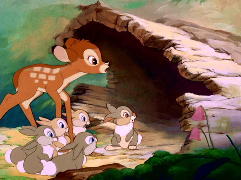 Bambi is a tour de force in color styling. It's so sophisticated and beautiful, I don't know where to start to describe it-but the theories they used on Bambi can be applied in simpler form even in low budget TV cartoons today. Ren and Stimpy once in awhile had good color. Power Puff Girls had some great color styling and so did Time Squad.
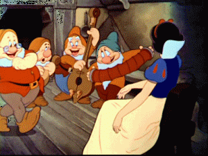 Look how warm this scene from Snow White is. How much more inviting is this than the crappy ass purple and pink stuff at the top of the page?
Note the floor-what color is that? You can't even name it. Part of it is warm grey, part is cool grey and there are all kinds of subtle tint and value variations in it. Those subtle variations make it seem real, even though it is obviously a stylized painting, not photo-realistic at all.
Well all this is a prelude to more color theories. I don't want to go too far in this post, just enough to give you some terms and basic concepts that I'll explore further in more posts.
Color is an amazing tool and can add so much to the mood and feel of a cartoon. It can also suck away any chance of warmth or feeling when abused, as it usually is.

In this Mary Blair painting, the brightest colors are separated from each other by neutral colors inbetween them-white, grey, brown, flesh etc. The brightest colors are still not pure primaries or secondaries. The pajamas are greyed blue. The doll dress is olive green. Even the flesh colors are not "flesh color".
This is way more colorful to me than the typical pink, purple and green cartoon BGs that are everywhere. This is color candy.

This Frazetta painting really illustrates the concept of color harmony. All the colors are related. Even her flesh is mixed with green. There are a ton of tints of greens and blues. The color palette is limited, yet a million times lusher and richer and more "colorful" than the terrible paintings at the top of the page.