

Some of my painting heroes:
Frank Frazetta
Mary Blair
JP Miller
Mel Crawford
Bill Wray
Johnny Johnston
Monteleagre
and...

ART LOZZI!
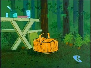
You don't have to have a lot of money in your production budget to still have tasteful and appealing, interesting, non-generic art. Here are some BGs from extremely low budget $3,000 HB cartoons from 1958. I find them infinitely more appealing than the purple and pink BGs that appear in movies that cost $200,000,000 and more to make. In Daffy Daddy and Robin Hood Yogi, Art Lozzi chose very atypical colors to paint the forest. Many cartoons paint trees and grass a simple middle green-straight out of the tube or they use 50-50 yellow green and paint all the trees middle brown.
 LEVELS OF IMPORTANCE: The painter decides what is important in the scene and uses color and value and texture and contrast to draw your eye to a hierarchy of elements.
The picnic basket is most important, so it has a lighter color than the BG and it is a contrast in hue. The BG is mostly greenish so the basket is orange-tan.
The table is less obvious than the basket but is still contrasted against the forest by being a lighter and more yellowish shade of green.
The values of the trees against the green BG are very close in value to the BG, so that the image doesn't become too contrasty or busy to compete with the foreground elements.
This is very logical or functional.
The choice of colors is then aesthetic on top of their functionality.
They work and they are pretty.
Frank Frazetta
Mary Blair
JP Miller
Mel Crawford
Bill Wray
Johnny Johnston
Monteleagre
and...

ART LOZZI!
You don't have to have a lot of money in your production budget to still have tasteful and appealing, interesting, non-generic art. Here are some BGs from extremely low budget $3,000 HB cartoons from 1958. I find them infinitely more appealing than the purple and pink BGs that appear in movies that cost $200,000,000 and more to make. In Daffy Daddy and Robin Hood Yogi, Art Lozzi chose very atypical colors to paint the forest. Many cartoons paint trees and grass a simple middle green-straight out of the tube or they use 50-50 yellow green and paint all the trees middle brown.
 LEVELS OF IMPORTANCE: The painter decides what is important in the scene and uses color and value and texture and contrast to draw your eye to a hierarchy of elements.
The picnic basket is most important, so it has a lighter color than the BG and it is a contrast in hue. The BG is mostly greenish so the basket is orange-tan.
The table is less obvious than the basket but is still contrasted against the forest by being a lighter and more yellowish shade of green.
The values of the trees against the green BG are very close in value to the BG, so that the image doesn't become too contrasty or busy to compete with the foreground elements.
This is very logical or functional.
The choice of colors is then aesthetic on top of their functionality.
They work and they are pretty.
 The tree in the foreground has the strongest contrast and thus it stands out and frames Yogi. The analogous colors (colors that are similar in tint) in the green BG give the BG depth. If it was all one tint of green with just darker and lighter areas (as in all the bad examples I showed you in previous posts) the BG would seem flat and artificial.
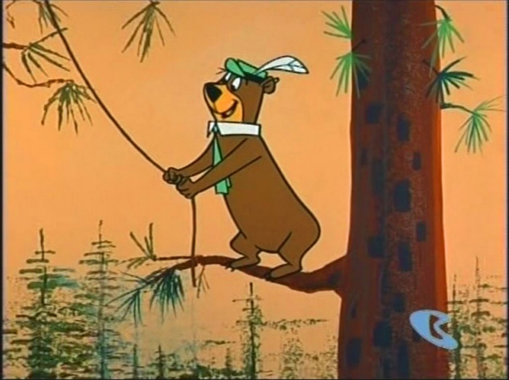 This peachy sky is surprising and a nice color and adds cartoony happy interest to the scenes.
 EVEN STYLIZED IMAGES SHOULD BE ORGANIC: Even though the trees are ALMOST straight lines, they aren't all perfectly parallel. They are just organically different enough to make the stylized BG feel natural.
The trees also are not evenly spaced. There are different sizes and shapes of negative spaces between them.
Note how the flowers are little spots of bright happy colors to liven up the image.
 This man is not brilliantly color keyed but at least he is not garish. His colors are related which helps him read as one object-a man. His colors contrast well against the BG painting and make him read clearly against it.
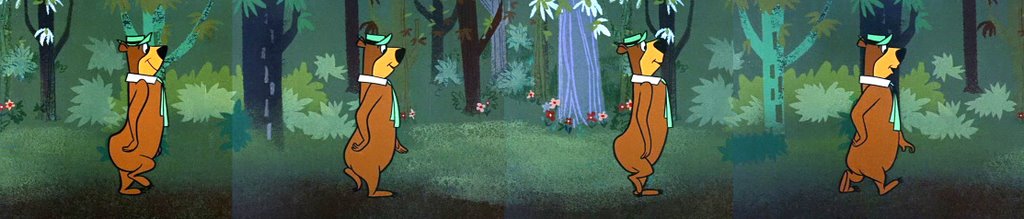 I had Richard Ziehler-Martin reproduce this pan BG for me and I used it in my Ranger Smith cartoons. I tried out so many BG painters and asked them to learn the early HB techniques and Richard was the only one who pulled it off. He then took the ideas from these cartoons and did more elaborate BGs for Boo Boo Runs Wild.
 I like how hills and planes are suggested by just putting a texture with one hard edge and then a faded edge.
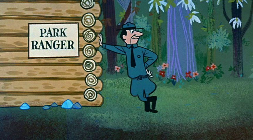 The log cabin is not the typical tan wood color you always see in cartoons. It's sort of a warmly greyed tan which is cartoony and still feels natural. It's not screaming at you.
 Look how happy and colorful this is!
I don't know what Art's thinking was for these 2 cartoons but maybe he figured that thick forests are actually kind of dark, not bright and typical "cartoon-colors".
Part of what makes something fun and colorful is that it differs from what you are used to seeing in a cartoon.
In later Hanna Barbera cartoons, the colors become much more standardized and generic.
For the first 3 years of Hanna Barbera's TV studio there was a lot of experimentation in design and color and texture and animation. All done cheaply, but much done creatively and full of surprises.
Fun needs surprise. Imagine getting the same birthday present every year? That's how modern cartoon studios treat their product. They give you the same thing over and over again.
Even if you genuinely like the combination of pink-purple and green, do you really ONLY want that combination?
Here's another Yogi Bear cartoon painted by Art that is in a different color style.

A still from Threadbare Bear
Art doesn't like to paint the same exact style every time and even on a super low budget cartoon show with a fast schedule still finds the time and will to make his work fun and pretty and full of surprises.
More about Art to come, including his insights and history of 50s and 60s HB cartoons.
Art doesn't like to paint the same exact style every time and even on a super low budget cartoon show with a fast schedule still finds the time and will to make his work fun and pretty and full of surprises.
More about Art to come, including his insights and history of 50s and 60s HB cartoons.