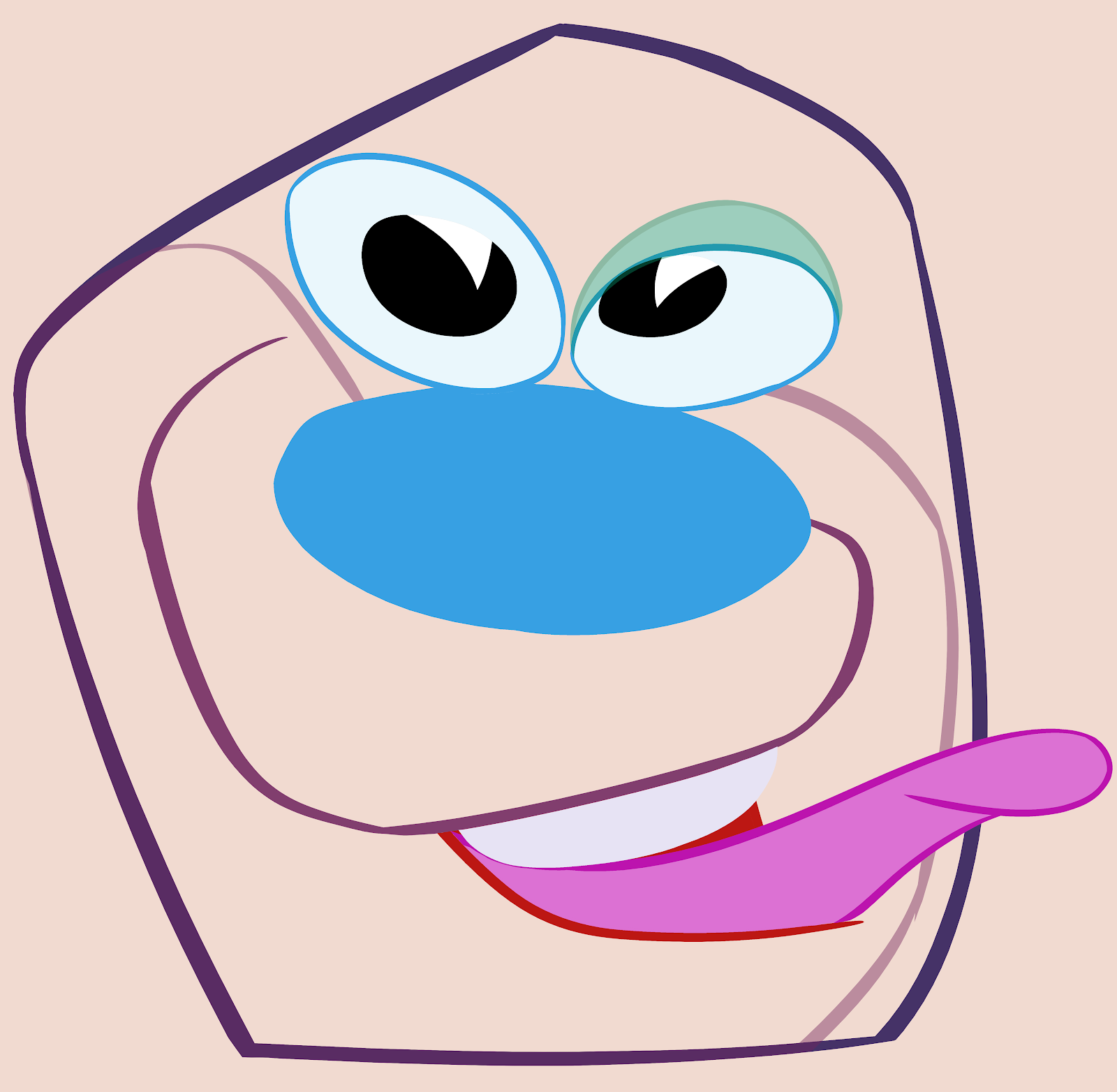
Do you think this is ugly? I'm sure Frank and Ollie would. I don't. I think it's immensely appealing.
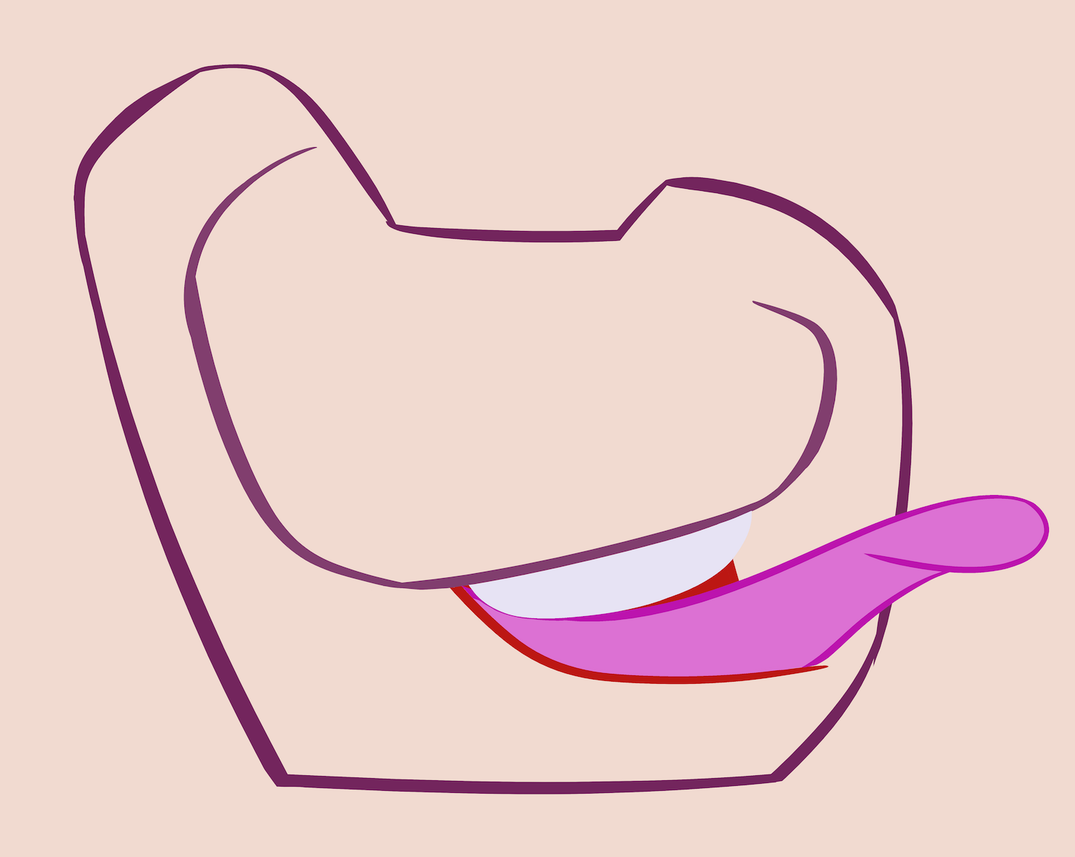
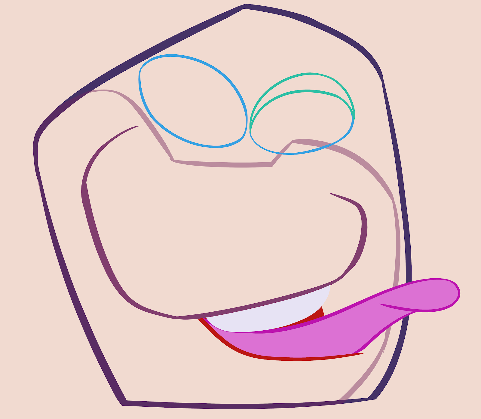
 Don't look at the itchy details. Look at the shapes that make up the whole image. I broke them down into their construction up here.
Although there are many itchy artists who preceded and followed Basil Wolverton, many artists can get lost in the details that obscure what's more important - the overall instant impression of the drawing.

Basil Wolverton has traits that I find appealing:
FUNNY: The Illusion Of Life's 12 principles of animation left out the most important one - that cartoon drawings should be funny.
DESIGN: Basil has a great design sense. Each shape he draws is fun and interesting and he arranges them altogether with great skill and with the final purpose of making us laugh.
What the Disney animators consider "appealing" is not really invented design. Instead, they evolved a community style that at its best balanced a few cute approved shapes in a non-offensive manner. Bambi is the epitome of the style at its most appealing. You can see their designs evolving away from the rubber hose style of Donald, Mickey and Pluto towards Bambi from the mid 30s to the early 40s. Once they got their appealing balance of shapes and squirrel mask down, they kept it going for the next decade; Lady and The Tramp are exactly the same designs as all the Bambi characters. They just take their appealing squirrel masks and wrap them around slightly different forms - and all the forms themselves are basically the same - even the humans.
Disney resorted to a "safe balance" of shapes, rather than inventing new designs from scratch on a regular balance. As far as I can figure, they didn't actually have a designer - they just let the animators work with the characters on each movie until they naturally evolved into a functional evenly proportioned design that was non-offensive.
 Basil Wolverton is a superior cartoon designer of the top-tier because of his great imagination and his control of shapes and hierarchy of sub-shapes and details.
The difference between these cartoons and some of the itchy ones I posted before is that these are not really ugly. They are cute and upbeat. Each of these characters seems to be unaware of his or her own ugliness - they seem to all be delighted to be ugly.
I know when a lot of young cartoonists try to imitate my style, they tend to focus on the scenes that were supposed to be ugly. There is a way to do pretend-ugly that is still appealing.

Here is a guy who is definitely blissfully happy to be ugly.
How does Basil make his superficially itchy detailed stuff look so unique and appealing?

He uses some of the same tools of design that animation designers use.

How does Basil make his superficially itchy detailed stuff look so unique and appealing?

He uses some of the same tools of design that animation designers use.
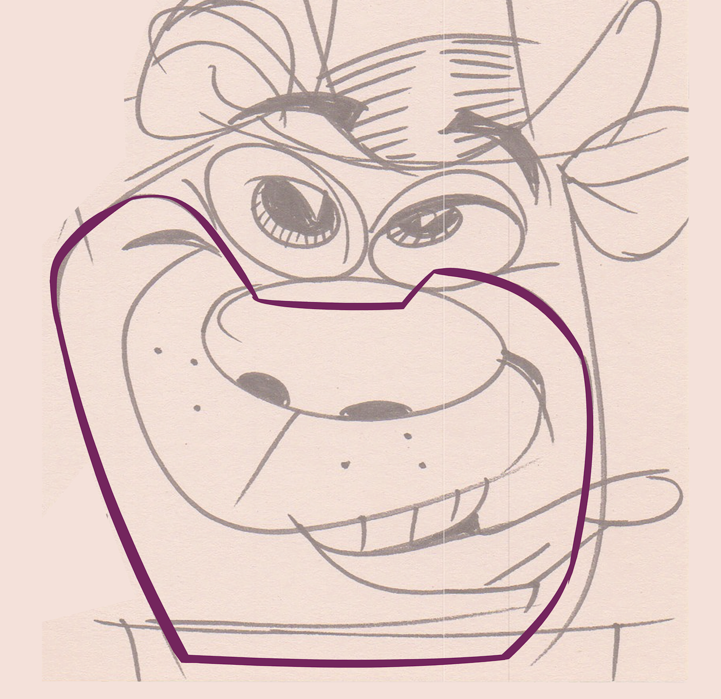
SILHOUETTES: His characters have a totally clear silhouette. That makes it easy to read, and it shows a command off design clarity. His designs commit to the idea. They aren't timid vague non-descriptive shapes.
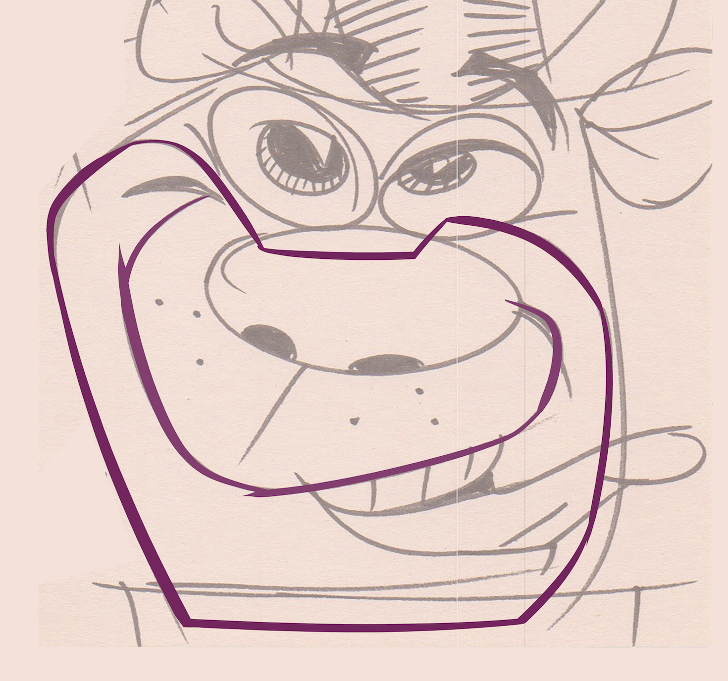
FILLED SPACE VS NEGATIVE SPACE
 NEGATIVE SPACE IS NOT JUST A TOOL THAT YOU APPLY TO THE OUTSIDE OF THE CHARACTER. IT SHOULD BE USED WITHIN THE CHARACTER'S SILHOUETTE AS WELL.
FILLED SPACE VS NEGATIVE SPACE
 NEGATIVE SPACE IS NOT JUST A TOOL THAT YOU APPLY TO THE OUTSIDE OF THE CHARACTER. IT SHOULD BE USED WITHIN THE CHARACTER'S SILHOUETTE AS WELL.
This guy's face is well forward of his head. We can see his face clearly because of the space behind it - between the face and the ear.
COMMITMENT TO OVERALL STATEMENT
This woman's head is bullet shaped. Nothing vague about it.
 The bullet shape is the major form of the design. The next level of the forms do not distract from the bullet. They are smaller and move horizontally, rather than vertically like the bullet.

HIERARCHY: The 2nd level of forms also have clear overall shapes - the eyes, the nose, the mouth, and the ring of curly hair at the bottom. The details - the individual hairs, the warts etc. are then wrapped around the forms in the same directions that the forms themselves have.
 This Russian guy has an overall boxy form. That's clear and non-ambiguous. Basil doesn't let the rest of the sub-shapes distract from this.
 Within the overall form, the next level of forms has a lot of contrasts - in size, in direction, in shape. The image isn't cluttered. There is lots of space between the funny parts. Space is a designer's friend.
 Speaking of which, there is a space on everyone's head that a lot of amateurish cartoonists ignore or are not aware of - that's the space between your face and the back of your head. The face is at the front of the head, it should never fill up the whole head. I have had to explain this to so many of my own artists, that I go into a trance whenever I have to explain it again.

THE "ITCHY" DETAILS
 The bullet shape is the major form of the design. The next level of the forms do not distract from the bullet. They are smaller and move horizontally, rather than vertically like the bullet.
HIERARCHY: The 2nd level of forms also have clear overall shapes - the eyes, the nose, the mouth, and the ring of curly hair at the bottom. The details - the individual hairs, the warts etc. are then wrapped around the forms in the same directions that the forms themselves have.
 This Russian guy has an overall boxy form. That's clear and non-ambiguous. Basil doesn't let the rest of the sub-shapes distract from this.
 Within the overall form, the next level of forms has a lot of contrasts - in size, in direction, in shape. The image isn't cluttered. There is lots of space between the funny parts. Space is a designer's friend.
 Speaking of which, there is a space on everyone's head that a lot of amateurish cartoonists ignore or are not aware of - that's the space between your face and the back of your head. The face is at the front of the head, it should never fill up the whole head. I have had to explain this to so many of my own artists, that I go into a trance whenever I have to explain it again.
THE "ITCHY" DETAILS
I love Basil's cross-hatching. It doesn't fill up all the space in his designs. It helps define the forms. It isn't random noodling. And on top of all that it's funny. The sheer idea that characters who are so ugly deserve all this extra work refining them kills me. This is the inspiration for the close up detailed paintings in Ren and Stimpy. The best of them aren't actually ugly. They are very beautifully painted, with much love by the likes of Bill Wray and Scott Wills. I have seen this idea copied since (even in the Games Ren and Stimpy's) and perverted by actually being ugly, either by a cluttered mean looking drawing, or by later cartoons with just plain sloppy painting technique.


 This style is not itchy at all to me. By "itchy" I mean useless floating cross-hatching that doesn't help describe clear entertaining forms. David has some thoughts on this too:
david gemmill said...
richard willaims. the dude tortures himself. who the #$%^* would want to animate that &*#%@? at least Anime has some sort of redeeming quality, like maybe the robot sequences and action scenes end up looking cool or entertaining..but all of richard william's $&%@# is always just painful to watch...and not entertaining. Only hardcore animation fans *%&^ off to the technical expertise that was involved to make it (not creative expertise though).I feel sorry for the people that had to inbetween. And he had the audacity to animate on ONES. on ONES.


 This style is not itchy at all to me. By "itchy" I mean useless floating cross-hatching that doesn't help describe clear entertaining forms. David has some thoughts on this too:
david gemmill said...
richard willaims. the dude tortures himself. who the #$%^* would want to animate that &*#%@? at least Anime has some sort of redeeming quality, like maybe the robot sequences and action scenes end up looking cool or entertaining..but all of richard william's $&%@# is always just painful to watch...and not entertaining. Only hardcore animation fans *%&^ off to the technical expertise that was involved to make it (not creative expertise though).I feel sorry for the people that had to inbetween. And he had the audacity to animate on ONES. on ONES.
Animate this *^&%$* design on ONES.You can look at scribner, and freddie moore and see pictures of them smiling, or you can look at pictures of Dick williams who looks very depressed and methodical.Animating cartoons is supposed to be fun, work, but fun. not torture.
Jonathan Harris said...
I will admit that I was inspired big-time by Robert Crumb at a certain point in my life, and that I do still admire his stuff. However, I do find myself wondering how much this is just a product of my being born in this generation, and thus having grown up being made to like ugly things (I've been considering this point lately and it's making sense of a few things).I do also find Raggedy Ann and Andy themselves quite appealing (in the faces, at least), but the rest of it does look a bit too much like animation #%$^&*@$#& (I still feel I should check the film out again, though).Also WOW I thought that link said "Michael's Porn Animation" at first! It made sense given the context, too!
There are many sides to the concept of "appeal" and I have barely scratched the surface. There is also "spicy appeal", a kind of appeal that grows on you. It's not instantly cute and might even make you mad at first but is much more human and honest than simple Bambi cute. Virgil Partch, Don Martin and many other artists fit that category.
I will admit that I was inspired big-time by Robert Crumb at a certain point in my life, and that I do still admire his stuff. However, I do find myself wondering how much this is just a product of my being born in this generation, and thus having grown up being made to like ugly things (I've been considering this point lately and it's making sense of a few things).I do also find Raggedy Ann and Andy themselves quite appealing (in the faces, at least), but the rest of it does look a bit too much like animation #%$^&*@$#& (I still feel I should check the film out again, though).Also WOW I thought that link said "Michael's Porn Animation" at first! It made sense given the context, too!
There are many sides to the concept of "appeal" and I have barely scratched the surface. There is also "spicy appeal", a kind of appeal that grows on you. It's not instantly cute and might even make you mad at first but is much more human and honest than simple Bambi cute. Virgil Partch, Don Martin and many other artists fit that category.