

 I don't enjoy coloring as much as inking. Especially doing the large flat color fill areas.
 I dread Stimpy the most because he has large areas of red to fill and I can never find a marker that looks like Stimpy's shade of red. Coloring takes patience and really taxes the ADHD. I try to break up the process by using more than one red and taking breaks between each step.
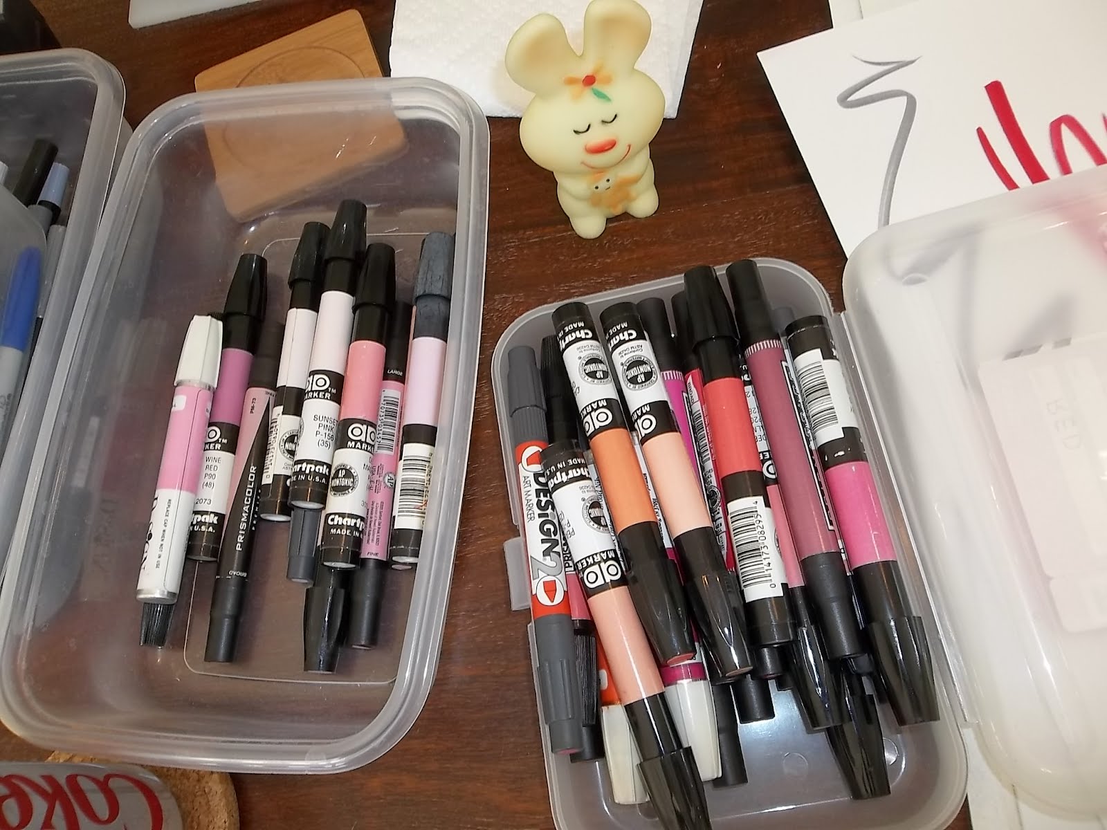 I have my reds loosely sorted by:
1) Warm reds - middle reds and reds mixed with yellows and browns.
2) Hot reds - Reds mixed with a bit of blue - magentas, wines, burgundies etc.
 I usually try to put a light pink highlight around Stimpy's RIM. It doesn't always work though, because the darker reds bleed into them.
 Then I take the middle red and draw a ragged line along that rim.
 I fill in the red. This is where I find out that I didn't make his outline dark enough, which means I'll have to go back and re-ink parts of it. I never learn.
 For the tongues I use very light warm and hot pinks as a base.
 Using the 2 different tints of red gives the picture look more depth. If I was to only use one kind of pink and just darker and lighter shades of it, it would end up looking monochromatic - which deadens the picture.
 Same theories for Ren's eyes.
 I gradually darken the pinks stroke by stroke.
 Next: The Art Of Naked Colors: