Tuesday, December 30, 2008

Critique For Kelly Toon


Kelly has bravely asked for a critique of a drawing. She is starting to use some classic principles which is good. Here are some tips to get them to work together.
from Kelly: Here are a couple of concept drawings I did to bid for a children's book illustration job. Take a Look. I tried very hard to keep my negative spaces interesting, asymmetrical, and to use balance in my designs, and make it all very appealing. I am proud of the results, though I can see where they need adjusting. A certain redheaded bombshell gave me some excellent feedback and that helped a lot! I am sharing these images, just to say thank you again for this wealth of easily-digestible information you provide every week. Hopefully these do not make you want to shoot yourself, if you decide to take a look. Of course I'd be delighted to get any critique.


I hope that is a bit helpful. My sketches are a bit generic just to make the points clear.

Monday, December 29, 2008

Can Angular Styles Be Staged and Composed Well?

Flat designs that are extra stylized can pose a problem for layout artists. If they get too flat or wonky, then all the individual design elements tend to veer off into their own planes and directions. This makes it hard to get an organic hierarchical warm composition.
When I was around 8 or so, Hawley Pratt and Al White's Hanna Barbera Golden Books were my favorites. I loved the design of the HB characters and Al White's bright happy colors and crisp rendering made the books look extra fun.
As a kid, I didn't think at all about composition - to me design just meant superficial stylistic tricks - like squarish heads and backwards hands.

Then one day I discovered a whole new approach to the Hanna Barbera style:


http://goldengems.blogspot.com/2008/02/pebbles-flintstone.html
This cover immediately caught my eye when I saw it on the bottom shelf of The Davis Agency Store in Billings Bridge Plaza in 1965. I grabbed it and stared at it in shock.


There was something really unique and brash and challenging about this style. Superficially the painting style looked messy because of the loose dry brush shading and textures. But it had something else that was different and appealing too. Each individual shape was designy and quirky, yet it fit easily and neatly onto the bigger forms. It had a great combination of contrasting curves and straights and everything just fit together so perfectly.
Biggest Forms of the composition make an overall interesting pleasing design. Every level of sub forms down to the smallest are interesting and fun.
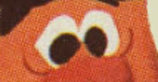
The eyes have interesting angles and are asymmetrical. But they still fit on the head in the right place. They don't go in a different direction than the angle of the whole head.

I flipped through the book in awe. Mel Crawford instantly became my favorite Golden Book artist. I didn't know at the time just how sophisticated his art was; I just knew it was different, somehow wrong and right at the same time.
This is not merely stylish and angular on a superficial level; it's great drawing, great composition and balance of filled areas against negative spaces. It has beautiful balance - much like the Bambi book, but in a more "modern" style. Balance is the key to good design. That's what's missing from so much of today's cartooning. Everyone thinks he's an instant designer just by drawing flat and wonky, or putting Anime eyes on a Bruce Timm drawing.
Of course, I also loved that Mel painted everybody the wrong colors. What a bonus!
By comparison with this stuff, the Hawley Pratt books look rushed and uninspired. I get the feeling that it was just easy money for him and he wanted to pump out as many books as he could. I know he has great layout talent because you can see it in the backgrounds of many 50s Friz cartoons. But the books look as if he just started drawing on the left side of the page and kept going till he made it to the right side of the page without worrying about having any compositional balance, or even good construction and balance in the individual characters.

http://goldengems.blogspot.com/2008/02/flintstones.html


I don't know if every Golden Book artist got paid the same page rate, but these Crawford paintings look like he spent some time planning each layout before he actually drew it. All the elements and shapes, big small and inbetween are related to each other in hierarchical order.
Mel is balancing a pile of skills and principles all together at the same time - a very difficult thing to do.
http://goldengems.blogspot.com/2008/10/hanna-barberras-cave-kids.html


This is the kind of stuff that gets easily misinterpreted as "wonky". It's anything but.
Every layout is a complete design whole. It's not just a bunch of unconnected sharp cornered shapes randomly thrown together.
The negative shapes are as interesting and appealing as the positive shapes. And they serve functional purposes too.


Mel Crawford - genius!
Staging - Bambi Hierarchy Broken Down - staging becomes art

There were a lot of good comments yesterday. Nate Bear especially made the points that I was focusing on.The main difference to me between that Flintstone staging and the Bambi staging is that one is merely functional and the other is planned artistically. In the Bambi picture, the whole layout is not only clear and easy to read, but the staging tself has been turned into part of the visual pleasure. It's so well thought out and artistically managed. It's logical and creative at the same time. The artist worked from the outside in to make an overall compositional statement where every level of sub forms and details agree with the big picture and follow its plan and physics..
Bambi and Thumper are each clearly framed by the BG elements, and those elements flow around the whole composition. The sub forms in the background are being pulled along and held together by opposing forces. The whole layout design is one force. Gravity is pulling the trees and snow down. The structure of the tree branches holds together the radiating pine needles and the clumps of snow.
Each clump of needles or snow all are following the same basic forces.
When you finally get down to the tiniest details, they too follow the physics of the larger forms. You could take any part of this image and break it down. You'll find the same logic everywhere.

This artist (the book credits Mel Shaw) is a real thinker and takes his work seriously.


The Flintstone picture on the other hand, while it's still very appealing looks like there was no thought put into it at all, except to cram all the elements into it and line them up next to each other where they at least don't bump into each other.

The appeal in the picture comes mainly from 2 places - the original Ed Benedict character designs - that even if drawn a bit sloppy, still look fun, and from the clean painting by Al White. The layout itself does nothing to add any artistic statement of its own. It looks like Pratt drew Fred first and then just filled the remaining space with the other characters.

If you look at all the details in the painting, they don't follow any overall statement. Each brushtroke is deft and clean, but the individual elements just go every which way at random without following any internal logic or form. They just fill up space.


Knowing this doesn't make it an easier to draw good compositions. I envy the people who have the knack for it - Jim Smith, Frazetta, a lot of the Disney layout artists. I don't seem to have this talent. I admire it though and wish it came naturally to me. I'm always looking for layout artists that can make this kind of picture magic.

I love how Shaw takes no detail for granted. Even the smallest elements -like the blades of grass above are each actually drawn with the brush, not just scribbled in. They are drawn and follow a larger form. The whole picture is a beautiful design, not merely an illustration of an event.

I always tell my artists to draw everything - even the smallest details. Never just sketch some scribbly lines in. Make each detail have a direction and shape and follow the physics of the larger form it is subject to.

Sunday, December 28, 2008

Disney Principles 6a - Staging 2 - examples to compare and contrast


What's the difference between these 2 approaches?

Market Research- Would You Buy These Toys


Let's say you saw a grab-bag full of these Little babies hanging from a peg in your local drug store or 7-Eleven and it cost 2 or 3 bucks of lousy US dollars.
I know David is gonna want this one. It's his favorite expression.


Would you buy 'em?

If you have Little brothers, sisters or kids, show them to them and ask the same question.