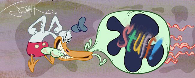
Kelly has bravely asked for a critique of a drawing. She is starting to use some classic principles which is good. Here are some tips to get them to work together.
from Kelly: Here are a couple of concept drawings I did to bid for a children's book illustration job. Take a Look. I tried very hard to keep my negative spaces interesting, asymmetrical, and to use balance in my designs, and make it all very appealing. I am proud of the results, though I can see where they need adjusting. A certain redheaded bombshell gave me some excellent feedback and that helped a lot! I am sharing these images, just to say thank you again for this wealth of easily-digestible information you provide every week. Hopefully these do not make you want to shoot yourself, if you decide to take a look. Of course I'd be delighted to get any critique.


I hope that is a bit helpful. My sketches are a bit generic just to make the points clear.

