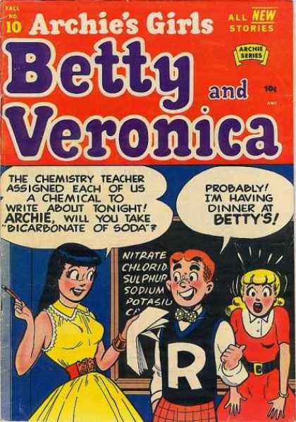

We like kids, baby animals and pretty girls because they have big eyes and big heads.



The first really appealing cartoons - that really looked like our modern conceptions of cartoons had very big eyes.
 This made them instantly more appealing than the previous 500 years worth of cartoons, which were really just itchy looking ugly caricatures of reality.
I can admire this kind of drawing for its technical skill but it doesn't attract my eye as quickly as an unrealistic simple, well designed big-eyed, big headed cartoon character. This cartoon from the 1800s is a slight distortion of reality, instead of a complete stylization intended for visual fun and appeal.
Big eyes and big heads are not the only elements that make a cartoon appealing of course, but they are probably the most important elements.


 Compare Coal Black above to the Friz Freleng version of the same character. Which one has more instant appeal?
 Tiny eyes are a sign of the conservative cartoonist; someone who thinks being too cartoony is not responsible or sensible.
 Big heads, big eyes = cute
 Small eyes, smaller heads = blah...
One thing that drew me to Clampett's cartoons so quickly was how appealing they looked. He drew not only bigger eyes than the other directors, but the huge eyes were much more expressive. They suck you in to the characters' feelings more and invite your empathy.
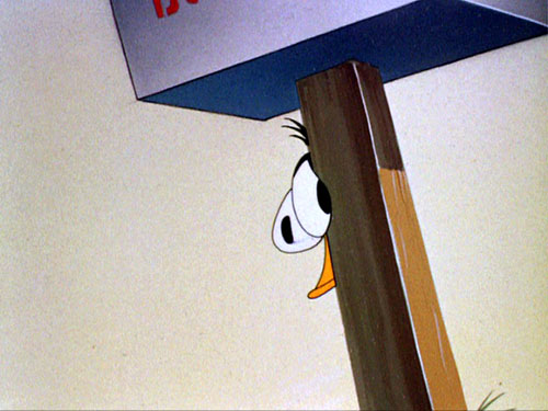

 http://johnkstuff.blogspot.com/2006/10/specific-acting-scribner-clampett.html
 Here's a Clampett Bugs drawn by Bob McKimson. His drawings for Clampett are more appealing than his drawings in his own cartoons.
Small craniums, small eyes not appealing


 You'd swear that McKimson actually rebelled on purpose against the accepted visual symbols of appeal.
He drew tiny eyes and really tiny craniums, with big jowls - as if he was predicting Fox News Anchors 50 years before their time.
 Low hairlines add to the natural unappeal of small eyes and tiny craniums.

 Tiny Pupils Lack Appeal and The Ability To Express Emotion
There is more than 1 school of animation design that fights character emotions by drawing tiny pinpoint eyes. These pinpoints just float around the vacant eye shapes as if they are not actually part of them. They can't bend around the eyes, can't dilate and certainly can't use cartoon license to enhance the appeal and expressibility of the characters.
 Cal-Arts animators had a period where they used pin-point pupils. To me this made the characters very cold and unappealing. The animators relied on a handful of Disney eye expressions from the late 70s, but simplified them to the point of - I don't know...coldness. It makes it very hard to get into the characters. You can see it came from Disney, but eliminated what made Disney appealing in the first place. It's Disney without solid drawing or cuteness.

 Cal-Arts animators had a period where they used pin-point pupils. To me this made the characters very cold and unappealing. The animators relied on a handful of Disney eye expressions from the late 70s, but simplified them to the point of - I don't know...coldness. It makes it very hard to get into the characters. You can see it came from Disney, but eliminated what made Disney appealing in the first place. It's Disney without solid drawing or cuteness.
Prime Time Cartoons

Of course, big eyes and big heads won't guarantee your drawings will be appealing. They still have to be well-drawn in every other way, but these are 2 obvious traits that help make your characters fun to look at and they help grab people's attention and draw them into the characters' adventures and emotions (if they have any).
And it's not just the SIZE of the eyes that matters. The shape is important too, but I thought I would keep this post on one basic point.
