


 I agree with almost everything Frank and Ollie say about appeal - in theory. Appeal is really important to all art. The combination of skill and attractiveness or pleasure to the senses is what makes art. For cartoons, that's the combination of "solid drawing" and what F and O are calling "appeal". Solid drawing is very easy to judge, because it is objective. It's either right or wrong. That doesn't make it easy to do, of course, but without it, you lack control over anything else, including "appeal".
It's much harder to define "appeal" than to define "Solid Drawing" because it is subjective; in Disney's case, "appeal" is judged very narrowly - very very narrowly. I find a much wider array of cartoon art styles appealing than the Disney animators do and find much of what they do unappealing-including the very generic Italian characters above, both of whom are the exact same stock design, varying only in their girth. These designs have been recycled endlessly throughout Disney's films - they even use the same designs for the animal characters. I think the very fact that Disney has such a limited repetitive amount of character designs is evidence of how hard it is to achieve appeal in the first place. Disney discovered a few stock traits that Walt found appealing and they just kept using them, for fear of trying something new that might be deemed "ugly".

By "ugly" Frank and Ollie mean just about anything that doesn't look like 40s Disney style. I agree that overly detailed characters or overly graphic characters are hard to turn into enduring animated characters, but it's not that simple.
"a drawing that is complicated or hard to read lacks appeal"


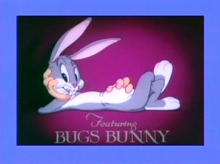
Many of Warner Bros. characters aren't as "cute" or appealing in design as the best Disney characters, yet as characters they have have endured. Bob McKimson's personal style is generally regarded as unappealing, even though it's obvious he has great solid drawings. Clampett was able to get him to do very appealing stuff in a few cartoons - Coal Black, Falling Hare, An Itch In Time, What's Cookin' Doc - and on the famous 1943 Bugs Bunny Model sheet.
The sad truths about "appeal" is very few people have it in the first place and the whole concept of it seems to be lost.
If you grew up in the 70s or afterwards, you've probably come to accept ugliness and lack of sensory pleasure in all the arts: music without melodies, sloppy illustration, icky fine art, ugly cartoons both on TV and in feature films. A small handful of today's cartoonists look back to the 1930s to the 50s and see that obviously everything was more appealing to the senses back then, but most people today just accept ugliness in art matter-of-factly. Anything obviously appealing, like an old time melody is automatically written off as corny and unhip.
At one time, the "look" of a cartoon was its main factor. It drew you in to find out what it was about just by being so much fun to look at. Now watching cartoons is an acquired taste. It has to be learned (like eating broccoli) because cartoons aren't attractive anymore. They actually hurt your eyes and you have to train from youth to ignore the physical pain before you can accept cartoons for some other reason than that they are cartoons.
There are more executives in charge of animation today at each studio than there ever were, and they equate "appeal" with "too cartoony". They all want to be taken seriously as filmmakers, so to them the uglier, blander, more detailed and less fun to look at their characters are, the more "realistic" they are. "Realistic" equals "quality" to the sensory deprived.
------------------------------------------------------------------------------
CAN APPEAL BE DISSECTED AND LEARNED?
I'm not sure, but I will try to analyze it, starting with how Disney found appeal in their style. It'll take a few more posts though.
Here are some "ingredients" of appeal, but knowing them doesn't guarantee that you can capture the subtleties and balance them to just the right degree to make your drawings look fun.
Pleasing construction:
Disney Appeal: Based on infant, baby animal and feminine traits.
 Big heads, big eyes, soft flesh - but wrapped around good construction and perspective.
Proportions: cartoonists magnify the things we find interesting and shrink the things we find ugly or boring.
Big heads, small bodies, big hands sometimes etc.
A good cartoonist draws emotions rather than precise accuracy or realism.
Personal style: Some artists just have naturally appealing styles. Rod Scribner and Chuck Jones can take Bob McKimson's basic structures and make them prettier. Fred Moore can take a character designed from generic circles and draw him with flair and appeal.
Animators who draw well but don't have strong appealing individual styles benefit from having good designs to work from. Design and appeal are not 100% the exact same concepts but they overlap.
Rhythm:
Freddie Moore is the basic Disney master of appeal, and lots of people have copied him superficially yet still find appeal an elusive concept. Cal Arts animators love the flow and rhythm in his loose sketches (I do too) and figure that if they draw loose with flowing lines and never commit to a finished drawing, then they will be as appealing as Moore himself.
Moore can draw solid finished drawings as well, but that's harder to copy. There is a lot more to Moore than just flowing lines. He understands construction, anatomy, balance and just happens to put it all together in a very unique and pleasing way that invites hordes of copycats who draw vague flowing blobs.
http://fredmoore.blogspot.com/
Control of variety of shapes: This is what good designers do. It's slightly less intuitive than personal style because you have to to intellectually create new shapes and combinations, rather than just rely on a gifted hand that makes every character look good.
You can be too intellectual though and have clever combinations of odd shapes that are intellectually stimulating but not very fun to look at.
Surface details: Disney has more surface details on their characters than Warner's.

 THE SQUIRREL MASK TRICK:
 Disney designers deduced that the fur pattern of a squirrel's face is the most pleasing of all and designed a squirrel face mask that they stretched over countless characters to make them automatically cute.

Disney imitators for decades have thought this was the secret and they stretched their squirrel-masks over their badly constructed characters and we ended up with "All Dogs Go To Heaven", "Balto" and many other unappealing Disney copies.
 Hmmm, the squirrel mask trick didn't work this time.
Balance of shapes: The spaces between your design elements have to be just right in order to have a pleasing balance. The Disney animators pursued this goal to an almost mathematical perfection. Bambi evolved from earlier Disney deer that had less pleasing proportions, balance and surface details. Once they nailed that balance, they used it on scores of characters for the next decade and feared trying anything new, until UPA and Ward Kimball purposely broke this mold and did ugly on purpose just to teach Frank and Ollie a lesson.
 Even though this is supposed to be cold and uninviting, it still retains many Disney design principles: balance, construction (2d construction), clear staging, variety of shapes and more.
Here are some "ingredients" of appeal, but knowing them doesn't guarantee that you can capture the subtleties and balance them to just the right degree to make your drawings look fun.
Pleasing construction:

Disney Appeal: Based on infant, baby animal and feminine traits.
 Big heads, big eyes, soft flesh - but wrapped around good construction and perspective.
Proportions: cartoonists magnify the things we find interesting and shrink the things we find ugly or boring.
Big heads, small bodies, big hands sometimes etc.
A good cartoonist draws emotions rather than precise accuracy or realism.
Personal style: Some artists just have naturally appealing styles. Rod Scribner and Chuck Jones can take Bob McKimson's basic structures and make them prettier. Fred Moore can take a character designed from generic circles and draw him with flair and appeal.
Animators who draw well but don't have strong appealing individual styles benefit from having good designs to work from. Design and appeal are not 100% the exact same concepts but they overlap.
Rhythm:
Freddie Moore is the basic Disney master of appeal, and lots of people have copied him superficially yet still find appeal an elusive concept.
 Cal Arts animators love the flow and rhythm in his loose sketches (I do too) and figure that if they draw loose with flowing lines and never commit to a finished drawing, then they will be as appealing as Moore himself.
Moore can draw solid finished drawings as well, but that's harder to copy.
 There is a lot more to Moore than just flowing lines. He understands construction, anatomy, balance and just happens to put it all together in a very unique and pleasing way that invites hordes of copycats who draw vague flowing blobs.
http://fredmoore.blogspot.com/
Control of variety of shapes: This is what good designers do. It's slightly less intuitive than personal style because you have to to intellectually create new shapes and combinations, rather than just rely on a gifted hand that makes every character look good.
You can be too intellectual though and have clever combinations of odd shapes that are intellectually stimulating but not very fun to look at.
Surface details: Disney has more surface details on their characters than Warner's.

 THE SQUIRREL MASK TRICK:
 Disney designers deduced that the fur pattern of a squirrel's face is the most pleasing of all and designed a squirrel face mask that they stretched over countless characters to make them automatically cute.
Disney imitators for decades have thought this was the secret and they stretched their squirrel-masks over their badly constructed characters and we ended up with "All Dogs Go To Heaven", "Balto" and many other unappealing Disney copies.
 Hmmm, the squirrel mask trick didn't work this time.
Balance of shapes: The spaces between your design elements have to be just right in order to have a pleasing balance. The Disney animators pursued this goal to an almost mathematical perfection. Bambi evolved from earlier Disney deer that had less pleasing proportions, balance and surface details. Once they nailed that balance, they used it on scores of characters for the next decade and feared trying anything new, until UPA and Ward Kimball purposely broke this mold and did ugly on purpose just to teach Frank and Ollie a lesson.
 Even though this is supposed to be cold and uninviting, it still retains many Disney design principles: balance, construction (2d construction), clear staging, variety of shapes and more.