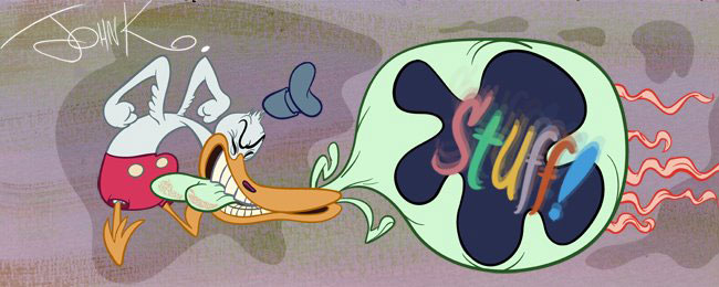
I'm just titling them this way because I'm using the text from "The Illusion of Life".
Here is an explanation of what they mean by "pliable" and what I term "organic". It isn't listed as a separate principle in the book, but it's sitting there on a page about squash and stretch. The book wasn't layed out too sensibly, but here it is:

I'm surprised there wasn't more interest in my first post on "appeal". It's a difficult subject and I see that there was some misunderstanding in the comments. I'll have to try to articulate some of the ingredients of "appeal" more clearly in further posts. The Dick Williams images are examples of drawings without appeal. Odd stiff proportions, too much detail; very anti-Disney. Designs that fight being animated. Difficult and clumsy for the sake of making it hard to move.
Also by "appeal" I don't simply mean character design. I thought I explained that in the post, but maybe not well enough.
You can have a bland character design like Tom and Jerry or Elmer Fudd, but an artist with natural appeal can apply style and appeal on top of the generic design. More on all this later, if anyone is interested.
Click the label below that says "organic" for examples.

