 On a related note, Kali has posted some funny rude drawings from the very first Flintstones episode-the only time I have ever seen Ken Muse draw funny, so go look!
****http://kalikazoo.blogspot.com/2007/01/love.html
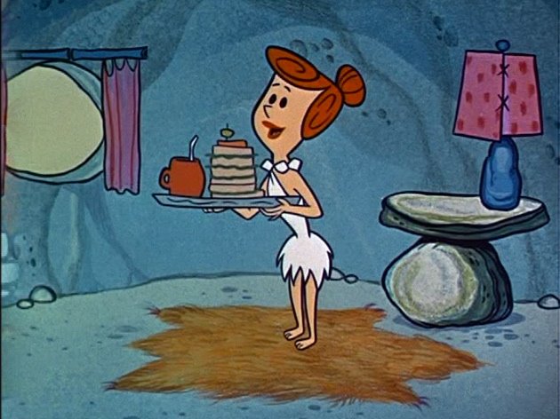
Flintstones_titles
Uploaded by chuckchillout8
 Hi Art
I posted your last letter about technique and put up some illustrations to help.Let me know if I got any details wromg and if you look at your paintings and remember any more details about how you did anything, let me know!I wanna ask you about the Flintstones next. The first season has some of the most beautiful BGs I've ever seen in cartoons.You painted the original title sequence right?
Ed's layouts and your colors and techniques are just amazing!
Did you spend extra time developing this style?I love the techniques on the caves-some shadows on the rocks done with friskets, some painted on with big brushstrokes. Sponge over more sponge, but such control! Did you use different kinds of sponges? With different sized holes?How do you keep so many details from looking messy?It seems like you designed every stroke and frisket.The green skies are really cool too.
John
Hi John,
Your latest post is excellent.
all kinds of stuff: Color Theory- Art Lozzi explains some technique
I had no idea that all these bgs still exist. Soon I'll be asking YOU lots of questions.
I'm trying -I really am- to put more importance onto the ones you mention. This has nothing to do with modesty. I do remember them and I remember the fun.
SQUIRTING PAINTS INTO THINGS
I remember standing there (never sat) squirting paints out of the bottle -sometimes into a baking dish, sometimes onto a cel. Another "palette" was a cupcake form for 12 cupcakes. Must've had about ten of them. Very good now that I look back at it.
APPLYING PAINT TO A SPONGE
You could dip your brush into the color and then brush a sponge, lightly, or you could dip the sponge itself into it. Of course you couldn't dip a roller into it. The roller had the sheets of celluloid. Some of the most amazing blends came up this way. Would you classify this as "technique"? It wasn't as controlled as it might appear, but there was always that critical eye that said, "No!" or it said "OK." It wasn't up to Bill and Joe or up to the animators and layout guys. It was entirely up to the bg painter.
TAPE THE BRISTOL BOARDS DOWN
By the way, maybe these bloggers today would like to learn how we held down our Bristol paper while we painted. Remember that we also had long repeat pans to do as well as the single frames. I don't know how backgrounds are done these days -I have NO idea- but after our paper was punch-holed for the pegs, we taped down the top and bottom and began, making sure the paint was always of a consistency that would prevent buckling. Acrylics helped us -the thickish consistency was useful.
WATER COLOR PAPER FOR WET EFFECTS
This, too, is why we avoided using water colors and such; i.e., the paper must never get drenched. When we needed to show a wet, watery effect, it was often on water color paper.
SPONGE EFFECTS
Sponging? Different kinds and sizes of sponges? Yes. Even used crinkled up kitchen paper towel, toothbrushes for splattering too. This is why I say that it was fun. What can you think of next to use?
TAPE PAPER TO WOODEN BOARDS
This taping down was done onto a very flat wooden board, about 4 feet long by about 15 inches high and about 3/4 inch thick. There was more than one of them in case we had a few different bgs to do -for different shows. When only one was being used they were stacked up vertically somewhere nearby.
You can imagine what that board looked like after a few bgs were painted on it. After the overlapping sponging, rolling, brushing, rubbing, etc, it was as if we had frisketed a lot of various colors and intentional designs onto it. I always liked that look. When I decided to get a new board, I didn't want to throw out the used one. I decided to "finish" it off as a painting, adding specific designs and colors that gave it a very "modern" look. I varnished it after and hung it on a wall with a thin wood frame around it. One of them is in Redlands where my late parents lived. My niece will take it and put it into her new home. It's a great memory, practically a museum piece.
HOW TO CUT A FRISKET FROM A CEL
Do people know how to cut a frisket from a cel? We had the pencil-sized X-acto knives, very sharp pointed. All it took was a slight incision, without cutting all the way through. We traced over a shape that was on a page underneath and incised. All it took was a light pressure with the fingers after and the shape would pop out. Simple and safe.
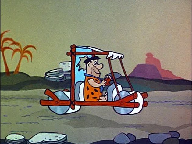
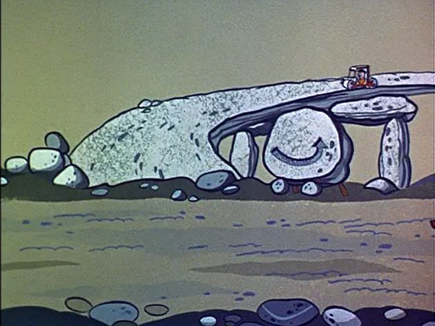
FLINTSTONES TITLES NO BIG DEAL TO ART
The opening scenes -what you call the "title sequence"- of the Flintstones were just plain all right to me. I'm not thrilled about them to tell the truth, but they worked. Let's be frank. So-so, not-too-imaginative layouts, with all that rocky look of buildings, etc, no greenery or trees or flowers or water. I can remember other Flintstone openers too, earlier ones besides those (?) and if I remember well enough, they were better.
I thank Ed B for his own input into the flavor and developing of the Flintstones. Unique stuff. Once that prehistory style was established, Ed's style, with the feel and the taste of Bedrock, it was easy to follow suit and to develop it even moreso. After the very first ones showed success and approval, the following ones were easy, so it was endless continuity: ariations on a theme.
But I dislike the idea of teaching this sort of thing or to stress this to all those young bloggers who want to believe that a specific technique was involved, as if Art Lozzi went to a particular university to learn this. I'D WANT TO THEM TO PICK UP A BRUSH, A SPONGE, USE THE FINGERS, FRISKETS, OR WHATEVER OTHER INNOVATIVE "TECHNIQUE" AND TO EXPERIMENT. Only this way will they themselves see results. They can then say, Hey! Or No! Something from inside will guide them. An instructor can only show so much. I'm back to the beginning with "Open your eyes. Make mistakes. Goof up. Some voice will tell you that they are mistakes and you're going to work to correct them. Or to evolve them into non-mistakes". Piano players don't go straight into Chopin...or who(m)ever.
Awaiting with bated (yes, that's the correct spelling) breath,
Art Lozzi
Here are some of the amazing layouts and paintings that Art just takes for granted as "no big deal".
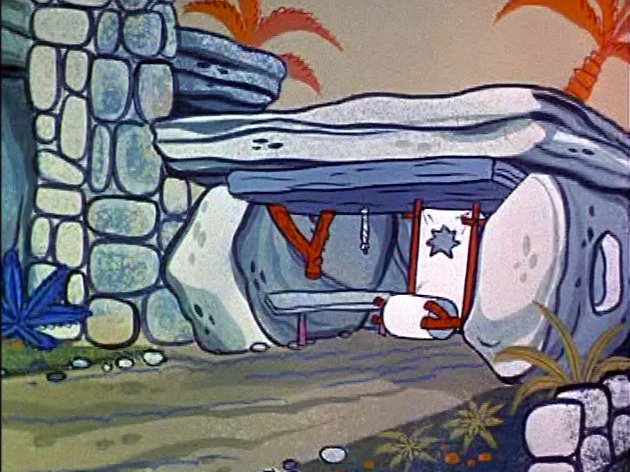
 These layouts are by Ed Benedict. They are absolutely great. Full of contrasts. Nothing mechanical about them. Completely thought out well organized placement of all the graphic elements.
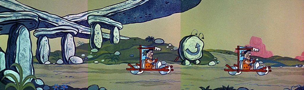
ORGANIZED ART ON EVERY LEVEL OF CREATIVE THOUGHT
Art follows this logic with his organized arrangement of colors, shades and textures.
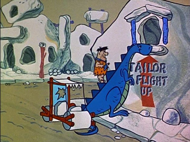
The rocks in the bridge have about the left third (not half!) in shadow and the rest in light. If the shadows were the same size as the light areas and reached the middle of each rock, the rocks would visually be split into 2 separate objects and would not read as solid images.
The textures of the rocks are different than the textures of the plants. The shrubs are painted on with brush, while the rock textures are done with sponge.
Each area of texture on the road is actually designed as shapes and not left to random chance. The shapes are interesting and the spaces between them are too. They are not evenly spaced apart either. This makes the road seem natural or organic, even though it is actually highly thought out by a human.
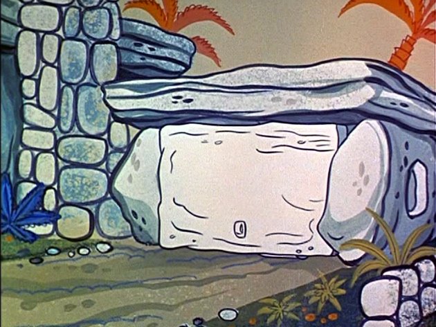
 Each building here is a different, yet related shape. There is a general look to them, while each is specific, following the general idea.
The color of the sky and the road is a similar greenish beige, while the buildings are cleanly separated by having an overall color of off-white.
Now within each of these general colors, there are slight variations to give the picture colorful interest and a natural feel. The shaded streaks on the road are slightly different colors than the base road color, which makes the picture colorful, fun to look at, natural and not monochromatic.
Note the shadow textures on the rocks DO NOT MIRROR THE EXACT SPACE OF THE ROCK and THEY DON'T FILL UP THE WHOLE AREA OF EACH HOUSE.
Each shadow is either sponged on, or painted on with brush-but the shape itself is clear and designed, and loosely follows the general shape of the building it helps define-without being a mathematical mirror image.
Art may think there isn't much to these paintings, but he comes from a very different era than we do. He comes from a day when people were raised on critical thinking and the difference between general concepts and specific instances. Everyone did things with thought 40 years ago. Sometimes artists of that era have trouble analyzing what they did, because it seemed to them to just come natural. Their logical planned approach to their work was instinctual to them.
Today there is no huge wealth of knowledge and experience in the back of anyone's brains that allows artists to act "instinctually". They just do whatever accidentally comes out of their pencils...or worse....Photoshop or Maya.
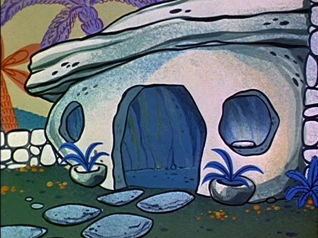
 Hierarchies of texture.
The whole building has a base color of off white.
On top of that, Art has sponged on a very subtle slightly different hue of off white-you don't notice that so much because...
Art then takes a large area on the right of the building and sponges on a darker more obviously contrasted shadow-and in a blueish hue.
He also has more shadow texture in a greenish hue, about the same value as the blue. This adds more richness to the painting.
On top of the sponged shadows, then Art paints on more shadows, some with brush in a washy look.
All these shadow shapes have individual shapes that form around the shape of the building, helping it look at the same time graphic and rounded and natural.
 Here all the colors are variations of a similar blue, but the hierarchy of textures makes it still read clearly.
 Look at all the amazing subtleties of colors in the shadows and streaks on the building here. Nothing garish, but just as delicious to the eye as rocky road ice cream is to the tongue.
This is cartoon pleasure, what every cartoon should strive for-fun pleasure for your senses.
It takes skill, taste and an appreciation for your audience to achieve this.
Today's cartoons-as well as TV, movies and music all seem to be intended to make you depressed and see the ugly side of life. A little of that would be OK, but everywhere I look or listen, I am bombarded by insults and offences to my senses. This is a fairly modern attitude in culture. It started in the 70s and has grown more grim with each passing decade.
My wish is to bring back some joy to cartoons and a reason to be proud to be human. Yes there are ugly things in the world and we shouldn't ignore them, but why do we glorify them in all walks of culture now?
All the real world ugliness of wars and hate and disease and misery could really use some balance of art that shows us of the beauty and joy that humanity is capable of when it is not trying to murder everyone.
 These backgrounds are so full of thought and fun and the pleasure of being alive and smarter than the beasts.
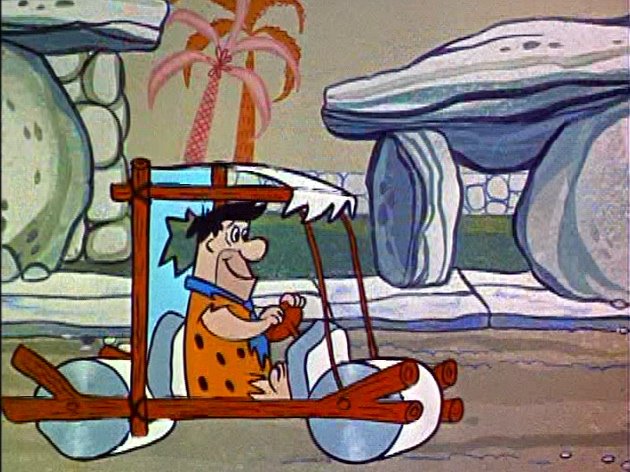
 A note on style:
Obviously these pictures are very stylish, They are not realistic at all.
BUT, they are not arbitrarily styled. Each element is made of different types of shapes and colors and textures that help define what the objects represent.
Today's flat cartoons treat everything in the cartoon like it is made of the same substance-broken glass. It is a style that is made up of the inability or unwillingness to make creative decisions.
It is "Trend-thinking". "
 Note that the treatment of the rug is completely different than the treatment of the rock table.
Note that the rock table stands out against the rock wall. How?
Because it has more contrast in the light and shadow than the wall.
It is a slightly different color and value.
It has a heavy black organic line around it.
It has more detail.
It takes planning and the ability to make logical artistic decisions to make a picture read clearly- and then to look nice on top of it it.
Now what the heck is this all about?