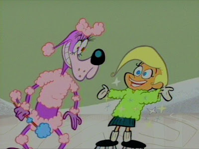
 The selling point of the commercial is her "curly fleece" sweater and I had to figure out a way to design the lumps to suggest the texture of the fabric and make it differ from the dog's poodle fur. The differences are subtle and disappear after the magic happens because I got lost in the rest of the animation and forgot.
 After she'd been fwaffed, I then animated her head pretty much straight ahead for her dialogue.
 I also wanted a complete contrast to the way I animated the dog -even in the dialogue mouth shapes.
 His mouth shapes were extremely specific and detailed. Hers I wanted to be simple, graphic and cute. Like the great Gene Deitch Terrytoons Logo from the 1950s.
 I even had to note when to fill in her mouth with red and when to fill it in with white, which I wasn't sure would work, but it seemed to.


 It switches to pose to pose here, as she stretches her arms out, the mittens expand and then contract.


 Here's the whole scene in action:
http://www.cartoonthrills.org/blog/01Principles/antics/CurlyFleecePoodlesmall.mov