The difference between a thoughtful cartoonist and a random cartoonist is that the thoughtful one organizes all the elements that make up his drawings into a whole.

He is thinking clarity of design, functionality and then an appealing arrangement of the shapes. Style happens only as an afterthought.

After the important drawing and design principles have been covered.
An inexperienced and unskilled cartoonist thinks of the individual pieces and his personal style and ends up with a cluttered, disconnected uncontrolled random image.
The drawings from the first episode of Rocky and Bullwinkle are skilled organized images that display most of the classic cartoon principles. On the surface, you may look at them and think, "Oh! That's that '
UPA style' where everything is simple,
designy and flat!"
Based upon that superficial observation you might then decide whether you like it or not. People who don't like things to look too simple will think "Oh that's easy to do. There are hardly any details."
this has a lot of details and some reasonable drawing skill, but no design or organization of the total image. Too many details can make an image hard to read and not have a point of view.People who love
UPA because it is superficially simple will think. "What genius! There are hardly any details!"
1) LINE OF ACTION
AND OPPOSING LINES OF ACTION.
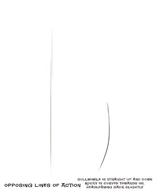
Cartoonists use lines of action to express characters' attitude through the body. A line of action is even more primordial than a skeleton. Once you have decided on your line of action, then you form your character along that path.
When you have 2 characters together you need to balance each of their body attitudes together so that:
1) They read clearly
2) that we know the difference between them, either as characters in general or their individual attitudes at the moment
3) They create an appealing or aesthetic balance.
http://johnkstuff.blogspot.com/2006/11/composition-7-compose-your-poses.html
I picked this image because it has a very simple pair of lines of actions, just to make this point clear.
Here is an image with no thought to lines of action, let alone opposing ones.

Here is an image with a nonsensical attempt at line of action:

I see young artists do this all the time. They put a curve in the body, thinking they are drawing a line of action.
Line of action is a tool that points your character in a direction. It has to have balance and go somewhere-forward backward, etc.
This drawing has no direction or attitude. It is merely bent. Bullwinkle's huge head in this position would cause him to fall backwards. It's a very awkward uncontrolled drawing.
2 Proportions

Proportions do a lot to help or hurt your drawings. Even proportions tend to look generic and bland. Odd proportions are more interesting.
http://johnkstuff.blogspot.com/2006/06/animation-school-8-proportions-affect.htmlBullwinkle has very unique proportions. He has an extra long torso and tiny skinny legs.
His skull is much smaller than his muzzle.
Even the structure of his torso has uneven proportions. The chest area is shorter than his belly.
Bullwinkle's proportions contrast strongly against Rocky's more even "cute" proportions.
Here is a drawing that doesn't use Bullwinkle's contrasted uneven proportions:

Hi muzzle is more nearly the size of his skull. The body is the same size as his head. His body is not as skinny as the god drawing we are discussing. All contrasts have been dulled down.
3 Construction and Negative Shapes- Bullwinkle

I combined these 2 concepts because I couldn't figure out how to separate them.
Bullwinkle has sensible construction in the basic shapes that form him. As I was putting together these shapes, I had to look at the relationship between each shape and the next.
Negative shapes:I do this by looking at the shapes of the spaces between them. These empty spaces are every bit as important as the filled spaces.
The empty spaces help us see the forms. Unskilled artists tend to have cluttered drawings. What makes them cluttered? There are no spaces- or no planned spaces.
The spaces should have appealing shapes too.
Note the thought in this drawing-not every part of the filled structures have the same amount odd spaces between them.
The arm on the left is close to Bullwinkle's side, while the arm on the right is much more in the clear where you can see it. The artist wants you to see that arm. It is waving. If the other arm also had the same amount of large space between it and the body, then it would compete for attention with the right arm.
Here is a picture made by someone not conscious of the
usefulness and appeal of negative shapes:
 Construction:
 Parts of Bullwinkle that in the finished drawing are made up of smaller parts are well organized. They fit within the larger forms.
His Antlers have a very definite overall shape. They aren't just wiggly lines. The negative shape in between them helps define their overall shape.
Unlike these:

Fingers are part of the hand shape. The hand flows out of the arm.

Rocky's proportions are more even than Bullwinkle's but not totally even. He is a bit more than 2 heads high. His design lies more in his details than in his form, but that's for the next post...
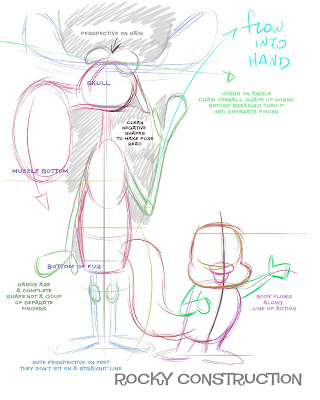
Note that Rocky's
construction flows along his line of action. I have seen many artists start out with a line of action, but then lose it when they plop the
construction on top of it. It happens all the time.
How did this artist avoid that problem? Compare the left side of Rocky's body to the right side. The right side puffs out more. It is a convex curve. The line on the other side is straighter. It doesn't puff out. This makes Rocky appear to have his chest coming towards us.
I am always harping on my artists not to add big lumpy details that break up the silhouettes and lines of action in their drawings. Your final drawings should have clarity of direction and attitude, and too many lumps and details that stick out of the silhouette eat those concepts up.

Raff here missed that subtlety - as many artists do. But now that I've explained it, I'm sure he will get it on his next try, and be a much richer man for it!
SO WHERE DOES STYLE COME IN?I'll explain that in the next post. I'll also add the details of the characters and show how the they follow same principles that I discussed here.
Style is the last element of a good drawing. If your drawing doesn't have all these other principles in it, then it won't have style. It will just be a jumble of mistakes.
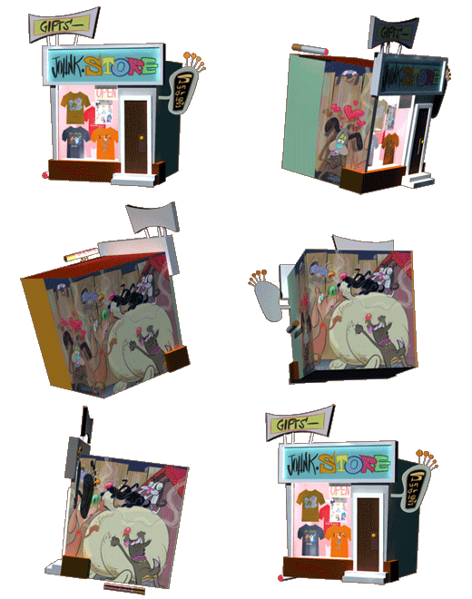

 Kali let me in on A secret the cartoonist girls seem to know. Japan makes the most interesting and fun toys. Here's a kind she just showed me.
 They make little tiny characters with stumpy armS and legs (when they have legs)
 Disney has hopped on the bandwagon too. I think it's a good idea. They are even allowing the toys to be off model.
 They give them a nice Jap feel.
 Kali suggested :"I think it would be keen if you made Spumco toys in the stubby small style" and I agreed.
 Would you buy these if you saw them in a gum ball machine?

 How about a line of stubby cartoonists?
 These were also featured in a monumental post on Kali's blog.