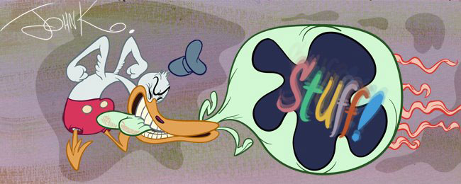
a broad example of action pose causing reaction pose
This is a super clear example of characters in a broad pose causing another character to react to the pose. It's a broad gag and the broad pose helps to drive it home and make it as funny and ridiculous as it can be.
A bland pose would weaken the effect of the gag.

Use this tool to make your characters come alive, to seem as if they are real and that they affect one another.
Opposing poses and lines of action will take your cartoon characters away from being mechanical puppets whose only function is to recite verbal nonsense that cartoon "writers" could tell you themselves in person without ever spending a nickel on a cartoon.
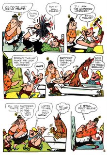
The poses of your characters can work together to create pleasing compositions and tell the story and define the characters emotions.. Usually one of the characters in a scene is the focus.


The character who is doing the "acting". Usually the one talking but not always.
The other characters are "reacting". Their poses are being affected by what the focused character is doing and saying.

A subtle example of action causing reaction
Ren is not directly talking or causing a reaction from Stimpy. He is not even aware of Stimpy in this moment - but Stimpy is aware of him.
Ren is thinking about the evil fun he could have if they have a baby. Stimpy has done his best to try to convince him and he is waiting with baited breath to see if Ren decides yes.
His body pose shows him slightly leaning towards Ren, but not so much as to risk making him mad and deciding against the baby. The pose shows his eager hesitation.
On top of the clear body poses are very specific expressions also helping to tell the story.
Your poses and careful drawings can tell the audience way more information that a pile of script pages can.
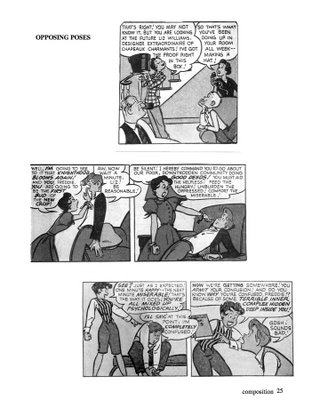 These kinds of poses are much more interesting than characters standing straight up and down,
 or characters that have random poses that don't relate to each other....that look like they were each drawn separately, then just pasted into the scene.

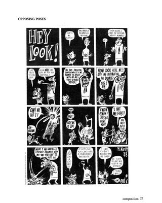
Harvey Kurtzman creates fantastic compositions and designs using his characters' poses and emotions. Look at the great positive shapes of the characters and the negative shapes between them. Harvey also uses many of the other principles I have been talking about. Can you see them?
Harvey is most famous for creating Mad Comics and Mad Magazine and the talented artists he developed- Wally Wood, Jack Davis and many others did their best work for him. Harvey did rough layouts or compositions for many of their comics and it made their work read better and have a lot more life than much of the work they did for others or even themselves.
Harvey didn't like his own drawings and it's too bad because I think he was the best of the bunch and wish he had drawn a lot more comics himself.
Here is an example of what happens so often in the crazy inefficient, wasteful animation production system we have today. There are so many steps in the animation production process, where about 5 different artists all work on the same scene and each one in succession has to draw the same pose that the previous artist drew, and each time the scene gets watered down, until the final scene is completely stiff and lifeless and has lots its original purpose and meaning.
Here's the basic process:
A storyboard artist (if he is a good one) draws rough scenes but with some life and poses that are recognizable as poses-with lines of action and specific expressions and sillos and maybe some suggestion of composition.
A BG artist takes the storyboard and draws the BGs with no regard to what actions and poses the characters have to perform in the scene. He never leaves room for the pose artist to actually move his characters around. If there is a composition in the scene or interesting BG ideas, he disregards them and pastes in drawings from the background model pack that are filled with distracting non-descriptive details.
This storyboard and BG then goes to a layout artist who has been brainwashed to draw everything "on-model". He swears under his breath at the storyboard artist for drawing off-model, swears harder at the BG artists who gave him no room to pose the characters in the scene.
Then he tones down all the poses and takes out the expressions that aren't on the model sheet.
A Prop artist (usually someone who was a security guard a couple weeks earlier) designs a separate "prop-model-pack" that's 6 feet high full of every imaginable hammer, fly, rubber chicken, blade of grass and ridiculous details-but draws them poorly and too big and wonky to actually fit into the poses and compositions that the storyboard artist and layout artist drew.
The storyboard and layouts and BGs and prop packages are then given to foreign animators who then trace all the poses from the layouts (without looking at the storyboard to see if they have been toned down) and proceed to lose another generation of life.
Then the animation drawings go to the assistant animator who traces the animators watered down drawings of the watered down layouts and waters them down again.
As if this isn't enough, after all the animation and assistant animation is done, all the scenes then go to the "on-model" department for one last check to make sure that no drawings in the cartoon stand out from each other, that nothing at all looks interesting or amusing or tells the story effectively.
The final cartoon eventually comes back to "civilization" and everyone who worked on it hates it and blames everyone in every other department.
It's no wonder artists get jaded so fast in this business. It's hard to care about your work, once you see that it never reaches the screen the way you meant it. You have to really dumb-down your expectations in order to survive.
Here is an example of the first stage of watering down, from storyboard to layout. Now imagine this happening 4 more times in 4 more departments farther and farther away from you.
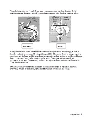 I've spent 20 years designing and honing a system that tries to fight this natural watering down tendency and encourages creativity and punching-up in each successive department in the studio. Other studios like Nick and CN adopt my system and then year by year throw more monkey wrenches into it, and undo it until the time comes when they still use all the terminology and superficial play acting of pretending to make "creator-driven" cartoons, when in reality they've almost reverted to the Filmation/ Hanna Barbera factory system of the 1980s, but now all the execs and front-runners act all retro and have big wacky pitch meetings, then send the storyboards overseas -DON'T EVEN DO LAYOUTS- and use "voice-directors" and "story-editors" to make sure no director or creator has any control over the characters he created and make everyone draw "on-model" and keep all the creative people in each important creative department from communicating with each other.
This costs a heck of a lot more than having a small crew that works together under a director who is in charge of all creative aspects of his cartoons, by the way, although they will tell you otherwise because they don't count their own salaries and the salaries of all the department heads and story editors and the years of wasted "development" and market testing that went on before anyone drew a single frame of film.
These below are not as crystal clear as the good examples of the work of my heroes above, but I try to show the best examples of a concept as I can to drive the point home. I don't expect everyone to be Harvey Kurtzman or Chuck Jones. I just hope to get artists to try things they might not have been aware of before.
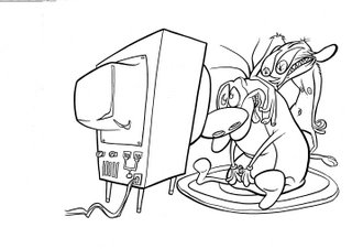
To get poses this specific on the screen, through the production sytem is very hard. It is set up to undermine whatever your creative intentions are.
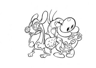
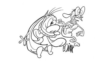

If you want to see this principle in action from a real sitcom check this out. Even without the sound you can see how great the acting and reacting is:
Buy the best sitcom of all time and laugh your guts out!
