 I was a design freak when I was a kid. I loved all cartoons, but really thought a lot about style and design-which I don't recommend that you do until you learn basic drawing principles!
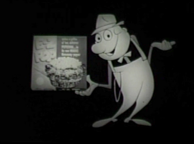
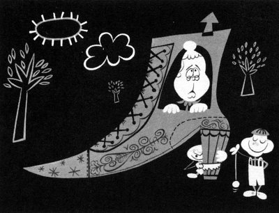
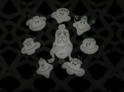
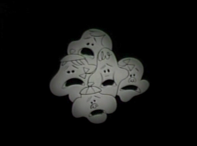
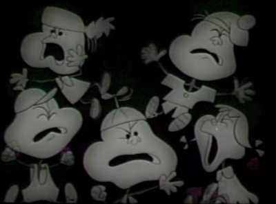
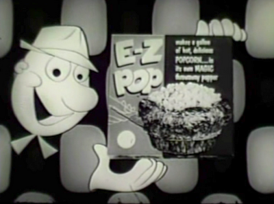
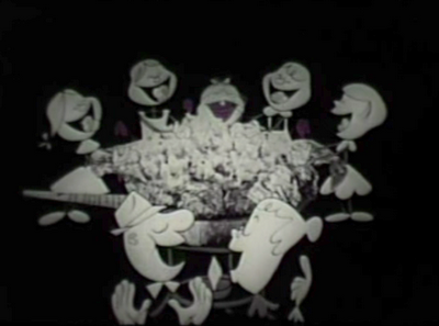
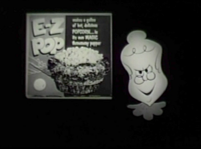
These striking images are from a John Hubley commercial for EZ Pop Popcorn from the early 50s.
 I'm not a big fan of UPA cartoons, mainly because they are not very entertaining and the animation is stiff and limited.
For some strange reason though the "UPA Style" worked best in 50s commercials.
This commercial is not only designed beautifully (much better than UPA's "entertainment" shorts) but it has great bouncy animation, a really lively track, cartoony characters and movement, brilliant cutting, fun timing and crazy background graphics.


By contrast, UPA's theatrical shorts are sluggish, bland and depressing and they have horribly influenced the whole cartoon art form-even today, 60 years later.
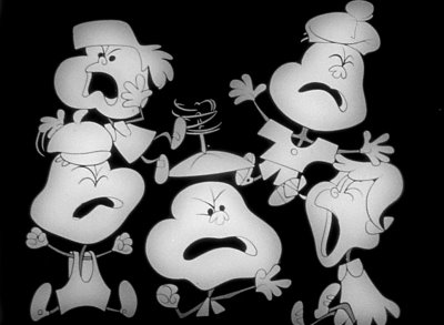 The artists that drew and animated this cartoon all learned classic basic cartoon principles.
You can tell by the drawings that they understand construction, line of action, squash and stretch, silhouettes, clear staging, negative space and all the principles I have been going on and on about in my blog posts.
FORMS WITHIN FORMS
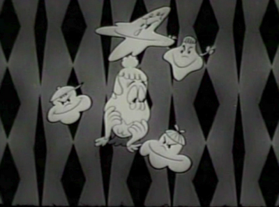
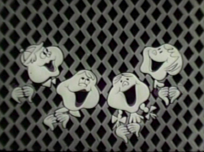
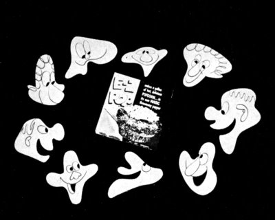 This frame above starts with a clear and simple COMPOSITION. There is a ring of popcorn heads framing the product.
All the heads within the ring are SPECIFIC DESIGNS-each a variation of a general shape-the shape of a kernel of popcorn.
The overall composition uses NEGATIVE SPACE to make the POSITIVE Shape (the ring of heads) read clearly.
Each individual head uses negative spaces to make the positive features (eyes, mouths, noses) read clearly.
The negative spaces between each head are interesting shapes.
The CONSTRUCTION
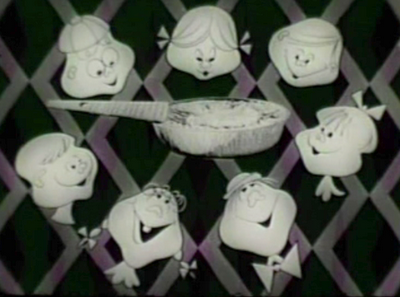 of the heads is slightly played with and distorted-and that's what makes the images look to today's primitive eyes- "stylized".
LOOK UP ALL THE CAPITALIZED CONCEPTS IN THE BLOGGER SEARCH AT THE TOP OF THE PAGE TO READ BLOG POSTS EXPLAINING THE CONCEPTS.
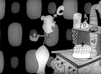
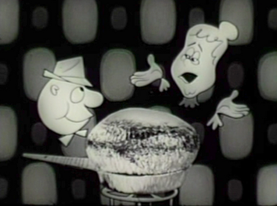
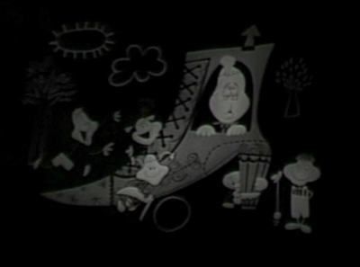 Every scene in the cartoon has an overall design. The individual pieces-characters and props are carefully fit into a larger design.
Today's UPA copycat cartoons look like each piece is individually designed, then the pieces are thrown onto the stage in a haphazard cluttered pile.
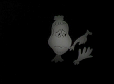
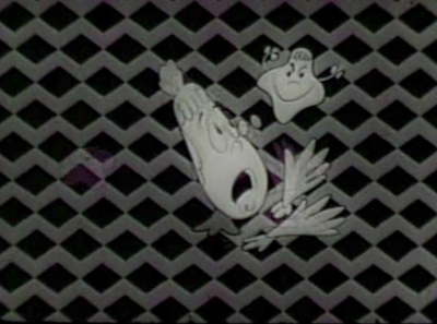
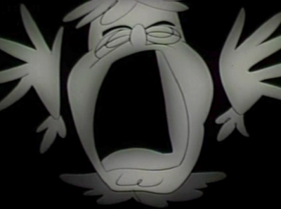
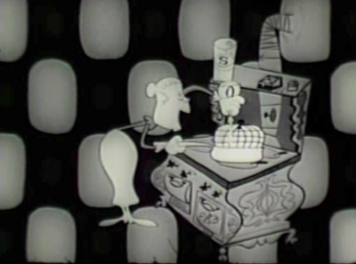
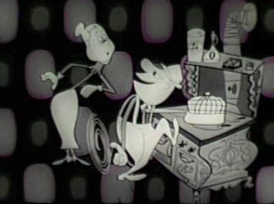
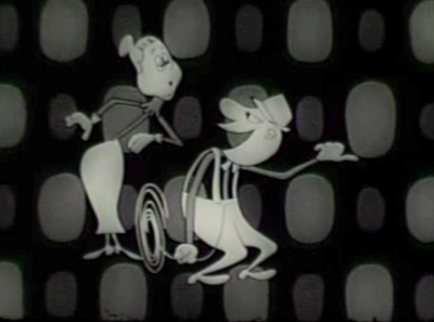
CLEAR POSE.
NEGATIVE SHAPES
ORGANIC SHAPES
ASYMMETRICAL DESIGN AND POSE.
CARTOONY
NEGATIVE SHAPES
ORGANIC SHAPES
ASYMMETRICAL DESIGN AND POSE.
CARTOONY
Just like this:
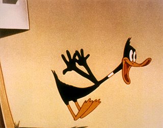
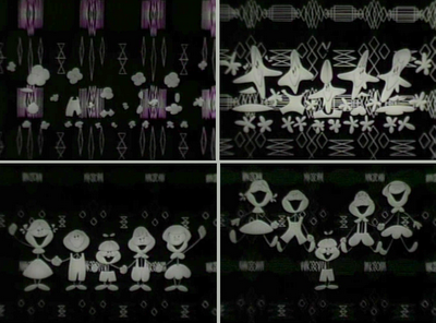 THESE IMAGES ARE DESIGNS WITHIN DESIGNS.
The group of kids is a shape- squint your eyes and look at them as one form.
Then that form is broken up into individual kids and then each kid is broken into his separate forms-but no matter how deep you go into analyzing the details and forms in the frame, they all fit into larger design statements.
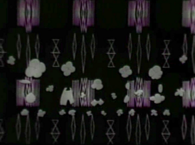 Now, beyond how great the design is, the way it MOVES is perfect for the style. The animator had to find an appropriate style of movement that didn't distract from all the compositions and designs in the still pictures.
In the UPA shorts, the designers seemed to worry that the animators would distract from the design, so they developed a style of non-animation. Gerald McBoing Boing is basically inbetweened from pose to pose and is pretty boring to watch.
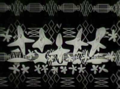 This stuff moves in an extremely cartoony, bouncy and fun way and it totally enhances the design.
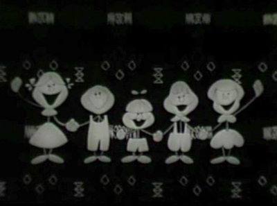
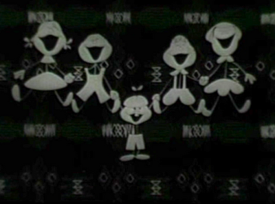
 The commercial is so fun and cartoony and to the point that it totally sells the product. It makes you want to eat the popcorn.
 It also makes me want to see an entertainment cartoon that's designy-but with solid PRINCIPLES, not superficial wonky flatness- a cartoon that does all the things a cartoon can do that no other medium can.
This EZ Pop cartoon couldn't be done in live action or even CG and that is the main reason to doo it in animation. To use the magic that only real animators can make.
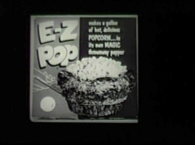
Thanks to Amid Amidi for the crisp images at the top of the page and for uncovering so much lost animation art and films and making the best animation magazine ever-Animation Blast. It's the only animation magazine that is actually about animators.
He also is the outspoken uncensored half of Cartoon Brew.
Amid has a book out all about 50s designy cartoons. It's full of great art (and some pretty awful art too-look at the damn cover!).
Of course, as in all art books, much of the art is way too small and there is a ton of wasted white space, but you have to buy the book anyway. Take the opinions with a grain of salt-it praises the movement that ultimately destroyed cartoons.
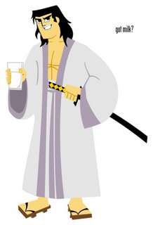
I'm gonna do more posts about designy cartoons. The main point I will make is that just drawing flat and primitive like so many Cartoon Network shows and others today does not make a good design.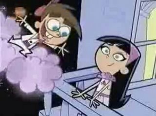 DISCONNECTED SHAPES, NO SILLOS, NO NEGATIVE SPACES WITHIN DESIGNS
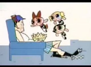 GENNDY IS THE BEST
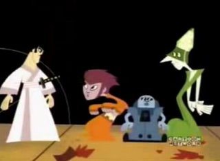
NO COMPOSITION, CHARACTERS NOT RELATING TO EACH OTHER, BROKEN UP POSES
 DISCONNECTED SHAPES, NO SILLOS, NO NEGATIVE SPACES WITHIN DESIGNS
 GENNDY IS THE BEST
I think Genndy is hugely talented, and that's why I recommended "Dexter's Lab" as a series to Fred Seibert and wrote about it in Animation Magazine. He makes the best of today's flat school of cartoons.
Genndy is great at timing, cinematic storytelling and really great at color design-the best today.
TO MAKE MY POINT CLEAR THOUGH ABOUT STYLIZED DESIGN, I HAVE TO SAY THAT THE DESIGN IN EVEN GENNDY'S WORK IS MISSING WHAT THE FANCY DESIGNERS HAD IN THE 50S-GOOD DRAWING PRINCIPLES.
Genndy himself told me in a published interview that he wished he had stronger drawing skills.
I think the character designs in his cartoons (the drawing "style") are very awkward and many times(as in the examples) not well composed and don't utilize the larger principles of drawing and design.
I can say the same thing about many many scenes in my owncartoons (and I have and will)-but I'm not relying so heavily on "design" for my entertainment value.
If you are going to shout "Hey look at how designy my cartoons are!", then you could benefit from stronger design and drawing principles. - Not just drawing eyes in a square and calling it a face.
CHARACTERS PASTED IN THE FRAME, NOT RELATING AS A COMPOSITION, NOT AFFECTING EACH OTHERGenndy is great at timing, cinematic storytelling and really great at color design-the best today.
TO MAKE MY POINT CLEAR THOUGH ABOUT STYLIZED DESIGN, I HAVE TO SAY THAT THE DESIGN IN EVEN GENNDY'S WORK IS MISSING WHAT THE FANCY DESIGNERS HAD IN THE 50S-GOOD DRAWING PRINCIPLES.
Genndy himself told me in a published interview that he wished he had stronger drawing skills.
I think the character designs in his cartoons (the drawing "style") are very awkward and many times(as in the examples) not well composed and don't utilize the larger principles of drawing and design.
I can say the same thing about many many scenes in my owncartoons (and I have and will)-but I'm not relying so heavily on "design" for my entertainment value.
If you are going to shout "Hey look at how designy my cartoons are!", then you could benefit from stronger design and drawing principles. - Not just drawing eyes in a square and calling it a face.

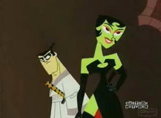
CHARACTERS MADE OF DISCONNECTED PIECES OF BROKEN GLASS, GENERIC SHAPES AND EXPRESSION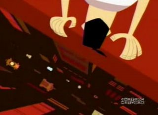
YIKES!! UNBELIEVABLE

YIKES!! UNBELIEVABLE
Good strong traditional drawing principles are the foundation of good design, so I consider all this flat craze to be horribly dangerous and an impediment to making quality cartoons. Drawing flat today is just an excuse to not do anything hard or have to learn all the tools that are available for animated entertainment.
Style CAN be good, but only in the hands of really great traditionally trained artists and it should never replace entertainment value. It should merely add an element to it.
