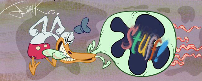
 I found this book at a sale the other day and it is illustrated by someone named Ballantine. I don't know anything about the artist but I really like him (her?) and can deduce a few things from his cartoons.
 Strong Principles: His cartoons show that he has had solid training. His compositions are organized and handsome. His poses are natural, yet exaggerated. He uses negative space to draw attention to the positive images. His drawings are organic, use line of action, clear silhouettes, perspective. His shapes are varied, imaginative, appealing and fun. He is impressively skilled.
 Design Sense: He has a strong and personal sense of design, although it's obvious he has influences. He tries different styles in different illustrations.
 Varied Influences: He is influenced by many artists and life itself.
 There are certain artists who have developed powerfully recognizable styles that have followers who do their utmost to imitate their heroes' styles.
Jamie Hewlett
Al Hirschfeld
Mort Drucker
Ronald Searle
Frank Frazetta
Disney
etc.
Each of these artists has a huge assortment of their own inspirations and heroes, but many of their followers struggle to merely imitate the surface details of these complex creators-and it's always obvious when you see it.
"Oh, that's someone copying Mort Drucker", or "Let's See, how does Hirschfeld draw arms again?" or "We're doing this cartoon in the "Spumco style." etc.
Jack Kirby was probably influenced by Milton Caniff, but nobody would accuse him of being a Caniff imitator. Kirby invented tons of things and was in turn imitated by an army of followers- some who are just imitators, others who were inspired and developed their own styles. Barry Smith, for instance started by emulating many Kirby techniques but soon developed a really amazing and original style of his own.
There is a big difference between being inspired and influenced by a lot of artists, and just copying the superficial aspects of one or 2 heroes.
Superficial style imitation second-guesses how someone else would draw something and severely restricts the range of ideas and images you can create. It's self-censorship.
 When I look at Ballantine, I see possible influences from Searle, Hirschfeld and others. But Ballantine still has his own style(s) and still takes in tons of information from the world around him and mixes it all together with his own opinion and personality-his "style".
In order to be able to truly express yourself and have a personality and style in your work, you need to:
1) Know how to draw- principles (principles aren't style!)
2) Have a wide variety of influences and interests- don't just imitate a "style" you like
3) Keep your eyes open-look at the world, people, animals, things - let the world be your style, don't filter what you see through how you think cartoons are supposed to look
I'm trying my best to help anyone who would like to have strong controls over their pencils. I hope it benefits someone out there. Maybe even I'll be able to take advantage of it someday and make cartoons with other like-minded artists who would want a director to encourage them to put their personalities into the scenes - as long as you have functional principles first!
****Blammo sent us this audio interview with Bill Ballantine:
http://wiredforbooks.org/billballantine/index.htm


