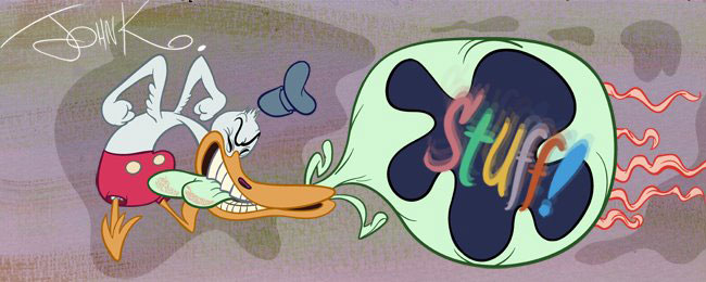
When I was a kid I recognized his style 2 ways:
1) Upside down curly mouths
2) His movements were more fluid than the other animators. -he did fully animated HB commercials too! I'll show some later
Upside Down Curly Mouths


Mixing different animators with different layout artists

Here are two animation drawings by Ed Love. They have different proportions. The one on top is more even and tastefully on-model. The one below is more awkward and dumpy.

The one above is probably layed out by someone like Dick Bickenbach who drew everything with even pleasing gentle proportions. The one below is by Walter Clinton who always drew Fred (and other men) dumpy and oafish, which is funnier to me. Above: Bickenbach
There is a ton more to be said about Ed Love, and I will in further posts. This was just to give you a quick superficial clue to recognize his work from the drawings. Above: Bickenbach
Some Clinton and Love oafs to admire


