Thursday, November 29, 2007

funny drawings from Flintstone - Carlo Vinci

Carlo has a really unique drawing and posing style.

There's something rude about it and I like that.


Do you feel shame shivers?
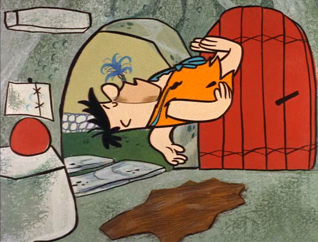


CARLO VINCICarlo Vinci was a dancer and a man's man at the same time. His poses have an awkward gracefulness about them. Look for lots of bent wrists.
Another dead giveaway: He likes to cock their heads at jaunty angles for accents in dialogue.


His anticipations are always recognizable. They are funny and add life and character to the cartoons. It's as if they are performers who know they are up on stage in front of you and mean to let you know they are putting on a show.

Fred is a well-cultured oaf in Carlo's hands.

His poses are off-balance yet flowing at the same time.
I like the early episodes when they drew Fred's hair with blunt ends.


Carlo hardly ever has the hands doing the same thing. Usually one is up, the other down. And they alternate. moving back and forth.
He loves to flop their noses around too. It grabs Wilma's attention for sure.
Barney is a peeping Tom in all the episodes.Carlo has very distinct scrambles and zip outs.
Note the DVNR on the toes and the hair.

Fred Dies
Fred's missing his equipment.


Carlo Vinci has heart


Carlo's style is really easy to see when you contrast it to Ken Muse, who doesn't add much to the layout poses. Ken Muse:I can recognize Muse's style by how even and straight up and down everything is.
Compare to Carlo:Carlo likes to use a zig-zag line of action in his poses, like Fred above. Awkward-elegance. I don't know any other animator who does that.

He also does the best nose-molestation. If you wanna see that, I can put some up tomorrow.

Go See Some Cool Puppets in CT!


My friend, Craig Marin (who made the Soupy Sales marionette) is having a huge exhibition of his FLEXITOON PUPPETS in Greenwich, CT. There will be over 100 puppets, marionettes, props, sets, storyboards and production art from their television, film and stage projects.


It runs from today, November 29 - January 5th.


The address is 299 Greenwich Ave 06830, and if you're anywhere on the east coast try and check it out. You can see a speedy promo at www.flexitoon.com"


Craig and I are trying to figure out how to do some live/puppet/cartoon stuff together all in one show.

Some good things in the Horton Trailer

Holy cow, I didn't realize I'd get so many comments just about a post I threw together. I was a bit worn out from preparing the college post and that got hardly any comments, so I threw up a picture of Horton and didn't think much about it and got deluged! Now I feel guilty. I looked at the trailer and the first thing I saw was all the modern 'tude and Cal Artsy acting and self-analyzing character story stuff.

But then I noticed there were some pretty good things in there, so I thought I better mention them.

http://www.hortonmovie.com/site/horton.html


The Non Cal Arts Expressions Look Great
A lot of them are buried in fast inbetweens though. And I'm curious as to why they are blurred. It'd be great if you could actually see this stuff.
I like how the eyes are sunk into the skin of his eyelids here. I wish we could see it better.
After the blurry stuff stops, he goes back into the Cal Arts business.

Here's some very clever stuff...
I'd rather it wasn't blurred though.
These hands are great!

The Textures Are More Subtle Than Usual
The fur looks more cartoony or toylike than what you usually see in CG films. They aren't putting realistic hairs and pores on cartoon bodies - which makes most cg characters look like deformed mutant humans.

These characters look like Seuss characters - at least when they aren't making Disney expressions and that in itself is a huge advance in modern cartoon design.


The Colors Are Not Obnoxious
They seem to be doing natural colors and not trying to punish our eyes with typical cartoon colors.
It doesn't really look like Seuss BGs and the colors are conservative, but it's a huge relief from what we are used to in cartoons:

I hope there is at least one sequence that is rendered in the style of my favorite Seuss book:
Maybe the Blue Sky artists are slowly pushing back against the forces of Hollywood/Disney formula. This definitely looks better than most feature cartoons. It's at least cartoony underneath the expressions and in a few short bits. Maybe there is more of that in the film.

I wish they could just go ahead and do some shorts using the Seuss stories as is, and not have to fill them up with Hollywood sappy story stuff and characters who have to examine their inner selves and learn that it's ok to be yourself. Just tell the stories and use the original poetry and get good character actors with fun voices to narrate.
Come up with a animation style that is as silly and cartoony as the drawings. Seuss is pure silly fantasy. It's not supposed to have fake heart or be believable. It's supposed to be funny and clever and imaginative. An escape from the mundane.

That'd make a great DVD.
_________________________

A note on individual interpretations of classics:

I'm actually all for individual creative additions to classic properties, as long as they don't completely undermine the essence of the material. Unless they are satires, of course. (Good ones). It's like covering a standard pop song.

Clampett and Jones both did their own interpretations of Seuss and Horton and you can sure tell the difference between them. I think Clampett did the better version and closer to the source, but that's just my opinion. The Grinch has a lot of good things in it. Both directors obviously have great respect and admiration for Seuss, but are also very strong stylists themselves and couldn't possibly help adding their own personalities to the cartoons. I wouldn't want them to just take Seuss' drawings and inbetween them.

That's not the same thing as a corporate whitewashing of a classic. My complaint is that the same bland formulaic makeover is applied to everything today. There's no sign of anyone's individuality anywhere. It's like there is only one animation creator and he makes every frame of every film. The same expressions, same acting, same contrived story gimmicks are just pasted over any subject matter.

There are lots of truly creative people in the business that could do marvelously entertaining, exciting and popular cartoons if only we could discard the corporate formula veneer that smothers every attempt to be sincere and creative.

Wednesday, November 28, 2007

Dr. Seuss Gets 'Tude. Big Budgets for Small Budget Thinking

Remember how much you loved this as a kid?
Well Hollywood has improved it.

HORTON HEARS A 'HO
I've always wondered why people in charge of animated projects like to take classic properties that completely stood on their own because of their inherent uniqueness and appeal and then change them into the same thing as every other cartoon.

At one time this kind of thinking was relegated to low budget bargain basement Saturday Morning cartoons. It seemed outrageous to anyone with taste or respect for creativity way back in the 70s and 80s, but you could use the excuse that it's low budget and therefore trash by definition, and trash doesn't deserve original or creative ideas.

Now Hollywood will invest huge fortunes on low-budget trashy 80s Saturday Morning type thinking. "Let's take a highly beloved classic character and 'tude him up!"
Cal Arts does Seuss

Kali and I went and saw Beowulf the other day, and besides the obvious outrages of the movie itself the theatre walls were littered with the movie posters of what else was going on in big-budget Hollywood. It was like looking at the Saturday Morning Cartoon lineup from 1985. Almost every poster advertised the types of ideas that 12 year olds come up with in the schoolyard at recess. I see this and wonder why ideas that anyone on earth could come up with deserve such vast amounts of money to produce. Couldn't a computer program generate the stories and concepts a lot cheaper than a bunch of Hollywood execs and writers?

The posters boasted something about people who ride the Coca Cola polar bears in the mountains. Hip Hop Chipmunks (with hairy human noses). Dr. Seuss who were designed somewhat like the originals, but standing around in poses and expressions from modern Cal Arts feature animation. The same expressions that are in every single animated feature made in the last 30 years. If you're gonna take Dr. Seuss characters, why not take the expressions and ideas along with them? That would be so refreshing to see something different. Why turn it into what we already have too much of? And why spend so much money on it?

Bad ideas don't deserve big money. I would think some smart executive somewhere would say we can do bad for a lot cheaper than the rest of Hollywood and therefore make more money back per dollar spent.

I wonder how much is spent on the scripts for ideas that anyone on the planet could come up with.

I really want to know how much they spend on movie poster bylines. "Honey just got funny". I hope they spend a lot on that department. Is there market research to demonstrate that having an awkward pun under the title brings in more profits?
How many car accidents has this billboard byline caused?

A comment worth answering:

Wes: How do you know the style of animation in this movie? Have you seen it? How can you judge a body of work from a poster that was more and likely done by a marketing team instead of the artist at the studio? You know as well as most people that even trailers are usually unfinished shots or shots cut from the movie. I do agree with some of what you say, but as far as people judging something before it's seen is really too bad, you might miss something great. Surf's Up was a great movie and Beautifully animated, but people judged it because of the characters and the movie failed. Don't judge a book by it's cover just because if it's bad you can say you were right....


These animators are obviously very talented, but the whole concept is playing against Dr. Seuss. It's acted and directed like a Pixar film,


rather than tailored to Seuss. I'm sure these artists could do a great movie, with some direction and an idea with more conviction. Technically, it's ready to go.Whoever animated this is pretty damn creative. The last scene in the trailer looks more custom than the first scene of this character. The first one looks Cal Arts. Anyone know why the 2 are different?


Do you like the normal sounding voices?

I think animators really would benefit from strong more distinct voices. When you have normal voices, then the broad animation actions don't seem to fit. To me, anyway. I'd like to see this animator do something to Mel Blanc or someone with real power and conviction in the acting. Good dialogue would help too.

Monday, November 26, 2007

Cartoon College - year 3


My 3rd year program assumes that students now have some solid basics down: Construction, line of action, basic motion. Now I want to take those skills and broaden the students' horizons.


Artists need to learn how to recognize the difference between formula and invention. Animation is full of formula and I would like to see a generation of artists who can break through the formula and start to use their skills as tools in order to create with, rather than simply repeat what has been done to death.

The year is dedicated to honing the cartoonists' observation skills and getting them to be able to apply their observations to their cartooning and animation.


Intense Caricature Study and Application

This is caricature with a purpose: to broaden your creative palette in animation. It's not to become professional caricaturists. It's not to get a caricature style. It's not to imitate someone else's caricature style. In fact, it's intended to cure students of desiring a limiting style.

Every person you draw is uniquely his or her own style, has a unique set of not only features, but expressions, gestures, mannerisms, textures, body language, body shape etc.
The style of your caricature should be dictated not by a preset notion of a caricature style, but by the style of the person being observed and dissected.

You want to get ideas from those you observe, you don't want to impose your own notions of what you think looks good onto your model. That's backwards.

The danger of imitating someone else's style is that you end up imitating their limitations and probably tone down their positive attributes. Hirschfeld is a great designer-caricaturist, but he doesn't really caricature bodies and he makes everybody look elegant, even though most of his subjects aren't elegant. It works for him and makes for great illustrations, but there is only one Hirschfeld.

For the purposes of animation, your caricatures should be observant and exploratory rather than imitations of someone else's ideas and filters.
Every subject you draw has new information that - if you can capture it, you can use in your own work. If you filter what the real world looks like through some preset notion of style (what things should look like) then you are severely handicapping your creativity.

Your goals in this course will be:


Make it look like the person.

Be Funny.

Learn the mechanics of the person.
To be able to draw a specific set of forms from every angle.

Be able to articulate what you learned from each person you caricature.
Absorb the ability to make new shapes constantly and not rely on traditional cliched animation shapes.


Specific Faces and their Mechanics

Students will pick either other students, teachers, family or film and TV actors and study not only what their faces look like in repose, but how their facial mechanics work for different expressions.


Specific Bodies
Everyone's body is as unique as their face, yet bodies are hardly ever caricatured. Usually someone has one way of drawing hands, or drawing fat, but this class will encourage students to observe how many different funny forms hands and fat can take.

Specific Expressions, Specific Gestures

I want students to constantly observe everyone around them. Be able to imitate them. Study their unique expressions, body language and gestures. There are no shortage of unique among cartoonists and animators. I've known so many that are full of individual quirks that are really funny. Amazingly these same individuals rarely put their own quirks into their cartoon drawings and animation. People automatically fall into line when they get a job and fit themselves into what they think is the correct and approved way to draw cartoons.I want students to begin to get a handle on real and specific expressions , then apply them to cartoon characters. Students can pick any of a set of classic characters and draw them in specific poses and expressions. This is not an easy thing to do!


Caricaturing Cartoons
The whole point of cartooning is to make fun of things. Did you know that you can make fun of people's drawings? You learn a lot that way.


Blandness is a big obstacle to creativity in animation today. This course consists of taking cartoon drawings that others have done and doing caricatures of them. This will get the students to be more analytical, and will instill a thirst for contrasts and fun in their work.The first semester would be spent doing still drawings and analyzing contrasts in designs. The second would be animating caricatures of cartoon styles and inventing funny ways to move funny characters.

This will teach students how to explore and refine creative ideas. To bring them conviction and clarity. To avoid the middle. To instill a sense of design and balance.


Character Animation

Walks, Dances, Rhythms

We'll study the best and funniest complex actions from classic Popeyes, Disney, Warners cartoons and animate variations using different characters.

http://johnkstuff.blogspot.com/2007/08/something-not-bland-popeye-can-you-take.html

Animating different types of designs.

Solving design/animation problems. Animating cartoon designs from media other than animation-comic strips, magazine cartoons, etc. Here's a few I would like to try, but there are a lot more styles to experiment with.


There are a small handful of design styles in animation today: The Cal Arts Style. The Spumco Style (its derivatives). The Cartoon Network Everything Has Corners Style. Each of these graphic styles come with their own set of cliched automatic motions.

These styles all come with severe creative limitations. I want to show students the vast variety of cartoon drawing styles that exist in other mediums and have them find ways to animate them that enhances the graphic styles - all with a mind to humor and entertainment.

This will open the students' minds to the limitless possibilities of animation that have yet to be explored.

Animating Super Structures with Varied Timings
A lot of animation today consists of quick actions that zip from pose to pose and avoids any slow careful 3 dimensional motions and subtle changes of expression.

This class will ask the students to do more careful and subtle types of acting and actions that don't rely on stock animation tricks.

We'll study live action actors and try to implement a wider range of timings and actions from life.

Bob McKimson's animation will set a great example of motion that doesn't cheat. Doing it the hard way.


Animating Caricatures

This class will take what was learned in the caricature classes and apply it to motion.

Students will animate characters that have the specific mannerisms and expressions that real people they have studied have.

Advanced acting, dialogue animation. Timing, pacing.

This continues the 2nd year studies.

Analysis Of Formula and Breaking Of Habits
Is this all there is to be said for eye expressions? Many animators think so.

Analysis and pattern recognition is the antidote to cliche. If you can see formulas, then you can break them.


The stronger your observational abilities and your analytic prowess is, the faster you will be able to grow creatively.
During your career you will be called upon to rely on formula and cliche, although your bosses won't call them that. If you recognize them for what they are, you can adapt quickly to different styles.

If you ever get a chance to work on a project that actually demands creativity, you will be less likely to be frozen in someone else's formula.

Saturday, November 24, 2007

Unusual Color Selections and combinations at HB

What color is the sky? Painting things colors you wouldn't expect automatically generates some surprise and interest.
One thing I look for in cartoons is clever and unique color combinations. You wouldn't think it would be hard to find that, but it is. For this post, I'm not talking about technique. Merely the choices of colors.

It's so easy for an artist to just grab blue, red, purple, pink, green and orange straight from the tubes and slap it on the paintings. It requires no forethought or creativity. Most paint sets come with those colors.

My favorite paintings, whether they come from Disney, Hanna Barbera, Genndy Tartakovsky or Illustrators are the ones where the artists choose odd colors. They mix each color in non-mathematical proportions with other colors, and then combine them with other odd choices.

What's a mathematical proportion? 50-50. Orange is 50% red, 50%yellow. Turquoise is 25% yellow, 75% blue. That's what you see in most cartoons-even in really expensive cartoons that could easily afford good color stylists.

CREATIVITY = SURPRISE

I like to be surprised. I think creativity is largely about surprising the viewer. If you just do what they are already used to seeing, then is that really being creative?

For about 3 years, the Hanna Barbera cartoons were filled with creative colors and color combinations.
Interestingly, the title cards tend to be less creative. They are more primary and secondary.
I like colors that are hard to name, like in the painting above. What would you call that ground color? Burgundian Umber?


How about the sky? Olive-mustard? And how many people would think of putting those two colors together in the first place?

COLOR BALANCE AND HARMONY

I like the kind of overall color stylings that start with one basic dominant color - like this sky color that doesn't have a simple name.
The other colors then are related to the dominant color.

Art put some brighter colors in the reeds. The smaller details are the best places to put more pure colors, because then they add some extra interest and punch without dominating the whole scene and taking away from the focus, which in a cartoon is usually the character.

He still was judicious in his reed colors. Light blue, purple and army green. He didn't put the whole rainbow there. He also applied the colors lightly so that some of the sky green blends in with the brighter colors and harmonizes the whole image.

These paintings are pure eye candy to me.

Here are slightly more normal colors, but still with harmony and a limited palette.

Title card with pink and yellow. Yeeesh.


A little too pure blue for me, but there is still something odd about it.


I really like clever uses of browns. Nature is full of an infinite variety of brown colors and inventive artists will take advantage of this much wider range of creative choices than what most cartoons allow.
What would you call the wall color below?


The greens in the grass have been blended with milky white to keep them from being too pure. I wonder why they didn't choose colors as odd as the sky colors for the grass.


Colors Out Of The Tubes

I actually don't remember the Rescuers looking like this. This may be the product of remastering. They take a lot of old cartoons and get rid of any mixed colors and turn them all into neon primaries and secondaries now. Especially pink and purple. They also seem to turn up the contrast so that dark objects turn solid black. The new Looney Tunes disk has some of the worst examples of color tampering I've seen yet- but not on every cartoon.

These colors don't need a color stylist to choose them. These are the first colors every kid chooses when they start coloring their pictures.
If I had a lot of money to spend on cartoons, I would expect my artists to come up with new colors and combinations all the time. Wouldn't they want to?

You know where to get good color ideas (besides from nature)? In fashion magazines-especially the European ones. I'll save that for another post.

Friday, November 23, 2007

the BG Style I'd Like To See

I would love to see the combination of Milt Gross's BG drawing style
with the painting style of Art and Monte


Look at these great colors! None of that pink purple and lime green stuff here.
Note the clever thinking of where to have strong contrast and where to have low contrast. Whatever has the strongest contrasts-like the house colors and values, draws attention to itself against the low contrasts of the grass wall and sky.

The house colors are all related too but the values are more contrasted than the relative colors. The colors all have orange-beige in them. This makes it hold together as one entity- a house.
I've been helping out a few cartoon students who have shown an apitude and eagerness to learn, like Amir and Mitch.

If anyone wants to practice and shows some aptitude for BG painting, I'll give you some tips.
Here's a simple one to practice on. Blow it up, trace it and paint it using Art's techniques. r paint one of the other Milt Gross BGs.

and below is a step by step how to paint this style:

http://johnkstuff.blogspot.com/2006/12/color-theory-art-lozzi-explains-some.html

Thursday, November 22, 2007

This old thing

Hammerson had this and sent it to me. Thanks Hammerson and have a happy holiday folks!

Wednesday, November 21, 2007

Enough Already!

Funny drawings once existed in cartoons, even cheap ones.
Here's a bunch of Carlo Vinci poses...


Ken Muse above


Ken Muse on his own above

Ken Muse with Ed Benedict layouts below


Tuesday, November 20, 2007

A+ Flintstone BGs - using neutrals and Grays between the colors


All these BGs are from one cartoon: The Tycoon from the first season of the Flintstones.
Take a look at how striking limited palettes and even large amounts of gray can be.

These are some of the most beautiful BGs I've ever seen in cartoons. So cartoony, such unique color choices, stylized textures, yet it all feels so organic and alive. Bedrock is a place I'd love to live in.
I would kill to have this BG pan of Bedrock!This is proof that you don't have to have big budgets to have good looking cartoons. Talent, taste and controlled choices can add up to a lot more than money and lack of controlled decision making:This looks like the painter couldn't make up his mind what colors to use, so he just decided to use every one. Straight from the tubes and shot through a blotchy airbrush. It's definitely hard to make creative decisions, but those who can are to be highly admired!

Using a lot of opposing pure colors just breaks up the image into little pieces and makes the character hard to see. It also makes the cartoon look fake. It doesn't help to not have a composition either.

Compare the texture in these trees to the textures in more cleverly painted BGs. These pine needle textures are not only blunt and sloppily painted. They completely fill the silhouettes of the trees. No creative selection has been made. "I'll just fill up the whole image equally with evenly spaced detail" is the decision that was made.
Well this has a composition and that makes it easy to read, but there are those favorite cartoon colors again!

It's hard believe this image below is from a fully animated big budget feature and not a Saturday Morning cartoon. Money doesn't always buy taste.

I'm willing to bet that many artists don't have much say in the stylings of their cartoons. A lot of the decision making is likely in the hands of execs who think more detail and brighter colors equals quality.Look what happened just 10 years later!

Monday, November 19, 2007

Art Lozzi - Snorkasaurus Hunter - salmon morning


This is my preferred color thinking for cartoons. Colors and techniques that make the cartoon seem warm, real and inviting. Even though this is very stylized-not realistic, it still has much depth.
I love the colors and textures in these BGs from an episode of the Flintstones.
The underpainting level is a salmon color (the sky)
Then Art painted the other colors on top, leaving some areas transparent so that the sky color blends with the other colors.
If you look at the walls, you can see a lot of clever decision making at work.
There is a fine sponge texture between the sky layer and the more contrasted brush strokes on top.

Note the big broad brushtrokes at the edge of the round house. Those are placed deliberately around the edge-not in the middle.

CONTROL YOUR CHOICES
This is a good use of contrast and control. The strokes themselves have a lot of flair and aren't parallel-yet they still wrap around the house. The organic shapes of the strokes make the house seem real, not mechanical. Lozzi has made many creative decisions, rather than just fill his whole painting with equal amounts of texture or evenly spaced brush strokes.
Looking closely you can see that the textures and brush strokes are not the same exact color tint as the underpainting. There are all kinds of subtle tint and value variations. This keeps the picture from looking monochromatic.
There aren't any simple colors. No primaries or secondaries, and the overall effect of the clever color choices makes the environment be more colorful than the typical garish colors you see in many cartoons, both past and present.


More good stuff...Subtle variations in texture and color make the overall main color seem much richer and not so simplistic and flat as pure garish primaries and secondaries.


I love the rocks in the original Flintstones.

Is there anybody out there who can paint like this and needs a cartoon to let him?


Friday, November 16, 2007

Grim in Barnacle Bill


BARNACLE BILL


Grim did the scenes with Betty and Bimbo making out on the couch and the scenes with Bimbo being chased through the rain. Genius!
I got these frame grabs off a youtube clip. There are much weirder ones even than these but I couldn't freeze the ones I wanted. But watch the cartoon and see some crazy stuff!
This is Grim with no rules except to have fun.
He drew Betty kinda ugly in this one for some reason. She looks really cute in Mysterious Mose.
Early animation was expected by everyone - producers, animators and audience to be imaginative. Grim really delivered.
You gotta see Betty and Bimbo make out on the couch! Pure cartoon magic!


This pussy has some really amazing lips.http://duck-walk.blogspot.com/2006/04/rubber-hose-animationbarnacle-bill.html

If anyone has a good copy of this cartoon, please make some frame grabs!

http://flickr.com/photos/brett_w_thompson/sets/72157603210963904/

Wednesday, November 14, 2007

Go See Grim Natwick Art In Person!

Grim Natwick is one of my favorite animation stylists. He drew in a really personal style that stands out from the studio styles he worked in.

As animation grew more principled in the 30s and 40s, it also had a tendency towards being generic. Disney's powerful influence urged animators to draw in styles that were "animation style" and many artists' submerged their personal styles to fit in with the group. A few charismatic and confident artists resisted. Grim is one of them.

Grim's illustration for a children's book.

A portrait of an ink and paint girl. Grim had a drawing ability beyond many animators. He could have been a successful magazine illustrator. He must have loved animation!

Steve Worth has put together a great exhibit of Grim Natwick's art from Grim's own collection.

This is wonderful on 2 counts:

1) It shows not only great drawings by Grim himself, but also drawings by other animators he worked with. Production drawings, caricatures, gag drawings. It really gives you a sense of what it was like working at Golden Age cartoon studios.

2) It's a compacted history of the entire cartoon Golden Age period-from the 20s to the 60s. Grim was there for all of it and played some big roles. You can see this all arranged in chronological order at the archive and Steve will give you a personal tour and history lesson.

30s - Fleischer
This is my favorite period of Fleischers- the most purely creative. Grim's personal style is most evident in these cartoons. He created Betty Boop and did the best animation of her by far. After he left for the west coast, they began tracing model sheets and she never had the appeal or spontaneity that Grim gave her again.
mid 30s IwerksAt Iwerks' studio, Grim's style was still strong but was starting to be influenced by Disney's cutesy animation style. This picture of Neptune is pure Grim. It's just pouring out style and indiviuality!

mid 30s Disney
Wow. This seems like a complete waste of Grim's talents!

Late 30s FleischerYou can really see the Disney influence in these cute little girls. They are beautiful drawings and still more specific than the general animation style of the late 30s. Steve says these designs were rejected at Fleischer's in the late 30s in favor of more blanded out characters - Disney's great influence on the animation world did not encourage stylistic individuals like Grim.

40s LantzGrim's drawing style is less evident in a lot of his Lantz work, but he did some really funny animation there. That chicken is from my favorite Woody cartoon - Solid Ivory. Grim's animation is hilarious in what could have been a generic cartoon story without him.

He had trouble drawing Woody in the Lantz style and some of his funniest scenes are the ones that are most off model.
He seems to be resisting the generic west coast style.You can see some of Grim in here, but he's struggling to balance the studio style with his own. All his Lantz animation is fantastic and super fun.

50s-60s UPA NY I don't know much about this period, but I think Grim's 30s drawings have much more design and style than this artificial design movement is asking of him.
Anyway if you are in the LA area, get over to the Archive and treat your eyes to some great art and amazing history. And give Steve a massage - preferably with a happy ending! He's earned it.

http://www.animationarchive.org/2007/11/exhibit-grim-natwicks-scrapbook-index.html


2114 W Burbank Bl Burbank CA 91506

Hoytyboy


Well I just signed a deal for my pal Steve "Spaz" Williams' commercial house to rep my commercials.
Steve is highly admired both as an animator and a director of live action. He's a real man too. A strapping stubbly Canadian who eats hockey pucks in milk for breakfast.

http://www.hoytyboy.com/directors/index.htm

He was the guy who designed and did the animation for Jurrasic Park.

Here is a link to the page they just made for my commercial reel:

http://www.hoytyboy.com/Director_John_Kricfalusi/Joins_Hoytyboy.htm

click around the Hoytyboy site and see lots of great commercials by their crew.

Thanks Steve, Clint and Emily!

Tuesday, November 13, 2007

Hanna Barbera's Missed Opportunities


"If only I had my life to live over, I would do what you want, John."


"Did I say "hippopotamus"? I meant a bear!"

Probably a lot of you full animation fans wonder how I can like Bob Clampett and Hanna Barbera at the same time. Clampett made the fullest of the fully animated golden age shorts and Hanna Barbera ushered in a whole era of cartoons with hardly any animation at all! Many think they destroyed animation for all time and I don't have a strong argument against that.

So I'm gonna attempt to explain why I still like and am inspired by their early stuff.

First, there is more to the appeal of animation than animation (the motion) itself.

When Hanna Barbera first started its TV Studio it had some creative elements that even many fully animated cartoons didn't (including their own).

GOOD CHARACTERS
Much has been written about the importance of good character in cartoons, but I haven't found it truly analyzed yet. What are the ingredients that make up good character anyway?

Appealing and Striking Character Design
This is the first thing you notice about a character. Whether he or she has a distinct design. Throughout even the classic period of cartoons, many characters had a generic design. My favorite character of all time is Daffy Duck and he is a pretty generic 40s style duck. He gets his personality from the animators, once he starts moving.

Hanna Barbera characters from 1957 to the mid 60s had not only an overall striking house style, but each character had a somewhat distinct design - an instant visual signature.


In real life some people are very distinct looking, but everyone is distinct enough that you can recognize them and you can instantly make assumptions about their personality just by how they look. (Do you make fun of everyone on the street when you drive around town? And act out their personalities and voices?) You might be wrong about your stereotypes but visual distinction is a powerful conveyer of character and Hanna Barbera had that more than almost any other studio.

Great Voices

Here is another cartoon tradition that has vanished.

Many of the best cartoon characters from the 30s to the 60s had extremely distinct sounding voices and then distinct speech patterns.

http://resources.bravenet.com/audio_clips/comedy_clips/yogi_bear_-_i_repeat_sir_wheres_the_goodies/listen/

http://www.barbneal.com/wav/ltunes/Bugs/Bugs09.wav

http://faultgame.com/images/screwy.wav

The great cartoon voices came mostly from radio. Radio by its very nature cultivates strong and distinct voices. The voice is all you know about the character. You have no visual clues and so the more clear and unique the character of a voice you hear, the stronger the character in your mind.

DOES ANYONE LIKE MOVIE STAR VOICES?

The really good cartoon talents of today complain that animated features won't use them because they are not big movie and television stars and I sympathize with them. Features want "star voices" and i have no idea why.

What makes most stars today is not their voices at all. What does Brad Pitt sound like? He may be an excellent actor with lots of charisma, but most of that is conveyed by his appearance and his expressions and mannerisms.

When I watch an animate feature, I couldn't tell you who was doing the voices. They all sound the same to me. They aren't distinct. They sound like your neighbors.

We watched Larry King interview Seinfeld the other day about Bee Movie and they kept running clips of bland characters with non-descript voices. Then they started talking about how great the voices were. They revealed, for example that Rene Zelwegger did the voice for the cross eyed human girl who makes it with bees. Not in a million years would I ever have guessed who was doing the voice. These hugely expensive movies seem to lack all the raw materials that make up likeable characters. No design, no voice, no dynamic. If Hanna Barbera can afford at least that much, why can't features? What a mystery...


TV voices these days attempt being distinct by having bland actors hold their noses and talk squeaky. This has been going on since the 70s. There are some exceptional talents in the business, like Billy West, Corey Burton, Cheryl Chase, Eric Bauza and others but they are not always taken advantage of by voice directors.

Anyway, the point I am making is that the voices in Hanna Barbera cartoons, as in Warner Bros. classic cartoons are first rate.

Extremely distinct.


If you take a really distinct character design and add a really distinct colorful voice, you instantly have a big head start for your characters.

Good Character DynamicsThe Flinstones dynamics were stolen wholesale from the the Honeymooners, but the combination of Ed Benedict's character design and the great voice talents makes them seem different enough from their inspiration that they really seem like real and distinct characters.

Hanna Barbera continued a longtime trend from classic cartoons. When they needed a voice for a character they sometimes imitated a actor from radio or TV. They would usually change it or exagerrate it enough to distinguish it as Daws Butler did with Art Carney's voice for Yogi Bear.

Ironically the cartoon characters have outlived the fame of many of the live actors who inspired them.


Yogi, Boo Boo and Ranger Smith have a great natural dynamic between them, and unlike the Honeymooners seem to have been created from scratch. (Unless someone knows some earlier show that inspired it)

The Jetsons has good design, great voices but not so much of a character dynamic and that show didn't do as well as The Flintstones, probably for that reason.

Distinct voice and design combined with strong character dynamics are fantastic raw materials for a cartoon series.

Good animation?

Well if you have those other primary ingredients then good animators can really take advantage of them. But will they? Sometimes, depending on the era and circumstances.

http://www.animationarchive.org/2006/09/biography-john-k-on-flintstones.html


In the late 50s when HB was new, the animators were basically undirected and left free to animate the characters according to the voice tracks. Sometimes the animation would be distinct even though limited, and those are the HB cartoons I like. The ones where the animators added to the raw materials of the good characters. The cartoons that each look different from each other, are cartoony and the characters seem alive, unique and motivated.

There are a lot of fully animated cartoons from the 30s and 40s that have no personality or design or unique character dynamics at all, including Hanna Barbera's Tom and Jerry. The animation is beautiful, flowing and full of strong accents. That (along with the extreme painful violence) carries the cartoons.

To this day I can't figure out how after 15 years or so of making the same personalityless cartoons over and over again, all of a sudden Bill and Joe created a whole slew of characters with distinct personalities, voices and designs. Anybody have an answer for that?

It's too bad the 2 approaches didn't coincide. Full animation combined with distinct characters.


Fun Situations and Environments

These ingredients added a lot to the appeal of the early Hanna Barbera cartoons.

Great BG StylingArt Lozzi, Ed Benedict, Montealegre and others created really happy colorful and distinct worlds for the Hanna Barbera characters. They pulled you into the stories.


NO DIRECTION IS THE PROBLEM

Kali and I were watching the Jetsons the other day. I loved the Jetsons when I was a kid, but I was really disappointed with the first 2 or 3 episodes we just watched.

The show has a great concept: a 50s situation comedy family lives in the 60s vision of the future. Man's basic primal instincts haven't changed even though technology is advanced.

I don't know how you can go wrong with the raw materials that went into the Jetsons. I would kill to do a series of them. Voices, designs, great concept, genius background design, funny situation...If you are a talented eager cartoon director, this is a killer foundation for you to work with. The possibilities for humor and invention are limitless.

The animation in the Jetsons is so bland that it shocks me. The same animators who were having fun on Yogi Bear and the Flintstones seem to be animating in their sleep.

The characters merely walk back and forth, say their lines and make the minimum required expressions of happy, sad, mad or dumbfounded. The characters merely do what the script tells them to do, like automatons. (like today's expensive primetime cartoons) There is no life. It's depressing to imagine the animators coming to work and parking their brains and just sitting down to mechanically churn out lifeless things that lift their arm, gesture, nod their head, open and close their lips.

What happened between 1958 and 1962?


ENTERTAINMENT IS LEFT TO THE ARTISTS

I have mentioned before that I think there is a value in having some cartoons be basically undirected. Like Walter Lantz cartoons and Terrytoons. And the earliest Hanna Barbera cartoons.
Carlo Vinci out of the goodness of his heart donates some fun to a cartoon that isn't directed

If they are undirected, but the animators and artists working on the cartoons are free to have some fun and be creative, then you will have a lot of lucky accidents and each cartoon will be unique and distinct from the last one-or at least parts will. A bad director can over-direct his animators by not allowing them to do anything creative ("Don't do that. It looks weird"). Maybe this is the difference between Terrytoons and Famous cartoons.

HOW MANY GOOD CARTOON DIRECTORS ARE THERE ANYWAY?

Undirected cartoons with lively animators doesn't usually produce cartoons as satisfying and complete as cartoons that are precisely directed by visionaries like Chuck Jones, Bob Clampett or Tex Avery - but then, there weren't a lot of great directors in history anyway, so it's better to have some cartoons that don't at least completely squelch the individual artists' contributions to the films.

Clampett is so amazing that he was able to have both these qualities at the same time in his films. His cartoons are uniquely Bob Clampett, but he didn't chain his animators and artists by demanding to OK every single creative atom in the cartoons. He had a way of inspiring his animators to do the best work they ever did. He encouraged them to bring their own unique ideas to the screen and that's why Clampett's cartoons can be watched over and over again, even after you know all the jokes. There are just so many layers of creativity happening all at once.


HANNA BARBERA HAD ALL THE INGREDIENTS AND DIDN'T TAKE ADVANTAGE OF THEM

The early HB cartoons had a unique set of circumstances- great raw ingredients for cartoon series, and top artists and animators, who were allowed (if not encouraged) to have some fun and create in their own styles.

By the 60s this aspect of the cartoons vanished and I don't exactly know why.

It seems that the more successful Bill and Joe became, the more sedate and undirected the cartoons became-and the less interested the animators were in their work.

To me this is an immense tragedy. Someone at HB should have seen the great potential the studio had and taken advantage of it as soon as they were able to afford to.

If they had a couple of creative directors and let them run with the raw material of characters and situations they could have made truly classic films full of fun and most importantly - life.
"What kind of crap is John feeding us?!!"

Monday, November 12, 2007

Pete Emslie Video Demo

Hey if you haven't already discovered this go learn some really good tips!


Step By Step Draw a Cute Girl

Korea Notes 3

THE IMPORTANCE OF EMPHASIS!

In many productions I've worked on-even when we have strong expressive dynamic layouts, the animation will come back soft and mushy and all the pose artists are dumbfounded.

Here are the two main reasons that happens:

These notes could just as easily apply to many American shows today. That second set of blanded Boo Boos is still more lively than many prime time cartoons I've seen!

Many service studios, once you have convinced them to actually use your drawings, will not add any breakdowns and will merely inbetween your poses-and use even timing. This makes the characters float from pose to pose and you don't feel any of the poses.
Please excuse the million exclamation points. I was in quite a frustrated state the day I scribbled these notes out!

Saturday, November 10, 2007

Kali's Birthday Soiree Pics

MORE FUN!


Here're just a few teasers. I'll put up some more later today.

Bio In Progress

I just started working with a commercial rep and they asked for a bio, so
this is a rough draft. I'm going to add links and then transfer it to my demo reel blog


John Kricfalusi is the animated cartoon’s modern pioneer.

Early Days
Kricfalusi started his career during the dark-ages of cartoons. In the 1980’s he worked on such ‘crap’ as he calls it, as The Smurfs, Laverne and Shirley In The Army and other Saturday Morning Cartoons being churned out by the animation factories. During this depressing period he and other disgruntled cartoonists developed and pitched his own cartoon creations. His frantic and extremely sweaty pitches terrified network executives.

The New Jetsons
Hired to train layout artists in Taipei, John took a young crew of inbetweeners and tried out a production experiment. He requested audio tapes of the voice recordings for The Jetsons and played every line for the artists and then customized each pose and expression to match the voice tracks. This was the beginning of a new TV animation production system and characters started to show some life again.

John also directed his first TV cartoon episode: High Tech Wreck.

Kricfalusi Teams With Bakshi to Develop TV Shows
Harlem Shuffle- Rolling Stones Video With Bakshi

Bakshi’s New Adventures Of Mighty Mouse
Ralph Bakshi discovered John in 1987 and hired him to direct CBS’ “Bakshi’s Mighty Mouse”.
This was the cartoon that started the so-called ‘Creator-Driven’ revolution. Kricfalusi hired a crew of artists that, like him, were dissatisfied with the formula cartoons they were forced to work on at other studios.

They made a witty, satirical and wildly imaginative show for CBS that delighted critics and kids alike and immediately influenced the competing studios.

http://johnkstuff.blogspot.com/2007/09/mighty-mouse-show-episode-2-mightys.html


New TV Cartoon Production System
John not only revolutionized the style and content of modern cartoons, he created a new production system that allowed it to happen.
He first introduced the Director-Unit system for Ralph Bakshi’s Mighty Mouse Show, and then went on to refine it for his own Spumco studio and The Ren and Stimpy Show. Kricfalusi developed a production system based on the classic cartoon system of the 1940’s but adapted it to the realities of TV production.

Bakshi’s Mighty Mouse became the foundation of not only the creative revolution that followed, but also gave the industry the mechanism that would allow it to happen. It put the artists back in charge for the first time in 30 years. 2 years later, Ren and Stimpy debuted and the revolution was in full swing.

Ren and Stimpy Smash Success Sets Trends For Years To Come
With his landmark 1991 TV series "Ren & Stimpy," featuring the demented, wildly anti-social and hilariously inappropriate antics of the two title characters, Canadian-born animator John Kricfalusi (b. 1955) kicked modern cartooning in its underpants, starting a myriad of trends: the gross-out subversive cartoon (Beavis and Butthead, Southpark, Sponge Bob), the thick-lined flat retro cartoon (Dexter’s Lab, Fairly Odd Parents etc.)
http://johnkstuff.blogspot.com/2007/06/more-stylized-spumco-199091-and-today.html

Every major studio today features styles, looks and humor that are highly influenced by John’s cartoons and ideas.

The show also made a fortune for Nickelodeon and enabled them to open their own animation studio.

Consultant For Hanna Barbera - Cartoon Network
When Fred Seibert took over the Hanna Barbera Studio in the early 90s, he hired John as a consultant. His first question was “Why are old cartoons so great and the new ones suck?”
John went on to exlain the history of cartoons and pointed out that the classic cartoons, Bugs Bunny, Mickey Mouse and many others began life as short cartoons. Old cartoon directors constantly experimented with new characters in shorts and when certain characters clicked with the audiences, they would then make many more cartoons with their newfound stars.
Fred said, “Then I’m going to make shorts from now on at Hanna Barbera and see what characters click.”

This led to Dexter’s Laboratory, Cow and Chicken, PowerPuff Girls, Ed Edd and Eddy and many more popular Cartoon Network series.

All the other studios quickly followed with their own shorts departments.

Ranger Smith/ Hanna Barbera Parodies
John started a caricatured revival of classic cartoon characters: Boo Boo Runs Wild, a Day In The Life Of Ranger Smith and other extreme versions of classic Hanna Barbera characters.

Father Of Internet and Flash Cartoons
After revolutionizing TV cartoons, Kricfalusi followed up by introducing and popularizing internet cartoons in 1997 with The Goddamn George Liquor Program and developed the techniques for Flash animation that are used at practically every studio today.

The Ripping Friends
John’s Spumco studio produced a low-budget kid series that has aired for years on Teletoon. It is a very popular show with Canadian kids.

Adult Party Cartoon
Spike TV contacted John in 2002 and urged him to make an extreme version of Ren and Stimpy.

Along the way, John suggested to Spike that they should license the Ultimate Fighting Championship and make a reality show based on the fighters. This became Spike’s most popular show and helped to further popularize the UFC.

Commercials
John has created characters for popular and award winning commercials for Old Navy, Nike, NBC and many other major brands, both for TV and Internet.

Music Videos
Popular Musicians have asked John to make animated videos for their songs.
Bjork, Weird Al and Tenacious D have made popular videos with John.

Toys
John produced some high quality toys of his own characters and The Three Stooges. He has also made t shirts, comic books and other merchandise using his characters.

http://johnkstuff.blogspot.com/2006/03/john-k-package-design.html

Thursday, November 08, 2007

My Reel


Well I figured it was time to put a reel up on a blog.

Marc put together some of my music videos to start with.

http://www.cartoonthrills.org/demoreel/

I think I will put up a bio on Saturday, so check it out.

Wednesday, November 07, 2007

HAPPY BIRTHDAY KALI!

Has it been a whole year?

Hi Kali

Hope you have a great birthday today and we'll celebrake tomorrow!


I promised Kali she could pick out any kind of meat and we'd grind it up and barbecue it for her.

She is only interested in range free organically grown endangered species. Mmm. Comb a little deli mustard through this guy.

"This looks delicious!"


"I have made my selection!"
Here she is drawing the invitation to a party.

Hey everyone, go wish Kali a Happy one!Don't make her beg for a present !

Tuesday, November 06, 2007

Flash VS Traditional VS Asia

IS FLASH EVIL?


Pete Emslie wrote a post that I mostly agree with.

http://cartooncave.blogspot.com/2007/10/flash-in-pan.html

He compares Pinocchio to a Flash cartoon, and of course you'd have to be pretty stubborn to say that any Flash cartoon can compete with A fully animated Disney feature from the 1940s. Or any cartoon from the 40s.

Pete also makes the point that he prefers low budget Hanna Barbera TV cartoons from the 60s to low budget Flash cartoons from today. I agree again.

Yet when it comes to TV production I will still opt for Flash from now on. Against my will.


Here's what it comes down to:


What are the most important drawings in a cartoon?


The Model Sheets?

In modern cartoons of all types, the model sheets are the most important drawings, whether the cartoons are drawn completely by hand or predesigned and then moved around like cutouts in Flash.Here's one of the best. When the design is appealing, it can work.

Even many fully animated cartoons today are basically puppet shows, because even the best animators are handicapped by their non-creative bosses' fear of creativity.

The Key Poses?

I would love to have full animation completely drawn by hand by great animators who sit in the next room to me. That would be my preference. To direct Bob Clampett's crew of animators. Or Friz Freleng's. Or to direct Cats Don't Dance crew. That would be so much fun and would allow me a much greater freedom to create the kind of animation I myself would like to sit down and watch.

Unfortunately, I have not ever found anyone who would pay for me to do full animation in house.

So by necessity I have had to make the best of the low budgets in kiddie TV animation.

The compromise I have had to make forced me to come up with a new production system that took what it could from classic cartoons and adapt it to the ugly realities of TV budgets.

To many people today "full-animation" means smooth animation.

To me it means more - smooth animation of lots of creative customized well drawn, well acted poses.

It's the key poses that tell the story. They are the drawings that the eye sees and responds to.

If I can't afford lots of inbetweens, at least I want to have the story telling-and entertaining poses.

That's why my cartoons have lots of layouts.


The Inbetweens?

Many richer prime-time shows today have lots of inbetweens and are very smooth but don't ever use original poses and expressions.

Many producers and in my opinion, non-creative types believe that having a lot of inbetweens is what makes quality and they are willing to spend a lot of money for drawings that no one sees. At the same time telling the artists who do the key poses to not ever make anything new up.
Computer animation is perfect for producers who fear creativity, because it is so hard to make customized poses in the first place. But it's easy to make it smooth. It's all about the "tweening".

I like having smooth inbetweening, but it doesn't normally add to the entertainment value, it just connects the key poses without causing obvious jerky movements.

Of course, if you animate here you can even make the inbetweens entertaining and fun if you are so inclined.

Flash

Flash looks like Flash no matter how hard you try to hide it. At least so far. It is basically an inbetweening program, not an animation program. The inbetweens - like in all computer programs are too mathematical. Hand drawn inbetweens make your animation feel more natural, because things don't move mathematically in real life.

Flash is only as good as the drawings you put into it- and how many good drawings. The less you do, the more fake it looks.

Ever since I started using Flash as a necessary evil, I have been trying my damnedest to make it look as little like Flash as possible.

When I first worked with Copernicus on Weird Al, I told them to make it look like they weren't using Flash and they did as good a job of that as I have ever seen, so I have been working with them since.

_______________________________________

Limited Animation Done By Good American Animators:

If I was able, I would go back to the 60s system of limited animation. The reality of the situation today is that there are no animators capable of what the animators in the 60s did. We have not done animation in the country for 35 years now so no one even knows how it works.

Yes, there are Disney 2d animators, but how many would be willing to do 4 to 6 drawings per second today as opposed to their usual 12-24? And would they be able to just sit down and start knocking out footage at the rate that the Flintstones animators did? And how many can draw in a non-Disney style?

Overseas Animation:

There is almost no point in animating overseas, because you get nothing creative out of it. (Rough Draft excepted). They are really there just to move model sheets from one position on the screen to another.

What we call overseas animation is really just inbetweening.

If you do send them specific customized key poses (which most studios don't) they won't use them anyway. Or even if they do they will tone them down so badly that it takes all the life out of the cartoons.

This causes you to lose a lot of time and money in retakes.

For my last 2 TV productions I stubbornly held on to doing all the inbetweening and "animation" by hand, just because I'm a purist and I don't like the way Flash inbetweens look. They are too mathematical-even in the hands of the best Flash animators.

BUT! The problems with trying to get service studios to use the work you send them are so immense and expensive that it has finally dawned on me that it's not worth it. I don't care whether the service studio is in Asia or a block away. This and some other expert scenes were animated here at a Korean studio next door. Anthony Agrusa, a Filipino animator worked closely with me and had to go against years of bland training in order to almost fully animate a few key scenes for me. Most of the rest of the studio could not grasp at all by what I meant when I handed them my drawings and said "use them".It takes too much work to retrain the working methods of studios that have done the tracing model-sheet method for years and can't all of a sudden adapt to a completely new way of thinking.

Copernicus surprised the Hell out of me for this major reason alone. They actually used the drawings I sent them!

I explained how I wanted the drawings inked and cleaned up- without changing them or toning them down and they actually did it. You can't even imagine how rare that is!
I have also worked with very talented Flash animators here and they know not to change my drawings (or Jim's or anyone else's). Once we get to the stage where everyone knows the mission: to try to not make it look like Flash, then we even are able to do some creative things that couldn't be done without Flash.

Does that make up for not having Bob Clampett's unit of genius animators and a big enough budget to make fully animated cartoons?

Of course not.


But right now, it's the best way to use original custom poses and have some hands on direction here in the country - or at least in North America with other like-minded artists who speak the same language. It's the closest thing to working directly with animators that we have.


Again, Flash is only as good as the drawings you put into it. But that goes for full animation too.

I would rather have original drawings with cheesy inbetweening than really smooth boring drawings and poses that we have seen a million times before.

It's the Devil's choice.

Give me 1/5th the budget of The Simpsons and I will give you hand drawn animation all done here.

Monday, November 05, 2007

Korea notes 2 - combining curves and angles to look stylish and natural


Sunday, November 04, 2007

My Notes To Korean Animation Studios 1 - Please use what we send you

At one point I got so frustrated with overseas studios throwing out all the work we would do stateside, that one gloomy day in a frustrated frenzy I scribbled out a pile of notes to explain what I think of as simple basic concepts. Notes that to me are like explaining to a grown up that "You have to put your shoes on on top of your socks."


I say scribble, because they really were scribbles. I just wanted to make the point as fast as possible and had no time to have someone clean up all my drawing to make them pretty. So excuse the roughness of the drawings.

Here's a sample:


wanna see more?


I don't blame the overseas studios for not following the instructions and drawings you send them. It's the fault of the American system in the 80s and the Americans who trained them in the first place.

But I got stuck with having to retrain so many studios to just do things logically that after awhile I lost it because of so much time and money wasted on retakes. Needless retakes that could be avoided if only service studios would literally use the drawings and instructions you send them-and follow the timing on the ex sheets.

Even though I had changed the creative production system in Spumco, we still had to have service studios not undo all the work we did here.

I eventually had to help start one from scratch that hadn't already been trained by the Hanna Barbera factory system. Then they became the most successful overseas studio of all and everybody uses them now.

It's not enough to have talent and funny ideas. You have to have a sensible production system that exploits the talent.


This post was inspired by Jaime Weinman's comment about "Don't Touch That Dial".

Jaime J. Weinman said...

"Back in Style" went to a subpar overseas studio and endured almost a full year of retakes, just to get it as good as it looks.

Didn't "Toby Danger" also go to that studio (Akom) and have to go through a lot of retakes? Or am I misremembering?

Yes, "Don't Touch That Dial," made for a lot less money, actually looks better -- it seems (from the outside) that there was a lot of money being spent inefficiently on studio cartoons in the '90s.

Tom said... jaime,

Putting that Scooby parody in "Back in Style" was something I was told to do. I felt it was redundant to do almost exactly what I had a part in doing a decade earlier but was overruled, being just a writer on that show. That picture also should have ended with the Filmation bit, imo. "Back in Style" went to a subpar overseas studio and endured almost a full year of retakes, just to get it as good as it looks. "Don't Touch That Dial", made ten years earlier, probably cost about one-fifth of the Warners short. Retakes were minimal at Bakshi's because we had to get it right the first time. There was no corporate parent company to foot one cent of overage.

Friday, November 02, 2007

From the Jetstones To Mighty Mouse

Back in the 80s I tried to sell a story to Hanna Barbera that combined the Flinstones with The Jetsons. I wanted to do the future of cavemen. Needless to say, the story people there just stared at me like i was an idiot. "People can't ride rockets made of rock".

Between season 1 and 2 of Mighty Mouse, Ralph wanted us to come up with new ideas for cartoon shows and Tom, Eddie, Jim and I wrote up a bunch of non Mighty Mouse shows including Snow White and The Motor City Dwarfs, and I wrote up a short idea about The Jetstones.

I didn't stay for season 2. I took some of the crew and we went to work on the doomed Beany and Cecil revival for ABC.

Meanwhile Ralph needed stories, so he had Jim and Tom write new ones, but also take stories we had already written for other projects and adapt them for Mighty Mouse.

Here's a really funny parody of Saturday Morning Cartoons they did for the second season.


I think Kent Butterworth directed it and he did a brilliant thing:

For the Scooby Doo parody, he went and hired a cartoonist who was actually a huge fan of the show-if you can imagine that possibility. He hired Daryl MacNeill (I think) and handed the scenes out to him straight instead of telling him to make fun of it.

It came out even funnier looking all naive and sincere.

If Tom, Kent, Jim or anyone reads this, please add more backstories about the making of it and I will add them here.

Thursday, November 01, 2007

Go Check Out The Pitch Blog


JOHN K. PITCH BLOG: GEORGE LIQUOR'S CARTOONY TYPE VARIETY SHOW

Make sure you comment and let me know your favorite jokes and characters...

Thanks!

Your best friend

John