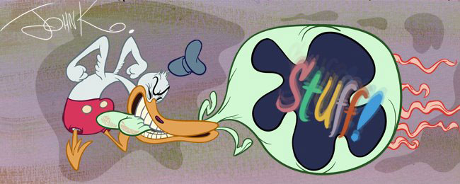
I mean an arbitrary placing of shapes within a picture. When a picture is filled with unrelated 2 dimensional shapes that have no overall graphic concept holding them together.

The inspiration for wonkiness was not actually wonky though. Wonkiness is a misunderstanding of controlled distortion.
Here's what inspired the late 80s, 90s and up to today's wonkiness.
TIN PAN ALLEY CATS
http://classiccartoons.blogspot.com/2007/07/censor-this-tin-pan-alley-cats.html
 Tin Pan Alley Cats blew my mind when I first saw it. I couldn't believe a cartoon could be this imaginative and beautiful and alive.
 Right from the opening pan of the waterfront I was sucked into the mood and atmosphere of the cartoon. I noticed the distorted perspective in the buildings and noted that even with distortion, you could still have mood. I was used to seeing 50s distortion-particularly Maurice Noble's Chuck Jones BGs. I liked them, but felt they were cold - graphic for graphic's sake, just to show off and steal the show from the characters.
Tin Pan Alley Cat's BGs didn't do that They enhanced the the strangeness of the unreality; drew your attention to it but it was all planned to make you feel something, not just notice intellectually that the cartoon was graphic. It makes you feel like this weird world is real and you are inside it, experiencing everything that is going on.
As distorted as these buildings seem, they still follow a careful graphic plan and composition. Each building doesn't just go its own way and the windows don't go in opposing directions.
The difference between Tin Pan Alley Cats and modern distortion is the first is carefully planned and on purpose; the other is superficial and by accident.
I'm amazed that UPA gets so much credit for creating graphic cartoons and purposeful distortion, when it was done so much better much earlier.
 This Clampett distortion was inspired by Milt Gross, so the ideas are even older.
 All through the 80s I had tried to do this sort of distortion in the typical bland cartoons I had worked on at Hanna Barbera and Filmation. I got yelled at a lot.
BAKSHI AND ME
Then Bakshi hired me in 1986 to help him develop some TV concepts and he let me try all my wonky theories and flat pointy character styles out.
 The Rolling Stones came along and gave Ralph a video to do. I designed it and directed the animation. Ralph directed the live action but built the sets to match my wonky BG styling.
This is completely obviously stolen from Tin Pan Alley Cats and I didn't really understand what I was copying. I just wanted to do something wild that emulated my heroes. I sort of combined Clampett with Hanna Barbera, partially on purpose, but also because I am terrible at perspective. Drawing wrong perspective gave me a great excuse to draw mistakes!
to be continued later today...


