By 1970 (and even earlier) no one was making pure entertainment oriented animated cartoons anymore.
WHAT HAPPENED TO ENTERTAINMENT CARTOONS BY THE 70S
Animated cartoon shorts were dead. Only Disney kept making traditional animated features, but all the animators were old and tired by then and the animation reflected that.
The cartoons in the 70s that purported to be aimed at entertaining kids weren't animated. They were the worst kind of limited animation and the animation was being done in Asia. No one making these cartoons were doing it to have fun, let alone to be inventive.
THE LAST FULL ANIMATION IN AMERICA WAS IN COMMERCIALS
The only "full animation" left was in animated commercials. They were "full" in the sense that they didn't stop moving, but the drawing style had completely degenerated into either kleenex box art style or clumsy combinations of 20s cartoon strips mixed with underground comics.
America had created, developed and made the greatest animated cartoons in history but that age was long gone.
For us young Canadian cartoonists, the future looked dreary. We had grown up watching the classics on TV: Looney Tunes, Popeye, Disney, Lantz and that's what most of us looked up to and wanted to emulate but there was no where to go to work on fun clever cartoons like that. Many of us emigrated to America to work in the depressing Saturday Morning cartoon factories.
Most young wanna-be Canadian animators wanted to do full animation. We hated Saturday morning cartoons and wanted something better, something that at least moved.
Sheridan College offered some hope that there was a market for this. They taught what they termed "traditional animation". What they meant was animation that moved smoothly with a lot of drawings. They also looked down upon Saturday Morning cartoons.
I personally think there is more to quality animation, full or otherwise than mere smooth motion. But in the 1970s and 1980s anyone who could animate smoothly, who knew what squash and stretch, overlapping action, weight and other old animation skills were, were extremely rare and admired by the rest of us.
The drawing on the cover of the Sheridan Animation program says it all: Quality animation is merely a lot of drawings per second. The quality or entertainment value of the drawings being moved were not serious considerations of the program.
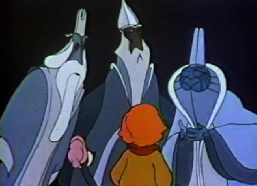
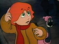
A Cosmic Christmas 1977

The Canadian animation style first got wide notice with Nelvana's Cosmic Christmas. It had a lot of drawings in it, compared to what we were used to seeing in modern TV cartoons.
The story, personalities and concepts - as you can see from the images and plot description are completely corporate and conservative and preachy. Nothing different than Saturday Morning cartoons.

A small town is immersed in holiday season festivities. A small boy named Peter and Lucy, his pet goose, are suddenly confronted by three aliens (wise men) investigating the real meaning of Christmas. For 2,000 years the alien visitors have been searching the universe for the significance of a brilliant star. Peter realizes that it is the Star of Bethlehem, and he and Lucy lead the way. It's a difficult journey, but it changes the town as it (along with the travelers) discovers the meaning of Christmas. Young and old, rich and poor participate in the rediscovery of the meaning of Christmas, which the space visitors carry away with them.
http://www.youtube.com/watch?v=s9yeS6091bI&feature=relatedThe fact that it was actually animated at all was a real advance in TV cartoons.
Canadian animators, even the ones who loved classic cartoons and were inspired by them, unfortunately faced big handicaps. The classic cartoons were developed bit by bit, cartoon by cartoon...by cartoonists and animators. It took a decade or so of hundreds of animators to develop all the classic techniques by trial and error.
Canada had no such history. We just had the old cartoons on TV to watch and try to figure out in a week with no one to teach us.
Classic cartoon designs were designed to be functional and appealing. They were made to be animated. Cartoon construction was a lost science and art. We could only imitate it very superficially without understanding what was behind it.
So here's where I think the early Nelvana cartoons failed to live up to the promise of great animation. The designs are primitive and fight the very act of animating.
Characters are too stiff, have no construction and someone at the top is not allowing the animators to use lines of action and some of the classic tools that make cartoons work and look better.

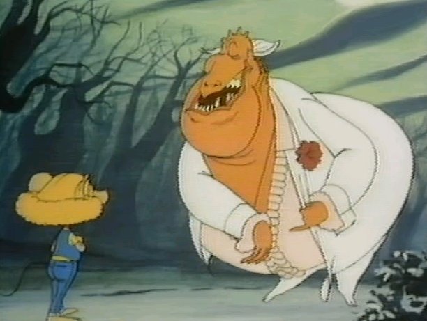
Devil and Daniel Mouse 1978

Frank Nissen was the main designer on the early Nelvana cartoons and he had some unique quirks in his style that influenced the rest of Canadian animation for the next few decades.
Stiff designs, long rectangular eyes and extra lumps in places that interrupt the potential flow of the poses.
A strong trait in Canadian animation is that the characters stand up straight and stiff, and when they bend their limbs, they do so in jagged awkward ways. This is the Sheridan College style and goes against all the principles of classic Disney style, which the Sheridan teachers all claim to be their inspiration and goal.
Romie-0 and Julie-8 1979

Intergalactic Thanksgiving 1979
A space-traveler family- in a covered wagon spacecraft at that- land on the planet 'Laughalot' and encounter King Goochi. His subjects, who are entertained by the King all the time, don't do any work.
Prince Notfunnyenuf meets the daughter of the space travelers and takes her on a ride about the planet. They encounter the other inhabitants of the world who live below and do all of the work, the "bugs." They carry the valuable message back to the other people on Laughalot that you "can't keep takin' out if you don't put back!"
Easter fever 1980


http://thecanuckleheads.blogspot.com/search?q=nelvana
Dan Haskett, an American who was to become one of the animators who brought back more looseness and classic construction and Disney principles to American animation in the 80s, worked for a short time at Nelvana. You can see him trying to recapture some of these classic qualities in these model sheets from "Easter Fever" (probably compromising them against management wishes). After he left, the looseness and construction and organicness left Canada's mainstream animation and it plugged on with its stiff signature design style.
Take Me Up To the Ball Game 1980
Baseball players from Earth try their luck against the Alien All-Star Intergalactic Champs. It's an interplanetary space jam!

This model sheet is almost constructed and definitely celebrates classic squash and stretch. I bet there was a big fight with management to get it to be this "cartoony".
The birth of Nelvana was celebrated in Canada as a hipster revolution. Young rebels going against the mainstream and pioneering a new edgy style where every old tired cliched story now happens in space.
Again - the fact that it used animation at all during that era attracted a lot of talented natural Canadian animators like Chuck Gammage and others. It was the only place where an animator could actually animate. Most animators I've known are pretty happy just to be animating. It's never been enough for me. I guess I gravitated more to design, acting, characters and story, which I think are even more important to cartoons than smooth movement - although I'm certainly glad to have great animation when I'm lucky enough to get it.
With an army of great talent, Nelvana got ambitious and decided to make a rebellious fully animated feature using worn Saturday Morning Cartoon ideas - Rock 'N' Roll and the future.


This film has some great animation, and some of the most awkward character designs and most patronizing ideas in history.

Drink a bag of milk while you are waiting for the next post...

