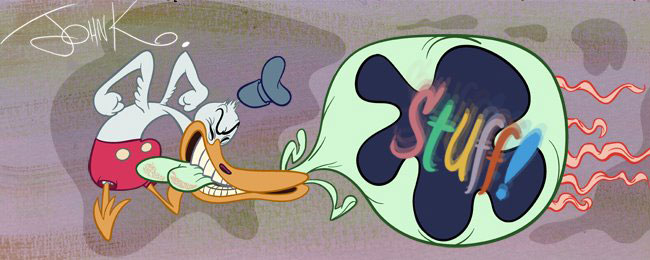


 This guy could sure draw. These old Eisenberg comics are great to study good principles from.
 You can see his style change over the years - getting simpler and more angular - like animated cartoons did from the 40s to the 50s.
 But his basics remain the same despite the superficial stylistic changes.
 Everything is well constructed and clearly staged - using negative spaces, line of action and all the rest of the useful stuff.
These have it all!
Bonus:


