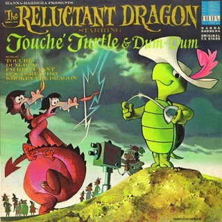
 Kali scanned her whole book for me just so I could rave about how much I love these paintings.
 Mel Crawford is my favorite cartoon book painter anyway, but this book is one of his particularly striking ones, just for color.
 His colors baffle me. I don't know what theories he uses to pick and combine them with.
 They are totally unique to him.
He never uses the actual colors that the characters are in the cartoons, which is to his credit, because that makes the books all the more fun. Like Hanna Barbera candy.


 Everything reads perfectly, even with all the odd color mixtures.

 Look at the neat colors in Dum Dum's butt. A dull grayed blue, and on top of that a sort of pee beige. Who would think of combining those 2 colors?
 All this stuff is just too happy in its weirdness.
 I just have to stare at this stuff because it's so original and surprising. Look at the colors of the bed covers and the bed posts. They give me a piss-willie.
 You now, the cartoons these are based on are pretty bad, but they are designed by another genius - Ed Benedict. Just having good design sure does a lot for a cartoon - and its spinoffs like these kids' books.


 All this cool stuff was made for the most pampered generation of kids in history.
Then they grew up and made everything bland, so no other kids could ever have as much fun again. Go figure.
Bonus
This one below is by a different painter - I think Paul Julian - also very nice.


