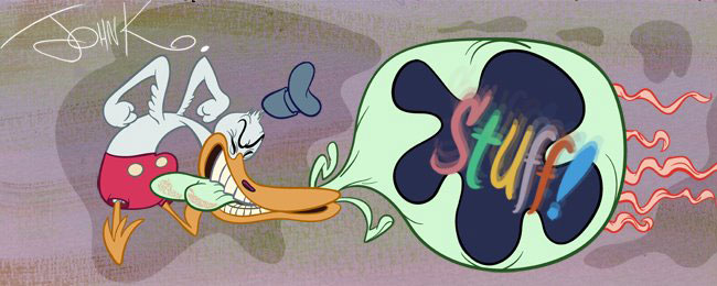
 Here's a cartoonist I like a lot. He's a drawing textbook for all the cartoon skills and techniques I promote.
 His basic style is generic 40s animation funny animal. He has all the principles that add up to that look almost perfectly. On top of that he has his own unique stylistic finish.
 His most amazing skill is his ability to organize all the principles and design elements with a scene and balance them into a perfect organic and appealing design.
 When you have this much hierarchy and visual coordination, you don't need to hide behind a bunch of cluttered details.


 I love the way he draws hands. They look like they are right out of the Preston Blair book, only drawn with more verve and contrast and design.
 Hierarchy: The few details he uses always form around the larger object they help describe. Like the stripes on the cat wrapping around the position of his body, or the little dirt clumps that help describe the larger mound.
 He draws really elegant simple compositions. I wish I had a bg artist who could do this!! Aargh!

 Look at these beautiful dynamic action poses.
 I love this cat. His stripes are so organic and gritty. Pure comic inking. I wish you could get that in animation drawings.

 Such luscious inking!
 Organic compositions: His backgrounds are made up of sub-elements that point in seemingly chaotic angles, yet they are all balanced against each other. They don't look wonky.
 Everything he does has inherent form and a visual plan. I think the plan in his compositions is the most fun part of his art.
 Hierarchy of thick and thin lines: The lines of the overall silhouettes are thicker than the details inside the forms. These bold lines help hold the characters together.


 I like that rabbit's nipple ears.
 Enjoy superb rare comics at Mykal's great blog!
