http://kalikazoo.blogspot.com/
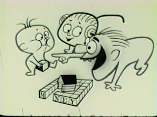
Here is a Hubley commercial animated by Rod Scribner.
Baby.
For me, animation is more than just smooth movement. It's not enough to learn a bunch of stock Cal Artsy moves and gestures and then move formula designed characters from one stock pose to another.
 Animation is movement of interesting and inventive drawings. The drawings that make up the animation are as important as the movements themselves. Maybe more so.
 It's even better when the drawings are not preinvented on model sheets or in decades of stock expressions.
 Here's a great combination of John Hubley's designs and Rod Scribner's animation.
 Hubley probably did a couple of the main drawings and the composition. A minor animator would have taken those poses and then just animated stock lip synch and moved the heads and arms to the accents in the soundtrack.
 An inventive animator like Scribner does a lot more than that. He adds to the "design" of the scene by designing original custom made expressions and poses that fit the soundtrack.
 Scribner also makes up his own mouth shapes, rather than rely on stock mouth shapes like you see so often.
 This is the kind of animation that made me want to be an animator.
 Custom made animation that isn't a formula. That shows what an individual cartoon animator made up just for that scene. ...That looks like a living breathing observant human did it, rather than a machine.
 Scribner must be the most creative animator ever. He's able to do all kinds of styles. When a lot of the Warner's animators couldn't make the switch to 50s graphic styles, he just jumped at it and created ways to move the characters that matched the graphic styles. His movements are as stylish (actually more) than the design themselves. He doesn't merely "squash and stretch" or "antic and overshoot".
 These 50s commercials commercials are among the best use of the UPA style that I have seen. They are lively and better paced than the entertainment shorts-maybe because they have to get the message across in 30 seconds to a minute rather than drag it out to 6 minutes or more.
 I can't figure out why UPA didn't use Scribner in their feature shorts. He understood how to move these designs better than anybody. The shorts are barely even animated. They are evenly inbetweened key poses.
 You can freeze frame animation like this and find a ton of great drawings and original graphic thoughts. Isn't that why we animate? To create new pictures? I can't understand today's urge to repeat actions that someone else invented 50 years ago and that have already been copied over and over again ever since.
 This animation is fun. and that's what it's all about isn't it?
 Well I can't think up enough words to describe each picture, so I'll just let you enjoy them.


 Cute and specific at the same time!


Amid On Scribner Commercials

