


 Mel Crawford is my favorite Golden Book Painter. (This is actually a "tell-a-tale" book, but it's Whitman's imitation of Golden Books.)
This book has simpler technique than some of the better known Crawford books, which makes me think maybe TellATale had smaller budgets so the paintings had to be done faster. Thus - less brush strokes.

 Crawford has a really unique brush technique, but he has an even more unique color sense. So unique that I can't figure it out.
 Usually when I see great color work, I can figure out the whole scheme and plan. Like with Frazetta or Genndy or my favorite Disney cartoons.
 I like these color schemes a lot, but I can tell what the plan is behind them. They are easy to analyze. Not so easy to come up with or paint though...
http://pumml.blogspot.com/2008/10/more-from-scott-wills.html

I can't do that with Mel's work. If he has a plan, it is very complex and unique to him.
 He doesn't seem to like pure colors. He mixes colors in unusual proportions - never mathematically. Not 50% blue + 50% yellow to get green. Not even 75% + 25% to get turquoise.
He mixes a lot of colors with grays and neutrals - even muddy ones sometimes - which normally I don't like. He makes it work.
So first - each individual color is interesting.
But secondly, the way he chooses what colors to work next to other colors is equally baffling to me. It totally works, because you can see everything in his paintings at a glance. There's no awkward clutter and nothing gets lost.

Sometimes the textures he puts on objects have colors that strobe - like the bark on the trees in these paintings.

 Or the orangish texture on the purplish-grey rocks behind the pinkish-brownish-grayed bear.
Another thing I love about Mel's color is that he refuses to use the approved colors of the star characters - which are usually mathematical mixtures of colors straight out of the cartoon color tubes.
 Wrong Color Magic:
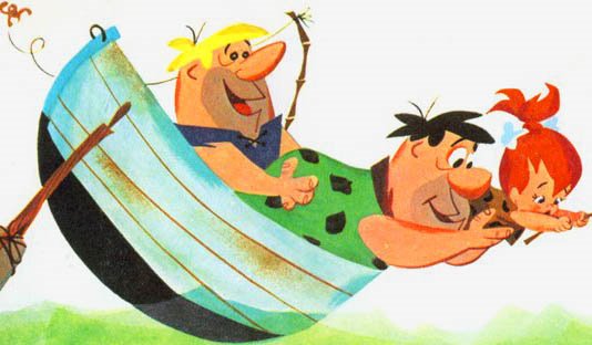

Many people who paint cartoons think that you are supposed to use the simplest colors imaginable - right out of the color tubes.
Partly it's because executives think that kids like "bright colors" and partly it's because it's easy and you don't have to think.
To me, "bright" doesn't mean primary and secondary colors, it means surprising fun colors and combinations. Mel Crawford's colors are always surprising and a lot more colorful than the typical cartoon formula.