Wednesday, April 30, 2008

Lloyd Turner Interview - Storyboard Artist/Writer at Looney Tunes

http://www.michaelbarrier.com/Interviews/Turner/interview_lloyd_turner.htm

If you were interested in yesterday's post about how stories are written at cartoon studios, there is a really fun behind-the-scenes- interview with one of the storyboard artists/writers at WB in the 1940s at Mike Barrier's site.
http://klangley.blogspot.com/2008/03/art-davis-bye-bye-bluebeard.html

Lloyd Turner was in Art Davis' crew and later worked for Bob Clampett on Time For Beany.
The image “http://www.tvacres.com/images/timeforbeany.jpg” cannot be displayed, because it contains errors.

http://www.tvsquad.com/2007/01/13/full-episode-of-time-for-beany-video/


He went on to Rocky and Bullwinkle and other Jay Ward cartoons.

He also wrote many live action sitcoms, including The Jeffersons, All In The Family and Mork and Mindy - unless there were 2 writers named Lloyd Turner!

Anyway, read the interview and you'll get a real feel of how they go about writing cartoons, with all the dirt and studio politics involved!

Tuesday, April 29, 2008

The Language Of Cartoons

As we all know, cartoons ideas and stories are written with drawings, accompanied by words for dialogue.
The drawings don't need to be finished, totally on-model drawings of the characters. The cartoon story writer has to be more concerned with the story- continuity, acting, staging, gags clarity.
If the story man has to worry about doing cleaned up perfectly on-model characters and finished background drawings, then his mind is not free to think about story.

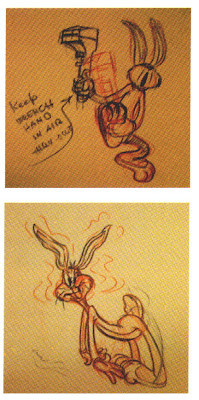
The storyman wants to show the continuity through the characters. The characters need to appear spontaneous and alive and motivated from within. A really good story man can draw fast and confidently, which automatically gives the continuity a spontaneous - this is really happening now - quality to the work.

That's why storyboards are generally simple and don't have a lot of extraneous detail. When you see a storyboard that is very clean and does have a lot of intricate detail, you can assume that the artist was not thinking about the story. He might have been thinking about impressing an executive, or preparing the drawings so that an overseas studio can just xerox them up to use for layouts, which is a very wrong use for storyboards. It generally adds up to general stiffness, lack of spontaneity, formula staging and storytelling.


The story artist still needs to use some of the same tools that other cartoonists use-clear silhouettes, line of action, opposing poses. All these tools make the acting and story clear and easy to read. They give direction and purpose to the ideas.

He needs to understand the characters and the dynamics between them, so that he doesn't draw each character acting and posing the same way.


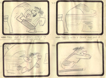
Here are some Dan Gordon storyboards for the first Flintstone cartoon. Lots of life and spontaneity.


Here's a Flintstone board by someone else with no life and formula staging. This started the trend towards cartoons where the cartooning doesn't matter. The characters just become surrogates that exist only to mouth the generic words of the people we've come to call writers - who are really just "writers - for -hire", a totally different animal than an actual writer. The irony is that it was probably cartoonists themselves that started this horrific trend, and made it easy for non-cartoonists to take over our business.
There are a series of semi-historical articles at the animation archive that tell how storyboards and the general writing procedures evolved at animation studios. Pretty interesting and very logical.

http://www.animationarchive.org/2008/04/story-writing-cartoons-pt-1-gag-session.html


http://www.animationarchive.org/2008/04/story-writing-cartoons-pt-2-continuity.html

http://www.animationarchive.org/2008/04/story-writing-cartoons-pt-3-structure_25.html

Sunday, April 27, 2008

Billy Chicken

Hryma is at it again!


Friday, April 25, 2008

Bobby Sox By Marty Links


Here's more proof that girl cartoonists have certain qualities in their work that are beyond us inferior boys.Tell me what you see in these drawings and I will add my notes later today.


Thursday, April 24, 2008

For Richard


http://johnkstuff.blogspot.com/2008/04/toy-paint-styles-i-like.html

Humpty Dumpty Magazine - Dan Lawler Illustrations

Here are some paintings by Dan Lawler.
Not only is the technique beautiful, the character designs are great too!
I wonder if he had anything to do with animation.
Too bad some dirty little kid got ahold of these and scribbled all over 'em! He needs a little discipline to beget love.

Wednesday, April 23, 2008

A President Who'll Kick Some Ass


What's the point of trying to reason with the dirty foreigners? So we've lost status around the world, eh?


Well maybe that's because we can't finish what we started.


Maybe this guy can. no more wimps for president!

There's only one way to win back respect for America and this guy knows the way.

Oh, by the way, I've broke over 5 million hits this week, so thanks loads, everybody!

A new way to completely screw artists-Is This For Real??

As if there aren't already enough ways to screw artists and creators, here is the latest news that everyone is sending me.

I guess we need someone who knows what to do about this to get some action going to protect creative people from non-creative people who can just instantly get copyrights on our work.
Any smart cartoonists out there who know what to do about it?

http://mag.awn.com/?ltype=pageone&article_no=3605


FROM THE ILLUSTRATORS’ PARTNERSHIP

Today the House and Senate sent us draft copies of the new Orphan Works Act of 2008. They haven’t officially released it yet, but we’ve been told the Senate will do so this week. A quick analysis confirms our worst fears and our early warnings. If these proposals are enacted into law, all the work you have ever done or will do could be orphaned and exposed to commercial infringement from the moment you create it.

A Webcast interview with Brad Holland about this bill is now available at:

Please listen to it because this radical proposal, now pending before Congress, could cost you your past and future copyrights.

On Saturday April 5,2008, artist and producer Mark Simon interviewed Hall of Fame illustrator Brad Holland on the subject of Orphan Works legislation. The warnings in this interview have now been confirmed by the advance drafts of the bill. Learn what artists groups are doing and how you can help oppose this radical departure from traditional copyright law and business practice.

The Illustrators’ Partnership is currently working with our attorney - in concert with the other 12 groups in the American Society of Illustrators Partnership to have our voices – and yours - heard in Congress. We’ll keep you posted regarding how you can do your part.

Mark Simon has worked on over 2,500 productions in the last 20 years as a director, producer, story artist, animator and designer. His clients include Disney, Universal, Viacom, Sony, HBO, Nickelodeon, Steven Spielberg, Fox, USA Networks, ABC, AT&T, and many others.

Please forward this information to every creative person and group you know. Mr. Holland and Mr. Simon have given their permission for this audio file to be copied and transferred and replayed.

For additional information about Orphan Works developments, go to the IPA Orphan Works Resource Page for Artists

Tuesday, April 22, 2008

Wally Man, Made Of Skin and Pink


http://johnkpitch.blogspot.com/2007/11/links-to-more-cartoon-shows.html

Monday, April 21, 2008

Mars Here On Earth


As I have mentioned before, we cartoonists and animators easily fall into creative cliches and artistic ruts, by drawing the same things the same ways over and over again for years. (We are encouraged to do that by non-creative management and a broken production system, so it's not completely our fault, but we also are slaves to trends unless we will ourselves to go against all that is conservative and holy.

We get stuck drawing the same stock expressions, poses and character designs and don't even realize it.

This applies also to background artists. You can see the same stock trees, plants, houses in tons of cartoons. Trees are always the same brown, sky is always the same blue, foliage and grass is always the same green.

The only way to break out of this pattern of animation sameness, is to observe the world. Take a trip to Mars if you can afford it.We went to the Huntington Library last year and took a bunch of pictures of their desert exhibit. You can't believe how weird and varied the life forms of just one environment are!
The way they have landscaped it is like a tour of evolution. You can see certain types of forms in each area and then a million variations of the forms. Like these cacti that are flattened star forms stacked on top of each other.Here's a Martian star cacti with pubic hair.

If you are a painter, you can get a ton of color ideas and break out of the primary, secondary pouring colors straight out of the tubes cartoon palette.

If you don't want to draw stock flat cheat designs anymore, you can study the hierarchy of forms in infinite varieties. (I'll do a post about this soon)
Textures also come in a thrilling variety.


How many times do you draw the exact same bark texture on your trees? Go out and look at how many different really interesting kinds of bark there are. (In Canada all cartoon background objects , not just trees, have the exact same surface texture, trees, houses, dirt, mountains are all covered with the same Sheridan College Layout Class surface itch.)

How many colors can you find just in these rocks alone?

Humans and Martians also come in many forms.

Saturday, April 19, 2008

Can he save us?


Hey I need another word for the other panel of the podium. What's another one of his buzzwords?

Friday, April 18, 2008

Harvey Kurtzman - Opposing Poses, LIFE

Harvey Kurtzman is one of my top favorite cartoonists. I could go on forever about his skills, but I'll start with just a couple important ones to do with character. His characters seem alive. Motivated from within. They aren't tracings of model sheets, or awkward accidental poses.

Here are a couple tools he uses to achieve this.

His characters each individually have direct poses and lines of action, but he goes a step further.

He composes each line of action and silhouette so that the characters dynamically oppose each other. They aren't parallel or mirror images of each other.

Their poses work together to create a composition and contrasts in their attitudes and respective total energies. The character with the stronger pose has more energy and is generally the focus of the panel. The other character is generally reacting to the more dynamic one. He will have less energy - which is described by a less dynamic pose - or line of action.
Harvey makes his characters' poses compose together. The negative shapes between them are beautiful and functional, as they help you see the contrasts in their attitudes.


This quality of being able to draw characters that seem completely alive and moving and progressing emotionally from pose to pose is a rare talent - too rare. It's what you need to be an animator. Kurtzman would have been a natural animator.


You don't see many comics that have this much life. We've come to accept much comic art as being stiff, using repetitive poses and appearing smug in their stagnant repetitiveness.
Sadly, this has crossed over into modern cartoons-expensive ones at that! And leagues of fans defend this stagnation as somehow being an artistic choice, rather than just a lack of knowledge or extreme conservatism. Life essence is now considered "too cartoony".
If you want to improve your posing, life and compositions, then you need this cartoon bible in your library, and you should copy the poses as an exercise every morning before you start your regular work. Then apply this quality of living characters to your own drawings and watch them come to life too.

Thursday, April 17, 2008

Chris Peterson Genius


Here's the standard to shoot for

Wednesday, April 16, 2008

Goofy Gremlins in color


Tuesday, April 15, 2008

Another Treasure


From the vault of Adrian.

http://johnkpitch.blogspot.com/2007/11/kaspar-unfriendly-bear.html

Saturday, April 12, 2008

Irv Spence - Perfect Cartoon-Animation Drawing Principles


Doing that Bickenbach post the other day got me to thinking about another classic animator who had all his principles down.

Irv Spence, more than any other 40s animator typified everything that represented the style. More than Scribner, Jones, McKimson, Kimball, Moore, anyone I can think of.

That's not to say he's better or more talented than those other giants. I'm saying that he puts all the 40s principles together in one package more completely and confidently than any other animator I can think of. He is great to study.

Irv has:

Solid Construction

Line Of Action

Clear Silhouettes and staging - easy to read the image
Flow All the details of his images flow along the line of action and construction of the larger forms.


Organic Shapes
Organic shapes means that the shapes are not perfect geometric shapes. Not circles, ovals, triangles etc. The curves do not bend exactly in the middle. S curves, asymmetry. Nothing looks mechanical.

No parallel lines. Even the hat and clothes are organic.


Design Balance-
Filled Spaces surrounded by empty Spaces -
to avoid cluttered design

This lion has much empty space in his design: his face around his eyes. The mane around his ears, the front of the muzzle versus the back. The jaw. Etc. This careful design makes the face very easy to read. If all the shapes were jammed close together you would get a jumble hard to read image.


Design contrasts
These characters from Tom and Jerry have many of the principles common to 40s cartoons, but they don't have any design. They are made of circles and ovals (somewhat organic) but without strong contrasts in the shapes and sizes. They are designed merely for the function of smooth animation, not for specificity.

Compare them to this more specific mouse. What makes it a specific rather than generic design? It's built up out of contrasting shapes. It's not just circles piled on top of each other.

Cartoony

Spence not only applies all the scholarly animation drawing principles, he applies them to a very cartoony look and feel. It's not merely "correct", it's fun.

The miracle: He makes them all work together
What's really amazing about Spence, is that he is able to balance so many principles and methods together and still make the result look effortless.

Many animators have some skills more developed than others. McKimson has perfect construction, clarity, dynamics but is not as flowing or cartoony as Scribner. Scribner is very cartoony, spontaneous, full of contrasts, but is less concerned with perfect construction and absolutely balanced poses. He understands them, but lets his spontaneity dominate his creative statements.

The top Disney animators have all the technical principles down, but lack spontaneity, design and specificity.

Spence manages to bring all this stuff together in perfect harmony.

------------------------------------
STUDENTS CAN LEARN FASTER WITH SPENCE

When you look at his drawings, you can clearly see each principle at work-which is why I recommend to cartoon students to use these model sheets to study, copy and learn your basics from. I will warn beginners to stay away from Scribner, because you get distracted by how wild his drawings are and will pick up the things he rushes through (like sometimes hasty construction or unbalanced awkward poses).


Does Irv ever Cheat? Sure...but when he does it's totally on purpose, in the clear and obvious. It's not an uneducated collection of mistakes that some people call "That's my style, man".
In this drawing, George's eyes do not follow the center line of his head. They are tilted to the left-however, they still flow; they don't look flat and don't exist on their own plane in front of the head.

The few cheats are on purpose, either to make a funny expression, or to make a cleaner design.

I always thought Spence was wasted animating for Tom and Jerry cartoons. The animators basically just had to move Joe's drawings from pose to pose using Bill's timing. Joe's poses are great, butdo limited and repetitive. There wasn't a lot of room to express any of your own acting, posing or cartoony ideas. It was a formula.

A good animator could just do what he was told, make it smooth and finish early to go play golf. Which apparently is what Irv did every week. I heard he would complete his quota by Thursday, then take Friday off to go shoot a few holes.

I also heard from other classic animators that he didn't think much about cartoons in his offtime. It was just a good job to him. He was so natural to it all, that I guess he didn't feel like there was anything to explore.

Whether that's true or not, he was a great animator and his stuff is really fun to watch.

Irv's animation for Iwerks is a lot more inventive, cartoony and looser than his Tom and Jerry work. It's much easier to spot his style. Same with his work for Avery. There is also a story that he didn't like working for Tex as much as Joe, because it was harder. Maybe someone knows more about this and can add some stories in the comments.

IS THIS IRV?

I always assumed this was Irv's animation but someone has said he thought it might be someone else.

It sure looks like his stuff. Irv always drew teeth with rounded blunt ends, very balloony but flowing bodies and a certain way of drawing toes.

There are a lot of scenes (like this below) in this cartoon that look nothing like the lion in the model sheet that Irv drew,

but these others look just like it and move like other scenes in other cartoons that I know for sure are him.

Either way, it's a brilliantly animated and hilarious scene!


Not Irv Spence
[Henpecked+<span class=


Here are some drawings from scenes not by Irv. By comparison with his models, these look very stiff and awkward and have no inherent sense of design. The contrasts have been really toned down from Irv's models.

Of course the animation and gags are still really funny.

Here's a model sheet done by Walter Clinton, a very funny animator.

See, I wouldn't recommend young cartoonists study this, because:
The principles are not as clear or well understood as they are in Irv's drawings.
The line of action is broken up, the silhouettes are not clean, the construction is uncertain.

Of course, they are still funny drawings and much better than anything being done today, but if you trying to learn how old cartoons work, this will confuse you, because so many of the rules are broken.

Irv's drawings are crystal clear, so take advantage of them.

I stole these images from Kevin Langley's great site, so I hope he doesn't mind. Go there and discover lots more great stuff!

http://klangley.blogspot.com/search?q=irv+spence

Friday, April 11, 2008

Hillary Sculpt By Arshak