 Hi Art
I got your email with more detailed step by step procedures. That was great! Thanks.
Your comments about the Flintstones baffle me though. Are we talking about the same title sequence? I'm talking about the one from 1960. Not the one where they go to the movie theatre and drive in.
The first one had no song, just instrumental music. It was called "Rise and Shine".
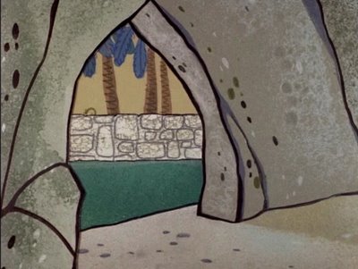
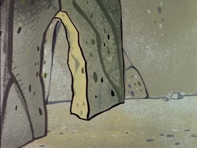
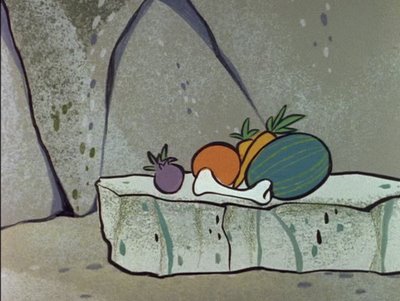
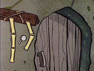
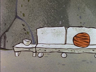
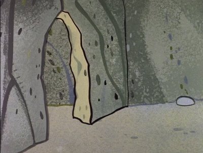
Ed's layouts are spectacular in it and your colors and brush tecnique are amazing. It's like you took the early HB simple techniques and turned them into a more elaborate art.
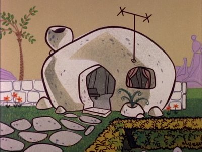
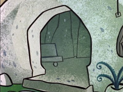
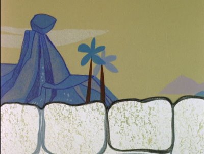
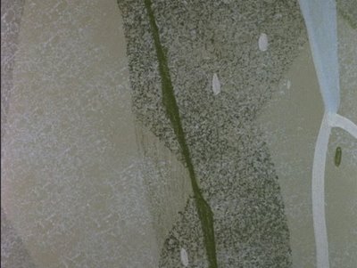
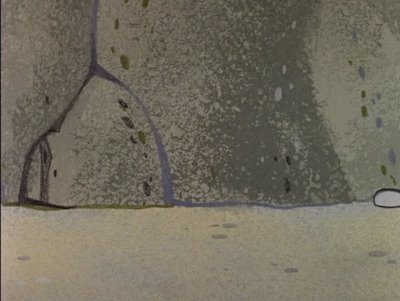
The skies are greenish and the whitish cave buildings are complex in all the layers of textures and hues.
all kinds of stuff: Ed Benedict , 1912-2006
Scroll down to the frame grabs.
That's what you think are not very good?
Wow.
Things must have really sunk since then!
I would kill to have BGs that looked this good in my cartoons.
Your pal,
John
Hi John,
OK. I'll concede.
I downloaded the video and did some closer looking at what you pointed out; and I had the chance to look at the still frames, the one by ones, like in a photo album.
Also as a fast moving clip, as the TV audience sees it, where it's all tied together. Then I asked myself, "But what is it that doesn't sit right with me?" I believe that the whole sequence is done too fast. Too much car. The movement is too fast, the car with Fred in it shoots by fast, through traffic, there are fast repeats and fast music. Yes, the pace is consistent but it simply looks too much like a modern LA freeway to me and not Bedrock. Bedrock begins when Fred stops to buy a news-slab, climbs the dino's "stairs" to pick up something from the tailor's and arriving home...the house, the garage, the interiors, etc. This is Bedrock.
I believe it was this, John, that I might've reacted to and not the treatment of the bgs. I agree with you (in retrospect) that the layouts and painting techniques were OK. Ed's work is unquestionably OK. And I'm trying to figure out what it really was that comes across negative to me. The thread of the story?
It's me. I like to think of the Flintstone territory as warm and more natural, not crowded, not so much a busy, dense neighborhood. Remember: there's a sign in there that says Bedrock -Population 2500- Not 25,000. Too many houses, overly populated, too much stone, not enough trees and plants. Yes, I guess that this is my objection...the freeway look. The older opener you mentioned was the drive-in movie. I don't recall details, but I do remember that it was 'friendlier', realer. It took the audience back into space and time where Bedrock was more believably prehistoric... such a pleasure. Maybe my biggest objection with ANYplace is traffic and speed, freeways and highways. Can't stand the stuff.
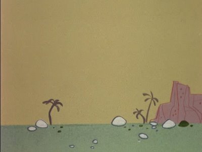
The sky color, btw, does look greenish. It was a sort of tinged ochre and it was the Flintstones sky in practically every show, one that we established as a basic so that we could simplify and 'standardize'. It was made up by our color supplier and delivered in quantities all mixed.
I appreciate the comments. Keep it going.
Best,
Art L.
