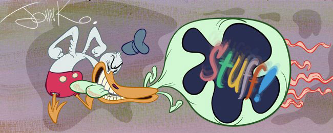
Visual arts (and cartoons have their own version) have something akin to a grammar and a vocabulary: not a grammar and vocabulary of words, but a visual vocabulary of concepts or tools, fundamental tools that help you speak in pictures. You couldn't say anything much with language if your language consisted of only 6 words and no grammar, consistent spelling or punctuation.
I see a lot of modern cartoonists who think they have personal styles that are so brilliant and original, that they transcend the need of having basic visual communication tools, and in fact modern animation executives believe this and encourage it as well. It is encouraged to be a visual (and verbal) illiterate, as if executives at Nasa believed that you could find a gifted caveman who never went to school, never rode in any kind of vehicle, has glimpsed a wheel once and is therefore qualified to build the next rocket to Mars. Cartoon shorts program thinking.
This is all very sad, ugly and very real today.
Because of this, every time I produce a new cartoon I have to train many artists from scratch. I make all these manuals just to present some standard and logical tools to help people make their ideas clear and understandable and worth looking at.
This particular manual is about cartoon background design.
I'll start with an important tool that all artists and communicators should use:
CONTRAST
Contrast is a tool of visual punctuation. Imagine if you spoke in a long run-on-sentence with no pauses, no changes in pitch or volume. (Think Wolf Blitzer or Mike Barrier) How hard it would be to understand what you are trying to say. No one would know what the important points of your discussion are. People would fall asleep as you drone along, or they would themselves pick out certain words at random and interpret what you are saying however they felt like. Everyone would hear your speech a different way. You wouldn't even be able to have any clear thoughts worth sharing if you had no shared communication tools with the rest of humanity. You can't make up your own from scratch and expect to be understood.
Luckily most languages have punctuation to help you draw attention to certain important parts of your speech, although you'd never know it from the way cartoon dialogue is read today.
If you want people to think what you are saying is important and want them to not misinterpret your meaning, you need not only a good vocabulary and grammar, you need punctuation. Spelling would be good too, though I realize that is out of style today.
Anyway, Contrast is an important punctuation tool for you. Use it in all aspects of art, writing, and communication if you want to be an effective and clear communicator.

This is just the beginning. There are many more types of contrasts and I will post some in the next few BG design articles.

