

 In my posts on bg paintings, I've mostly been talking about color choices. Good color goes a long way in making your backgrounds appealing- good color is a lot more pleasing and effective than a lot of busy detail.
Now I want to talk a bit about texture and brush technique.

I tell all my painters that every stroke they make should be on purpose and should be done with flair and style. Don't just apply paint and push it around and dab it on sloppily.
Below, the paint is just slapped on. The one attempt at texture is the sloppy, ragged old brushes in the tree.
Use an assortment of surface textures:
 Like this above: There is a variety of surface textures in the painting. The tree feels like a different substance than the bush which feels different than the grass.
Many painters use the same types of technique and surface texture to describe all surfaces, regardless of what the substances are made of. They just paint the surfaces "wood color" or "rock color" or "flesh color".
 Everything is made out of the same rubber in this still, skin, underwear, buildings. There is only one substance in this universe.
This one too. Here's the blotchy airbrush universe.
 The smooth shiny universe:
A good cartoon painter can suggest a variety of surfaces with just a few simple techniques-but it takes his artistic taste and control to apply his brush strokes, sponges and pencil shading with confidence and flair.
THAT TAKES PRACTICE! If you are an aspiring painter or just want to try something maybe new, experiment with your brushes and tools and degree of wet paint to paint strokes with flair- just to get your wrist used to applying good looking strokes and textures.
It's the same way with pencil lines. Some artists might have good solid drawings but their finished drawing suffers from awkward sloppy pencil cleanup. Other artists have great finished stylish lines, but maybe don't have a good drawing underneath (this seems to be the style today). You need both. Good knowledge AND good finish.
 Tom Oreb here has great drawings and great stylish contrasty finish.
So does Freddy Moore:

 Here is crummy drawing and NO finish whatsoever. Nothing at all worth the time of an artist or viewer.
There are many painting styles (like Impressionism) where the brush strokes are not as important as what they add up to when you stand at a distance and see them all blended together.
I happen to like less work and more flair and style. This is especially important in animation, because the paintings are not on screen for a long time, and they aren't usually the focus of attention.
You don't have time to look at tons of detail.
So I say "make your details count".
Your colors and your brush techiques should together convey a feeling that enhances the story or mood of the cartoon.
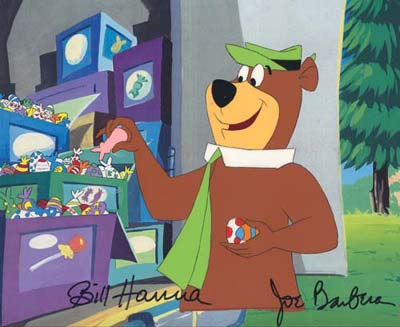
Art Lozzi and Monteleagre were very good at this and that is why their BGS to this day still look so good and are so much fun.
The general feelings they conveyed were fun, silliness, elegance and style.
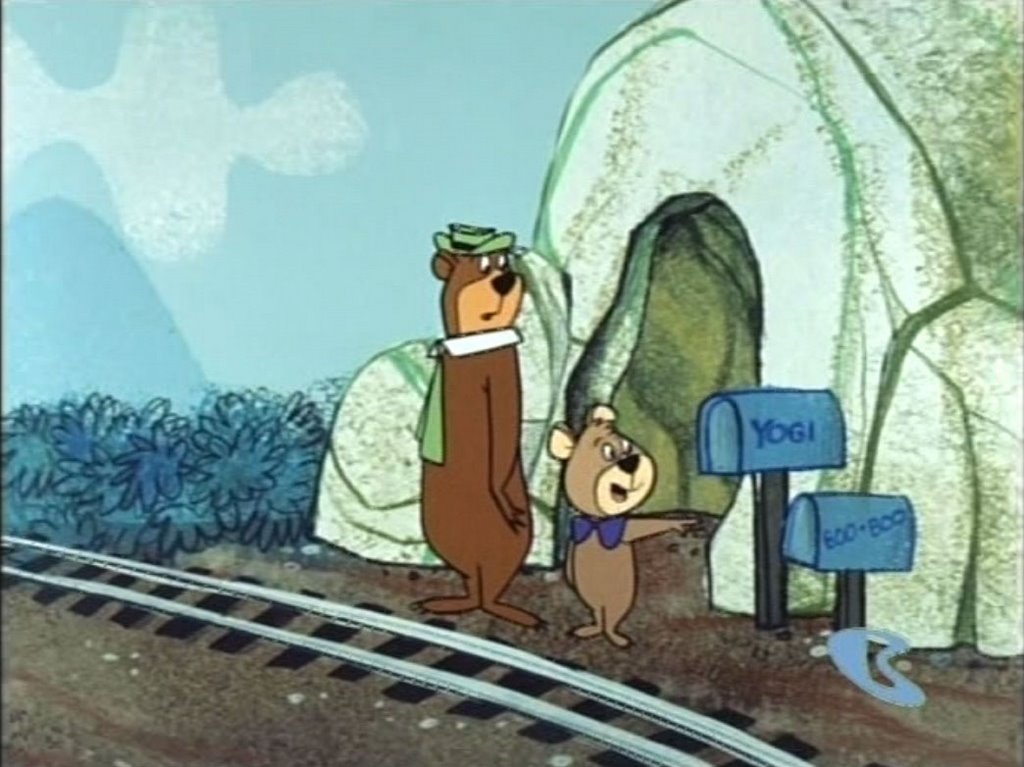
Look at the way Art uses sponge on the cave to suggest form and rocky texture. The shapes of the sponge areas help make the cave look rounded.

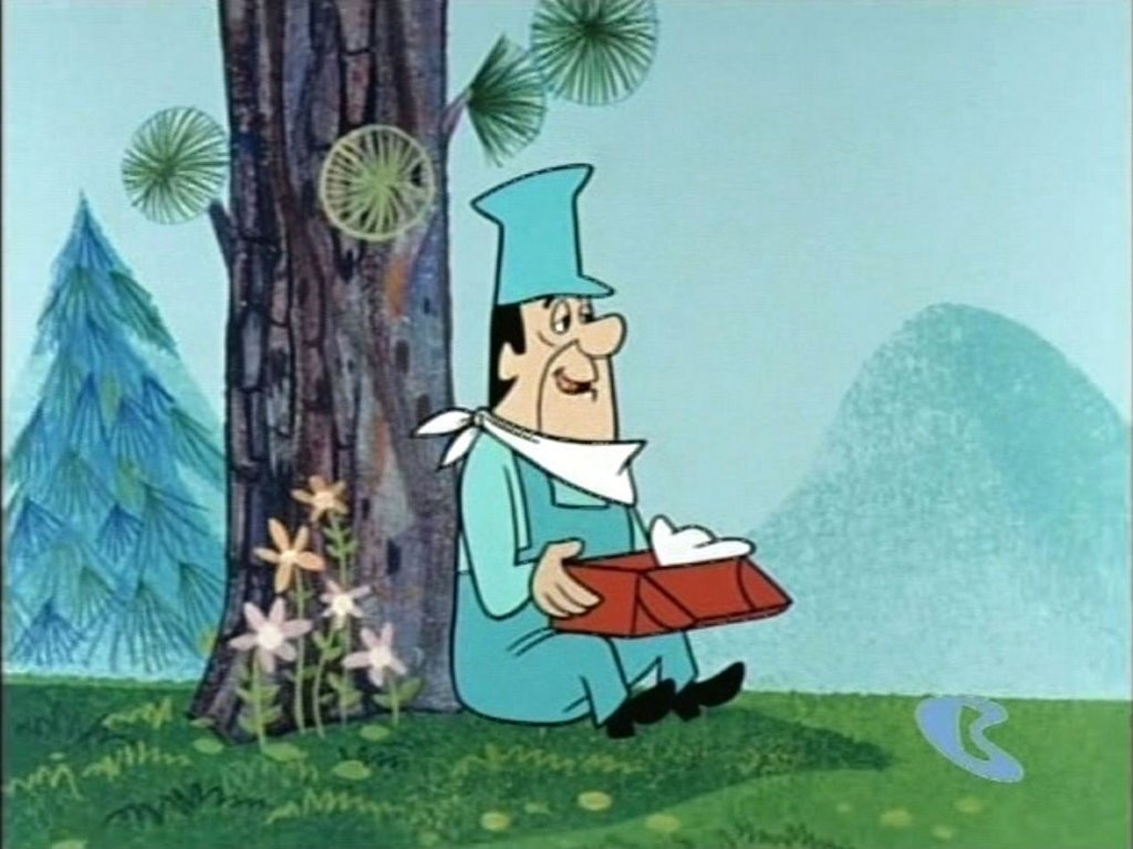
Art has designed a neat way to graphically paint coniferous needle textures. That texture is different than the sponged on texture of the grass.


Note how Art draws on the umbrella shaped needle textures on the bush. Each stroke is clean and careful, no sloppiness and vagueness.
Hey, here are some neat concept sketches Art did for a theme park in 1969. You can tell he did them fast, yet they are still very pretty colors and loose yet confident brush strokes. These are water color, different than the techniques Art used at HB, but still very nice and still his voice.


 I found these at a great site called The Imiaginary World.
http://www.theimaginaryworld.com/page4.html
You could spend days there looking at all the fun retro art, toys, cereal boxes and cool stuff. I have.