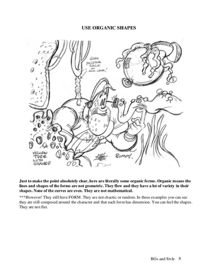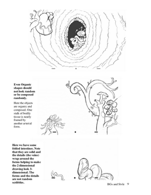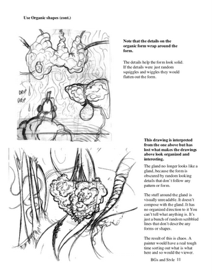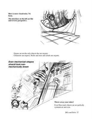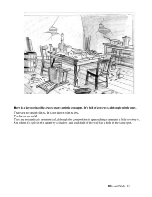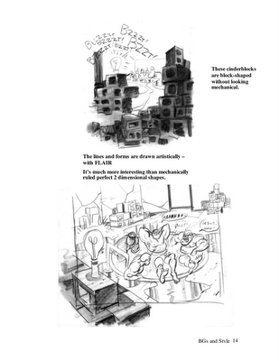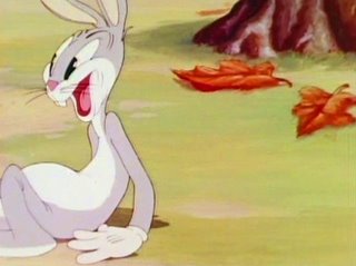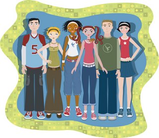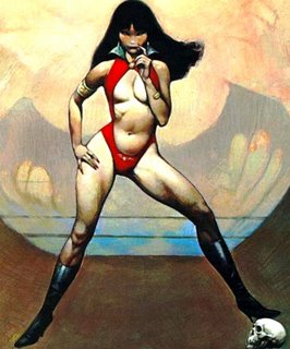
The manual pages below are about BG design, but they feature the principle of "organic" so I figure I better give you a clear definition of what I mean by that.
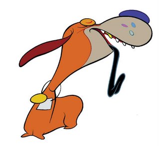
Organic as opposed to mechanical or geometric. Natural objects are organic. They are uneven, they flow, they are not symmetrical, they are complex.
 Humans, animals, rocks, trees, rivers and old cartoons are organic.
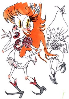
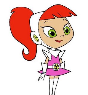
Nothing in reality is perfectly geometric. Man tries hard to make things into simple shapes and forms sometimes, like boxes, balls, mailing tubes and modern cartoons.
 This kind of form is simple, regular, predictable, easy and in most eras, boring.
Organic art uses smooth flowing lines and shapes describing various surfaces and densities and textures as opposed to geometric lines and shapes that describe all surfaces and substances stiffly and the same way.
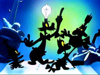 Organic art under control gives you an infinite palette of ideas to create from. Geometric is limited. There are only so many types of shapes you can make with straight lines and simple curves.
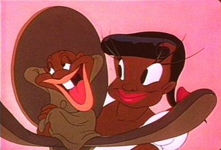
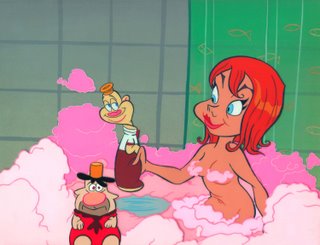
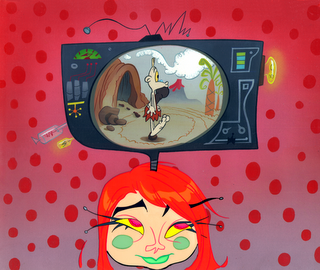
Organic comes in infinite variations and styles.

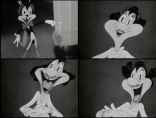

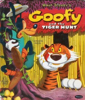
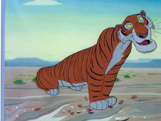
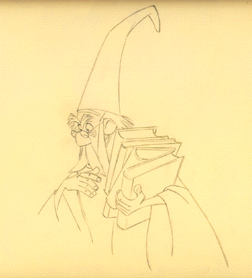
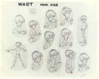
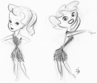 Stylized cartoons can be organic - and should be.
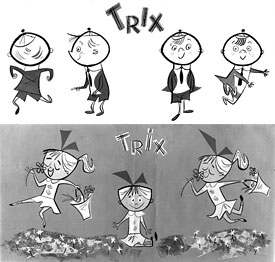
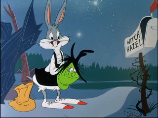
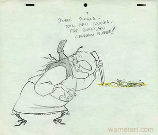
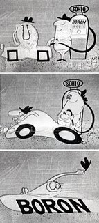
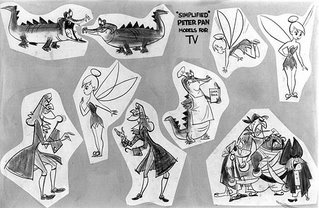
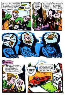

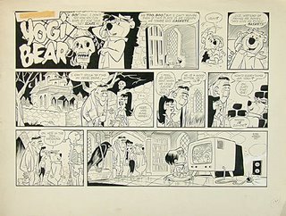
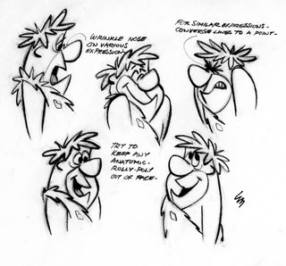
Of course you have to be a much more sophisticated, intelligent, cultured and skilled craftsman to be able to take advantage of organic art, but if you regularly haunt this blog that's your goal, isn't it?
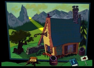
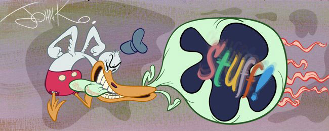
If you want the easy way, then get a circle template and a ruler and you can create cartoons like these:

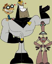
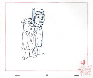
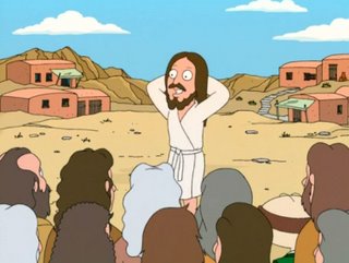
Because the trend for the last 30 years has been stiff, regular and evenly composed art, it makes it hard for me to hire current artists-especially if they are over 25 and set in their ways. This happened to me on The Ripping Friends. I hired 2 Canadian studios who were used to drawing in the Canadian style, which is even stiffer than the LA styles. Jim Smith and John Dorman would draw brilliant backgrounds and character layouts and we would send them to the Canadian studios who would look at them in disbelief, toss them away and then "correct" the drawings by spacing every object in the scene on a grid and standing all the characters straight up and take out everything interesting or worth looking at.
So I made all these manuals to try to teach them. The younger folks, Helder, Kristy, Nick, Steve, Jose and a few more caught on quick. They hadn't been ruined by Nelvana yet. Jess already drew in an organic old fashioned sophisticated way, so I didn't have to teach her anything.
The studio's old guard of calcified brained 30 year olds and older were hopeless. They couldn't even grasp a single concept I wanted - and refused to even try.
So here's more free information for you. Learn it and practice it and if you become decent and functional, work for me. If you understand these concepts you will be suicidal working on Samurai Jack or the other million modern cartoons.
