Now, having said that I need to add that if you don't already have skills, then you won't understand contrasts and won't be able to use them with control. So learn your construction and other basic principles before you concern yourselves with this advanced concept.
 A conservative person fears contrasts. Contrasts draw attention to themselves. This Donald on the left has contrasts in sizes, widths and shapes. A small head, long beak, fat belly, skinny chest, feet that are longer than they are wide.
The Donald on the right has a beak that is the same length as its width, a head that is the same width as the beak, feet that are the same width as length, a chest the same size as his belly.
Donald has been toned down and evened out. The Disney style is the direct result of Walt's extremely conservative taste.
Tom and Jerry are also extremely conservative. Hanna Barbera TV cartoons after the first year became very conservative to match the nature of the studio's owners.
 This Disney pig is made up of the same shapes and sizes piled on top of each other. To me it is completely bland and boring. But I'm not conservative. I like excitement and ideas and bold statements of creative conviction.
 This Tex Avery model sheet is much more interesting and FUN to me. The tiny heads of the characters nd huge fat bodies are extreme contrasts. You laugh at the boldness and audacity of the idea. Tex's statements are always completely clear. He is not afraid of contrasts. They are his tools of communication.
Bob Clampett is even more comfortable with contrasts and that's a reason I like him so much. He uses contrasts not only in his drawings, but in his acting, voices, cutting, music, staging, personalities and everything else he touches. He even lets his animators all draw in their own styles and casts them according to what scenes he thinks they will be most effective at animating.
 Now, you can be conservative with skill and appeal, as these Disney designs above are. Skill and cuteness can go a long way in entertaining a non skilled person. Skill in itself is a contrast. If everybody had it, it wouldn't stand out.
That's why today, in an age where skill is almost absent from culture, Tom and Jerry looks so radical and wild. It looks like superhumans did it, and by the standards of today's entertainers the Tom and Jerry creators were superhuman. They could do what only a handful of people could do then and nobody can do now.
Today's art and culture has such low skill standards that almost anyone can become famous in arts and entertainment. Could 50 Cent make it in an era that produced Frank Sinatra, Ella Fitzgerald, Hank Williams, Count Basie and scores of towering entertainers?
If you add contrasts and personality to skill, you get art, not just mere craft.
Tom and Jerry and Disney are craft. Clampett, Jones, Avery and the Fleischers were art.
A truly creative skilled person is not afraid of contrasts or clear statements. All the musicians I mentioned above fit that description. There were some musicians in that era who were skilled but lacked personality, dynamics (contrasts) and were not as interesting as the non-conservative ones.
Here is a conservative skilled drawing of a girl.

Here is an imaginative creative drawing.
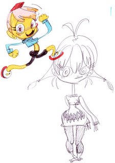
 What's the difference? Katie's girls are full of contrasts. The contrasts give the girls their unique differences that make them individuals, rather than generic symbols.
Conservative art without skill is the norm today. It is the evilest combination and will destroy what was once a great civilization if it continues.
Conservative art with skill is useful as a learning tool. It is not thrilling or uplifting to the human spirit, but it beats the Hell out of amatuerism.
Creativity without skill cannot exist-or it cannot be used effectively. Contrasts won't help unskilled work.
Contrasts added to skill equal interest, dynamics, statements and art and magic.
OK, get what contrast is?
There are many types of contrasts, not just the obvious ones of size and shape.
Here are some to start you thinking:


